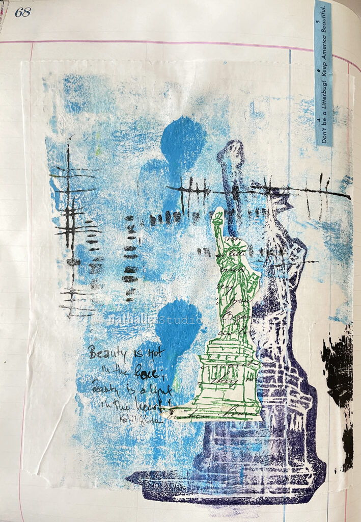
In this art journal page I took advantage of some painty grunge on a deli paper piece that I had used to dab off some excess paint from a gel plate, as well as some stamp marks from my foam stamps.
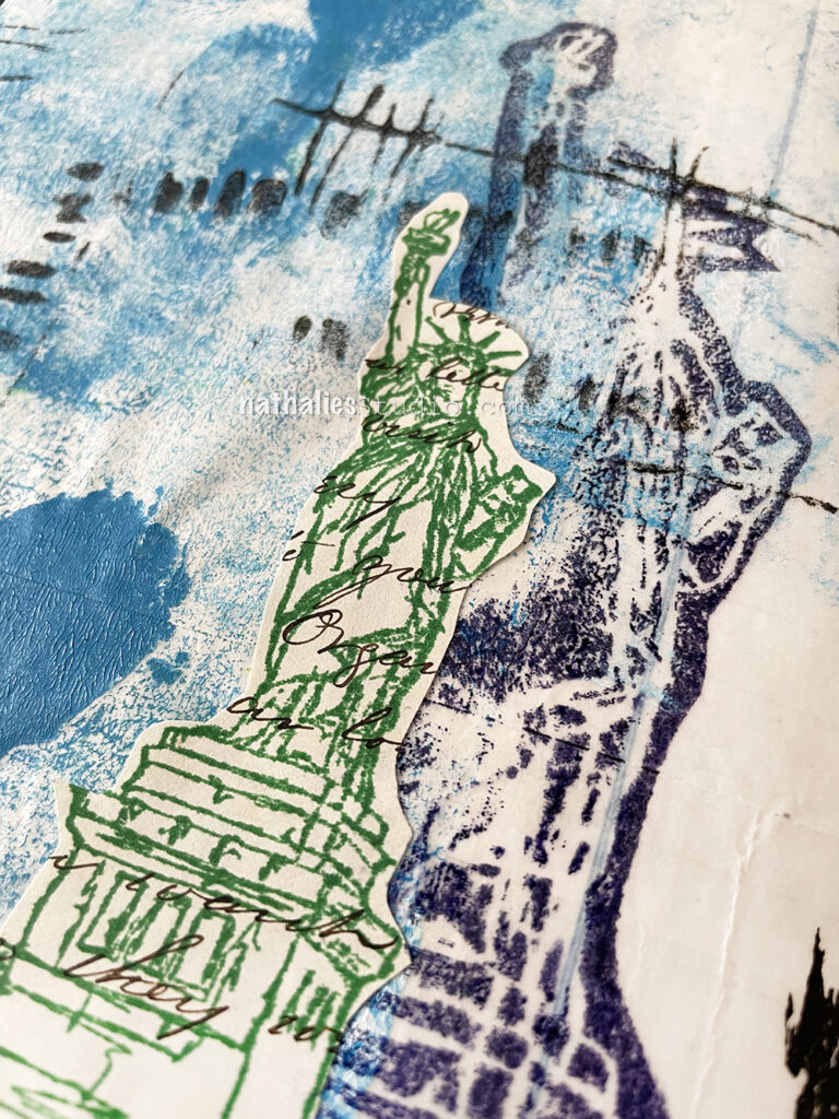
I adhered the piece for a background into my ledger art journal and stamped on top with Versafine and the Lady Liberty foam stamp. Next I stamped the Lady Liberty rubber stamp in green on an old letter and adhered that too. The “Don’t be a litterbug” is from an old road map…a paper road map… wow, what a blast from the not so far past LOL.
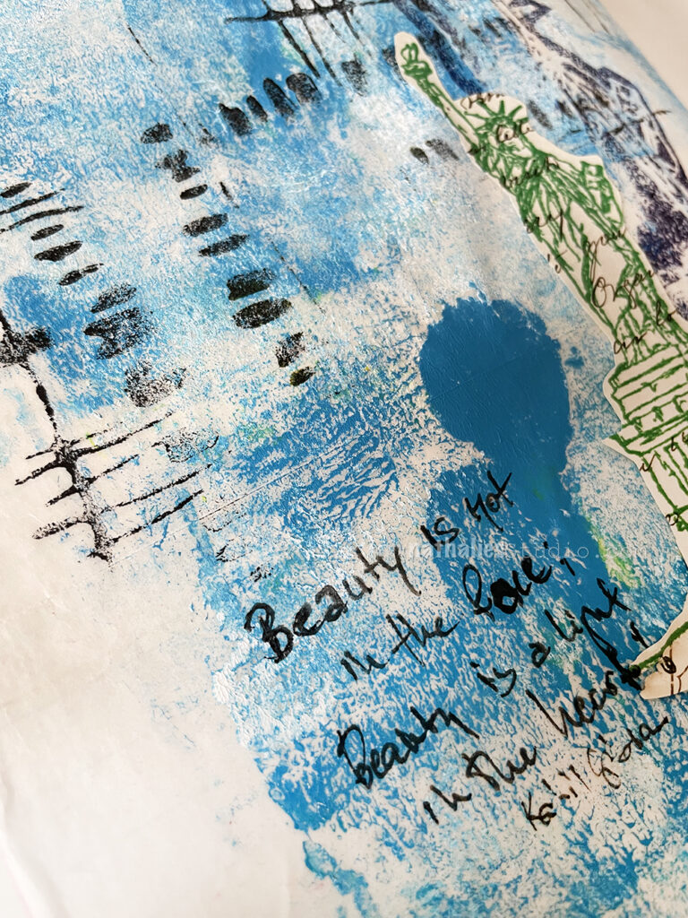
The journaling is supposed to read:
“Beauty is not in the face; Beauty is a light in the heart!” The pen died on me though and I made a little mistake, but oh well ;)
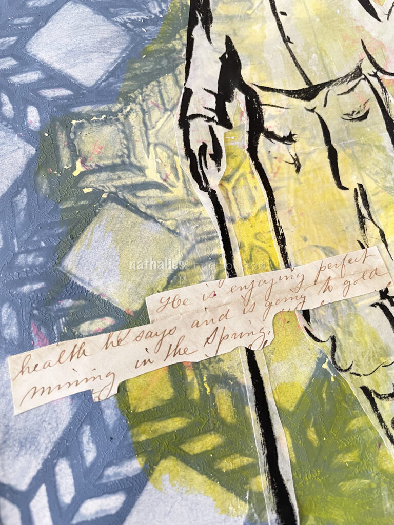
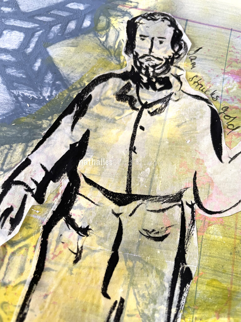
This is another art journal page – like Pre-Pandemic Letters – that sprung from a sentence in an old letter from 1867 where Amanda writes about Uncle Sam “He is engaging perfect health he says and is going to gold mining in the spring.” I like to think that Sam struck gold – lol
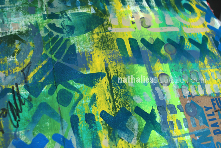
This background was rather mucky as I stared out with a lot of left over blue grey acrylic paint on my palette – I wanted to use it up instead of wasting it – but when I added it to the page it was still too much. So I put the Santiago stencil on top and took some of the paint off with a moist rag and then spread it over to other areas of the page. It was way too much paint in any event so the stencils is not nice and crisp but that is ok. I added some yellow acrylic ink here and there and then sketched with black ink “Uncle Sam” on Deli paper and adhered it with a glue stick to the background.
Cutting out the letter sentences like that seems a bit crude but I did not want to cut this further up. If I find more fun letters I might actually just scan in the parts I like and then manipulate them… although… do I really need more collage material? Probably not, and the look of the old letter paper with ink does look cool to me.
I like the color of the Santiago stencil section, it reminds me of an old quilt, the blue is like water, and the grid pattern someone might use when cordoning off a section to pan.
Hello from my Creative Squad! Today we have a gorgeous post from Maura Hibbitts using my Large Circle Jumble, Fan-tastic Large, and Hex Set Large rubber stamp sets and our new June theme: The Great Outdoors – The experts agree that getting outside for activity each day is a super healthy thing you can do for your mind and body. Let’s get outside and seek artistic inspiration out there. Find something that catches your eye and then when it’s time to come back in, use that inspo to create.
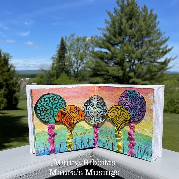
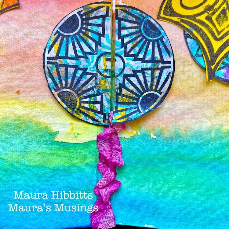
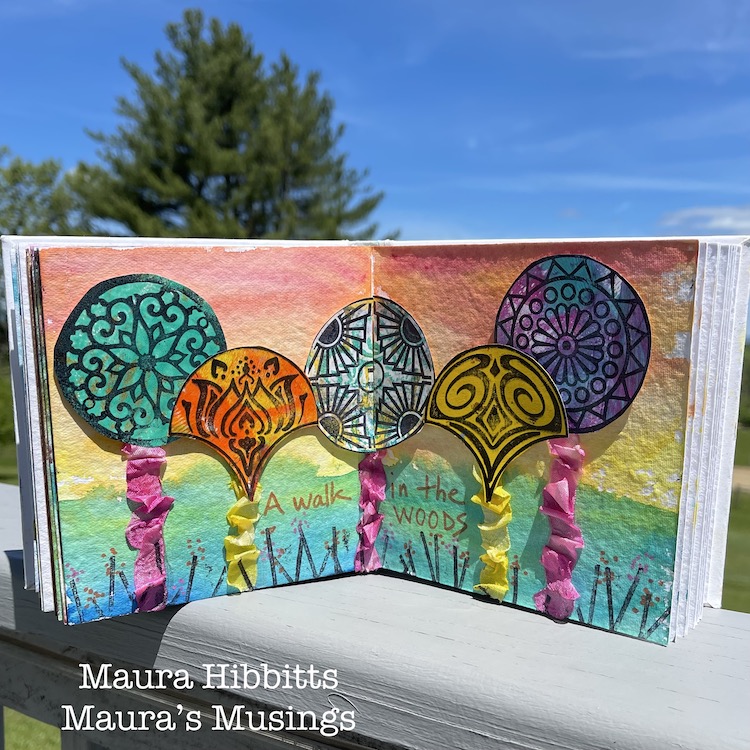
What a perfect time to celebrate the great outdoors! It’s a time of year when people love to get out in nature and play. Camping, hiking, boating, gardening…and the list goes on. I have always been drawn to the woods. As a child, you could find me playing out there almost every day. This year, I closely observed the leafing out of the trees, and celebrated their return to glory.
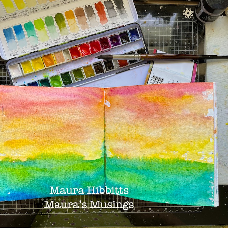
I began in my Media Journal with a watercolor background. I decided to use non-traditional colors on my spread. I used a #12 brush to swipe color across the pages.
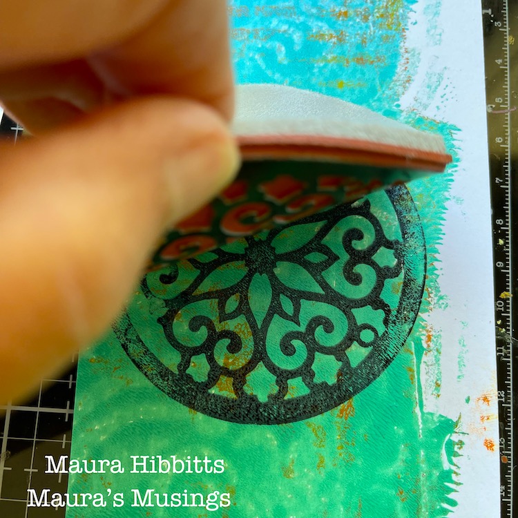
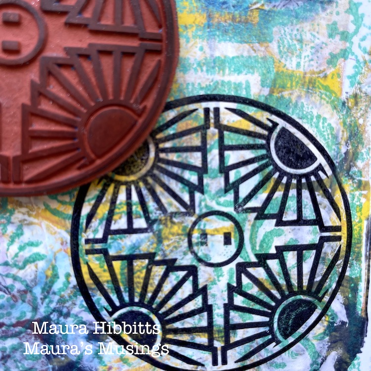
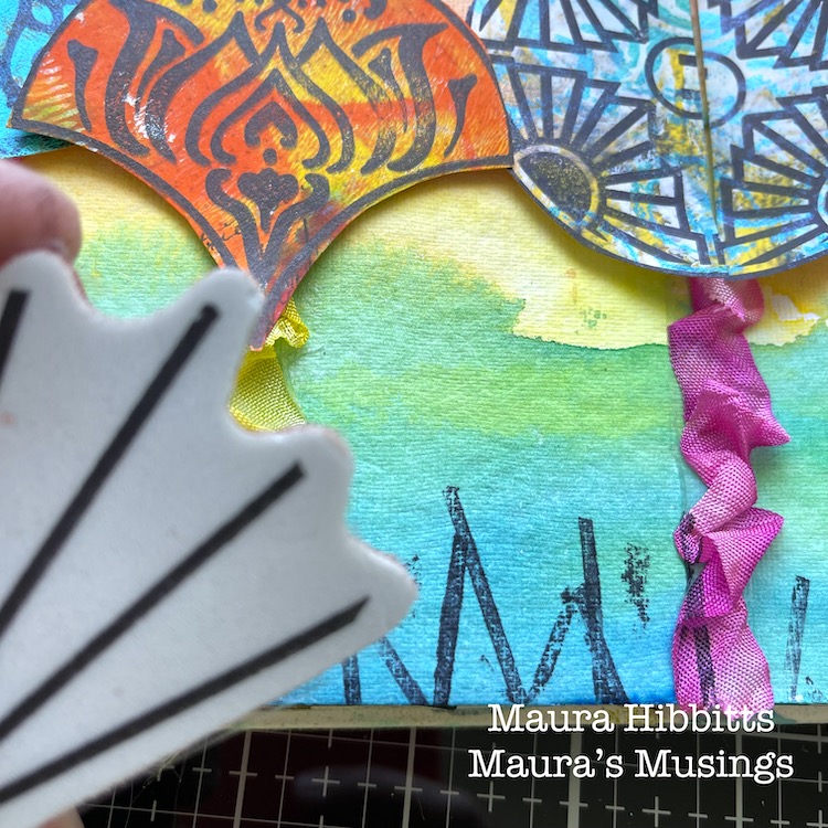
While the background dried, I stamped onto gel prints (any collage paper would work) I had in my stash using a black dye ink. I used Park Boulevard, Broadway and Valley Road stamps from the Circle Jumble large set…
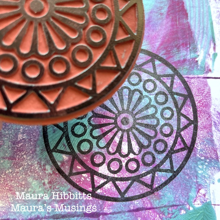
…and the Lily and Fairview stamps from the large Fan-Tastic set by Nathalie.
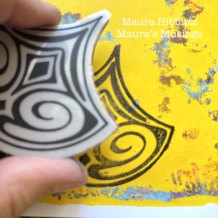
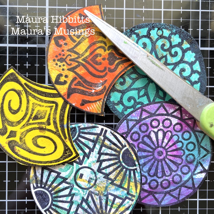
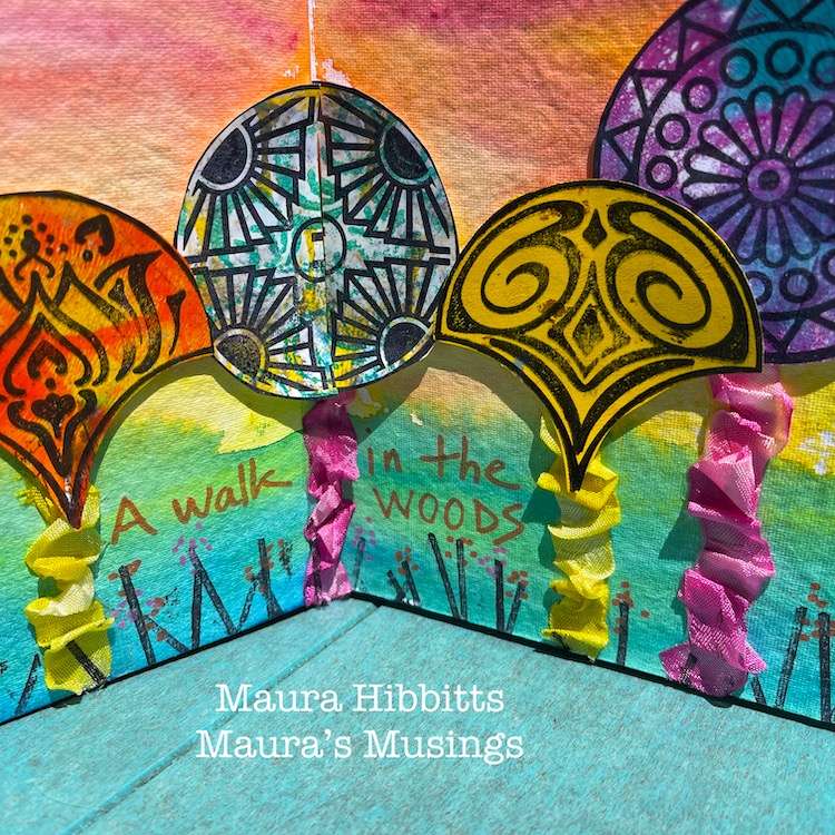
Next step is to cut out the stamped shapes to use as the trees.
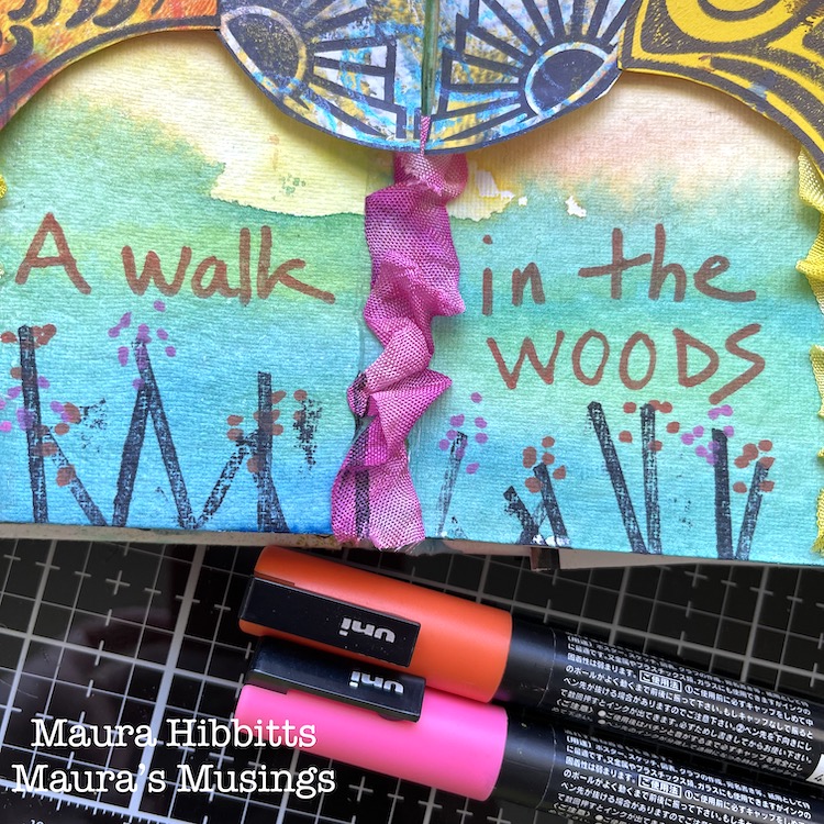
Run adhesive over the area of the tree trunk and layer ribbon down. I used some hand-dyed ribbon I had in my stash, but any ribbon will work. Pleat it a bit to get some texture. Add foam tape to the stamped image and use as the tree canopy. Note – split the center image and space far enough apart so the book will close.
Use the Beacon Positive stamp from the large Hex set, and black dye ink to create grass and flower stems along the bottom of the page.
To finish the pages, I hand lettered “ A walk in the woods” and added dots to make flowers, using Posca markers.
Popping up the tree tops with foam tape, and scrunching the ribbon adds some lovely texture that you can see in the sunlight. Many days, I just observe the trees from my deck and that brings me peace. It is a special day when I can get out to the woods for a walk or picnic. I wish you many opportunities to enjoy the great outdoors this summer! – Maura
Thank you Maura for this colorful and fun celebration of the outdoors! Love the idea of using all the stamps to create different trees :)
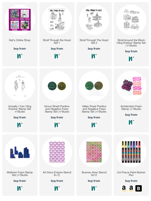
Give it a try: you can find all my Rubber Stamps in my Online Shop and in addition to gelli printed papers from her stash, here are some of the supplies Maura used:
Looking for more projects? Follow the Creative Squad on Instagram here.
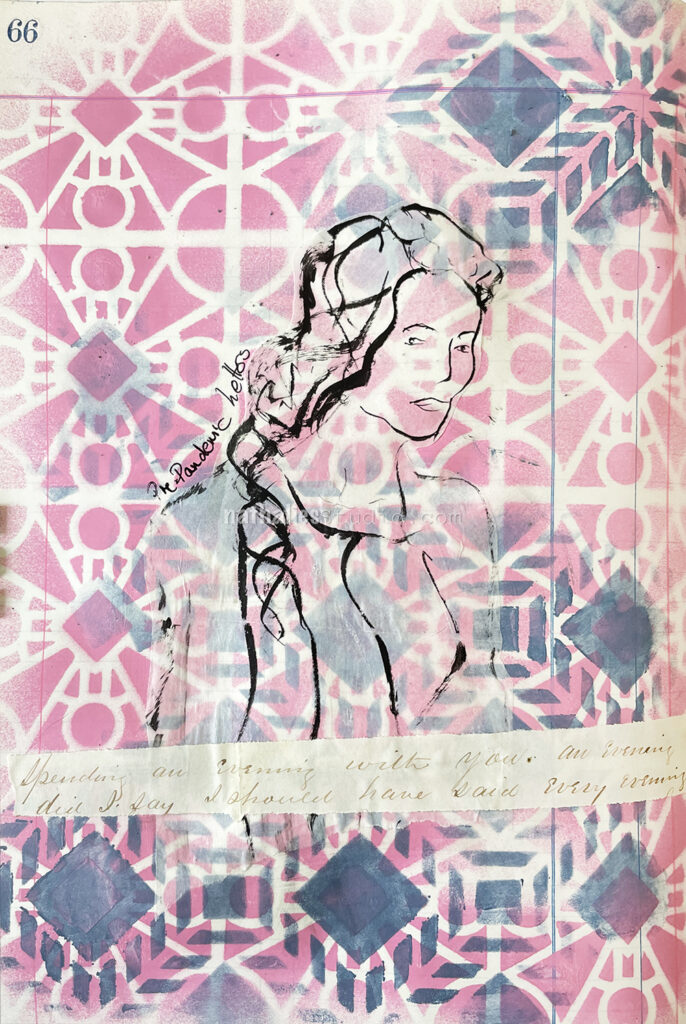
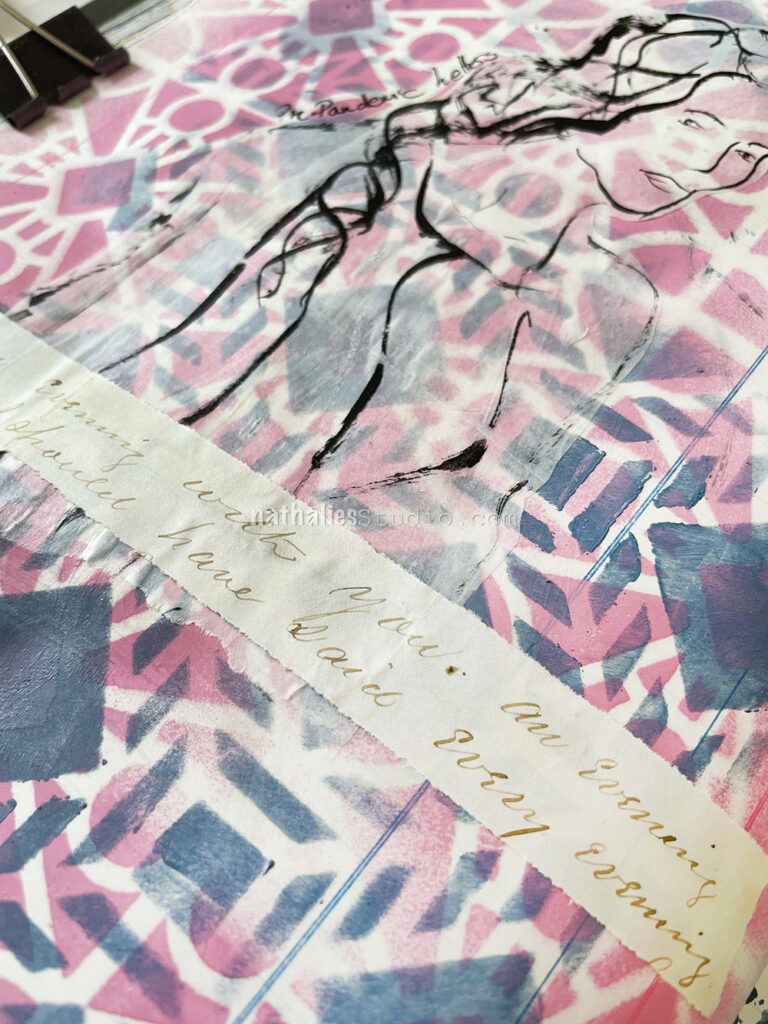
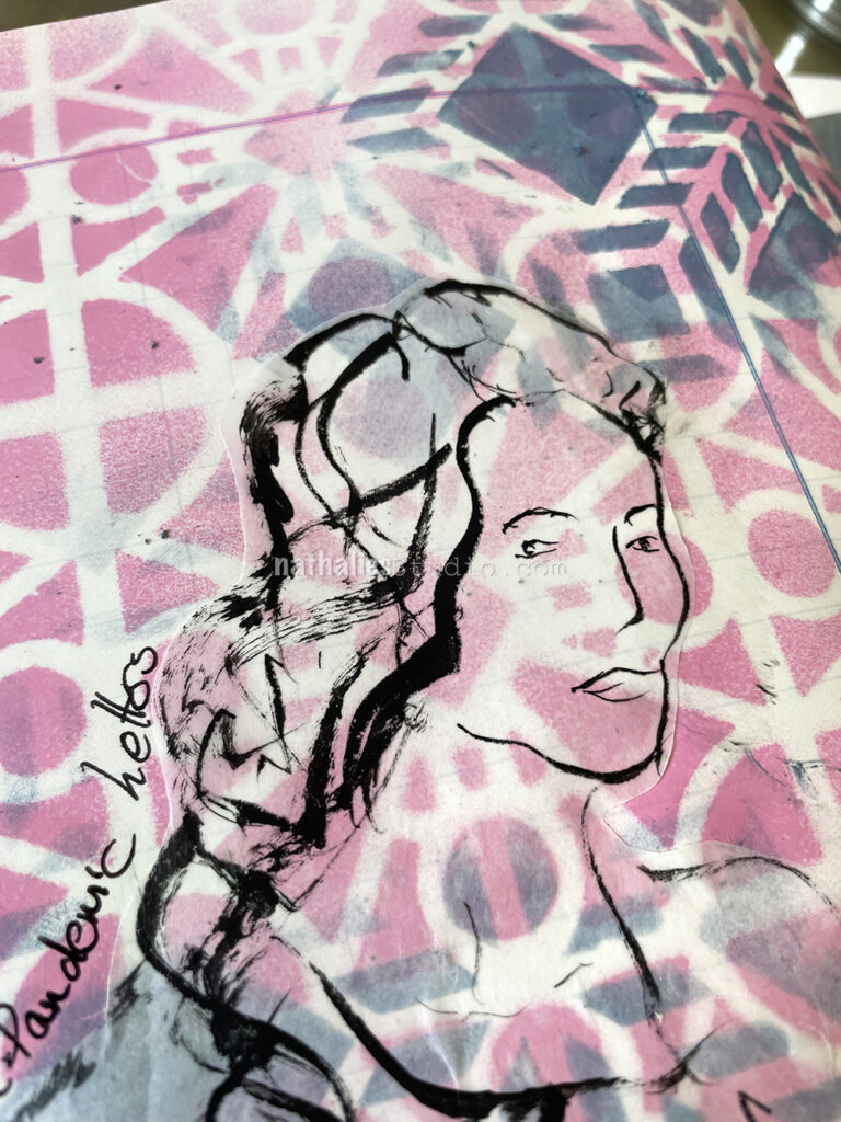
I love old letters. When I find them at a flea market I pick them up and use them for collage or background purposes later. It is always a spark in the moment when I pick them up and find a word or sentence jumping out to me. I had used some other parts of this letter before but had not read the whole letter and when I was cleaning up my workspace this jumped out to me: “Spending an evening with you. An evening did I say. I should have said every evening.” And while Oscar was really romantic my first giggle thought was “well that was a pre-pandemic letter”.
I am almost tempted to find more sentences in old letters and make a series hahaha- we shall see if I find more.
For my art journal page I sprayed with MTN acrylic spray paint over the Buenos Aires Stencil, then layered the Santiago stencil on top and added some acrylic paint over it here and there.
I also tested a new liner brush I recently purchased (Princeton Aspen Acrylic brush part of a set) and used Holbein black acrylic ink on deli paper for the sketch.
I cut the sketch out and pasted it along with the letter part with Liquitex Matte Medium.
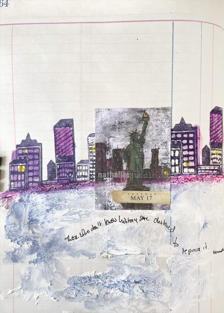
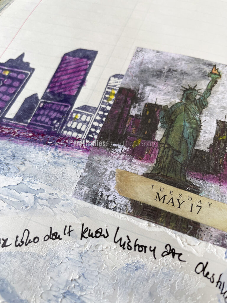
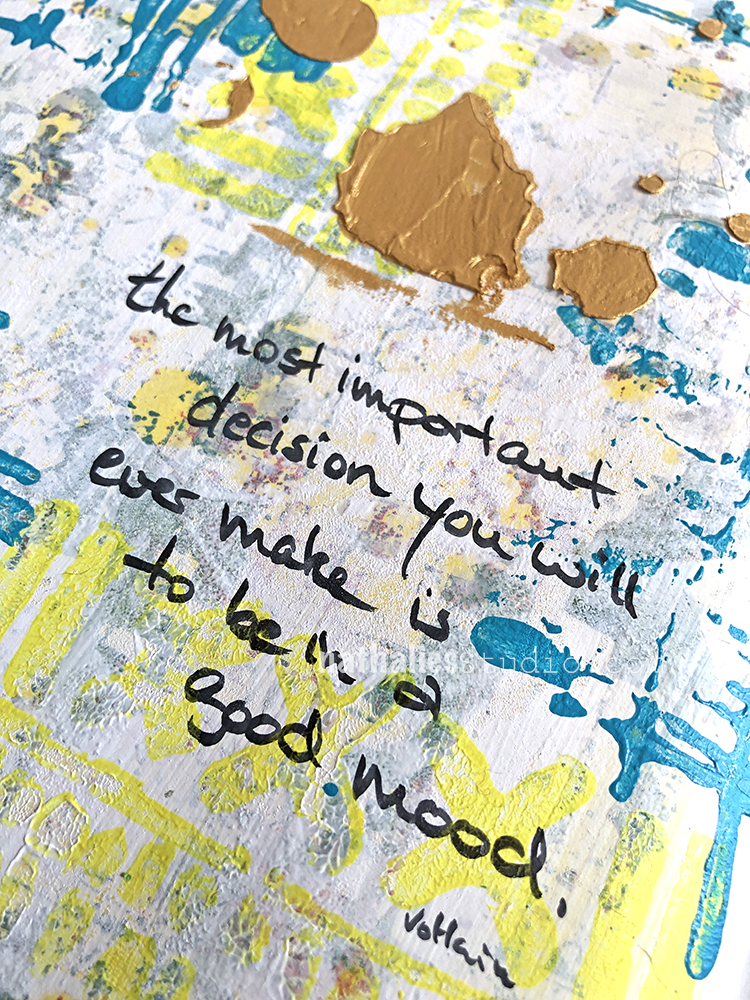
“Those who don’t know history are destined to repeat it.” – Edmund Burke
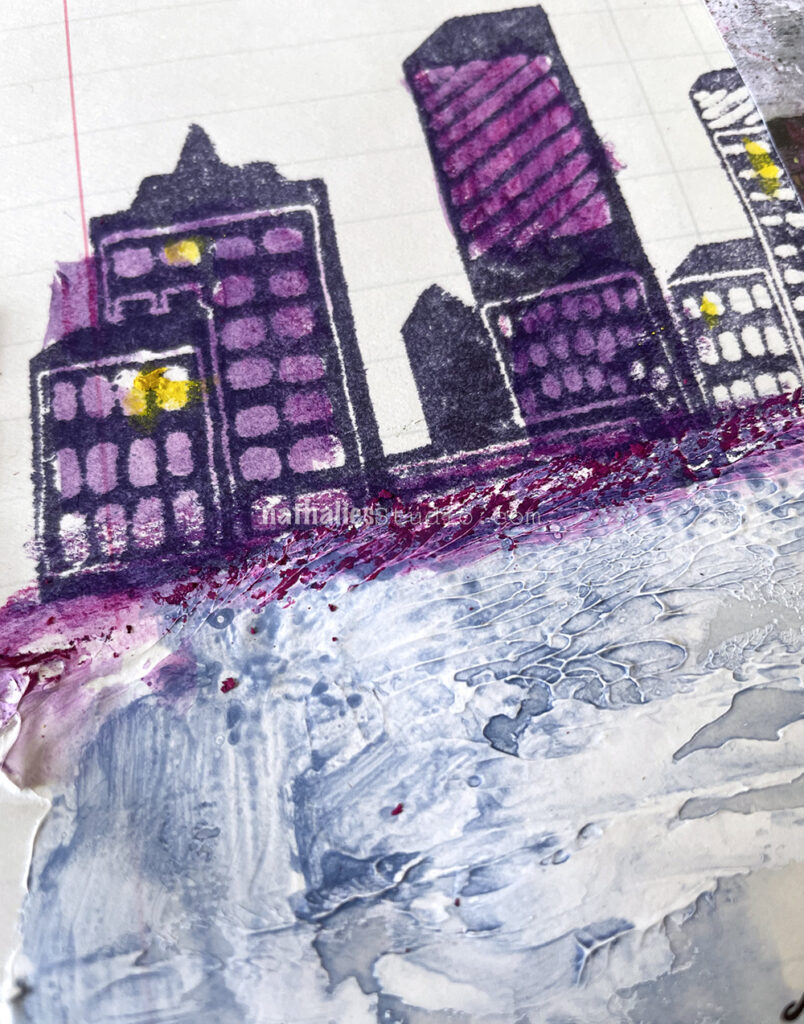
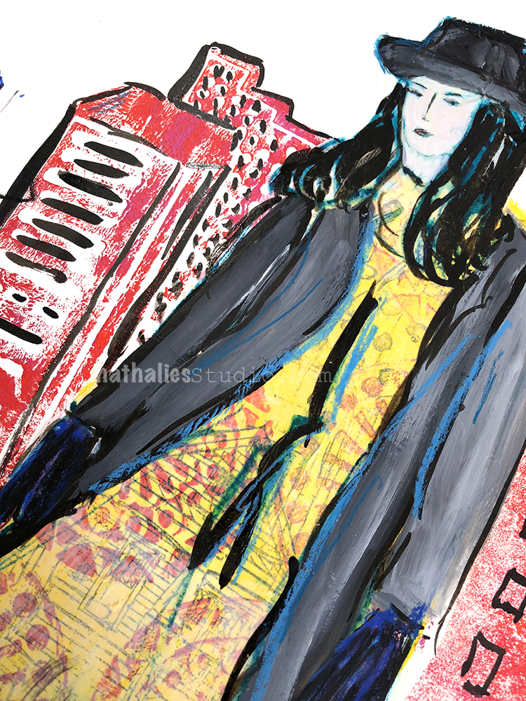
For this page I was working with one of those nice little collage pages from the Artist Almanac calendar (2023 version is in the works!). I still have a few giclee prints left of that original painting here in my shop. Then I added Liquitex heavy gesso onto stripes of canvas and pressed them onto the ledger page for texture.
After it dried I painted over it with some watered down Liquitex Blue Gray paint. For the skyline I stamped with Moonlight Duo ink and the Midtown and Midtown Mini foam stamp sets. To tie things together I used a Neocolor II in a rich magenta color.
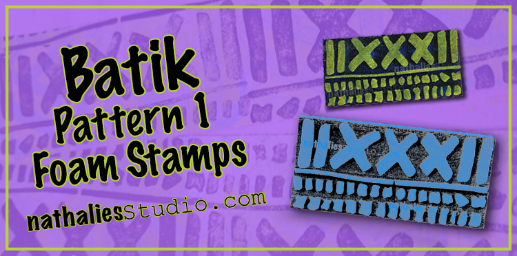
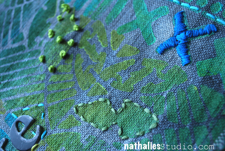
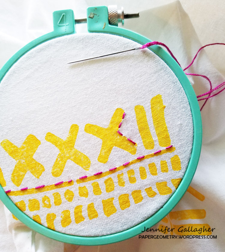
One of my favorite things about all of my Batik foam stamp designs is that every stamp has a few things going on. You can use the whole thing, but you can also just use one element if you need some interesting patterns or marks. My Batik Pattern 1 stamps are no exception, whether you reach for the full sized Batik Pattern 1 or the Mini Batik Pattern 1 version. Sometimes I need some border elements and the bottom half of the stamp is a go to. Other times I want a bold statement and I need some X’s to “mark the spot” so to speak.
Above all else, I reach for the stamp because it’s so versatile for mark making. Especially if you don’t stamp the full stamp perfectly, and you weave it into your layers, you can suggest all sorts of stuff like maybe it is hinting at hash marks, tallying, or keeping some sort of record.
Even though it looks bold at first glance, Batik Pattern 1 doesn’t have to be the focal point. Use a mellow color and it can blend in with layers and add to the complexity of your image without stealing the show.
It layers up nicely with other foam stamps or in keeping with a love theme, my Love Tag and Love Knots rubber stamps. The abstract marks of the pattern can blend in with backgrounds.
But if you do want to call attention to the design, I totally recommend adding some embroidery to highlight it. Whether you follow the design exactly…
Or maybe just use it as a jumping off point.
So grab your Batik Pattern 1 foam stamp or the cute Mini version, and get stamping – on fabric, in your art journal, or somewhere else that calls to you.
Here are some of the supplies used in these projects:
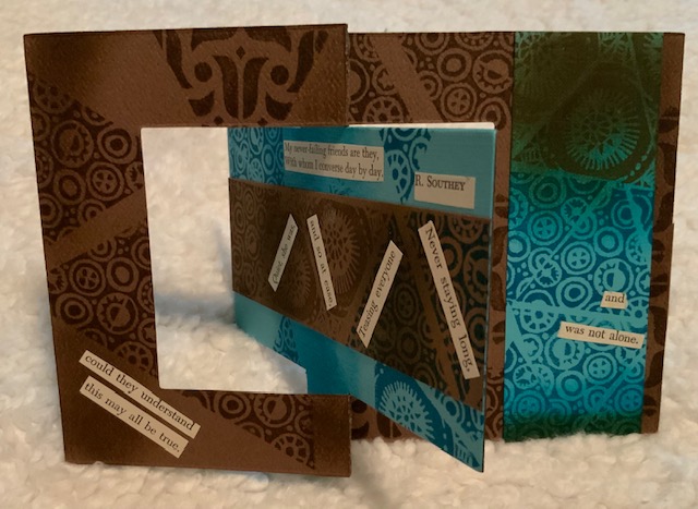
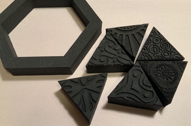
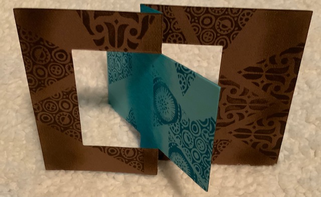
Hello from my Creative Squad! Today we have a post from Judi Kauffman who is sharing a fun flip card using my Triple Play foam stamp set and our theme: A Tale of Two Colors – Think about two different colors, one you love using and one you find more of a challenge to work with. Use them together in a project and see what happens.
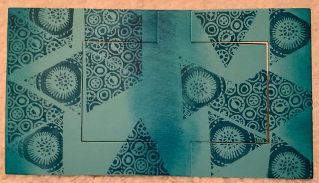
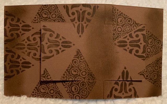
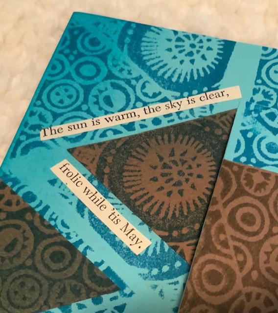
When I heard this month’s theme I knew right away that I’d be using brown as the more challenging color and teal as the favorite. Even though I love chocolate (brown) and trees (brown trunks) and my brown suede boots (UGGS) it’s just not a color I turn to in the studio. If it weren’t for the fact that brown is usually included in assortments I probably wouldn’t have more than one or two sheets.
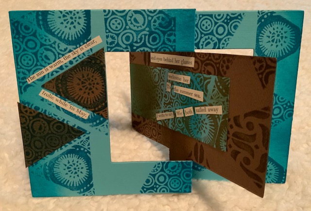
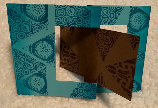
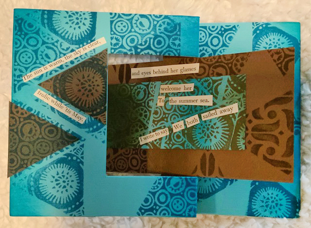
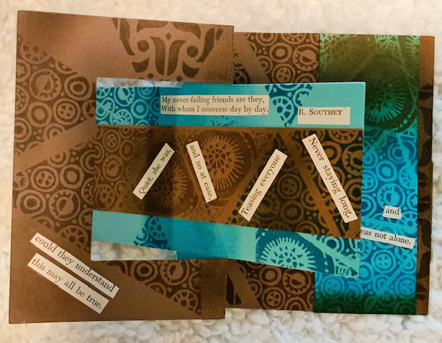
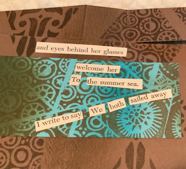
The project: A flip card that began as brown on one side and teal on the other. As it happens, those two colors are fabulous together – something that is revealed right away with a flip card. And I soon decided that I’d use some of each on BOTH sides! To finish things off I added some collage, found poetry made with words and phrases cut from a damaged book.
Instructions:
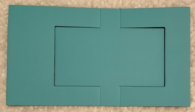
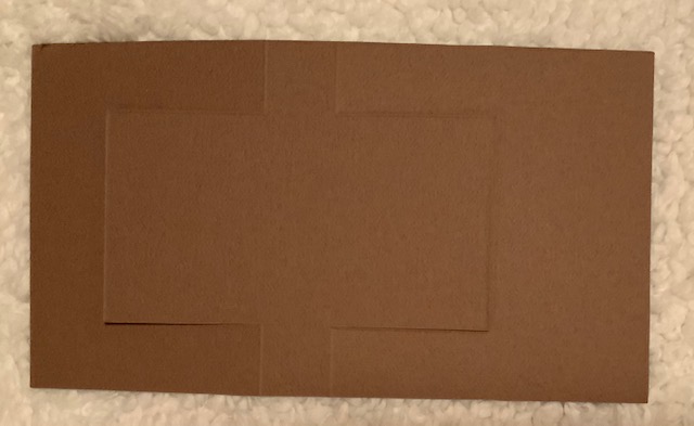
Using double-sided adhesive sheet or a glue stick, adhere 2 sheets of cardstock back to back. Hand- or die-cut a flip card base.
Using the ink that is in the same color family as the cardstock, stamp both sides of the card base with triangle shapes from Nathalie’s Triple Play ArtFoamies set. Using a craft sponge, smudge on a bit of ink on each side.
Stamp leftover strips of cardstock, mixing the colors and smudging with additional ink in both colors. Tip: Don’t wash the sponge for this step. Let the colors blend!
Cut the stamped leftover strips into pieces (rectangles and triangles) and adhere to both sides of the card base.
Complete the project by adding found poetry as shown, other kinds of collage elements, more stamping, or whatever you want!
Thank you Judi! We agree – the teal and brown work beautifully together, especially with the coordinating ink colors!
Give it a try: you can find all my Foam Stamps in my Online Shop and in addition to pages from an old book, here are some of the supplies Judi used:
A Look Back – Often I will include a figure in my art journal pages and hey, they’ve got to wear something ;) Usually I reach for my stamps and stencils to give their clothing a little pattern and style and sometimes the art magic happens and their clothing turns out pretty nifty. So nifty, I wish it actually existed in my own closet to wear! Maybe someday I’ll try to replicate one of these looks for real life:
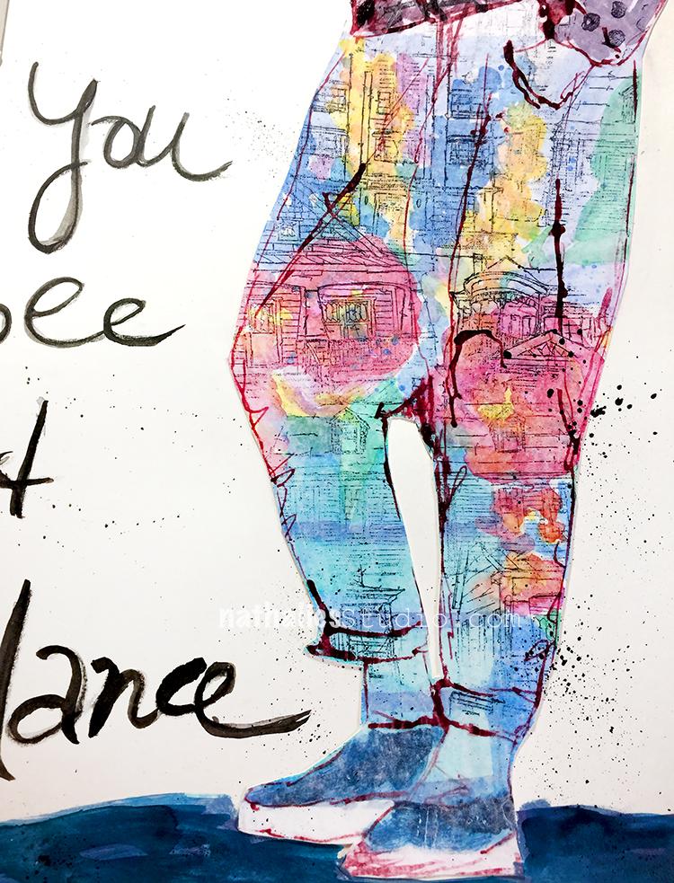
This art journal page from 2018 is one of those serendipitous moments where something just happens and it looks so good. I did some practice paintings of florals with watercolor and decided to sketch the legs on one of them with acrylic ink, and then I stamped over it with some of my Stroll Through the Hood and Stroll around the Block stamps. These pants are pretty wild but I totally dig them.
In this art journal spread I created a dress using my Grove St and Valley Road foam stamps and then thought it could use a bit more texture, so I added the Craftsman stamp from my Stroll Around the Block rubber stamp set. I guess more is more here and it came together nicely. Yup, I’d wear it!
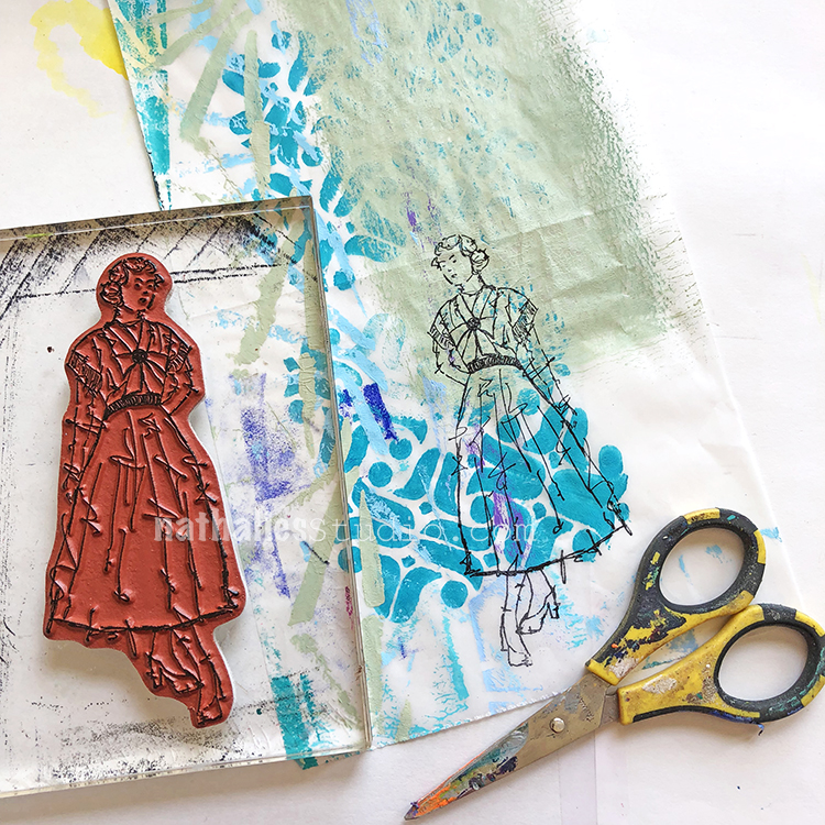
In this art journal page I kinda made things easier for myself and stamped my Millie stamp from the Actually I Can set onto deli paper. I positioned her skirt over the Amsterdam foam stamped part and the top half of her body over the painted section. Check out the completed page here to see how I finished off her look and then incorporated her into my art journal.
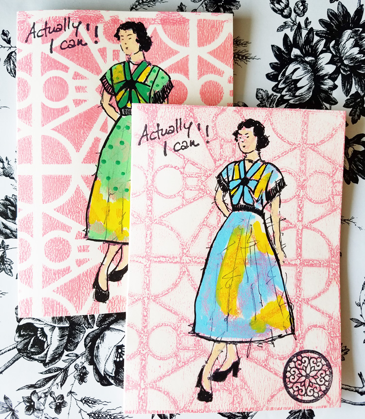
Creative Squad alum Jennifer Gallagher created a bunch of different looks for Millie’s dress here in this post. It totally brings me back to paper dolls and I love the variety of dresses she’s made using Posca pens.
Even just a tiny part of a stencil, carefully placed, can take a plain top and give it a unique style as we see here in Creative Squad Jordan Hill’s art journal page. My Art Deco Empire stencil looks really cool as a pattern around that scoop neck. Once again, I’d wear it :)
I hope you enjoyed this Look Back post and will think about how you can use stamps and stencils to give the clothing your figures wear a finishing touch. And maybe like me, you’ll wind up loving what you create and think about how you might be able to make something like that in real life.
Here are some of the supplies used in these posts:
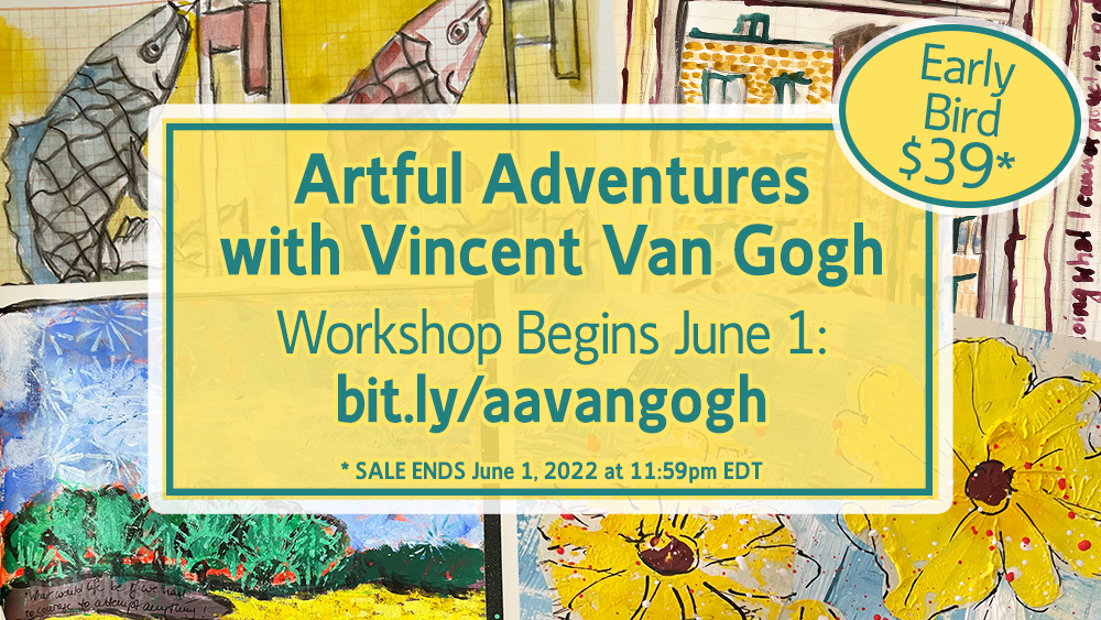
My new online workshop Artful Adventures with Vincent Van Gogh begins TOMORROW, June 1 with the first technique lesson. (It’s also the LAST DAY of the $39 Early Bird Sale price).
Are you looking for a little Artful Adventure and some inspiring project ideas for your art journaling and beyond? AA Van Gogh explores how we can draw inspiration and technique ideas from the master himself, Vincent van Gogh. We will touch on color, texture, mark making, and more, all based on the art of van Gogh, but in a way that YOU can adapt to YOUR style of making art.
And don’t forget – tomorrow is also the LAST DAY of our Artful Adventure Workshop Sale! All Artful Adventures are just $39 here in the online shop. Sale ends June 1, 2022 at 11:59pm EDT.


I like the color of the Santiago stencil section, it reminds me of an old quilt, the blue is like water, and the grid pattern someone might use when cordoning off a section to pan.
Reply