
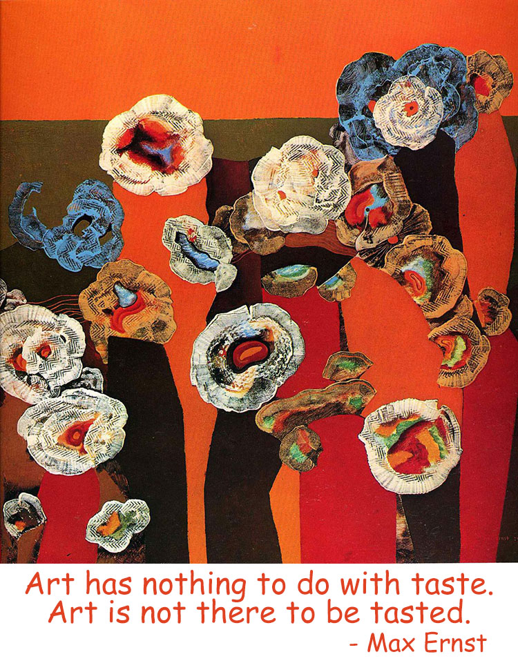
Nat


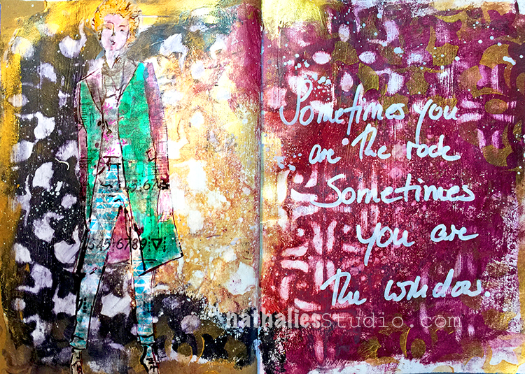
Loved Michelle Ward’s video at Creative JumpStart 2018 and used her technique with my Amsterdam and Versailles Stencil creating a grungy background.
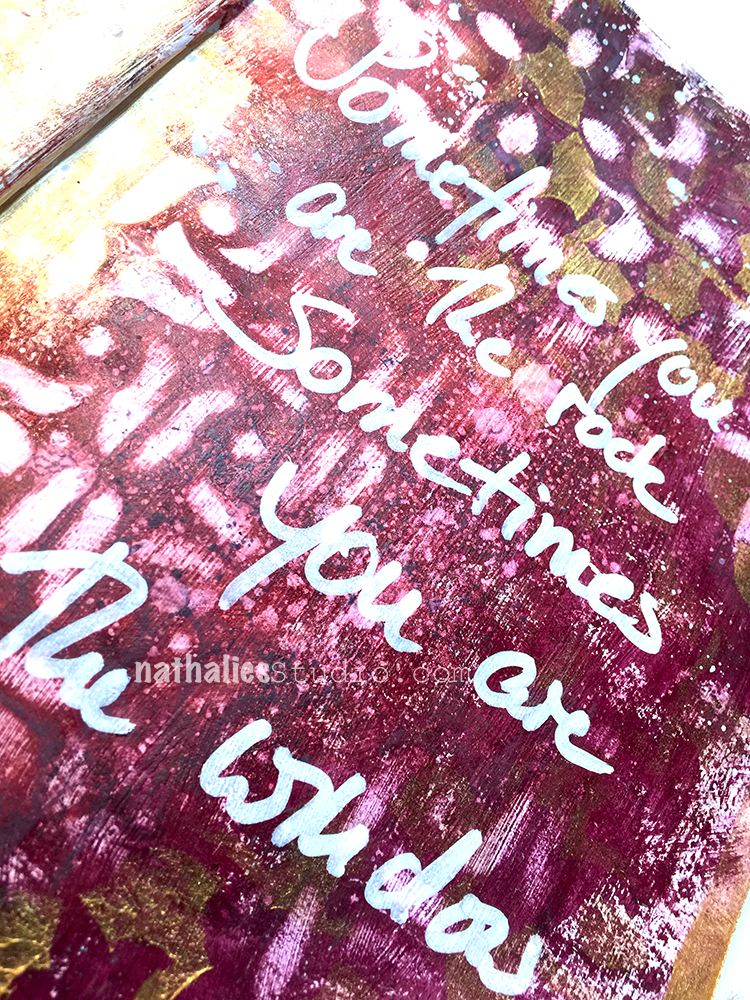
Just love the outcome – Michelle does the technique a bit different when I usually do- so it was fun to do it with a different approach. What Technique you ask ? WElllllll…LOL- yes- I am doing this to you right now…you gotta sign up to and see yourself- it is so much fun and the videos are so awesome. You still have time to join us for Creative JumpStart and play along!
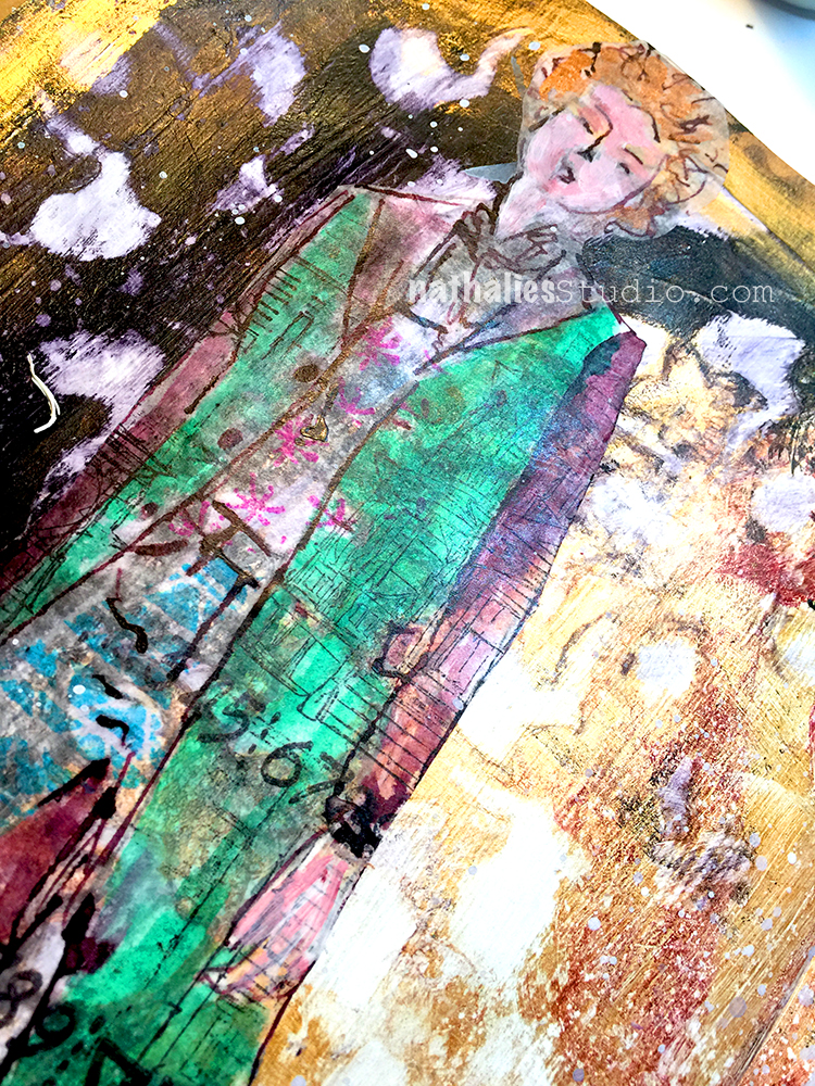
Loved creating the girl with some ink sketching and stamping- ….I kinda want her coat- LOL.
Here are some of the supplies I used for this spread:


Love this so much!
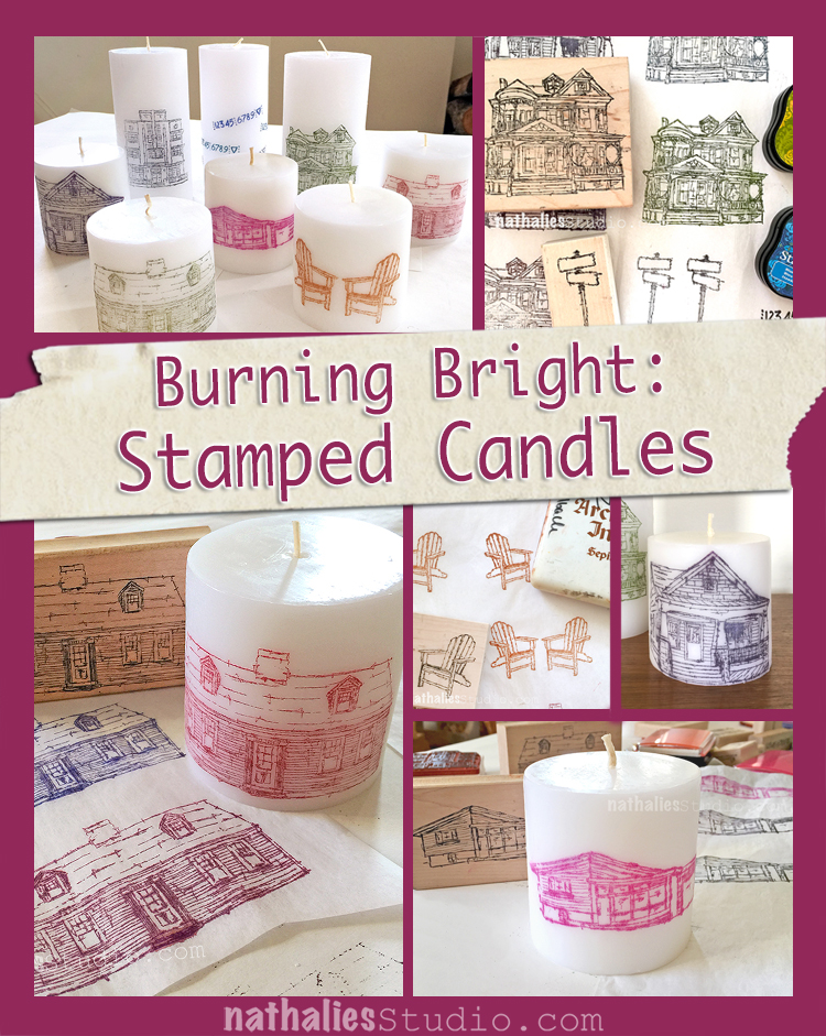
Kim and I had so much fun again at our monthly Craft Play Date. This time we made some candles and it was so easy and ohhhh I love them !
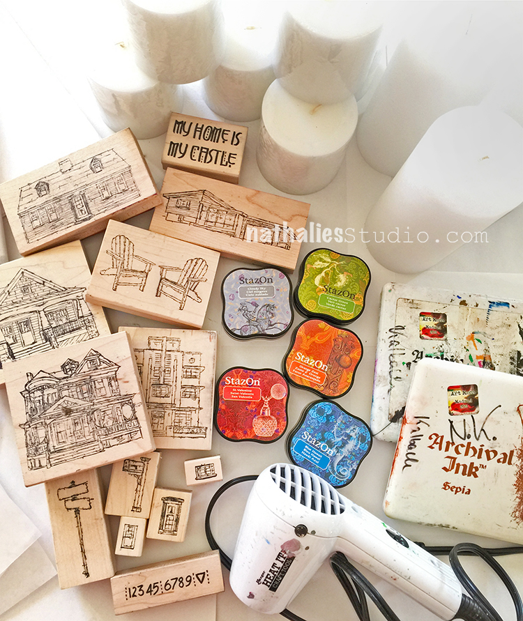
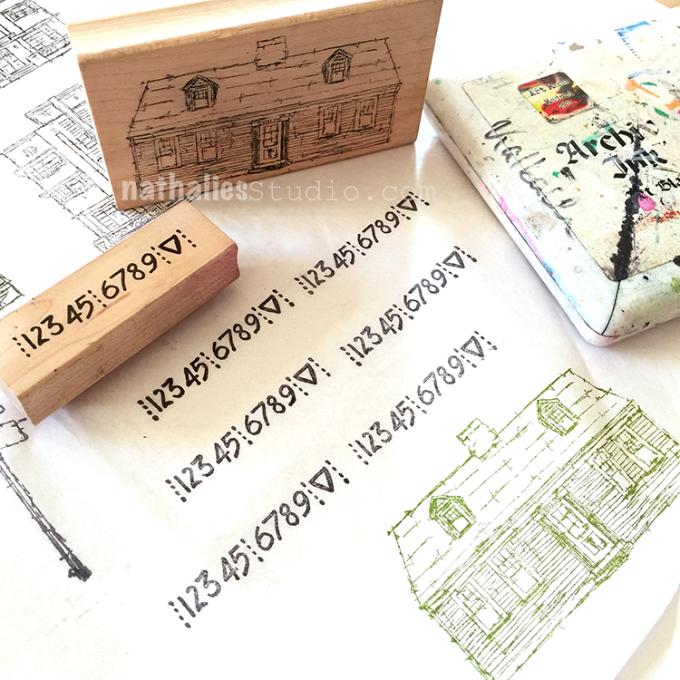
All you need are some stamps, some ink pads (try different ones as some might bleed) some tissue paper, wax candles and a craft heat tool.
We used my new RubberMoon Stroll Around the Block and My Home is My Castle Stamp Set.
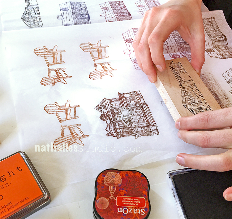
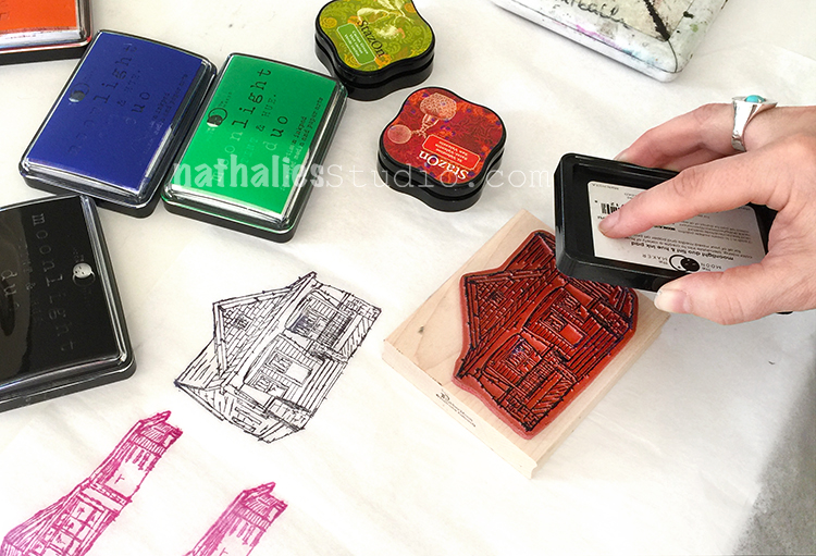
We just stamped along on the tissue paper with different colors and brands
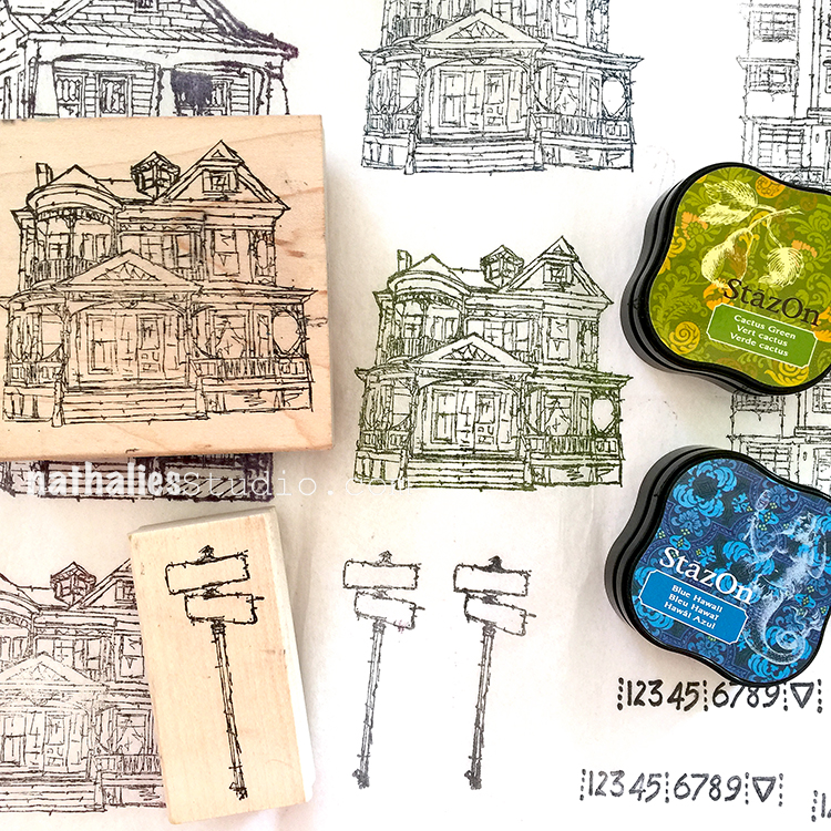
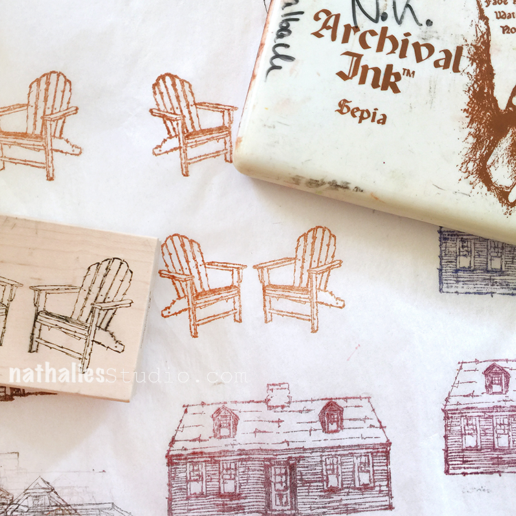
the less juicy the ink pad the less it was bleeding into the tissue but I also liked the bit of a painterly look a little ink bleed would give.
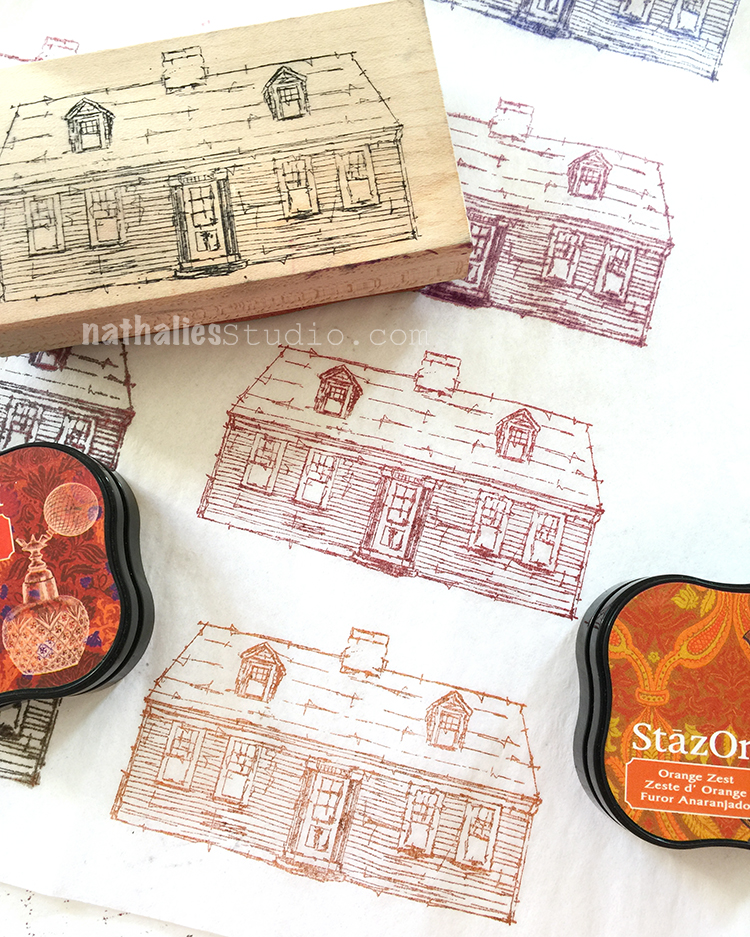
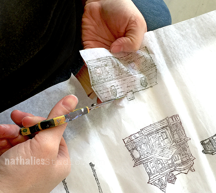
Then we just cut out the stamped images very close to the edges
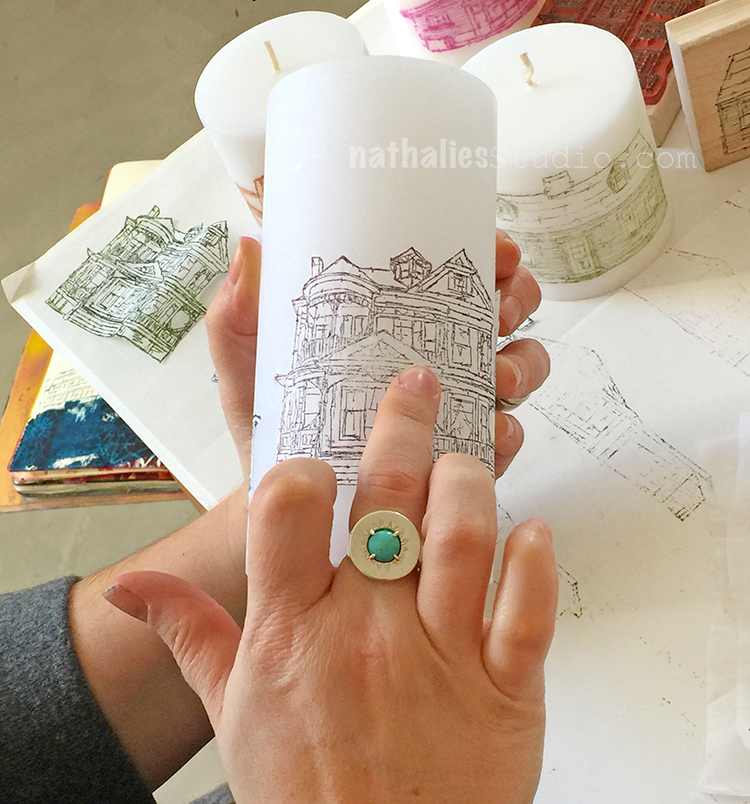
and smoothed it out on the candle.
With a heat tool place on some deli paper(or non stick paper) we placed the candle and carefully heated it up – once the wax is molten the stamped tissue paper fuses right into the wax.
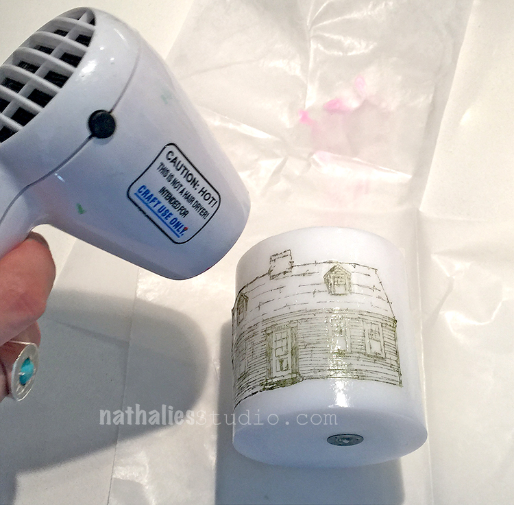
I used the deli paper while the wax was still warm and smoothed out any wrinkles. Make sure to be careful and not burn yourself !
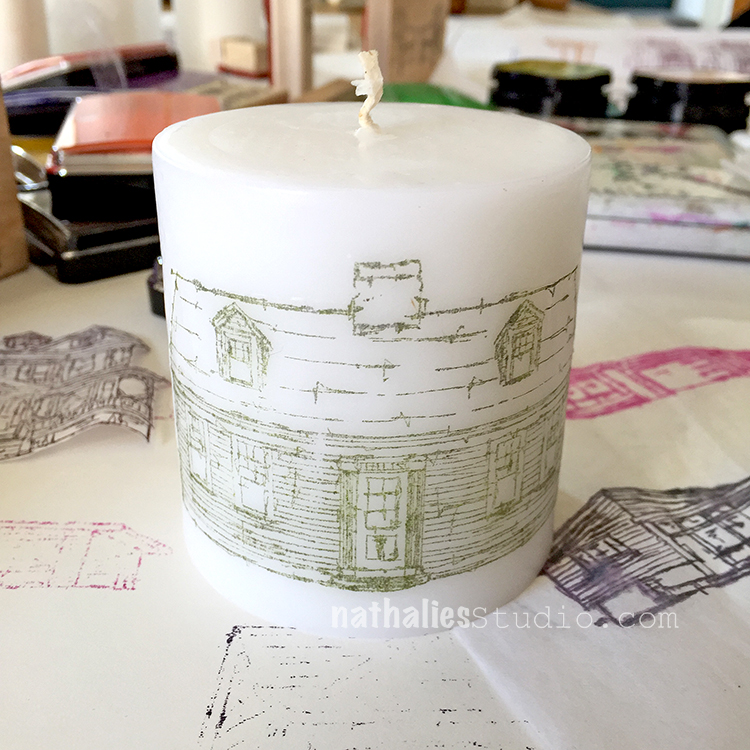
I love this so much
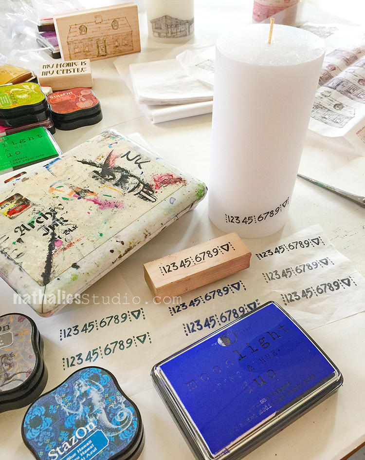
We just couldn’t stop
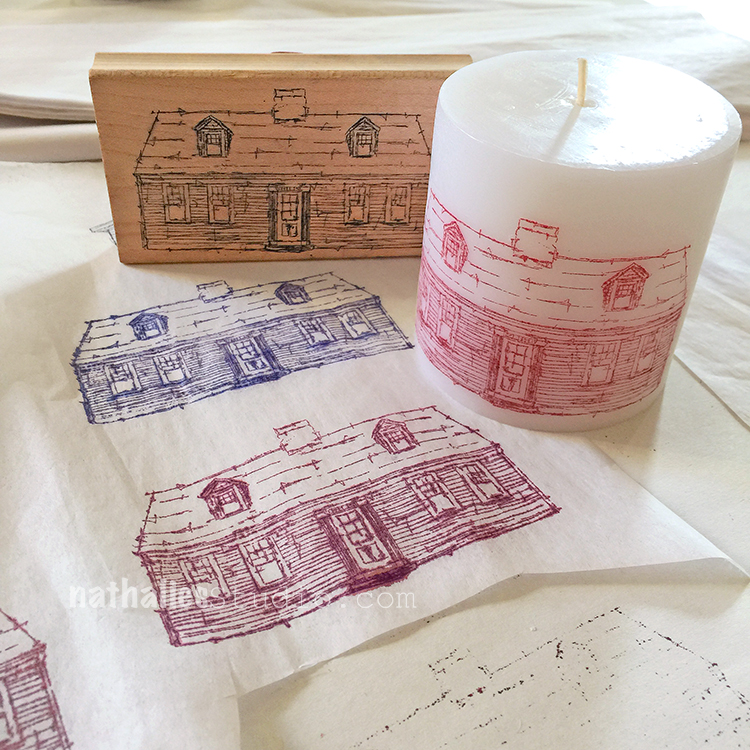
but there were only so many candles- LOL
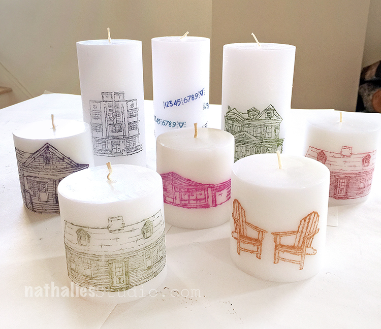
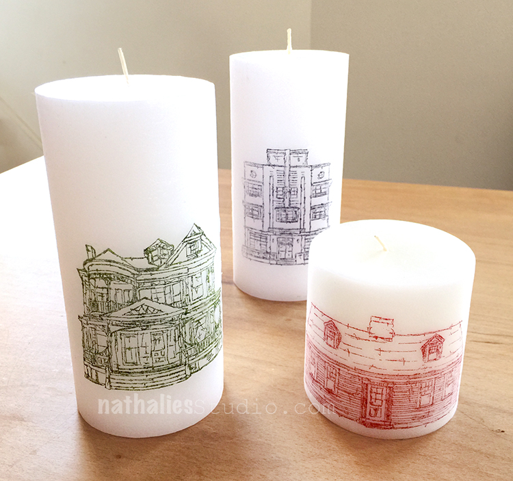
I love them with different houses and different sizes like below
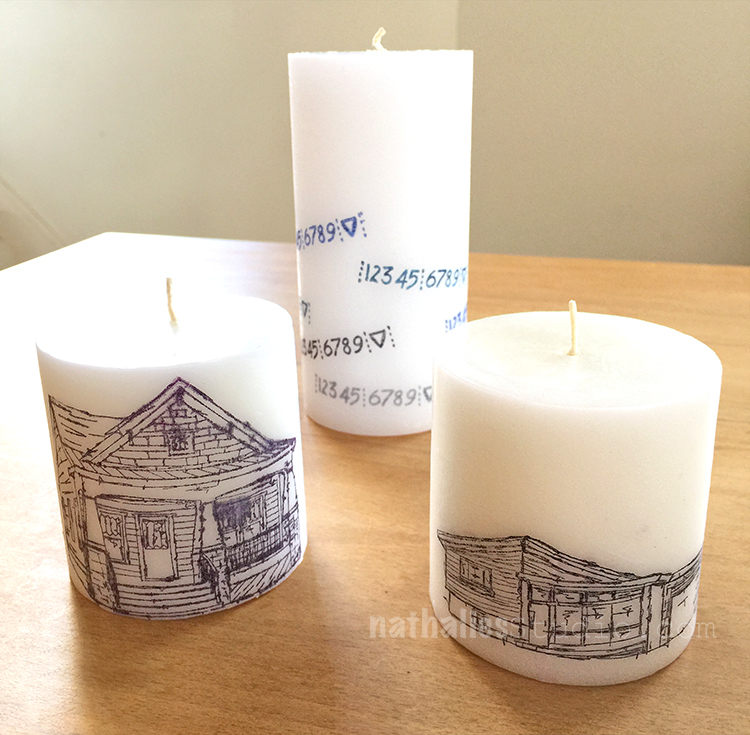
I love Kim’ Number Candle as well
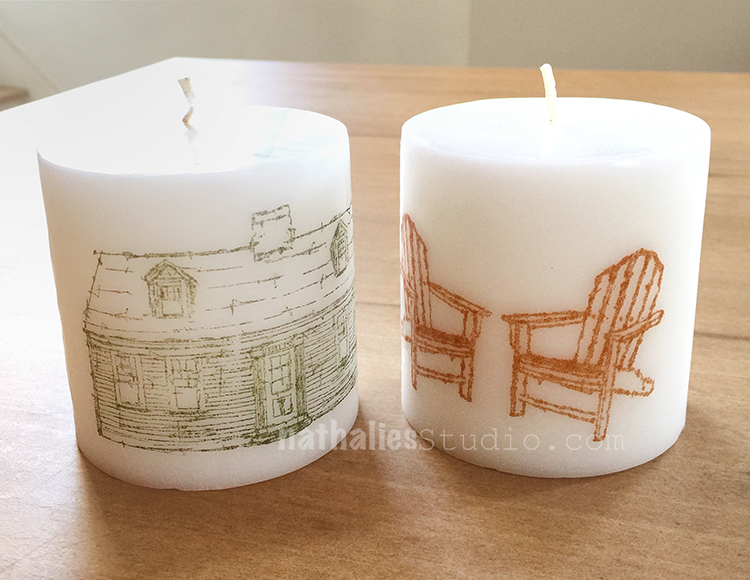
And the Adirondack chair candle on the right makes me want to gather some sand dollars and sea shells and set up a beach themed plate for the candle in the center.
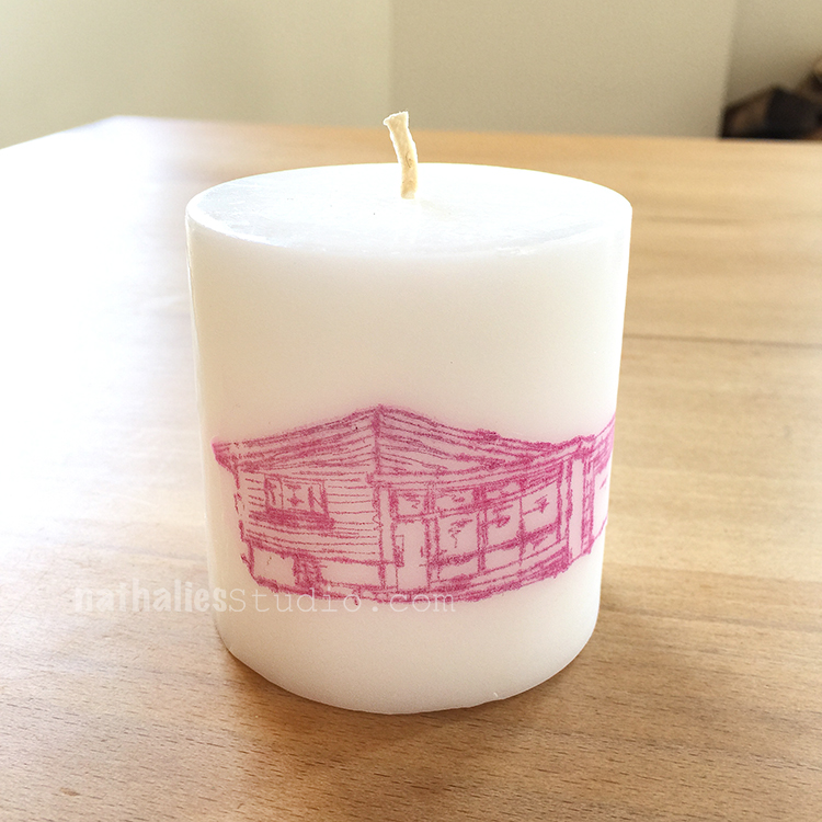
And …I still want the Mid Century House that would host the candle below … I mean…for myself- LOL- One can dream, right?
Hope you liked it and give it a try- guess what everyone is getting for next birthdays- LOL.
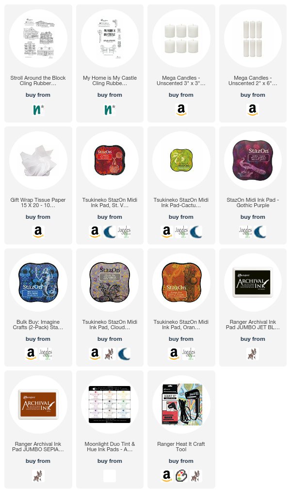
Here are some supplies we used – of course you do not need a huge amount of ink pads
Can’t wait for our next play date- always love getting creative with Kim :)

What a great idea! Love this, thanks for the tutorial.

Hope you will give it a try, it was super easy and fun!

Nice presents and they can even be personalized with the number of the house.
Such a great idea to add the number of the house! Thanks, Sue!
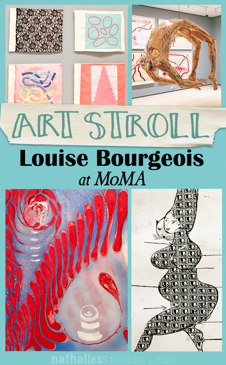
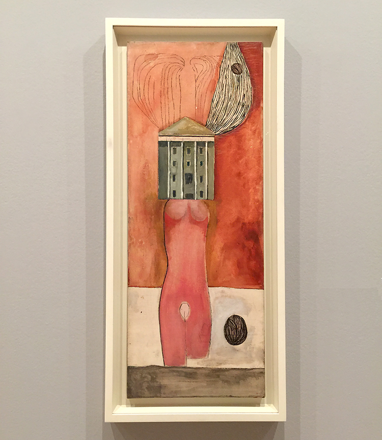
A couple of weeks ago Kim and I went to see Max Ernst at MoMA and while we were at it we also went to see the Louise Bourgeois exhibition. Louise Bourgeois was born in 1911 in France and died in 2010 in NYC.
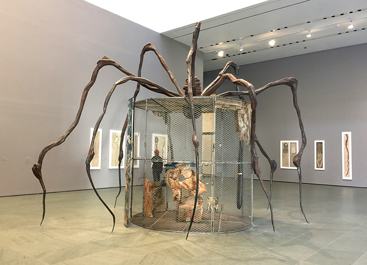
“Spider” (1997), steel, tapestry, wood, glass, fabric, rubber, silver, gold, and bone
Now the reason why I say that in a kind of “well guess we have to”-manner is, that I mostly associated Louise Bourgeois so far with her spider sculptures and well…I am not a particularly big fan of spiders ;)
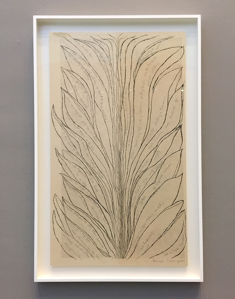
But I am happy to say I was pleasantly surprised and happy I went to the exhibition! I came to like her work a lot.
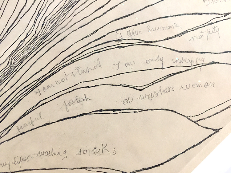
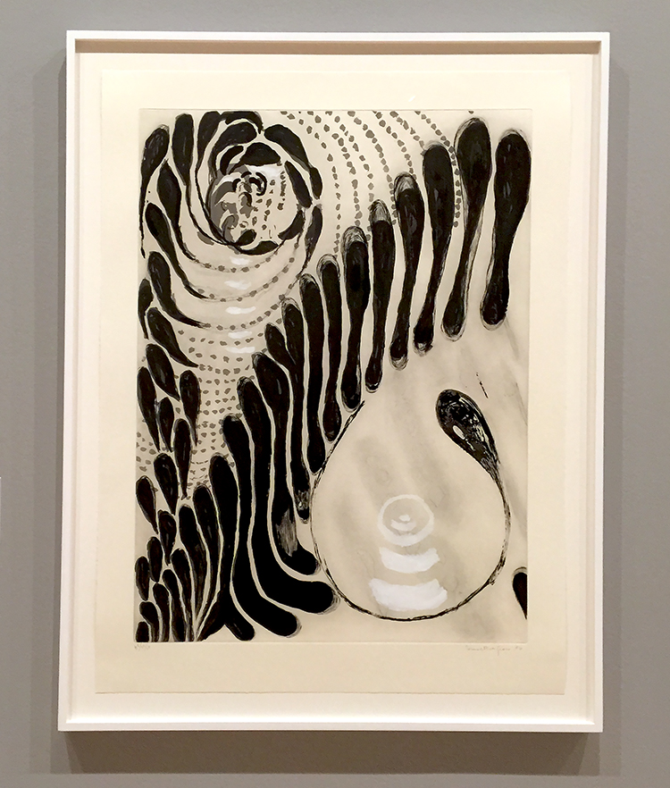
Soft Ground and Drypoint etching techniques were a big part of the exhibition. – and I found her studies of lines very interesting
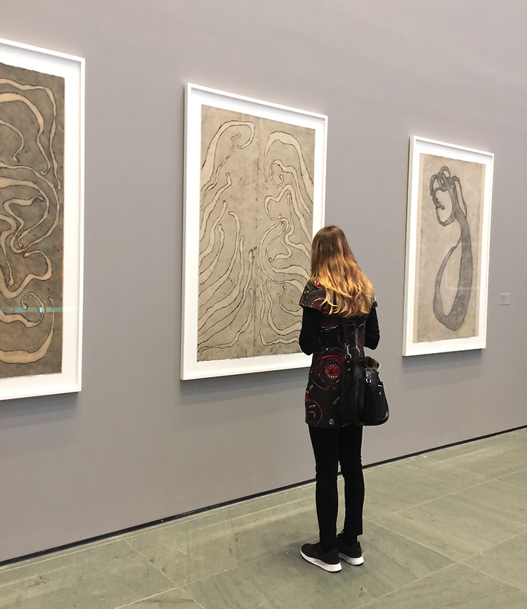
so did Kim ;)
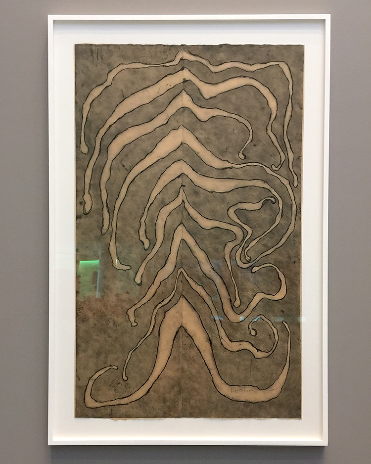
These prints were actually made in her last two decades of her life and the end of the show in the atrium of MoMA but we started there and it pulled us in to go to the exhibition rooms.
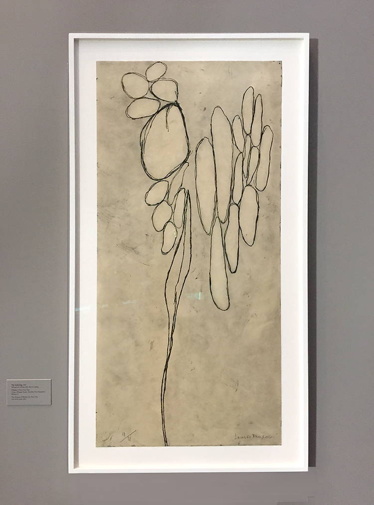
Funny enough a day after we saw the exhibition I got an email from my friend Bruno Nadalin offering a Drypoint Etching Class and needless to say- I signed up – I cannot wait :)
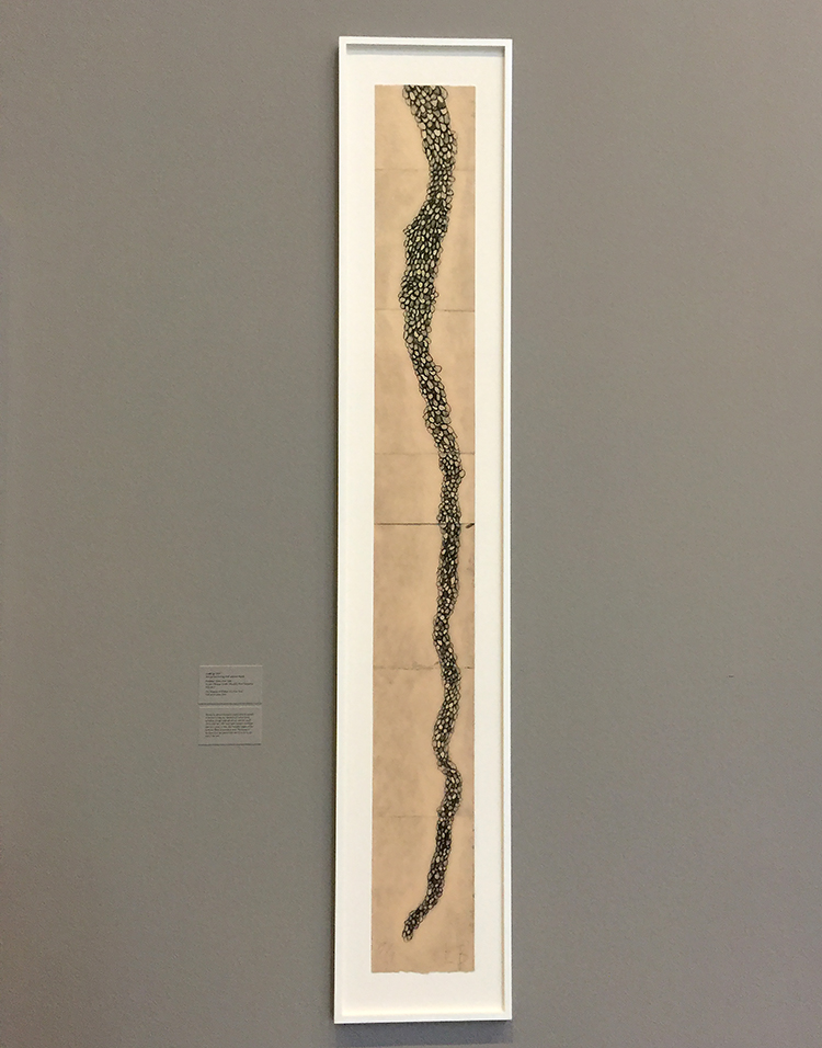
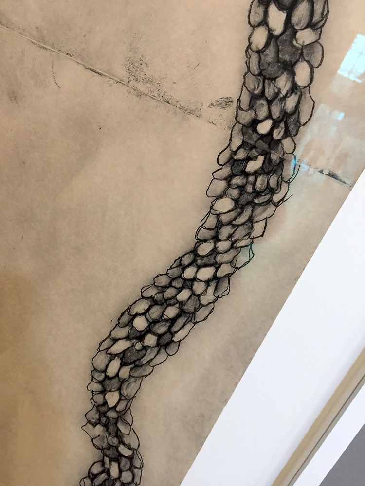
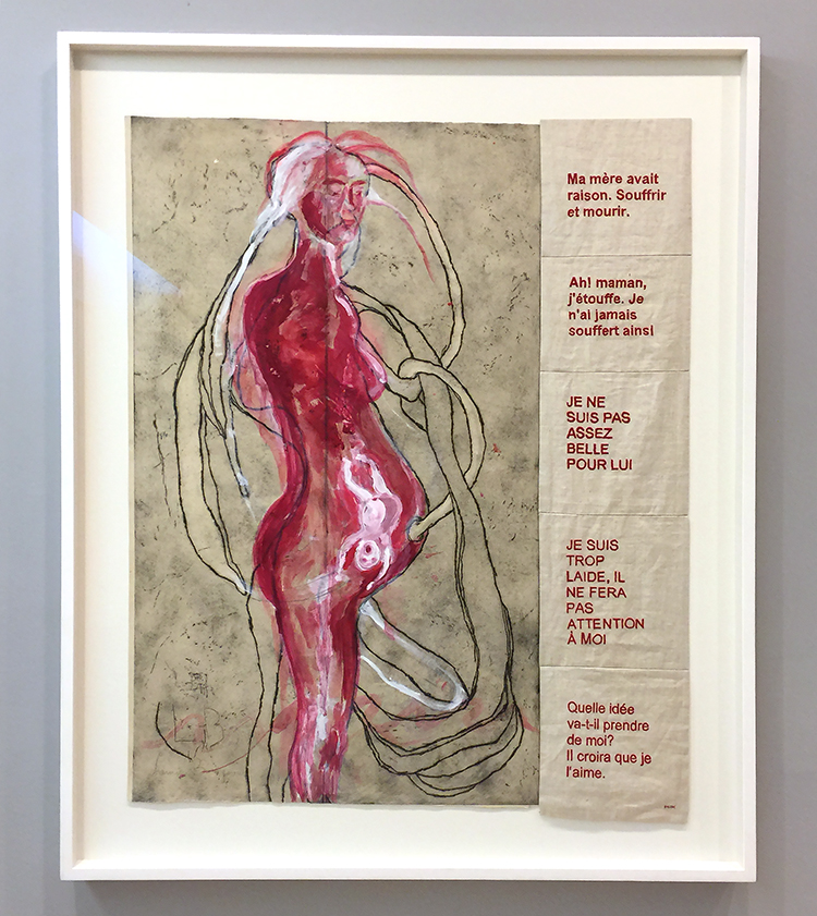
I was fascinated by her organic shapes, the color choices and also the repetition of themes. But when I saw the first piece with fabric I was super intrigued.
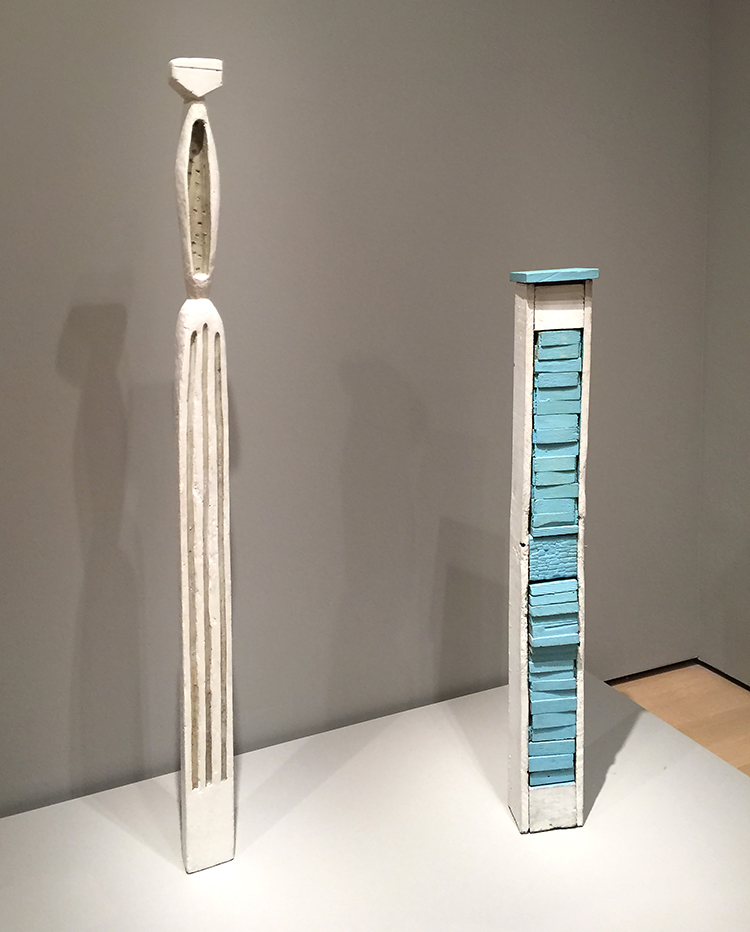
Her wood sculptures are beautiful
she also incorporated a lot of architectural symbols in her work
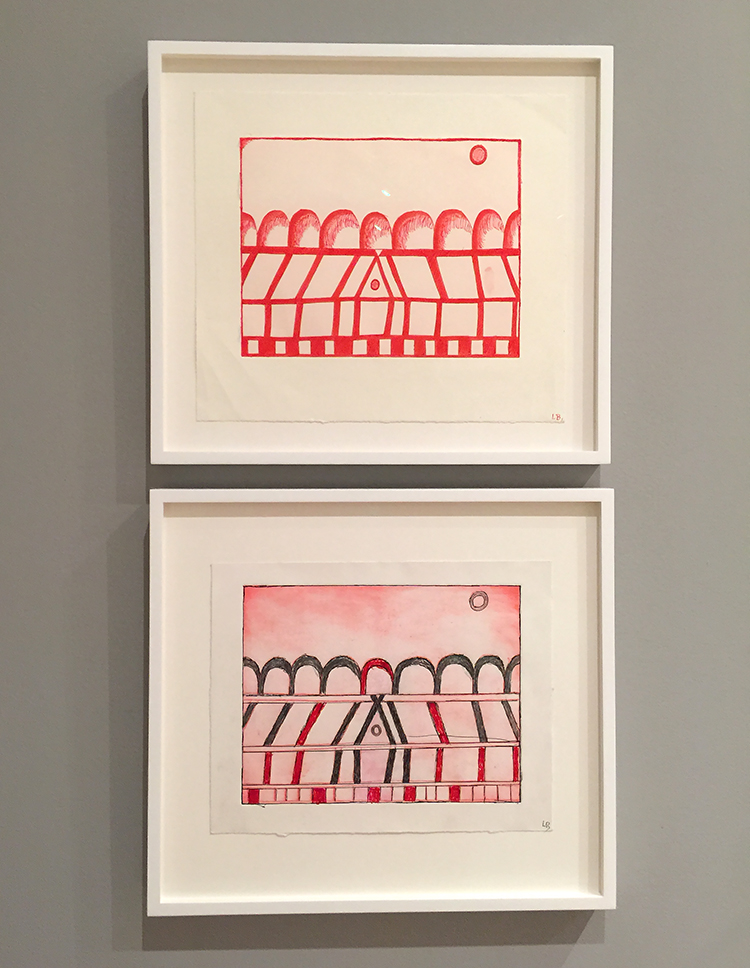
this one is called the Happy House 2001-2003 Drypoint with selective wiping – on the bottom with added pencil and crayons
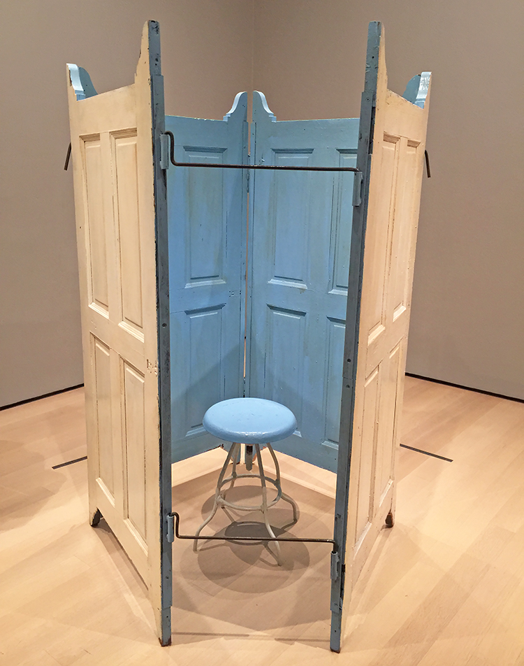
She also did a series of room- like sculptures called cells in 1991 – about sixty of them. Some are filled with a haunting mix of her personal belonging. She often used the color blue for its serene and calming effect.
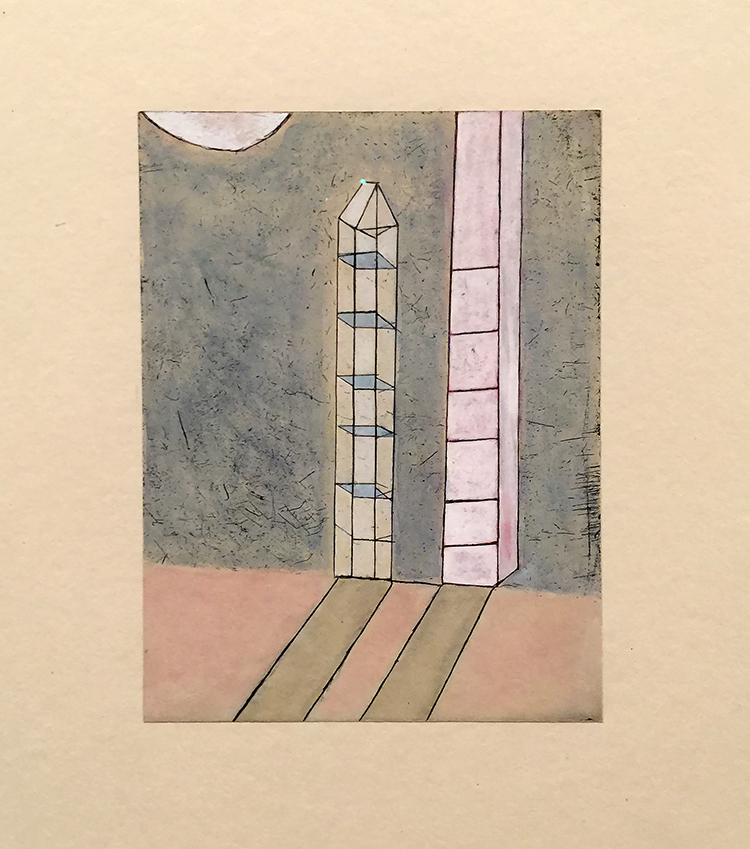
Side by Side – Etching with watercolor and gouache addition
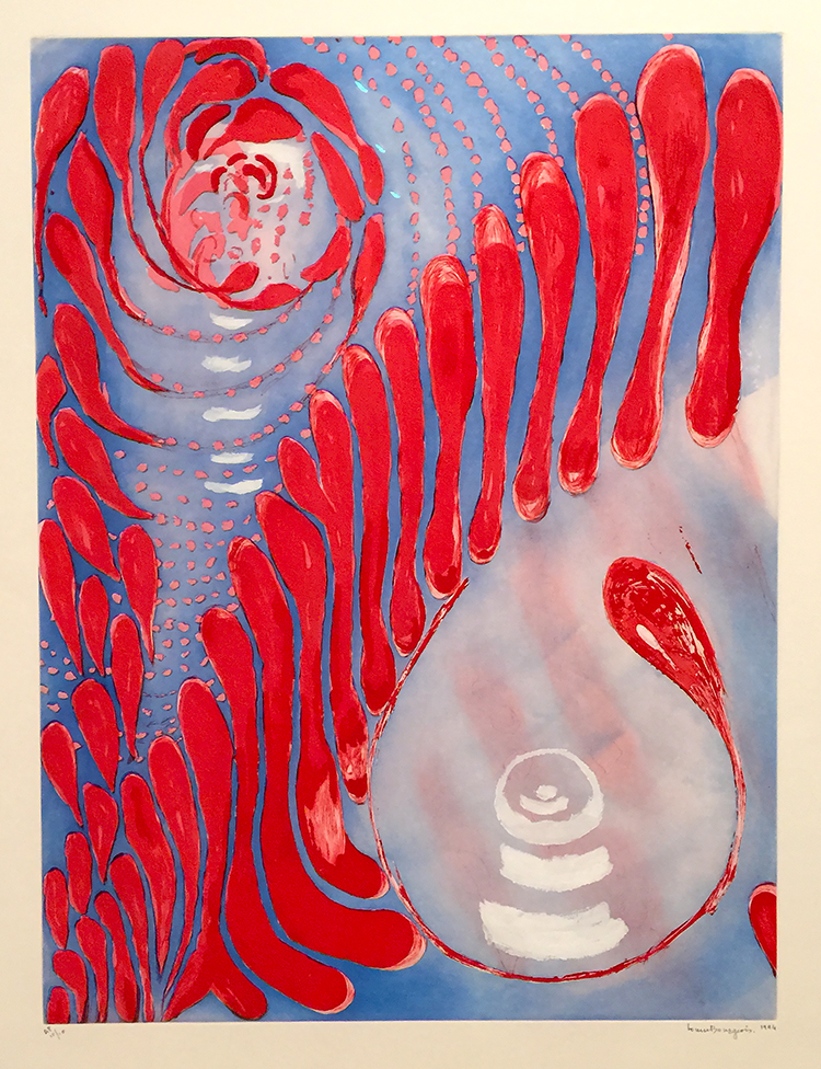
more drypoint etching
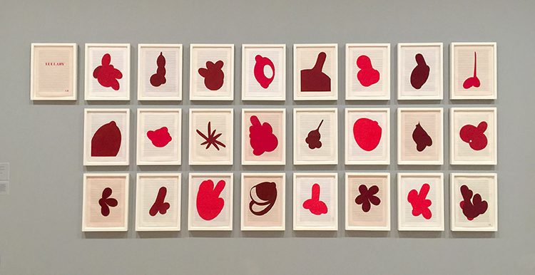
This is so beautiful until you really explore the shapes and then the Lullaby – as this work is called is starting to be scary!
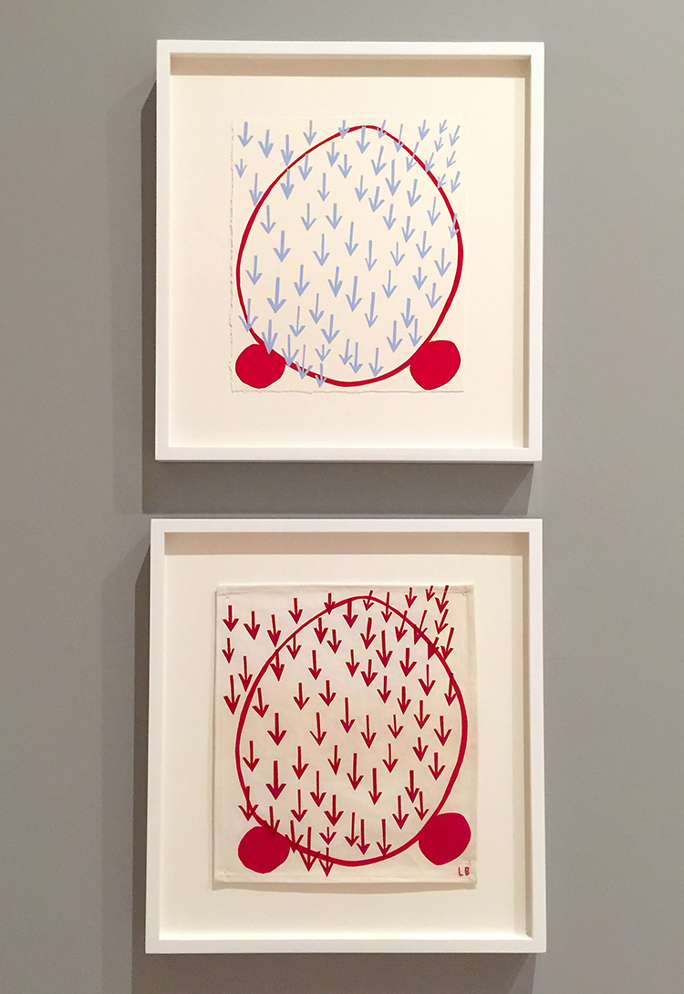
“You can …remember your life by the shape, the weight, the color, the smell of clothes in your closet” Louise Bourgeois
Although Bourgeois was raised in a family of tapestry restorers, she introduced fabric in her art only when she reached her 80s.
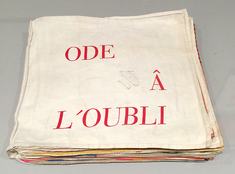
She made prints on fabric napkins, hand towels and even shirt cuffs. She enjoyed the tactile qualities of the surfaces and the ways they absorbed ink.
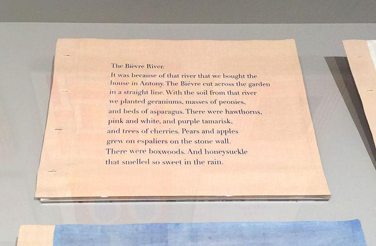
She also created fabric books, filling the pages with abstract designs fashioned from bits of old garments, stains, scorches and cigarette burns testify to their histories.
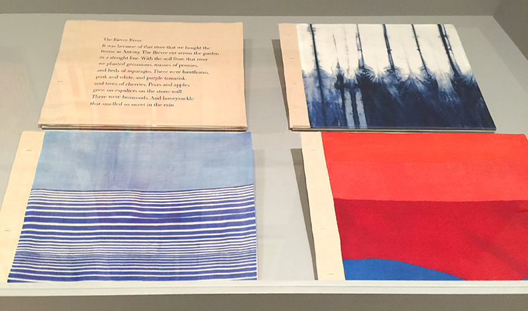
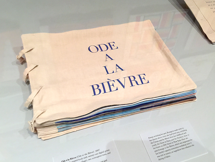
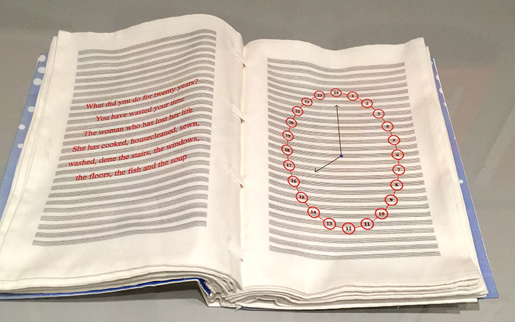
Hours of the Day, 2006 – Fabric illustrated book with 25 digital prints
Bourgeois took advantage of digital printing for the ease fo printing on fabric. Every spread has it’s own text as the hour on the clock advances. She was already in her mid nineties when she made this book!
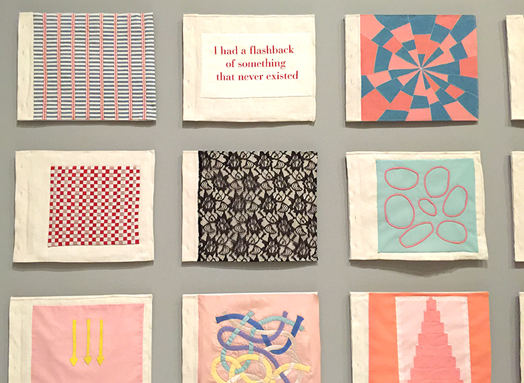
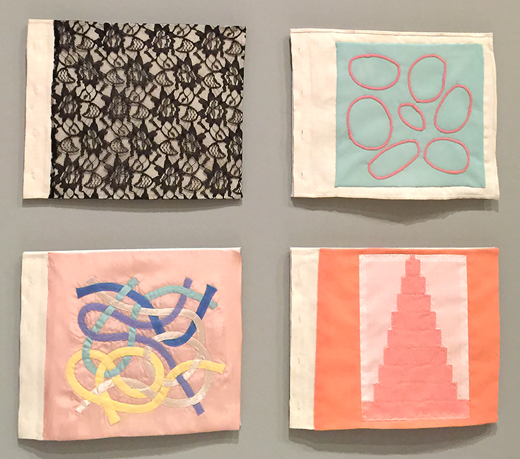
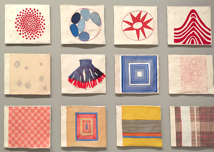
The patterns and colors are just so striking and soothing – I love this and thought of all the fabric pieces that I saved from me great aunt -(an apron, a dress, handkerchiefs) and I thought it would be really cool to make a book out of those pieces – I will chew on it – since my fabric- sewing- skills are …ahem….you know ;)
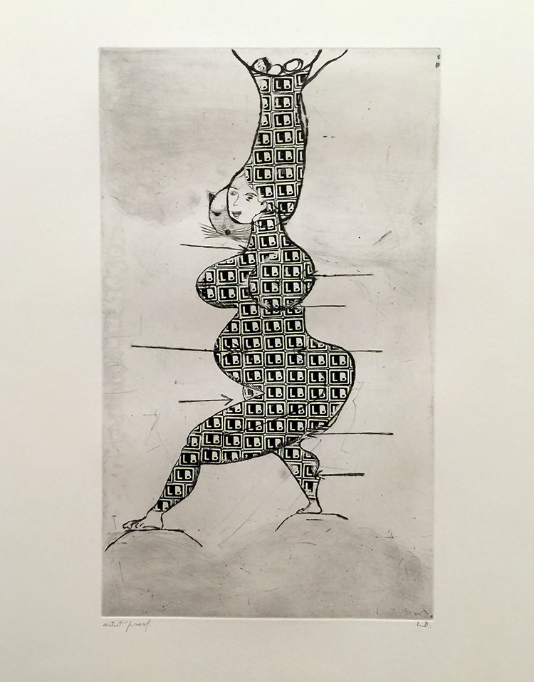
Stamp of Memories- 1993 – drypoint, with metal stamp additions –
Oh man- I love this so so so much- I cannot even begin to tell you – LOL
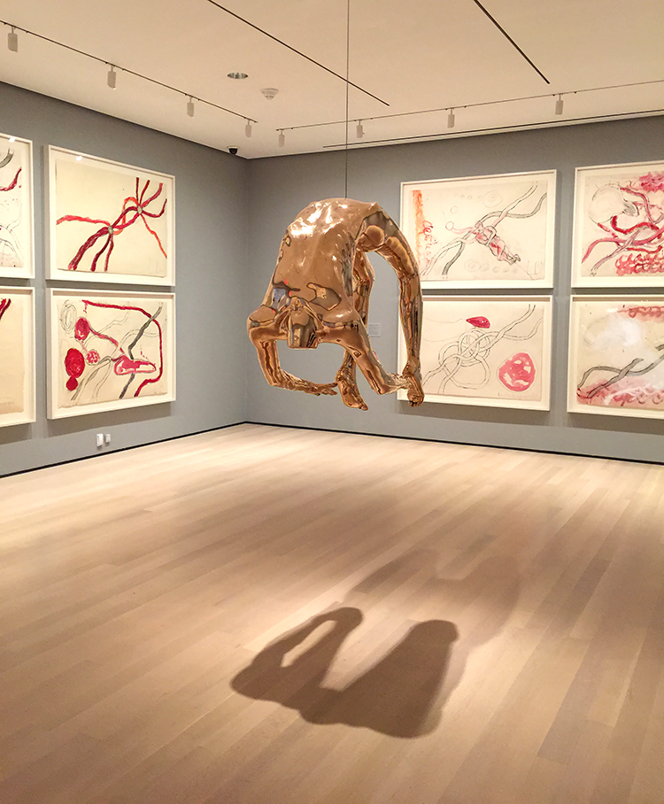
Arch of Hysteria, 1993
“My early work is the fear of falling. Later on, it became the art of falling. How to fall without hurting yourself. Later on, it is the art of hanging in there.”
Amazing – I am in awe and I am so glad we went in. It was a very inspiring exhibition making me want to learn more about Louise and her life! Have you been surprised lately by an artist you thought first to be not quite your taste and then starting to be inspired by her/him?

Thank you for sharing, it is delightful to see the exhibits and experience the artists works being shown. If it were not for your posts, I would miss the opportunity to see them. ❤️
So glad you enjoyed this Pam!!! <3

This is a frightful thing to contemplate. Otherwise, her work is positive and amazing. I recognized the arch statue.
Warning: There are extremely graphic photos in this article. Elizabeth Kaplan
Wow that was interesting Elizabeth- thank you for sharing.

Thanks so much for posting this, Nathalie. I don’t often comment on your posts but always read them, specially the ones abour your museum trips. In this case you inspired me so much that I just had to get the book that accompanies this exhibit. Just wish MOMA was on my doorstep!
Thank you so much Frieda! Oh I love that you got the book- I hope you get lots of inspiration out of it. My favorite was really how she used her own clothing to create fabric books- so amazing. Cannot wait to see your magic inspired by it :)
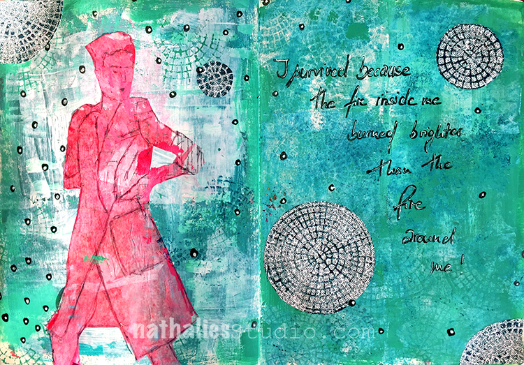
“I survived because the fire inside me burned brighter than the fire around me!”
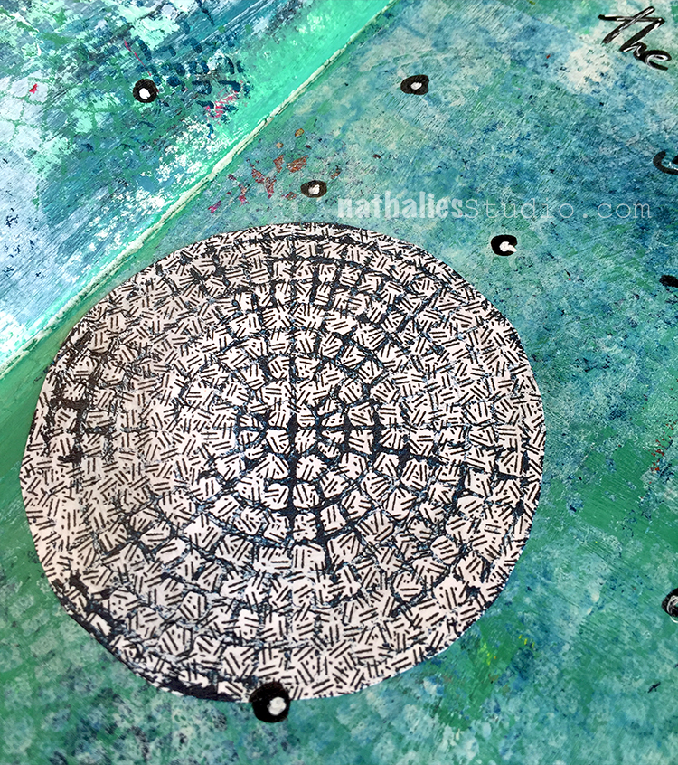
I started this art journal spread a while ago but Carolyn Dube used in her Creative JumpStart Video junk envelopes which inspired me to add some collage elements from the inside of junk envelopes as well. I stamped with my Central Avenue Foam Stamps and acrylic paint on top of the envelope pattern and then cut out circles in different sizes – the lines of the stamp providing perfect cutting guidance.
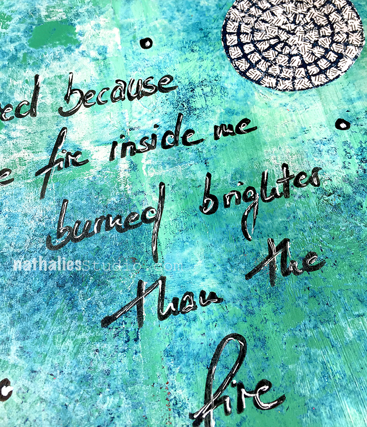
I used a black Fude pen for the journaling and to add some dots here and there and then added some white highlights with a white Signo pen. It basically repeats the color scheme and the circles theme of the collaged envelope circles.
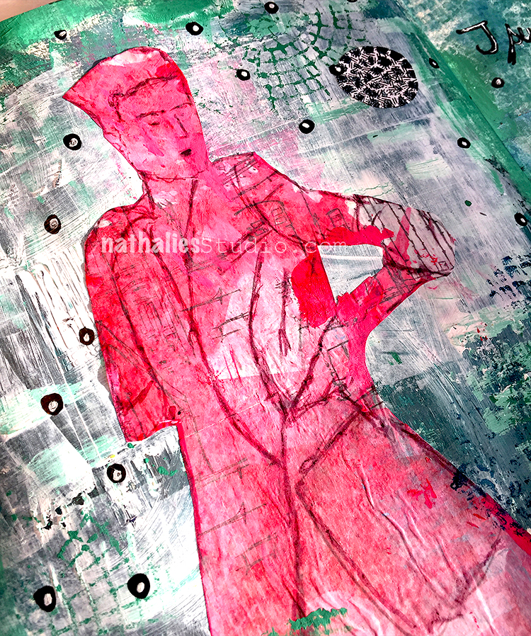
The figure was from a demo in a class in Oregon – Ink drawing on deli paper and then pasted into the art journal with gel medium.
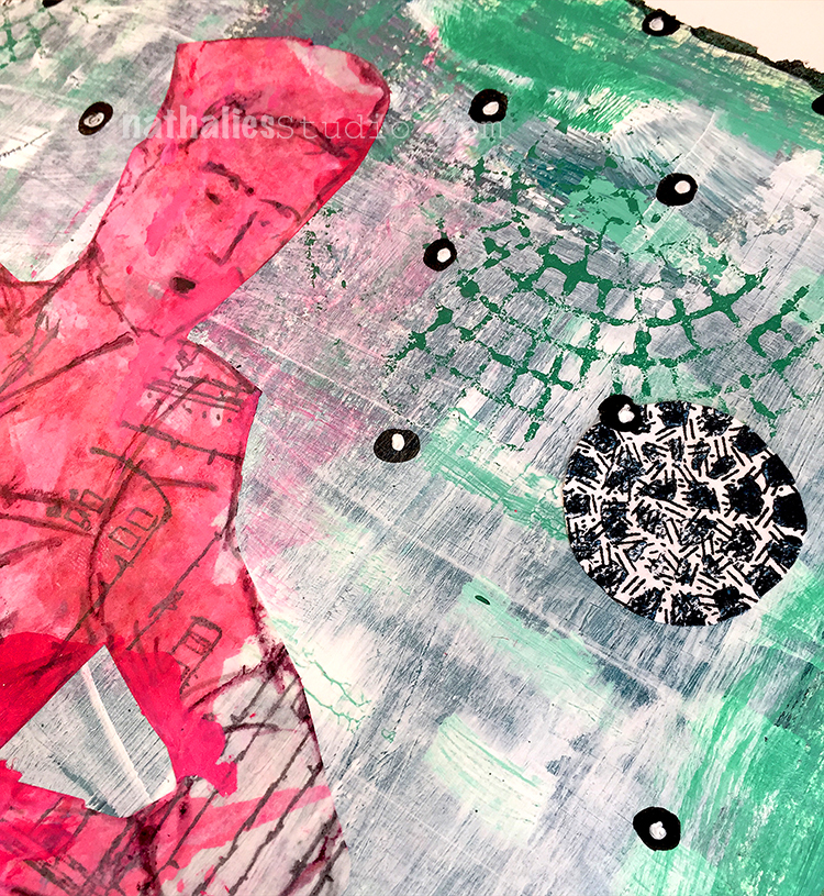
The red and green are giving a great contrast and impact – it is a not so simple but kind a simple looking page – I like it. Here is what I discovered with this page:
There are so many ways you can get something out of Creative JumpStart – wether you are a beginner, an intermediate or advanced Mixed Media Artist. You can take the videos “literally” and do the same project, you can get inspired by the theme, certain materials, use the same techniques, try to substitute materials to see what happens in comparison …the ways are different…but they all have something in common – YOU HAVE TO WALK!

Looking great! Some nice textures and patterns going on here. The colors are great also.
Been reading your blog for a while but first time commenting here :)
Thank you so much for visiting Ben !

I love your texture and colours! I keep forgetting what a great impact white scraped over colour makes!
thank you Sue, yeah I love the grungy white scraped look over color.
This is fabulous, Nathalie! I too have started saving the insides of security envelopes for collage. I never noticed them before Carolyns’ jumpstart project!
thank you so much Gloria- yes those security envelopes are so cool!
Love your background, Nathalie. Lots of details in there. Your Art Foamies are very cool as well.
Thank you Florence!

Love what you created and great to see you jumping too :-)
Thank you Cath – I hope I can do a couple more :)
Glad to see you playing along with us and enjoying the fun of Creative Jumpstart that you created for all of us!
It is super fun :)
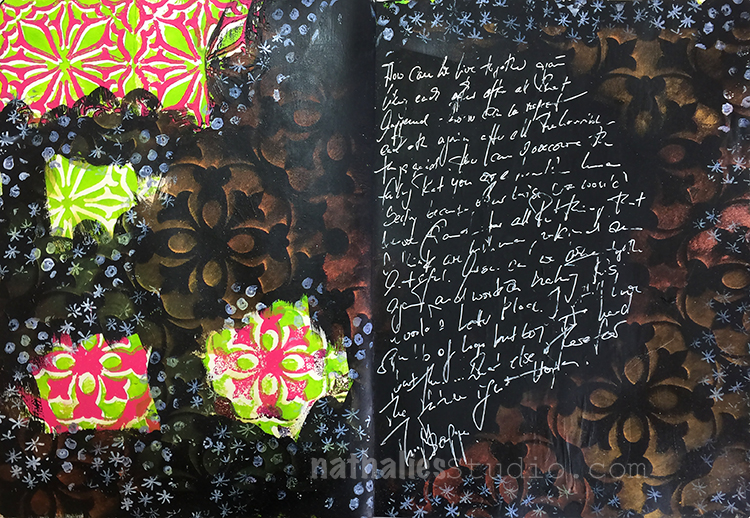
After watching Tina Walker’s Creative JumpStart Video I was inspired to pull out my PanPastels. Her video wasn’t about using PanPastels but she had used them in a little part of her video and that made me pay extra attention. I used to use them all the time and also teach with them and then somehow I really neglected those little pans full of pigment joy! So it was time to dust the pans off and get them out.
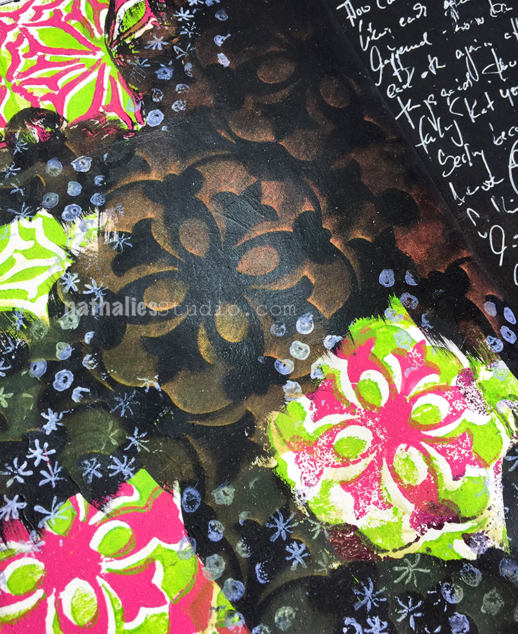
I had covered up some of the background with black gesso which I had stamped with my Versailles Positive & Negative Foam Stamp Set and my Van Vorst Positive and Negative Foam Stamp Set.
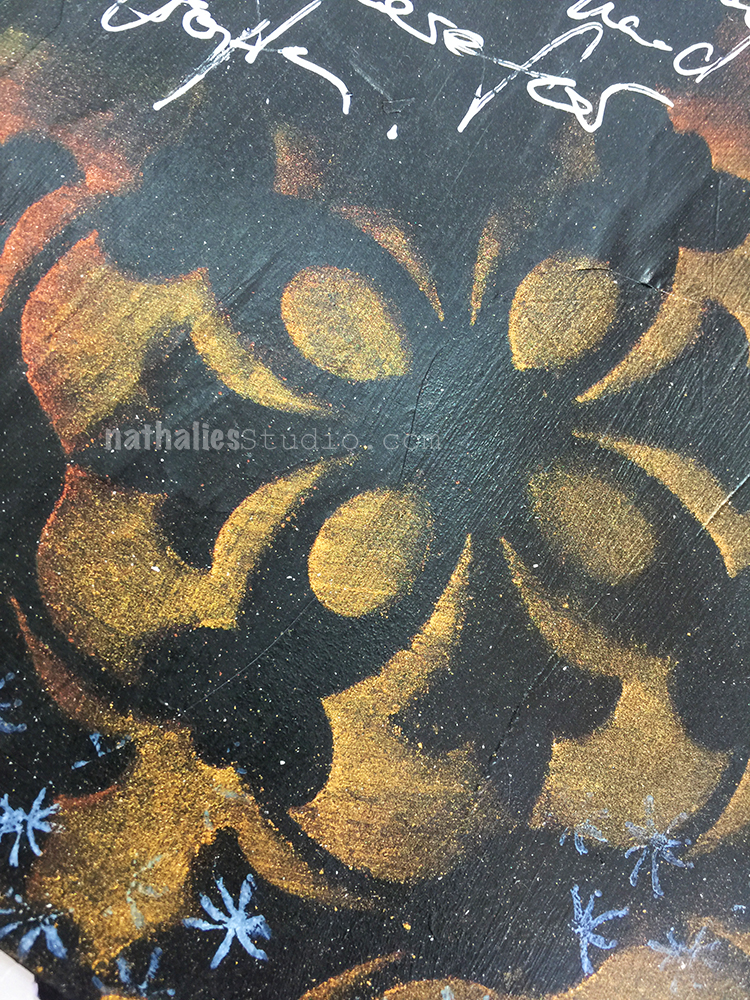
I used gold and bronze PanPastel over black gesso using my Versailles Stencil. I always love how black gesso makes the pastels really pop.
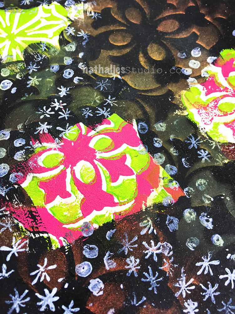
I also stamped with the white side of RubberMoon’s new awesome Moonlight Duo Ink Pads. Each ink pad has a white pad next to the initial color for creating tints and I just love the white by itself. It dries permanent – yeahhhh!!! I used my Embroidery Stamp Rubber Stamp set. This page was really more a bit of a play but I had fun and I put some thoughts down as well – and it served a couple of really good purposes:
I hope you are part of Creative JumpStart as well – it is such a great and supporting community and looking at everyone’s project based on the daily videos is another wonderful source of inspiration. If you haven’t joined yet- you can still do it – sign up for Creative JumpStart 2018 !
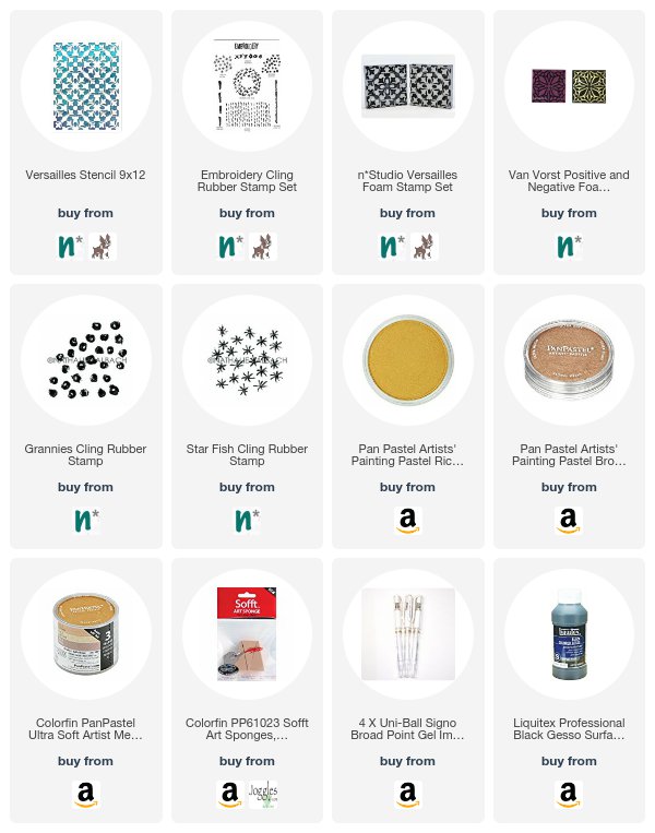
Here are some of the supplies I used for this spread:
Lol hairspray. Does it smell perfumed? I guess workable fixative doesn’t smell all that nice. I love that you are writing white on black. I’m going to have to give that a try too!
LOL- all I head. Fixative is actually smelling worse and most you have to apply. That wasn’t an option with the cold here anyway- LOL
Oooh, those metallic PanPastels – wow! They look fab….
They are really beautiful, Cath

Nathalie, I really like these journal pages! I love using Pan Pastels, but never quite know how to affix them to the page! Did you use anything so they won’t rub off? Thanks!
thank you Catherine. yes they def. need to be fixative either with a fixative or in this case just with hairspray.. hairspray might change the color but i can live with this in my art journal
Thanks, Nathalie! I think that would be the easiest! Will try it!
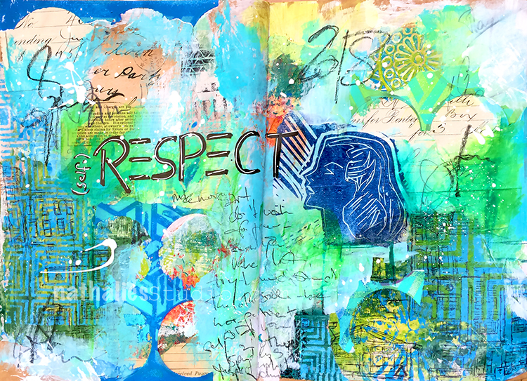
I am so excited- LOL- Hold your horses! This is the very first year in seven years, I actually started to play along with Creative JumpStart– usually there is just too much going on on the administrative side of organizing the workshop, traveling to teach and with CHA/Creativation that I just cannot play along. But ha – this year I am in! This art journal spread was inspired by the first video with Mystele in CJS18 – wow- she rocked that video. I used some of her ideas to jumpstart my own page and then went for it.
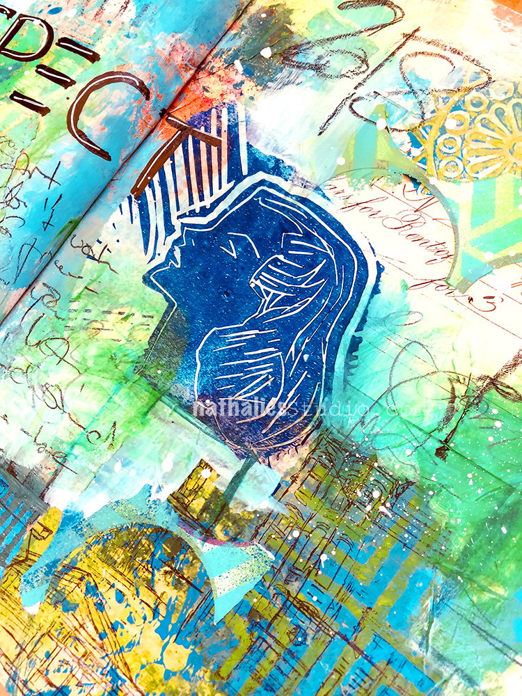
Mystele painted a gorgeous face – I used a hand carved stamp – see you can do whatever you want with those videos (get inspired by the technique, the material, the way the artist use things, the look, the colors…nameless options) but they do totally feed you if you are just willing to play- and Oh and I am willing this year ;)
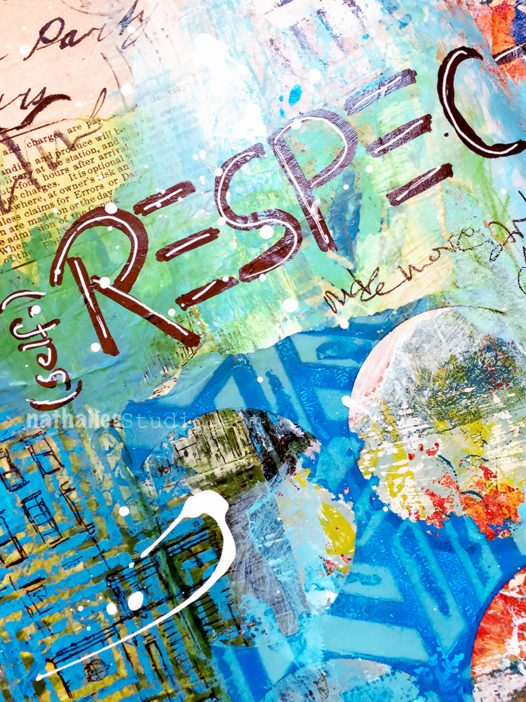
My word for 2018 is (self-) Respect – and so it was a good page to do !
Are you in for Creative JumpStart 2018? If not you can still join – check it out !
Give yourself the permission to play!
Wow, I love the colours, and energy from this page.. and LOVE that hand carved face!
thank you so much Sue!
To quote you “love love love” that you are finding time and space to JUMP as well :-)
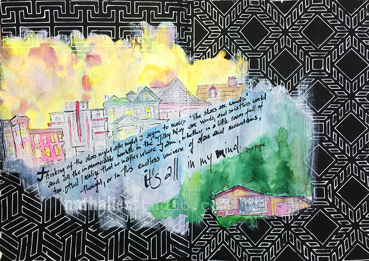
I love how this page turned out. I had seen a page by my sweet friend Birgit Koopsen where she had used a black art journal and then doodled in white on top of it and that set off this page. I painted my art journal page with black gesso, let it dry and then added some white watercolor ground into the the middle area.
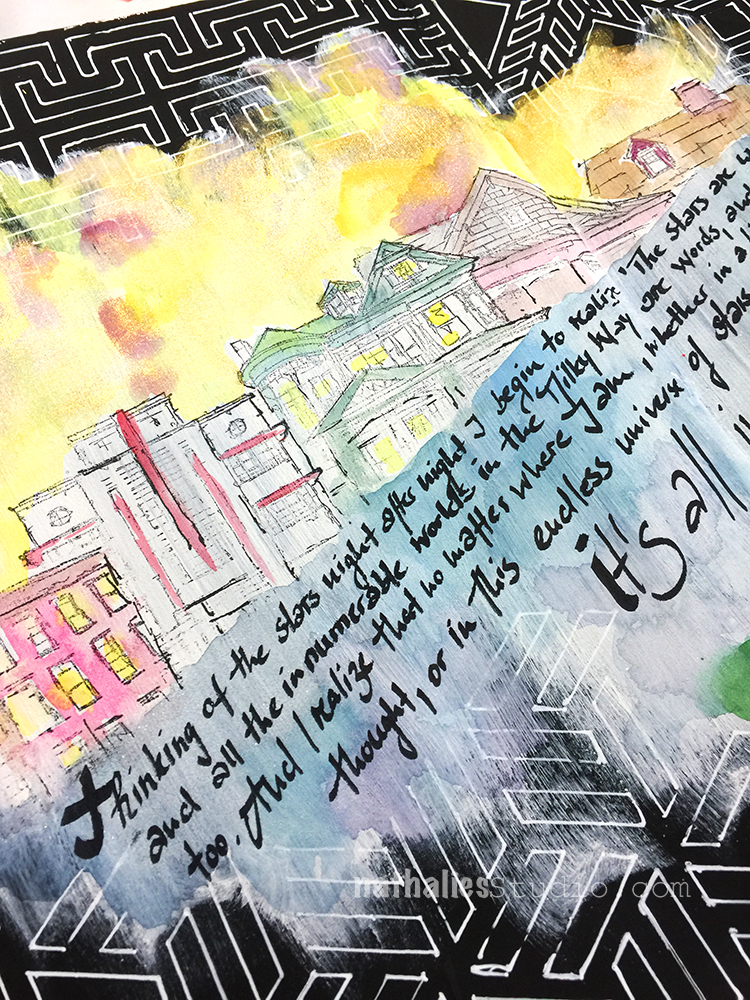
I then used different stencils of mine and used a white Signo Pen to outline some patterns on the black gesso
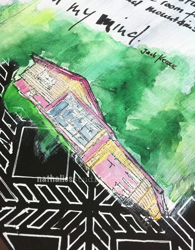
I stamped the different houses from my Stroll Around The Block Set with archival ink and then added watercolor and the journaling.
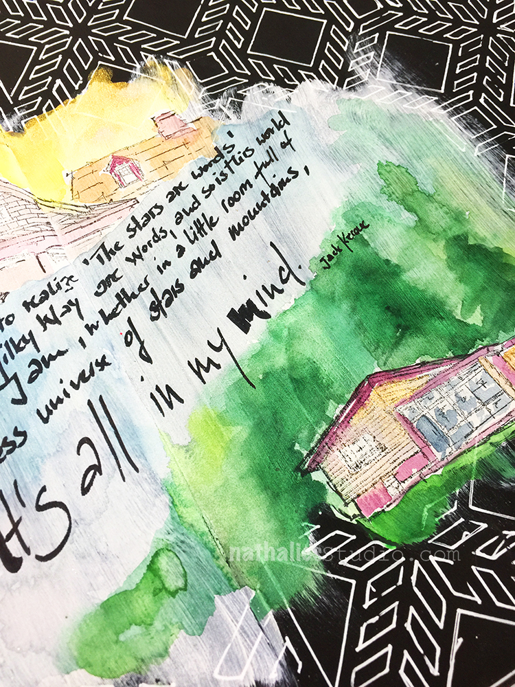
The watercolor ground gives a lot of tooth- so the watercolor looks a bit different on it when on normal watercolor paper- but I love the texture.
It was fun playing with different media and a different ground
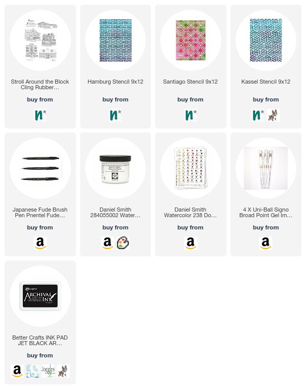
Here are some of the supplies I used for this spread:
I love how the white pattern on black sets the background for the rest of the page.
I must try this soon in my new art journal!
It was really fun – hope you give it a try!
Just in time for a new year I finished one of my art journals. I am keeping about 4-5 journals at the same time, sometimes I send one out to a publisher and then it takes a couple months before I get it back or I work in several at the same time – anyway- this one in the video started in 2015 and it ends in December 2017 – some pages make me cringe- some I would love to do similar stuff again.
Art Journal Flip Through 12/2017 from Nathalie Kalbach on Vimeo.
I think it is interesting to see how my style changed in one book and a good way to check on your progress :) Hope you enjoyed this!
Beautiful journal, very inspiring!
Thank you so much Catherine!

Cool flip through! Lots of different ideas in there. I swear one of those figures winked at me as you went through the pages, LOL!
LOL_ Maura – wink wink

Great journal! Is it the large Dyan Reaveley one? Are most of your art journals that size or do you work in smaller ones as well.
Thank you Lisa- this is the letter sized /A4 sized Dyan Reaveley journal. I do mostly work in that size even when I make my own journal -and I always work double spread.
Comments (4)
joanja
| #
ha ha quite a quote with the present theme of jumpstart 2018!
Reply
nathalie-kalbach
| #
LOL- true right? :)
Reply
stephanie
| #
Made me giggle!
Reply
nathalie-kalbach
| #
LOL- he was a funny guy :)
Reply