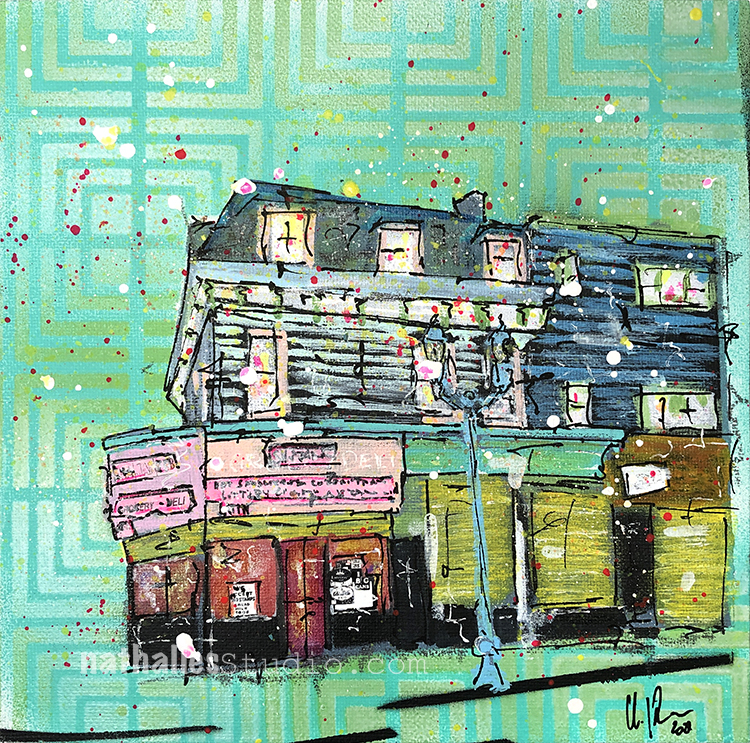
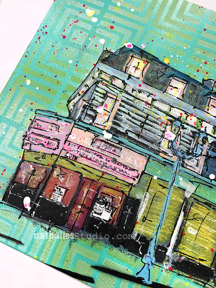
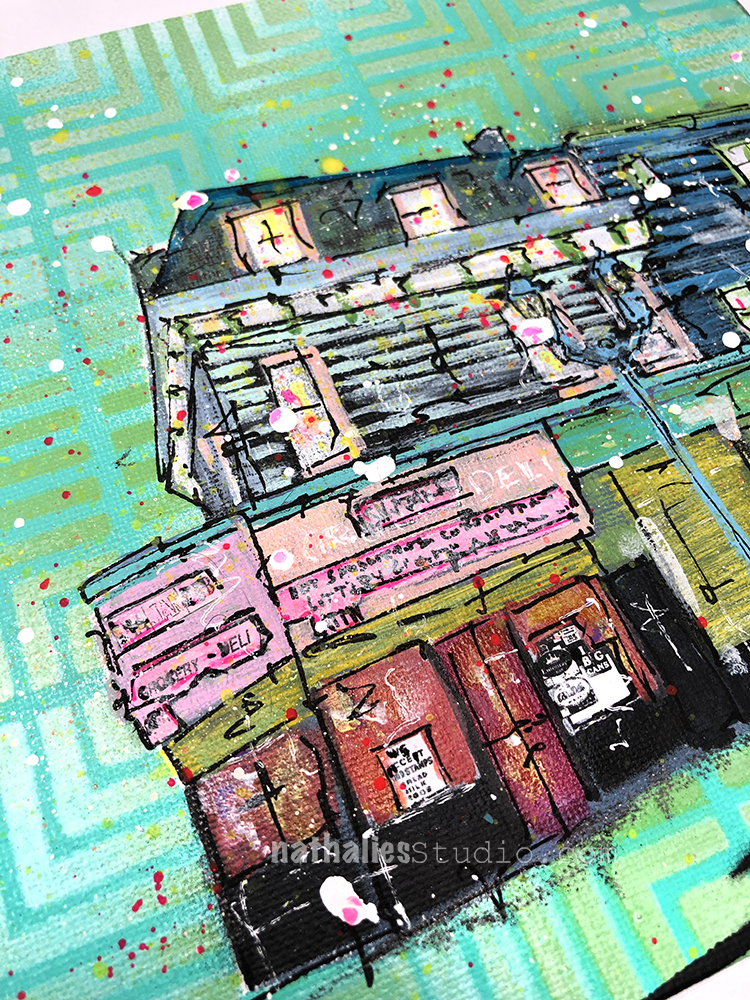
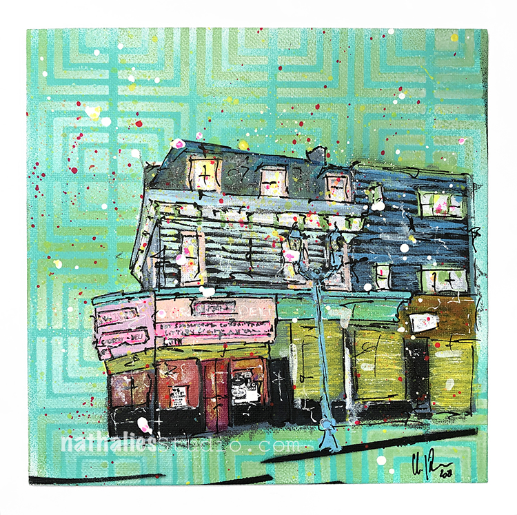
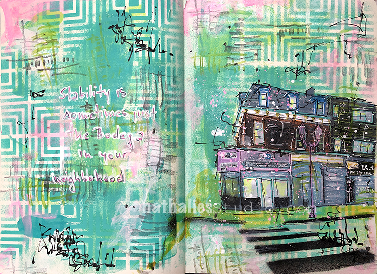
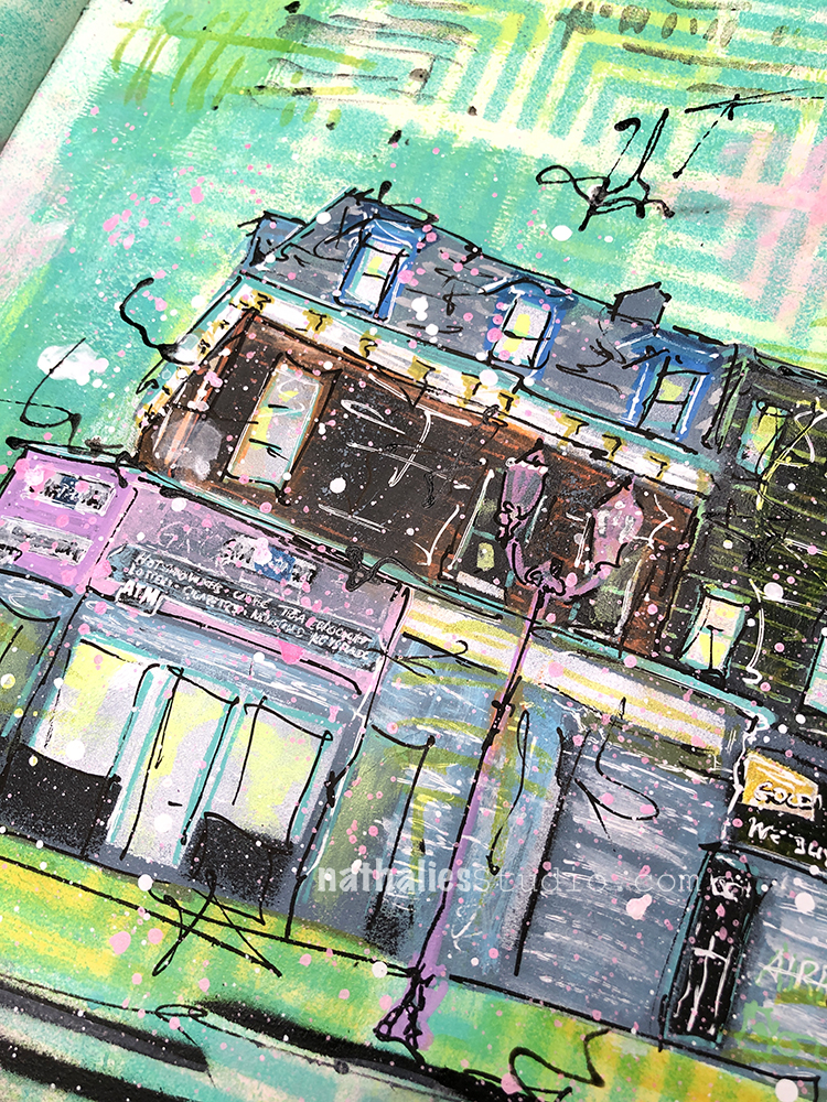
Corner Store is a new small painting inspired by my Strolls Through the Hood.
Corner Stores and Bodegas are often a lifeline in our communities- there are many people that depend on them. Whether it be to get some small grocery items, the newspaper, a cup of coffee, have packages delivered there or a listening owner to the worries of someone who lives in the neighborhood they are essential to every city neighborhood.
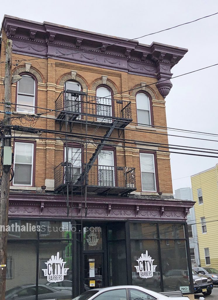
This particular corner store used to be a bakery selling bread and rolls , what is it about corner businesses that offer the most essential items?
Corner Store measures 8×8 inches on canvas board and would love to find a new home !
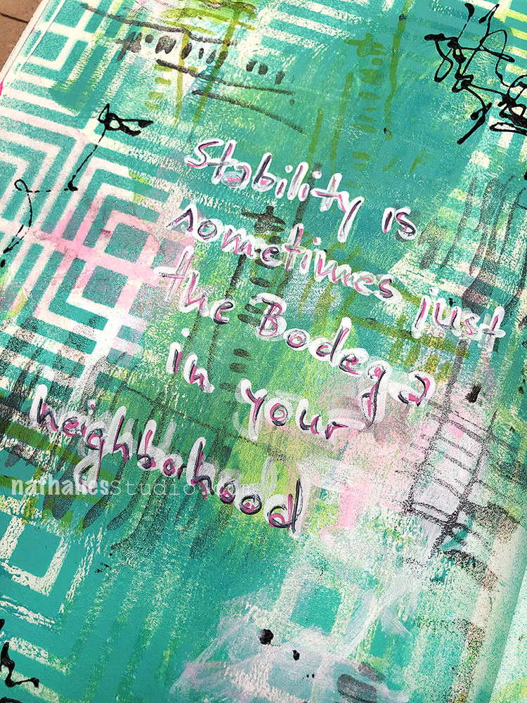
“Stability is sometimes just the bodega in your neighborhood” . I played around in my art journal for a painting of this building on canvas.
I built up my background with my Manhattan stencil and acrylic spray paint. I also used my Gnarly and Far Out foam stamps along with ink and acrylic paint.
I also used various acrylic markers for my sketch and journaling.
Does your hood have a bodega or corner store that has all those little things you need?
Strolls through my hood get me out of my studio, they help me get unstuck and often I get inspired by what I see and get new ideas to create something. It is part of my philosophy about Artful Adventures in Mixed Media – which is the subject of my book. Here are some photos that I gathered in the last couple weeks.
Puzzling – was it a window and then covered up? And then there are elements missing …I like it :)
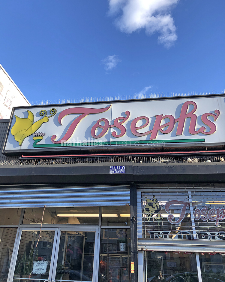
I love the sign – the font and the butterfly – for this flower store.
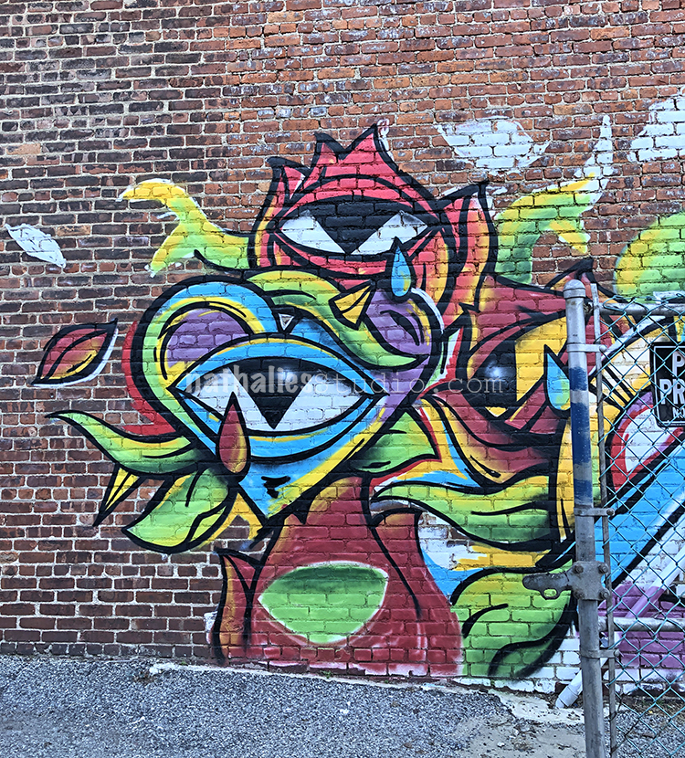
I am always intrigued by bright colors on brick ad I love those big eyes.
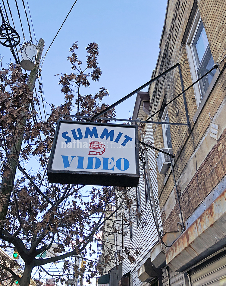
Def. a sign from a while ago.
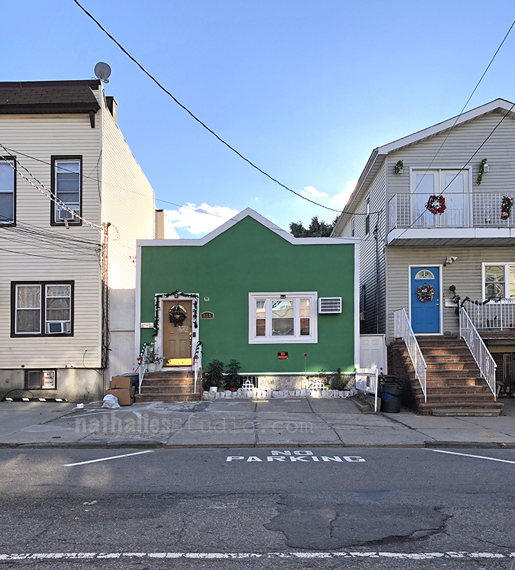
This green little house intrigued me. Is it Santa’s Shop?
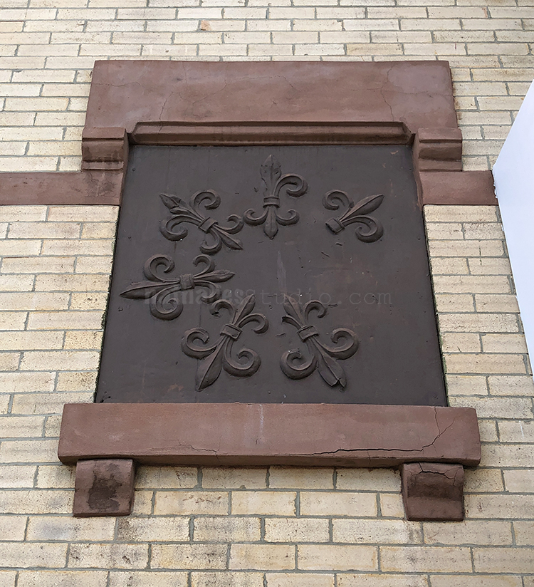
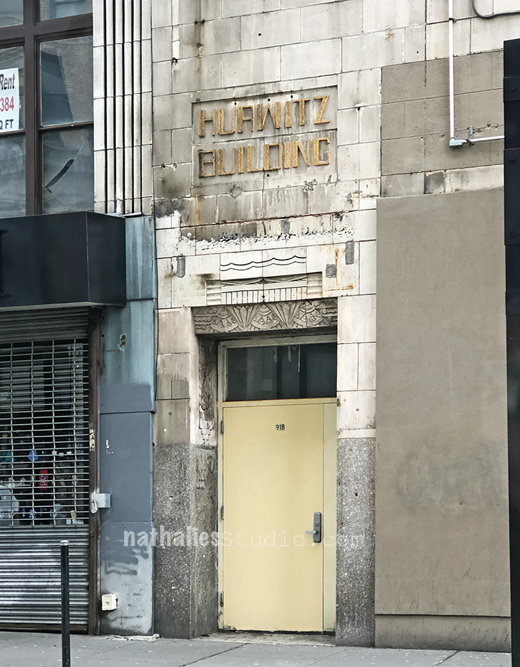
A hidden treasure of Art Deco – I walked past this building a million times, never realized the name on the building nor the top of the entrance.
I loooovee Cornices- – I have a little bit of a obsession for them – but this one is the coolest- look at the corner !
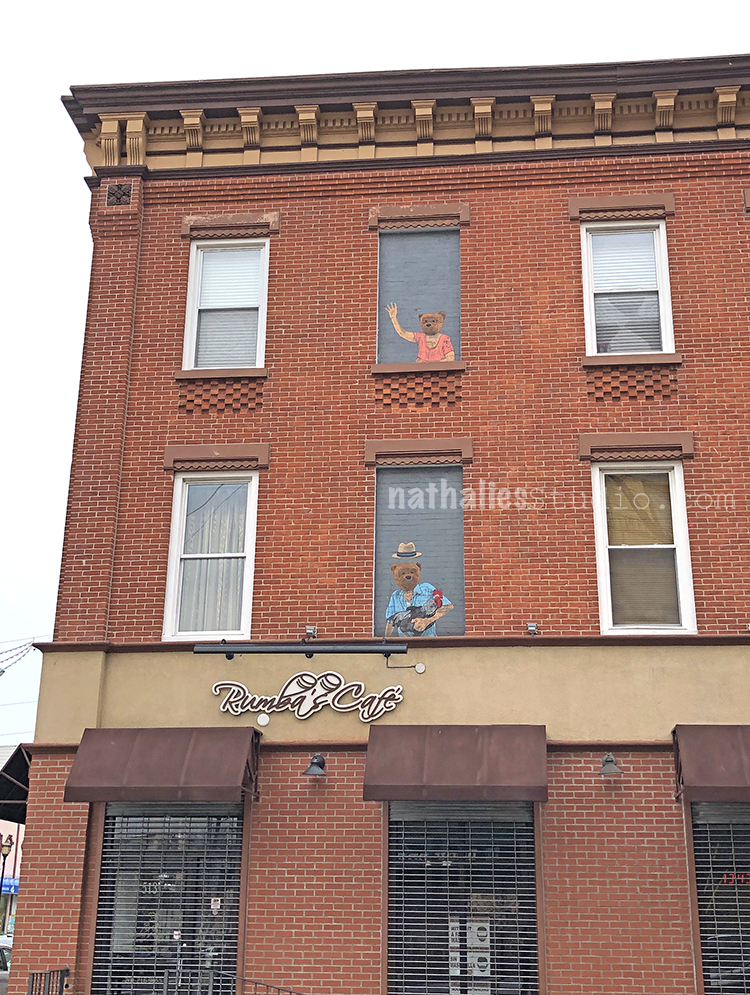
Love those bears peaking out from the closed windows and I love the brick work underneath some o f the windows.
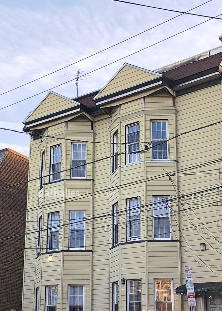
This house makes me scream. Sometime in the 40s or 50s some guy must have walked around in Jersey City and told the citizens “hey guys, your house would look sooooo much better if you would just put some aluminum siding onto it” and 80 percent of the people did. I hate it – you know there is some beauty underneath those sidings!
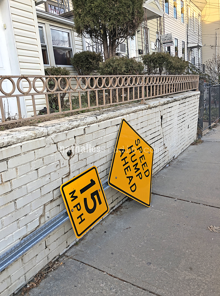
Lot’s of signs down this week- probably from the storm .
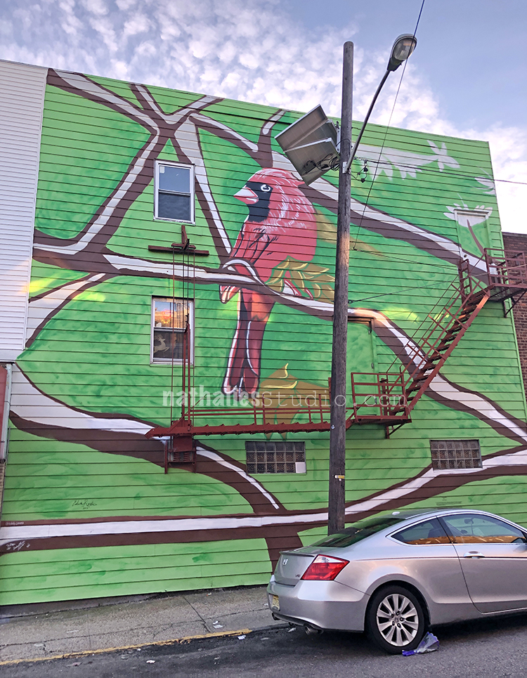
Lovely Cardinal .
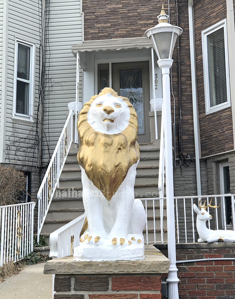
Interesting beautification of this lion LOL
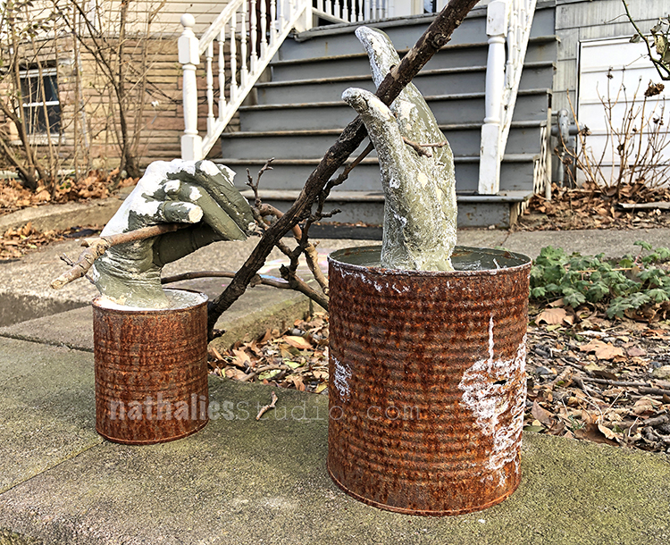
Loved those hands in their rusty cans.
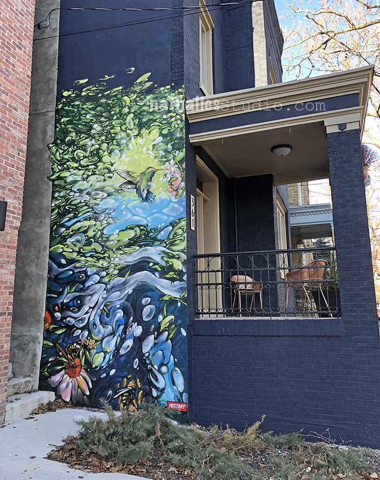
Great mural by Mr. Mustart and I like the blue painted brick building. I especially like that the trim is painted in a light color. I dislike the fashion fad right now where everyone seem to paint the old brick buildings in dark colors but without any distinction of the trim or roof and all those buildings look like shapeless blobs.
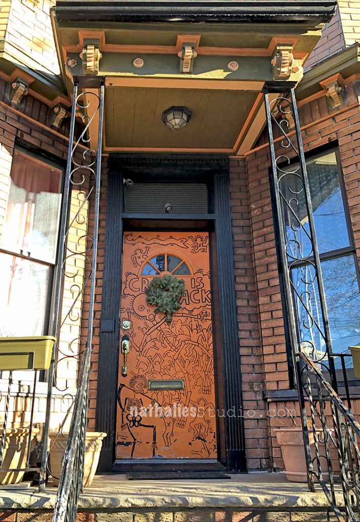
Not only was the house itself amazing- but this door was fun. We are actually getting a new door soon – maybe meanwhile I can have a go at the old one LOL.
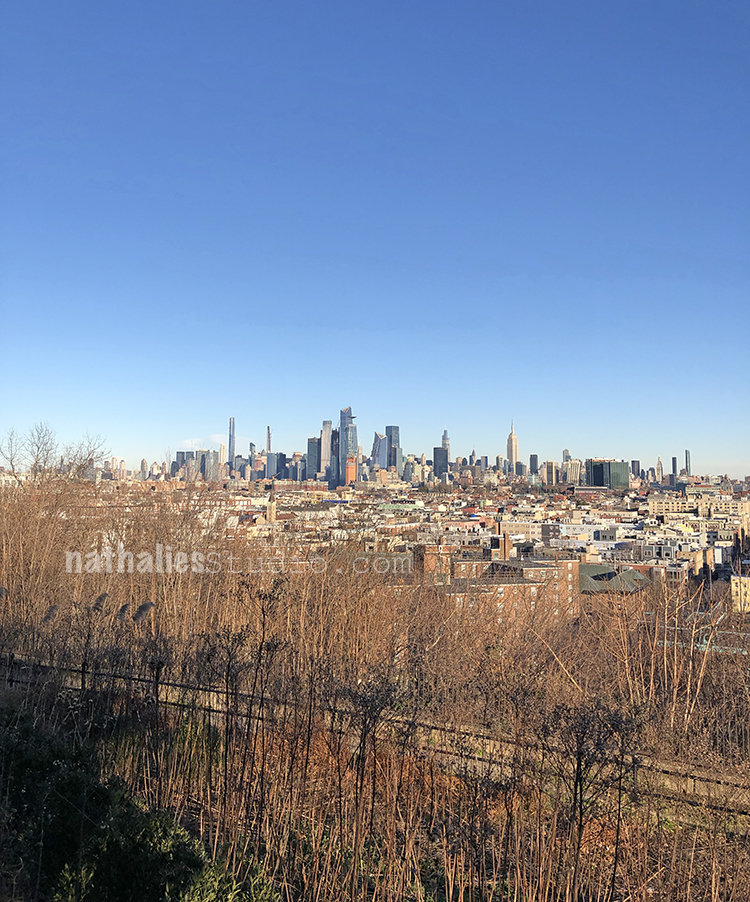
Lovely view of Manhattan from Riverview Park.
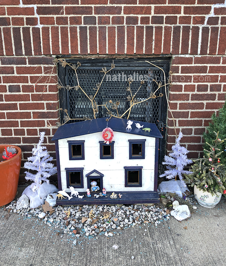
Fairy house – actually the only house you could possibly afford on this street ;)
RIP John Lewis!!!
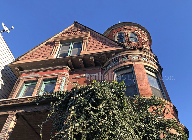
What a beautiful house – it is in bad shape but it looks as if there is some restoration starting soon.
Thanks for joining me on this stroll – I hope to see you next month again.
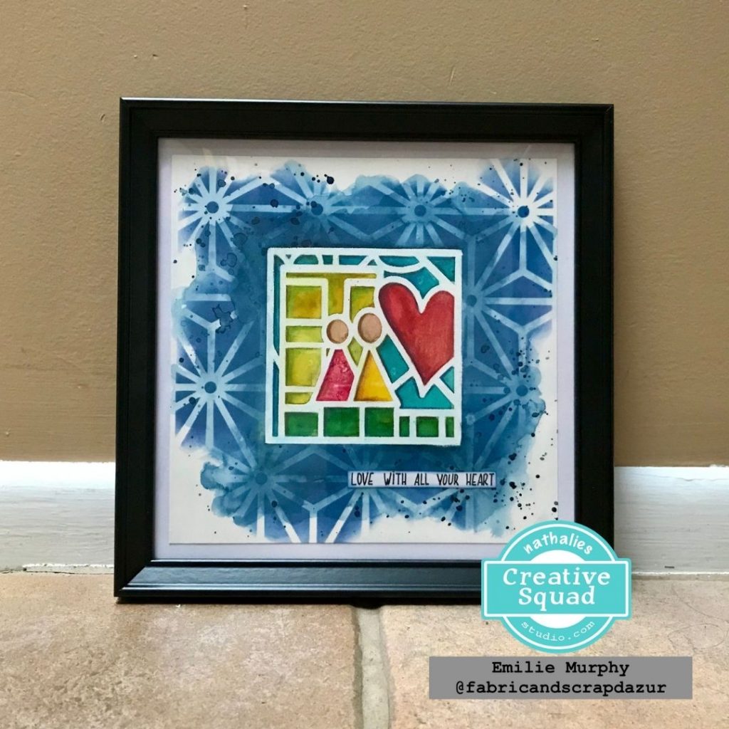
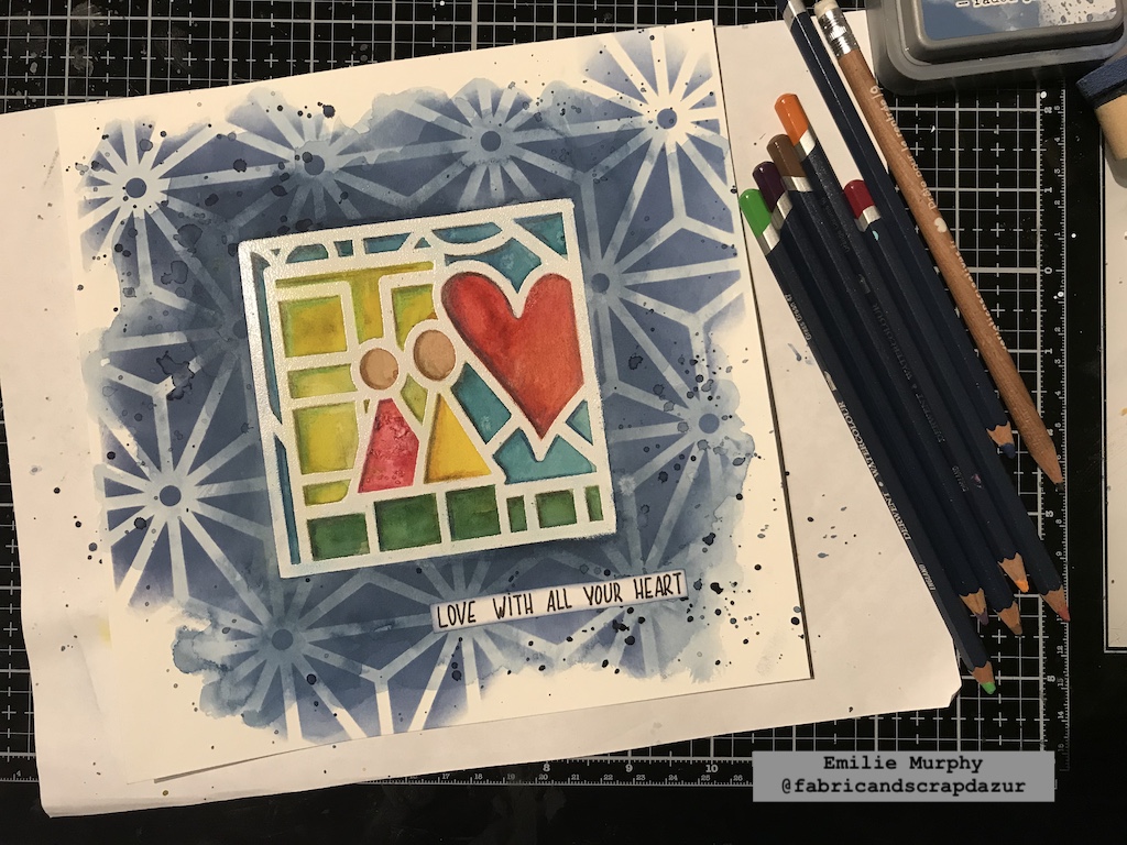
Hello from my Creative Squad! We have a fantastic mixed media painting from Emilie Murphy who is using my CJS21 limited edition foam stamp Love Story, my Star Struck stencil, and our theme: Storyteller – This month we’re playing along with Creative JumpStart 2021 and the theme Storyteller. We’re using our artwork, our color and material choices, and our personal style to tell a Love Story.
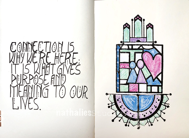
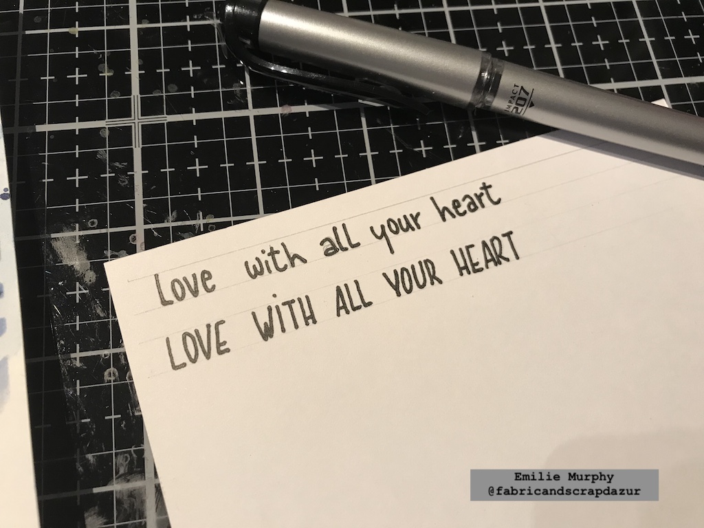
“Love with all your heart”
Hi there! And Happy New Year everyone!
Let’s start the year off by playing along with Creative JumpStart 2021 using the limited edition “Love Story” foam stamp. I decided to paint a simple illustration with watercolors. So let’s jump!
I worked on an 8×8 piece of Hot Press watercolor paper, because I wanted to have a smooth surface but it will also work great on cold press watercolor paper as well.
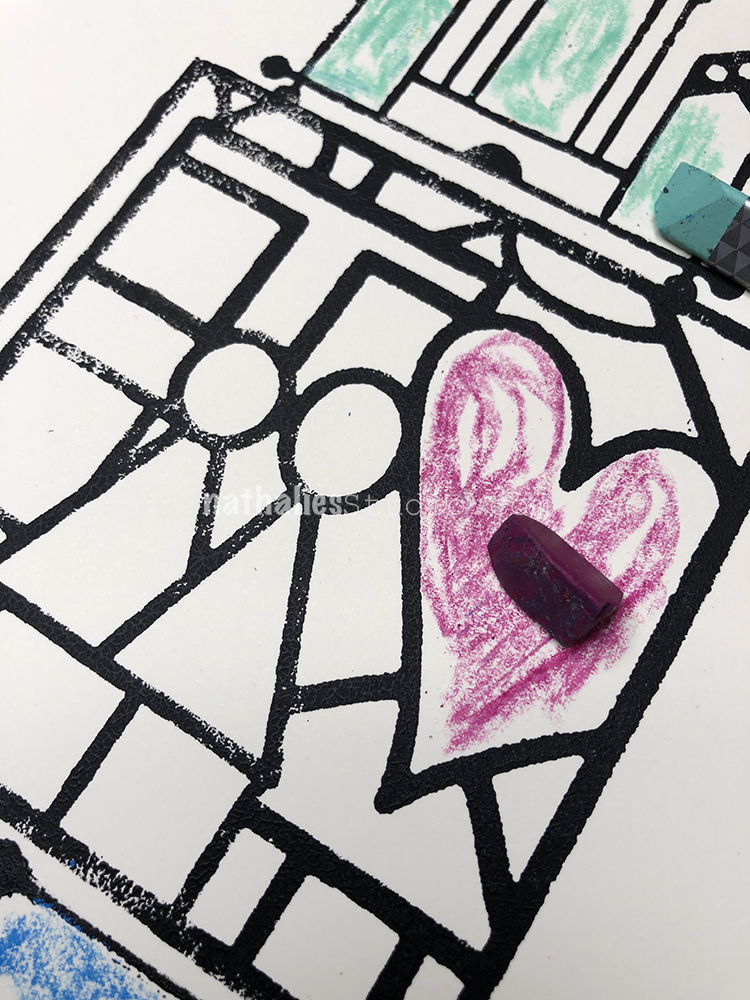
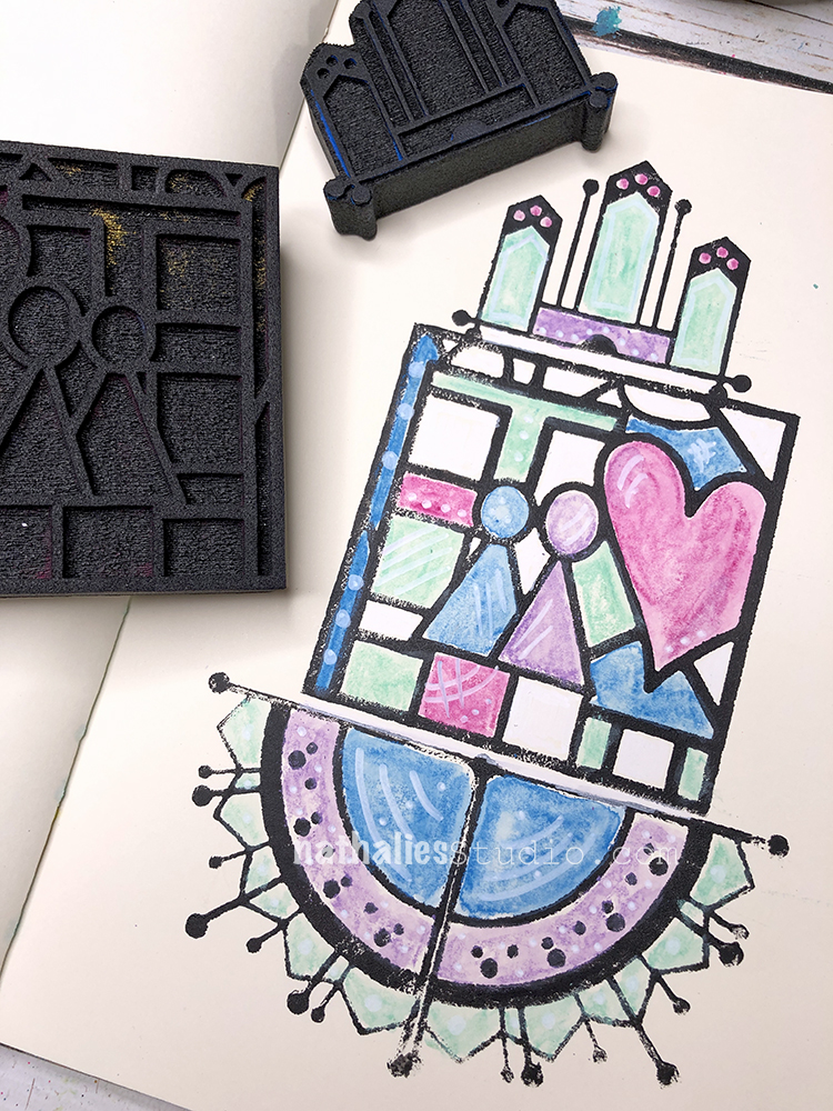
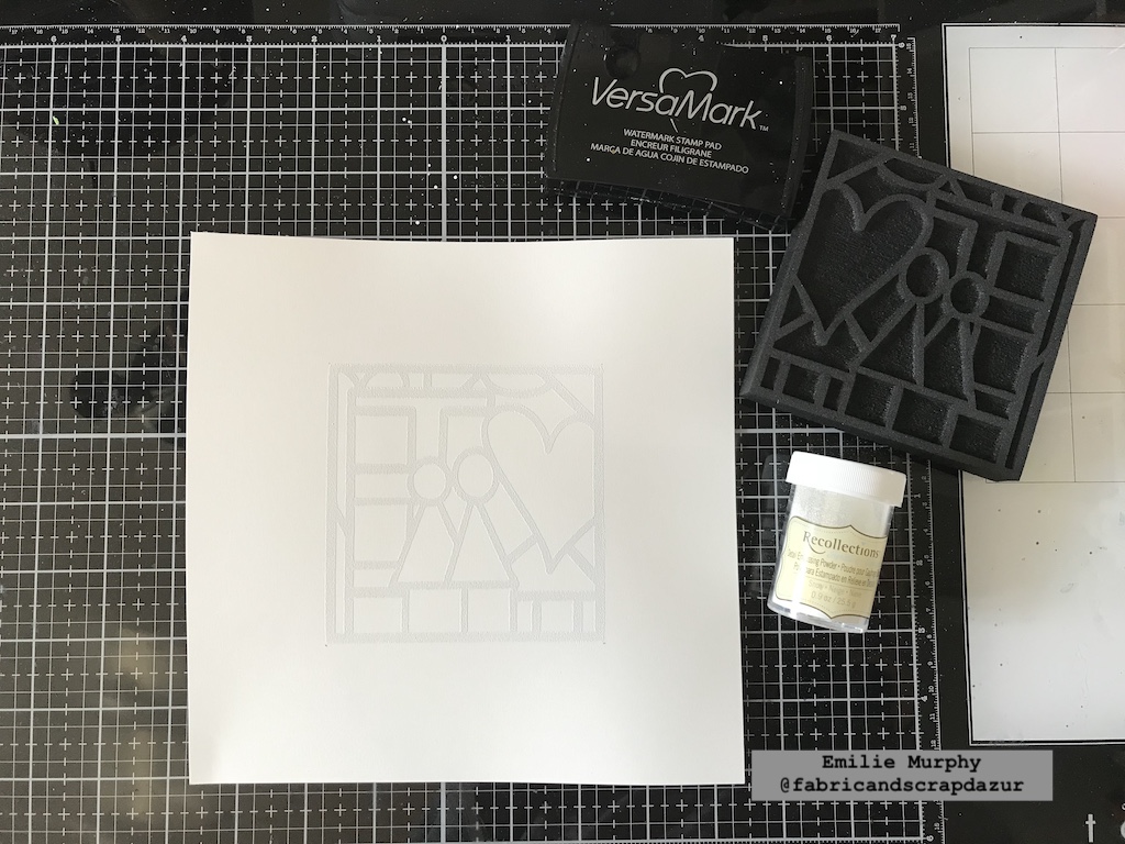
The first thing I did was to apply VersaMark ink on my Love Story foam stamp to emboss it with white embossing powder. That’s a great technique of “resist” when using watercolors.
Next, I painted the interior of the stamp with bright watercolors. Don’t hesitate to apply enough watercolor pigment because the watercolors get lighter when it dries. I sprinkled some salt on the pink triangle shape to add some texture. I did the same thing on the heart but it didn’t show up when it dried. Probably because my surface was too wet and/or I didn’t put enough salt on it. Just so you know.
Salt is a nice way to add texture, which adds a little bit of interest when using with watercolors.
I let dry, then, I applied some indigo watercolor to the exterior. I left some white space on purpose and added more watercolor pigment along the exterior edges of the stamp.
What I recommend is to work in layers. First, apply a layer of watercolor, let it dry slightly, then add some more and so on.
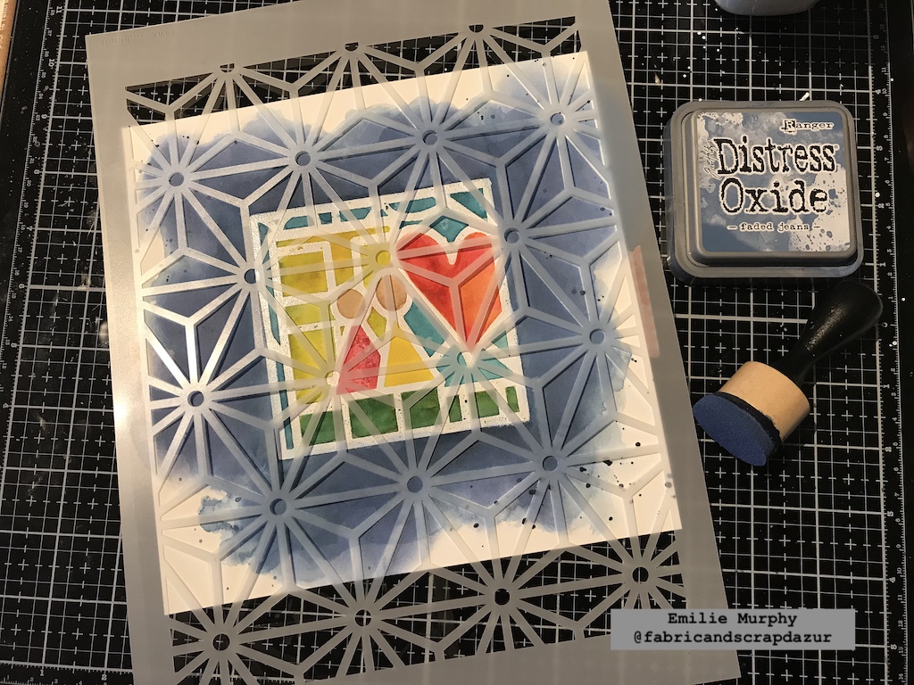
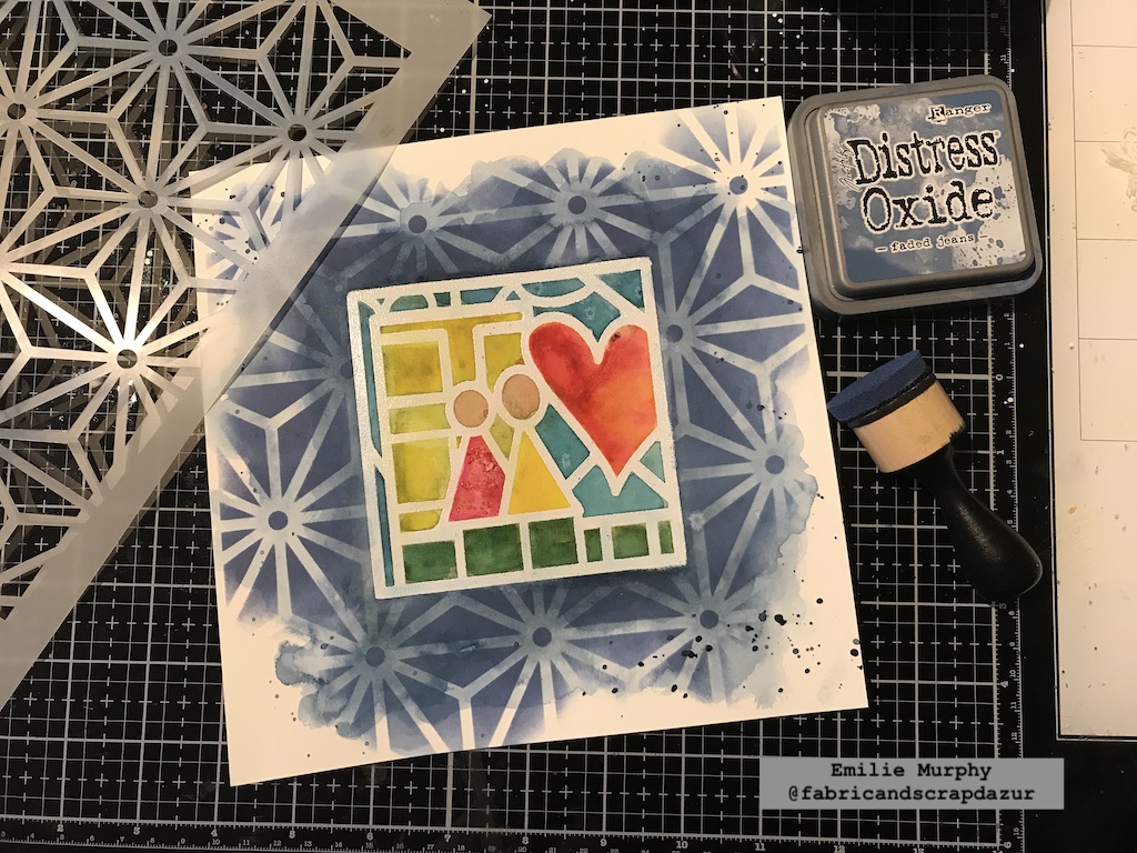
To add some interest to the background, I laid down the “Star Struck” stencil and applied some “Faded Jeans” Oxide ink with a foam applicator, only over the layer of watercolor. I slightly went over the top right corner and bottom just to give an irregular look while still leaving white space.
I really love the result. The distress or oxide inks work beautifully with watercolors.
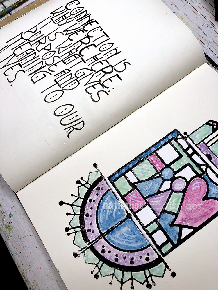
At that point, my painting needed a title. I simply wrote down by hand the sentiment on a piece of white cardstock. I chose the uppercase style by preference.
I slightly inked the edges of my sentiment with some oxide ink. Before gluing it down, I applied some splatters with indigo watercolor hiding my stamp image.
Finally I used some watercolor pencils to add some depth to the image and get a dimensional effect. I first applied a similar color inside each shape to get more depth. Then, I used a brown color to enhance the left and top edges of each shape to get the dimensional effect.
And voila!
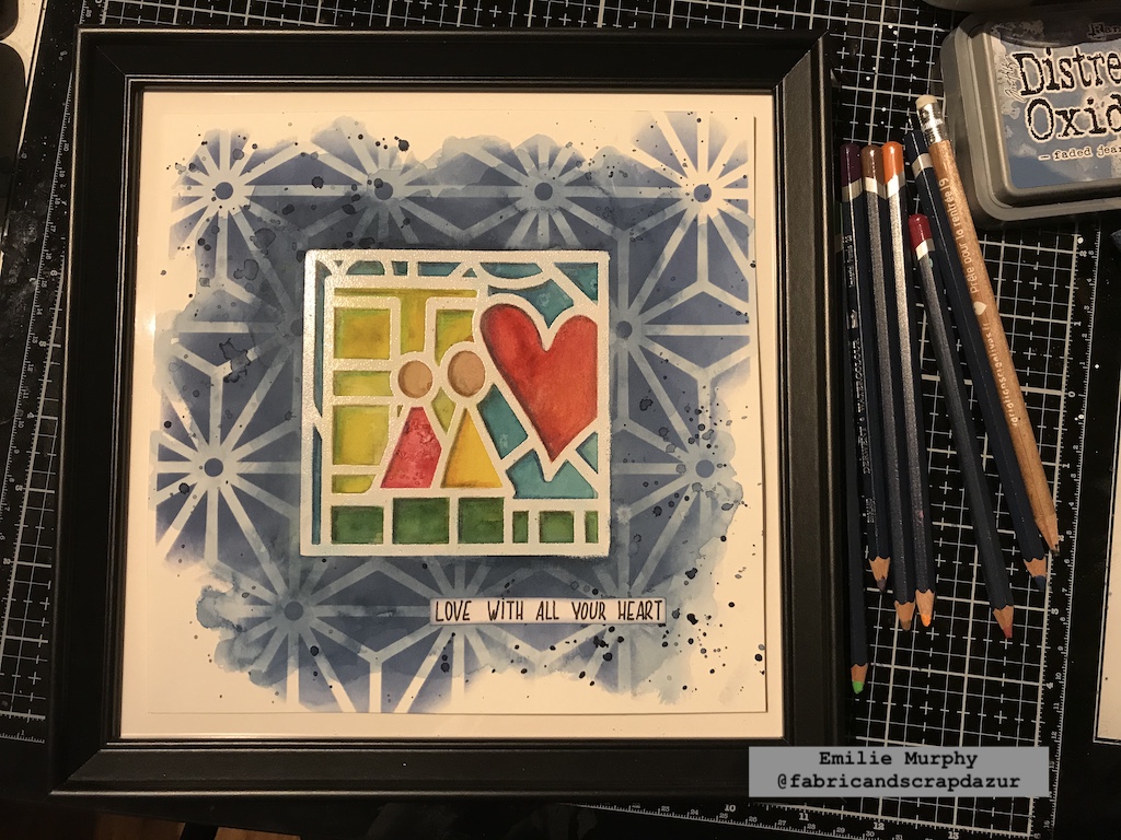
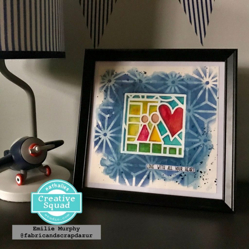
I decided to frame this painting and put it in my son’s bedroom. This painting can make a great gift for someone you love.
It would make a nice greeting card or art journal page as well or whatever you’d like to try and make.
Hope it gets you inspired. What about starting the year of 2021 with some fun and creativity!
Have a good rest of the week and see you next month!
Thank you Emilie – absolutely love this piece and that it now has a place in your son’s room – lovely!
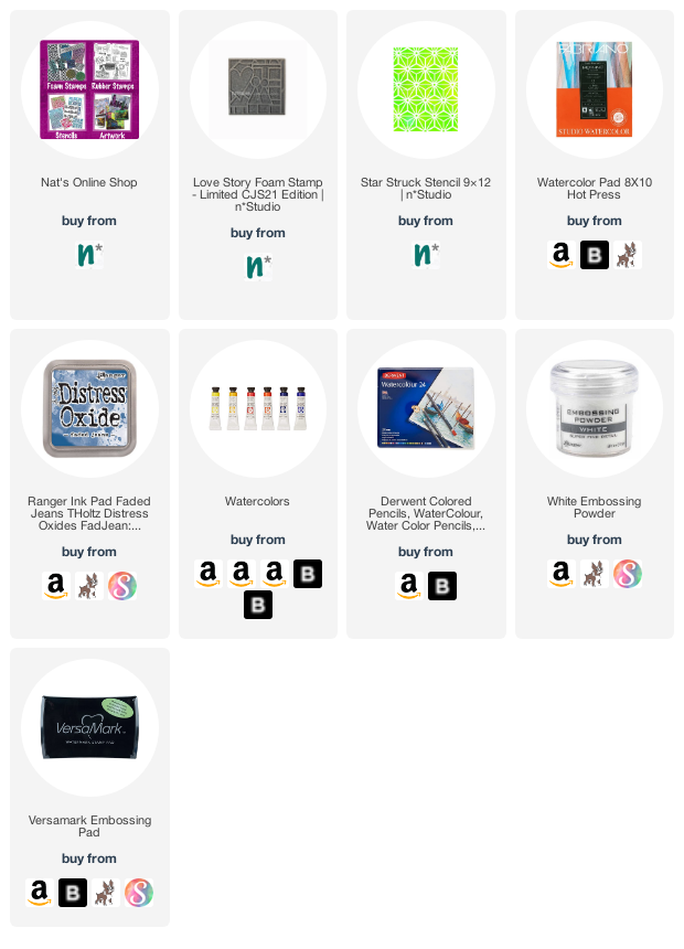
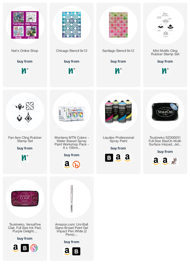
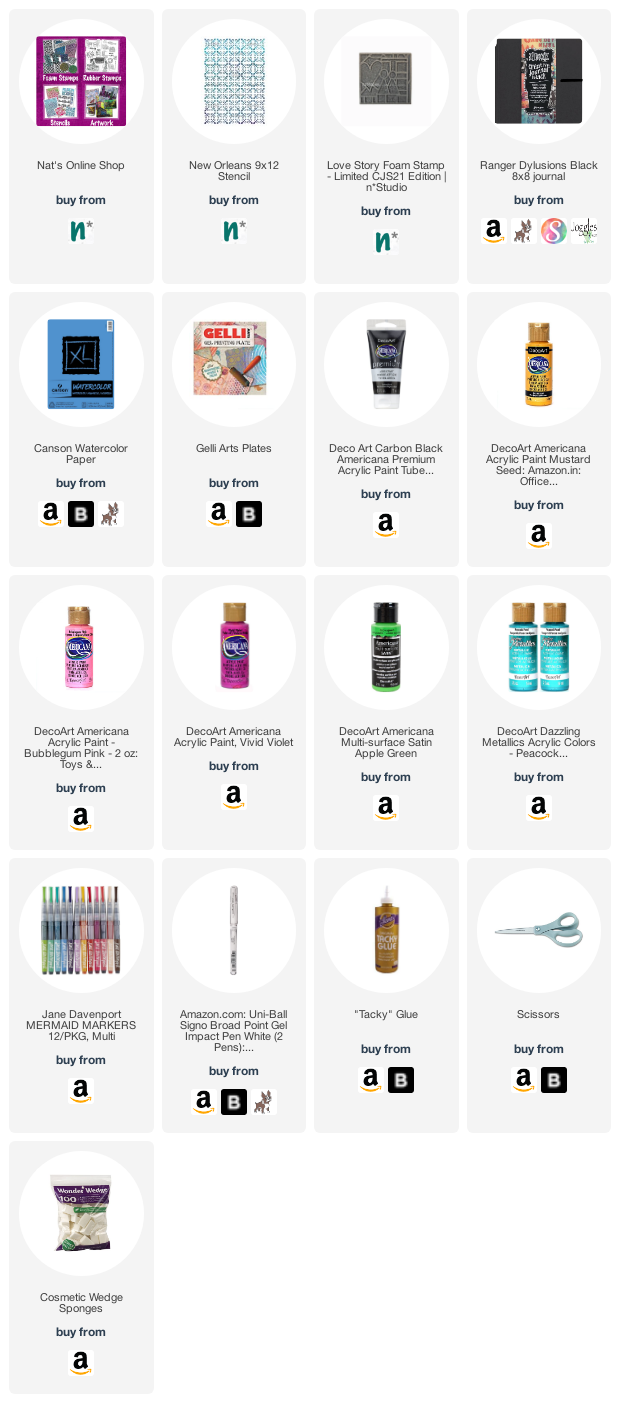
Give it a try: you can find all my Foam Stamps and Stencils in my Online Shop and here are some of the supplies Emilie used:
Don’t forget to check out Nat’s Creative Squad on Instagram too: Each week we post projects, ideas, and inspiration for mixed media art.
Emilie. As always, your piece is beautiful! I love the colors and how you used the stencil in the background. It’s so fun that it’s framed and in your sons room!!!
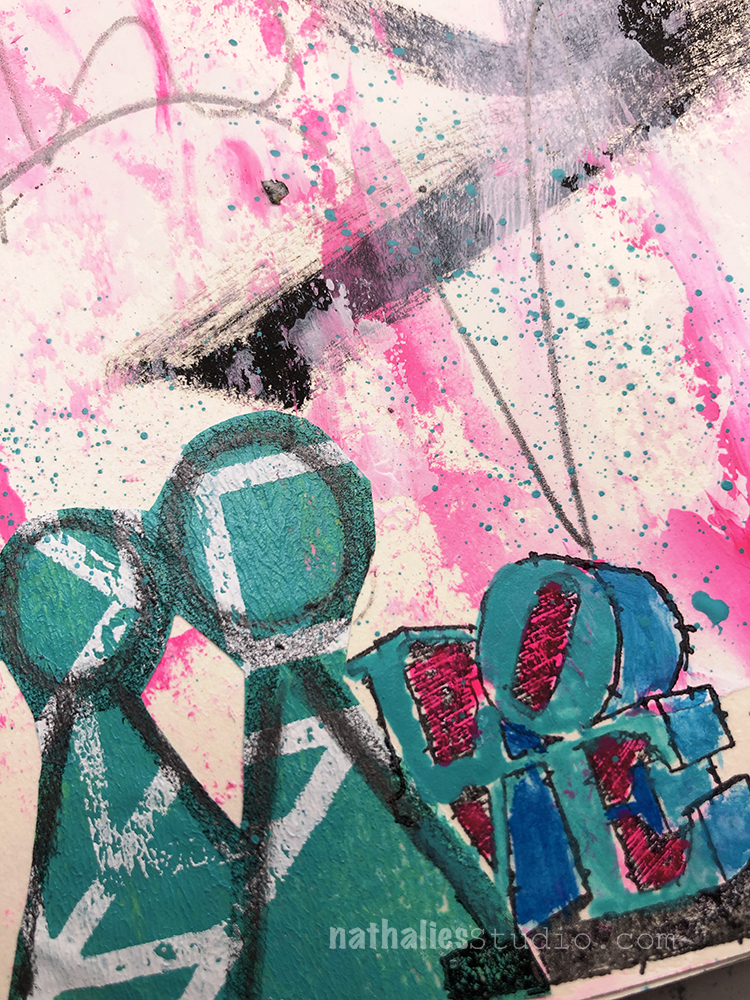
I created big brush strokes and used a palette knife with white gesso, black gesso and pink acrylic paint. Then I stamped my Love Story foam stamp on some left over collage paper and cut it out and pasted it.
Our friend and Creative Squad member Judi Kauffman shared some inspiring extras with us this month: an upcycled calendar collage and some beautiful envelopes.
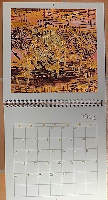
Last year Judi created a calendar for the year ahead that we shared with you here in this post.
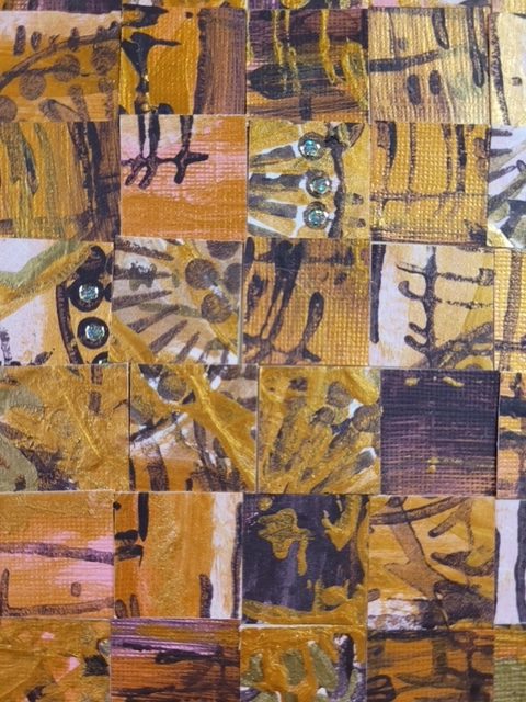
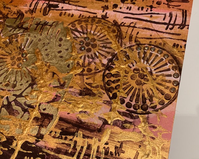
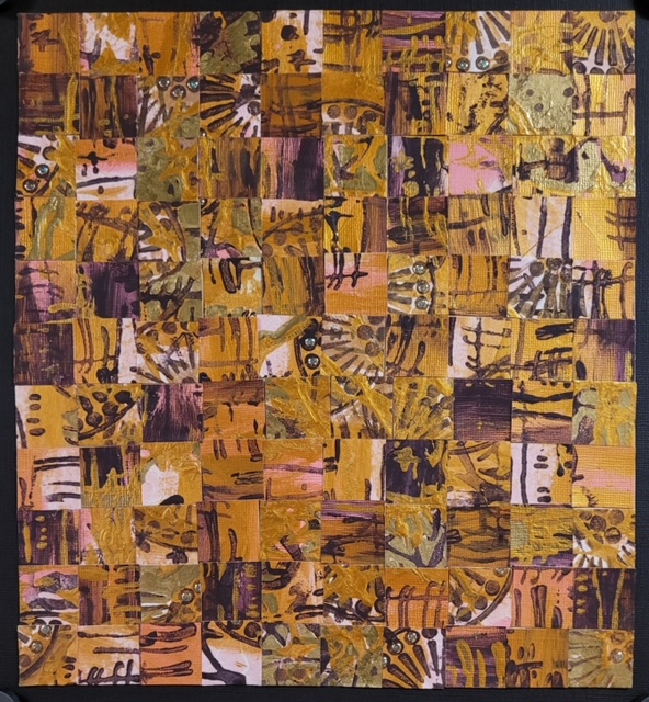
And then Judi totally surprised us this month with a reimagining of the calendar. She saved her stenciled calendar pages from 2020 and for most of the months she turned them into bookmarks and card fronts. But for this one she decided to cut the whole piece into 1” squares and reassemble it into a mosaic. She said it’s her way of giving visual form to this horrible year when everything felt like it had crumbled into tiny pieces by making it into something interesting and cohesive. It’s going to become the first calendar page for 2021! Turning over a new page, as it were.
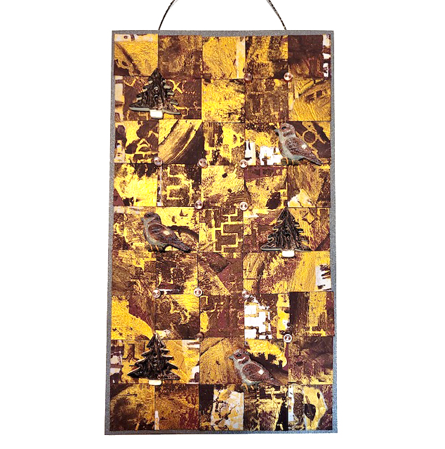
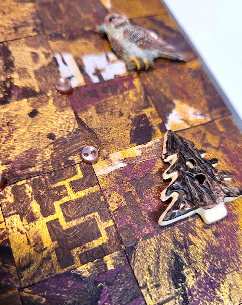
Judi also created a fantastic wall hanging from another calendar page redo.
She writes, “I made mosaics out of another of the stenciled calendar pages, adding some dimensional bird, tree, and mini buttons for embellishments.”
What a fantastic idea for those old calendars.
Judi also shared with us some envelopes she created using my Mini Motifs rubber stamp set. She writes, “The method: My go-to “Stamp & Drag” where there’s the look of motion.” Love the look and the softer lines.
Envelopes definitely deserve just as much love as the cards that go inside them and we think these are beautiful!
Are you sending snail mail these days? Follow Judi’s lead and try stamping some of your envelopes too.
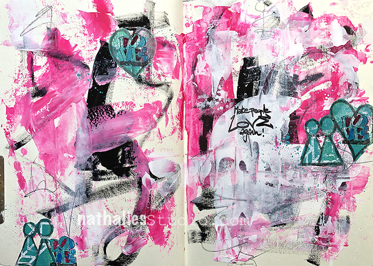
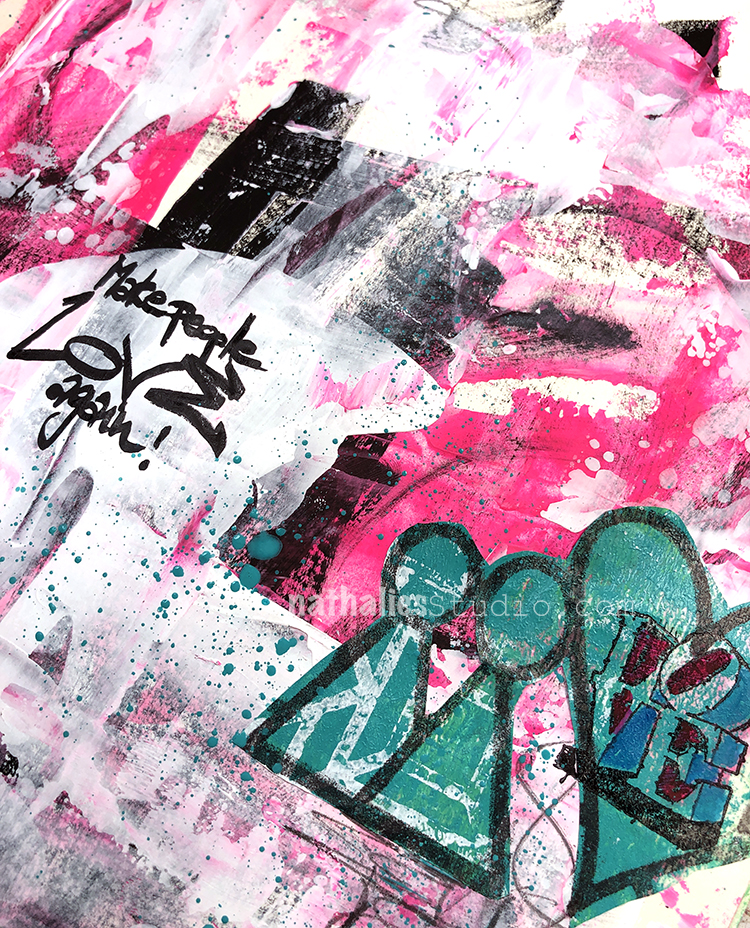
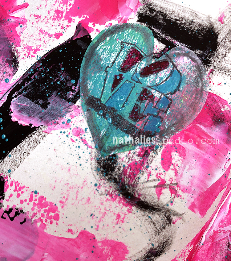
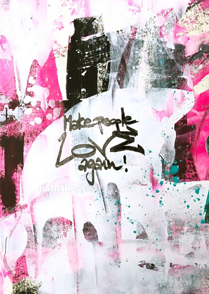
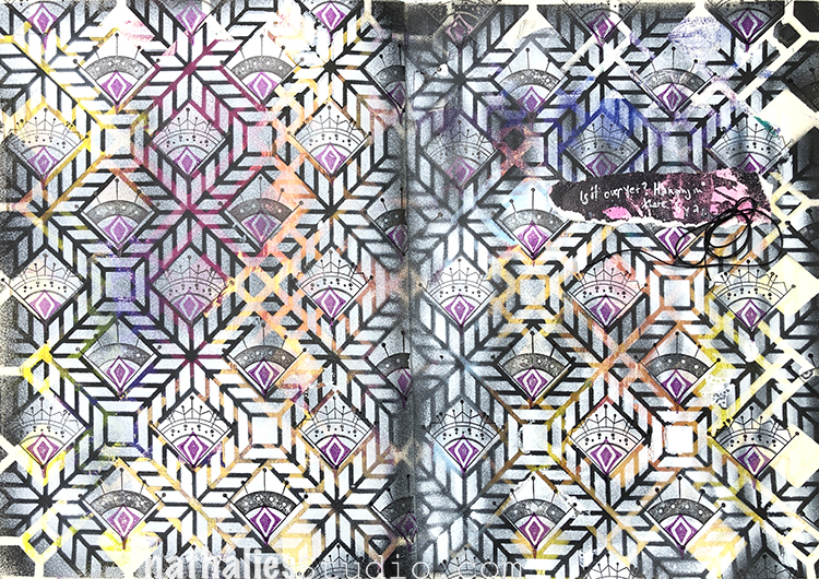
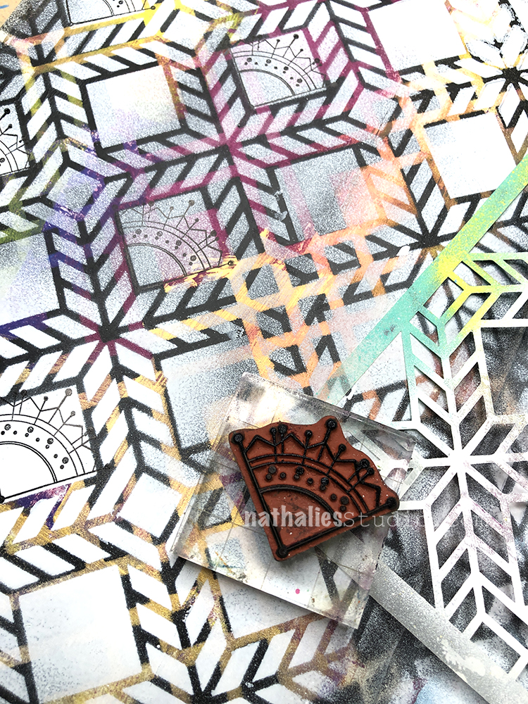
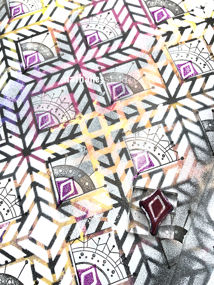
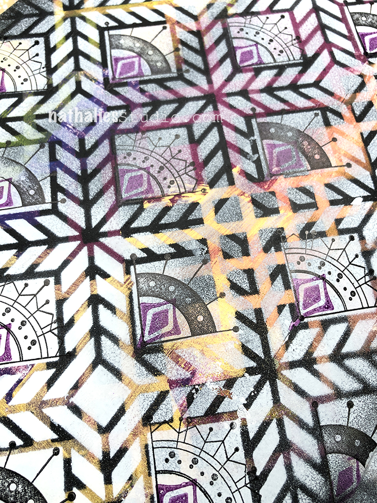
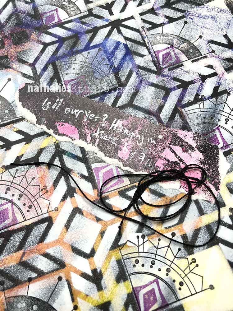
Is it over yet? Hanging on a thread… I created this art journal page at the end of December.
I began with a background that was from cleaning off different colors. I used black spray paint over my Chicago stencil first, then layered up my Santiago stencil and sprayed with white. My Mini Motifs rubber stamps fit perfectly in the stencil design (smile!).
And I added one last detail to my pattern with one of my Fan-Fare rubber stamps.
I added a bit of coordinating collage paper and my journaling with a white Signo pen. Hang in there everyone!
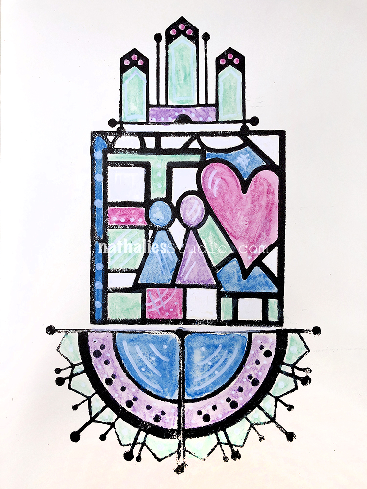
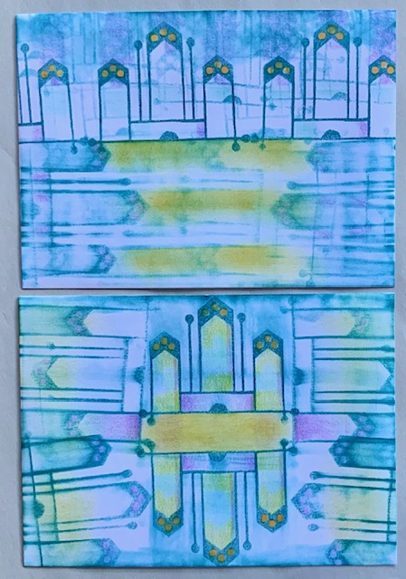
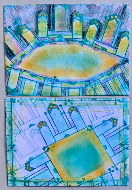
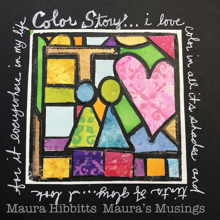
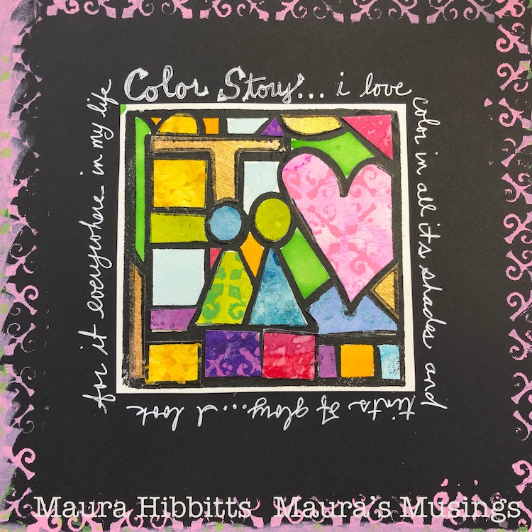
Hello from my Creative Squad! We are kicking off January 2021 with a gorgeous “Color Story” piece from Maura Hibbitts, who is using my CJS21 limited edition foam stamp Love Story, my New Orleans stencil, and our theme: Storyteller – This month we’re playing along with Creative JumpStart 2021 and the theme Storyteller. We’re using our artwork, our color and material choices, and our personal style to tell a Love Story.
Wishing you a new year of health and joy (and yes, the little joys count)! I am so glad to see the door closed on 2020, and am hopeful this year will bring better changes to us all. One of those changes is Creative Jumpstart which I look forward to each year in January to get my creative mojo revved up. This year, the 10th anniversary of CJS, promises to be amazing! Nathalie, you have outdone yourself organizing a wonderful 45 days of creativity with an awesome array of artists. I’m having fun so far, thank you!
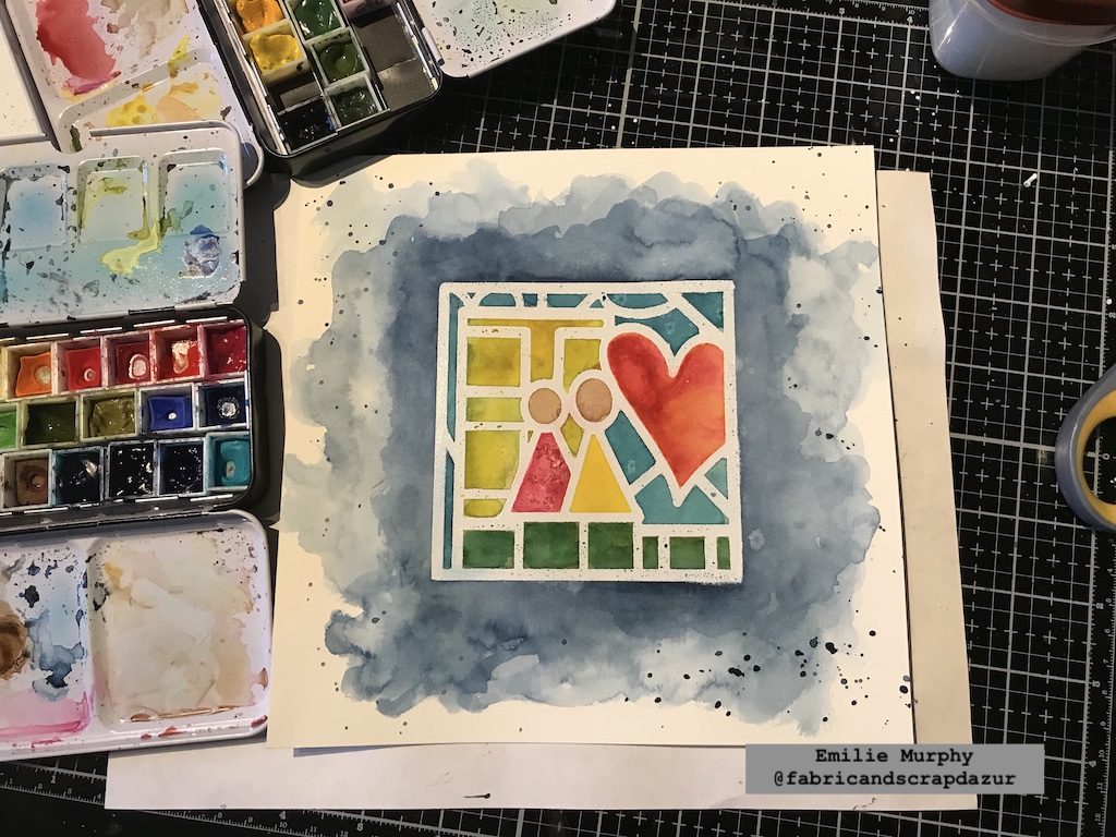
The theme of CJS21 is Storyteller. I love being able to tell a story with my art, and my story today is all about my love of color. I am “fatally” attracted to color…I seek it out around me, I have to wear it, I am compelled to buy it…one bottle of green paint is not enough, I have to have ten shades of it! I love observing the myriads of color in the natural world around me. I love playing with color, dressing myself in bold colors and patterns, photographing it, seeking it out in my travels, and even dreaming in color.
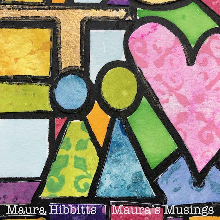
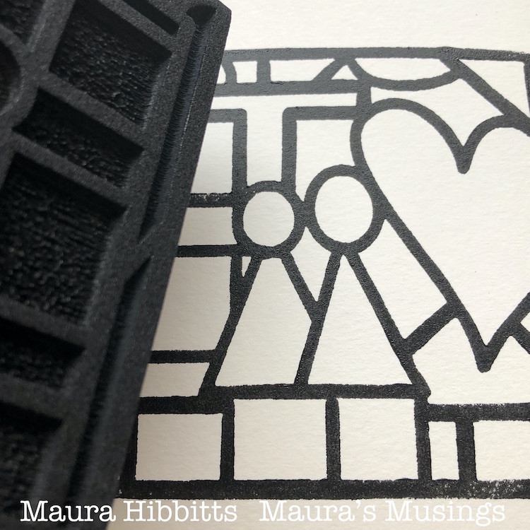
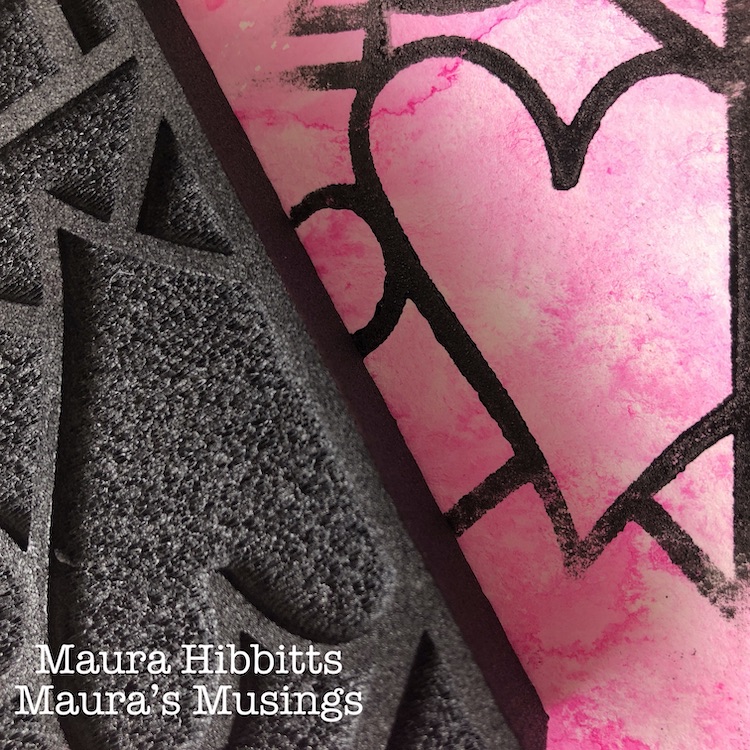
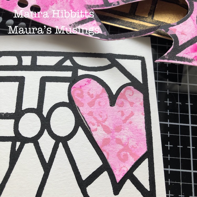
So, with my love of color in mind, I looked at the beautiful Love Story Art Foamie stamp Nathalie designed for CJS21, and envisioned it in all its colorful glory. I began by stamping the image onto watercolor paper with my gel plate and black paint for a bold frame.
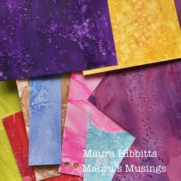
I pulled out an array of watercolor papers I’d made with my watercolor paints, gouache, and salt for another project. (You could easily substitute colored card stock.) I stamped different areas of the Art Foamie image onto each color.
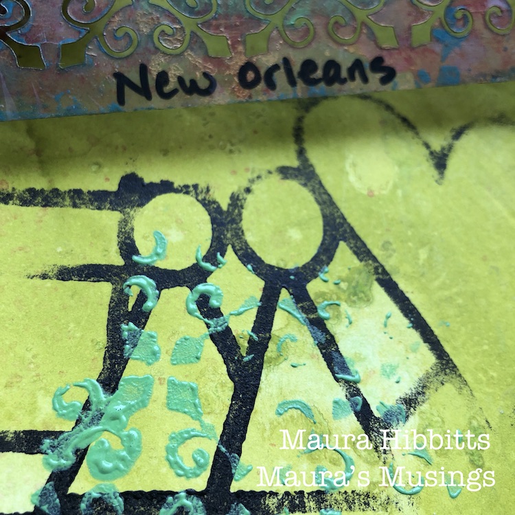
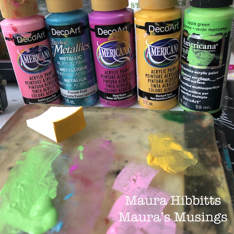
I wanted to add more texture to my pieces, so added another layer with the New Orleans stencil and a variety of paints. I really like using a cosmetic sponge to apply my paint through the stencil. Let dry. (Be sure to tap off excess paint from the sponge first, so you will get a nice crisp image).
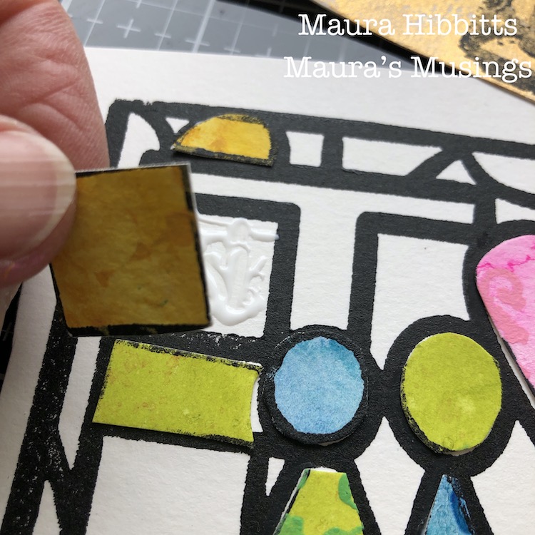
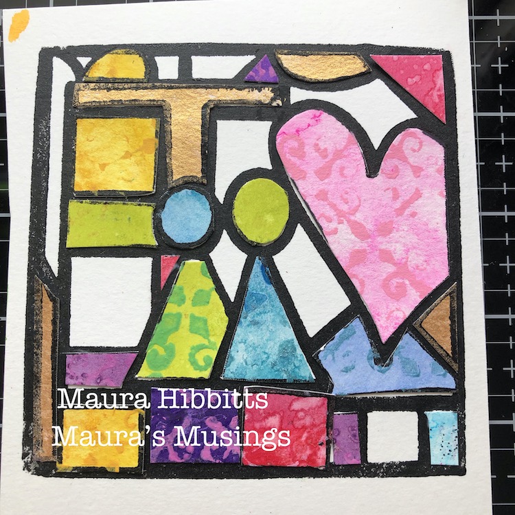
Next up, cut out the colorful pieces, and fit them into place on the original stamped image. I used a tacky glue to hold them in place, since they are heavier papers.
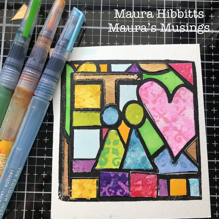
I purposefully left some spaces white, so I could also add in some watercolor…after all, I hadn’t yet used every color!
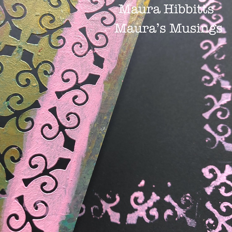
I headed to my square black journal, and created a frame with the New Orleans stencil, pink and a bit of green paint.
I trimmed my Color Story piece, adhered it to the center of the page in the journal, and my final step was to journal around it with a white pen.
When I step back and look at my image, it reminds me of stained glass, with its bright array of colors. If you look closely, you can see the stenciled texture, as it is very subtle on some pieces. I like how it stands out on the black background in my journal.
“Color Story…I love color in all its shades and tints of glory…I look for it everywhere in my life” I hope this year is a colorful year for you, filled with stories. Maura
Thank you Maura – we love the bold stained glass effect you created with your Color Story!
Give it a try: you can find all my Foam Stamps and Stencils in my Online Shop and in addition to watercolor papers from her stash, here are some of the supplies Maura used:
Don’t forget to check out Nat’s Creative Squad on Instagram too: Each week we post projects, ideas, and inspiration for mixed media art.
Maura, I love how you used this stamp! The texture in this project is sooo yummy! The color on black… and the variety of colors…. it all just fits together so beautifully! What a great start to our squad posts! Bravo!

Comments (2)
Sue Clarke
| #
Love it!
Reply
nathalie-kalbach
| #
Thank you so much Sue – it feels good to finally be back a bit more to painting
Reply