Blog: Stencils

Does it really matter? Art Journal

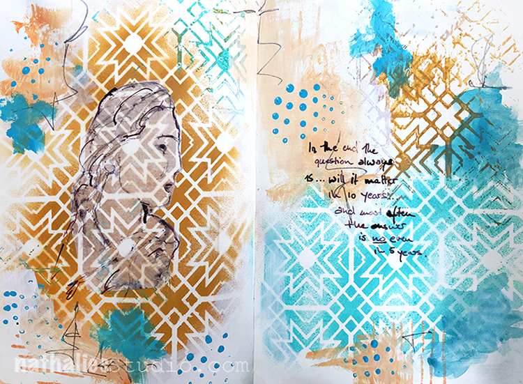
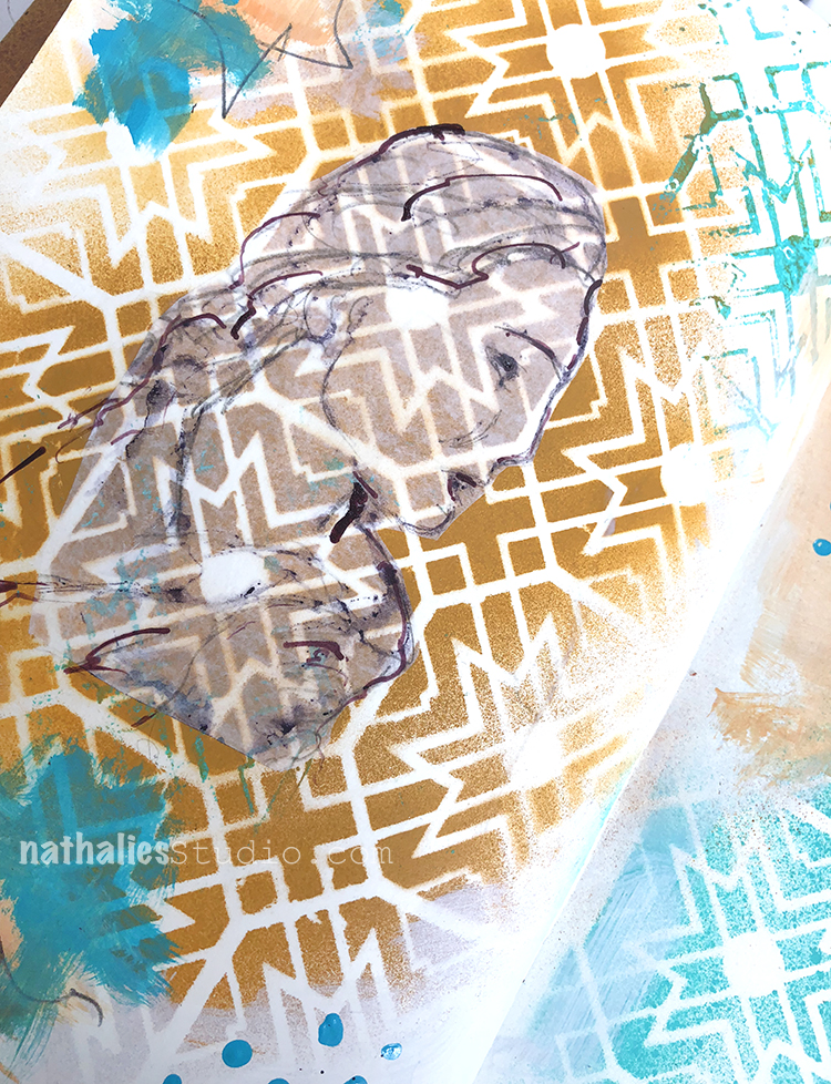
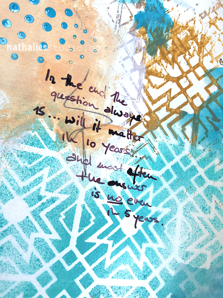
In the end the question always is…will it matter in 10 years?…and most often the answer is NO even in 5 years.

Thoughts that went through my head about something that didn’t work out the way I would liked it to work out- I was actually really disappointed but to be honest …it really won’t matter even in one year …so I will get over it ;) LOL

I played with spray paint and tried to keep it just to teal, beige and purple. I used my Toledo Stencil and sprayed over- then flipped the stencil to also get the reverse pattern transferred to the background.

The journaling and sketch on deli paper was done with acrylic ink and a bamboo sketching pen and I added some marks by dipping the end of a pencil into paint and stamping with it.

It was a freeing page to do :) Sometimes art journaling just helps you to get some stuff straight ;)

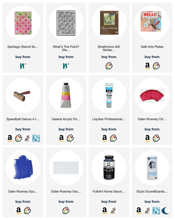
Here are some of the supplies I used


Leave a comment

It’s getting interesting – Art Journal

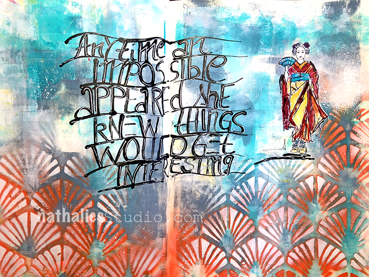
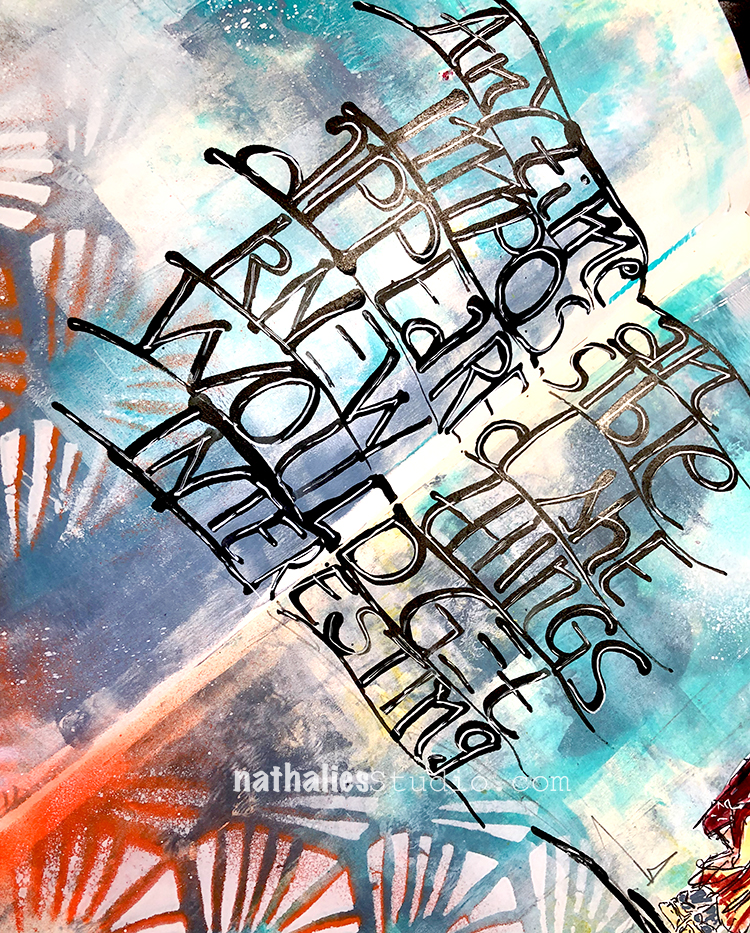
“Anytime an impossible appeared she knew things would get interesting. ”

I pretty much feel that way- LOL – and sometimes that is a struggle. Like oh wait- that is a hard way and then I go ” oh …let’s go that path”

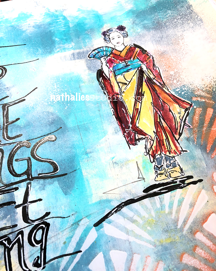
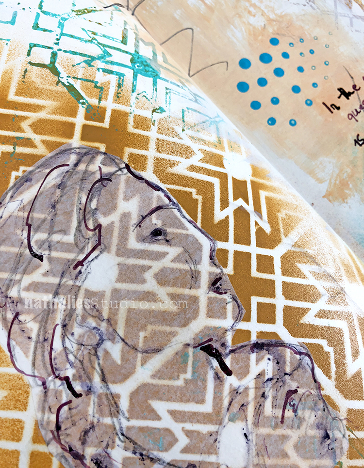
I wrote the journaling using black ink and a bamboo sketching pen, going over it again with a white signo pen later.

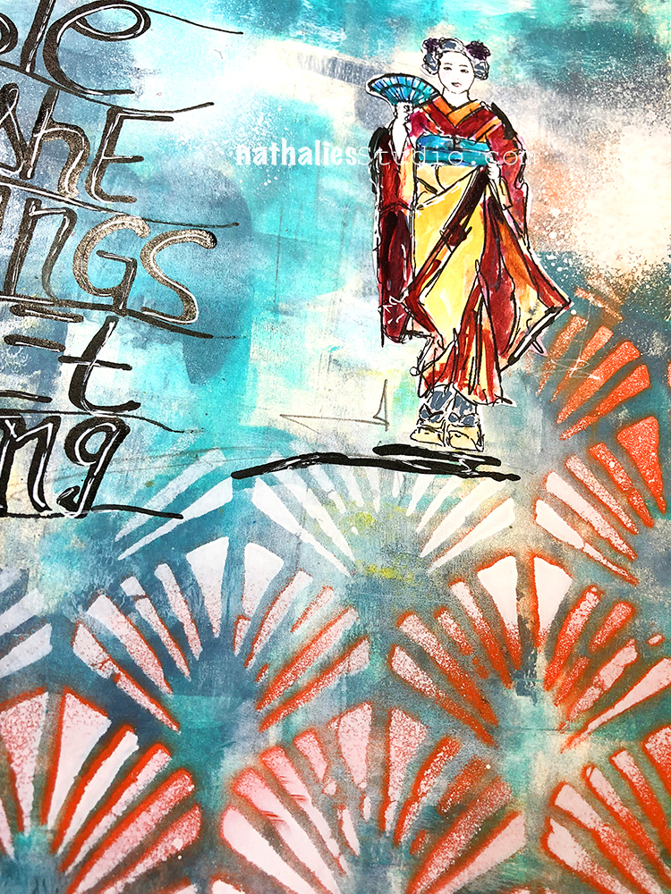
The Maiko is a little sketch I did, I cut it out and then painted inside. The background in blue was created by rolling out thin a think layer of teal and blue  as well as white acrylic paint with a brayer.

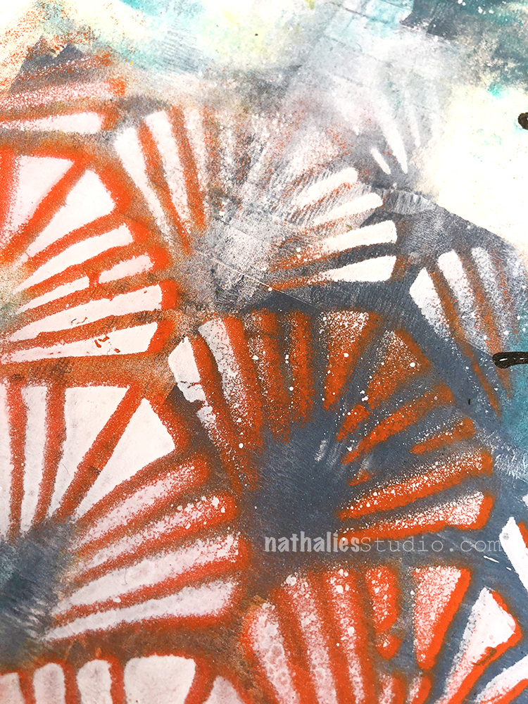
Using my Art Deco Wallpaper Stencil I sprayed over with some orange first and then moved the stencil slightly and sprayed over with white again to get more dimension but also to knock the orange back a bit.

And that was it- it was a fun and fast page …not impossible- LOL- but maybe still interesting ;)

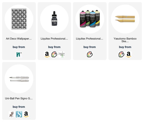
Here are the tools and supplies I used for the spread:


Leave a comment

Layers of Love – Maura Hibbitts


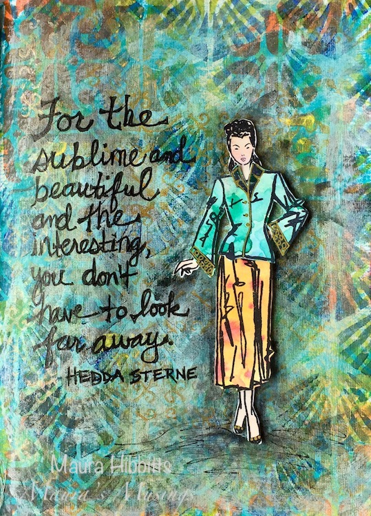
Hello and welcome to a post from my Creative Squad! Today we have a gorgeous art journal page from Maura Hibbitts, layering up my Fashion Dame stamp set, my  Art Deco Wallpaper, Amsterdam, and New Orleans stencils and totally rocking this month’s theme: Layers of Love – We love layers and all the juicy yummy goodness they bring to mixed media. This month we’re layering it up and letting viewers discover all the different strata of our artistic mark making.


I headed to my Dina Wakley Media Journal and started by brushing on a layer of Turquoise paint in a rather imperfect way so some white would still show. While the first layer dried, I worked on creating the “fabric” for the outfit. I used Prima watercolors and painted a couple of different designs on watercolor paper.
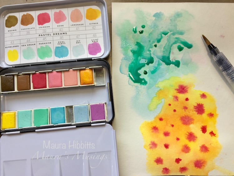
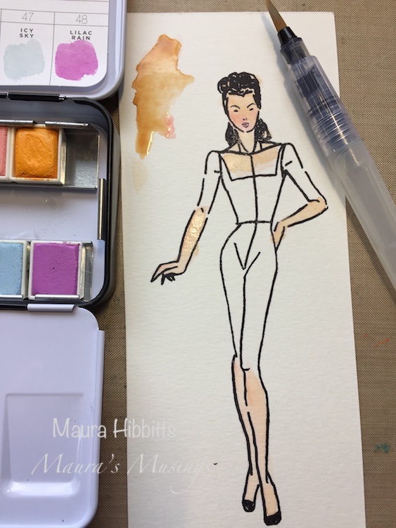
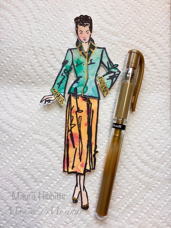
I stamped the Fashion Dame onto watercolor paper with black archival ink, then used a water brush and watercolors to color in the skin tones. I stamped the clothing onto the “fabric” designs I created earlier, then put her outfit on, and added some gold highlights.
Back to the art journal page for a stenciled layer. I used the Art Deco Wallpaper stencil and Green Gold paint and a cosmetic sponge to stencil in the design. Once that dried, I turned the stencil upside down and added another sponged layer, this time with Ultramarine Blue paint.
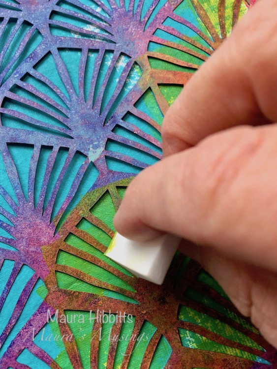
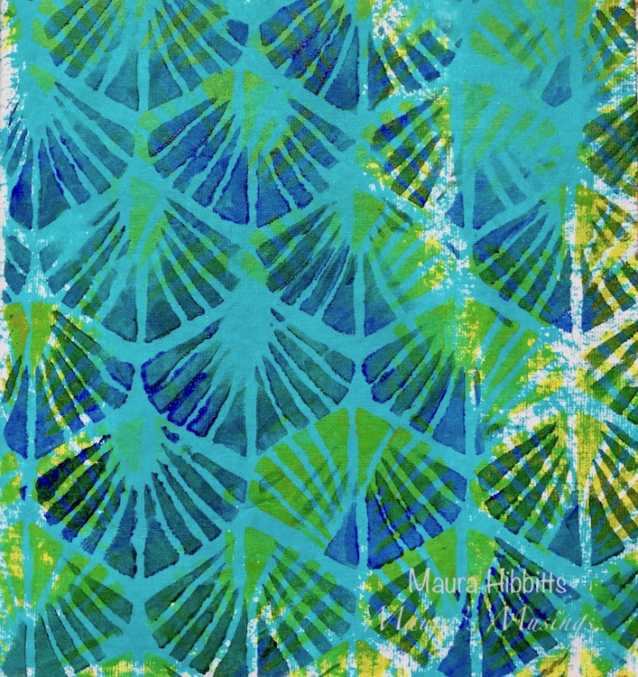
With the cool colors laid down and completely dry, next up are the warm colors to layer on top. I used the Amsterdam stencil from the Fashion Dame, and dabbed in yellow and orange with a sponge. I only stenciled parts of the background in each color.
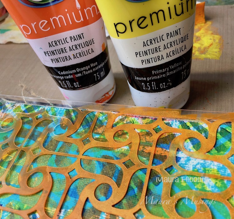
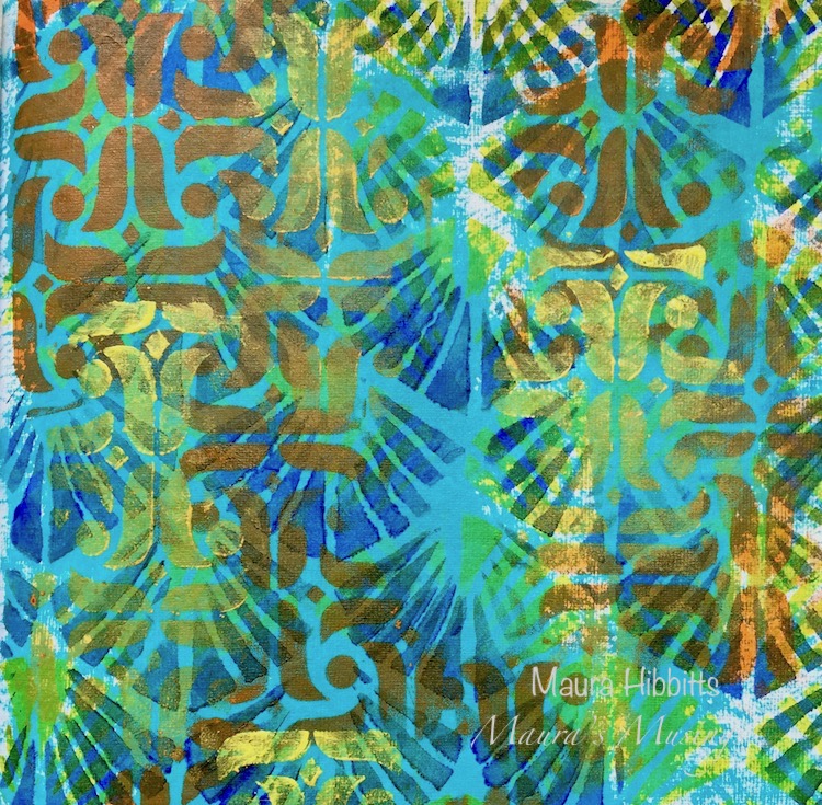
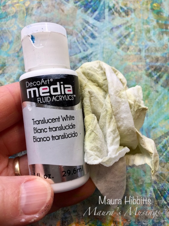
While I loved the layers I had created in the background, I knew my Dame would be lost, and anything I wrote would be hard to read, so I whitewashed the page. I used a translucent white and painted a thin layer over the page. I went in with a baby wipe and scrubbed back some areas since I still wanted color to show through.
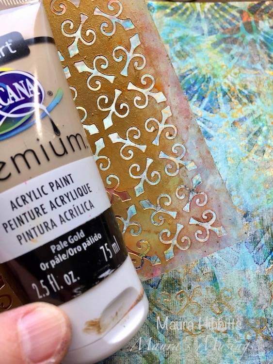
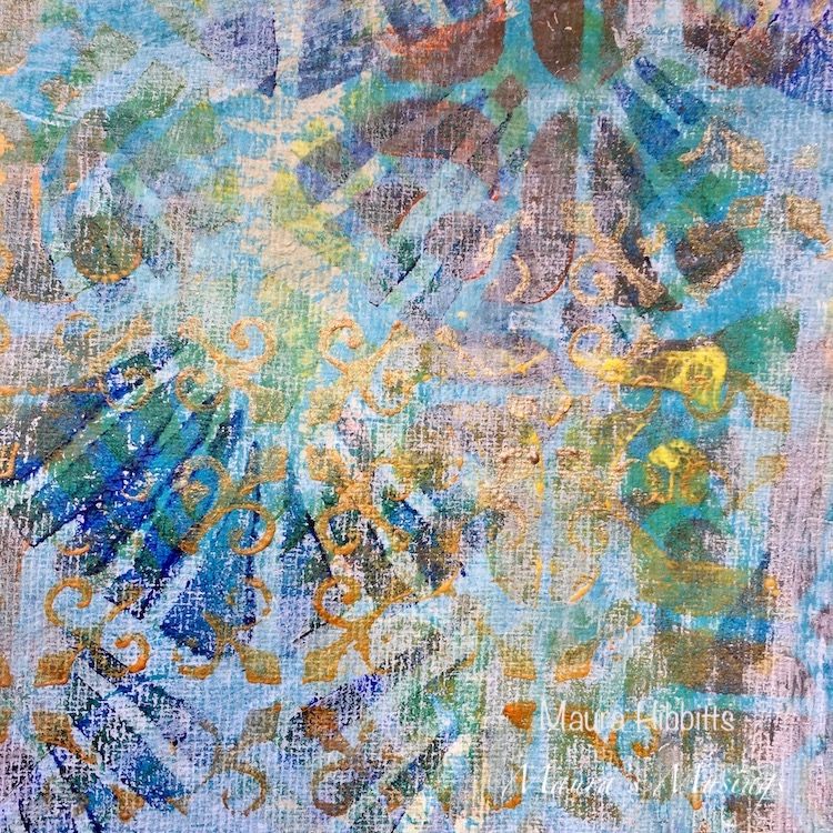
Time for a little gold. I really like adding a bit of metallic, and the gold adds a subtle layer to the page. I used the New Orleans stencil and a pale gold and randomly sponged gold onto the page.
I adhered the Dame with foam tape, then scribbled around her with a Stabilo graphite pencil. Next, I softened it with a water brush. This is a great way to create more depth on your page. I also added in some scribbly lines underneath her to ground her.
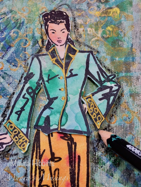
I hand-lettered a great quote on beauty by Hedda Sterne – “For the sublime and beautiful and the interesting, you don’t have to look far away.” It is always interesting to me how my mind can work in the background when I am creating. The Fashion Dame has an Asian look to her, and the Art Deco Wallpaper has the appearance of fans. I really was not thinking about this while working, but when I stepped back I saw that connection.

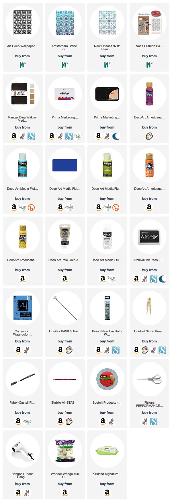
Thank you Maura! I love all those layers and what a great quote – I definitely think if you look, the sublime and beautiful are all around us :) Here are some of the supplies Maura used:


Feel inspired? Working on something yourself that you’d like to share?  I love to see how you interpret our monthly themes. Email me how you used my stencils and stamps with the theme and email me an image – I would love to share your projects in my next  “n*Spiration From Around the Globe“.
Comments (2)

  • Sue Clarke

    |

    Gorgeous layers and colors Maura!

    Reply

    • Maura

      |

      Thanks Sue!!

      Reply

Leave a comment

Layers of Love – Jennifer Gallagher


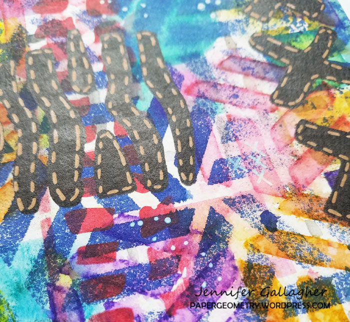
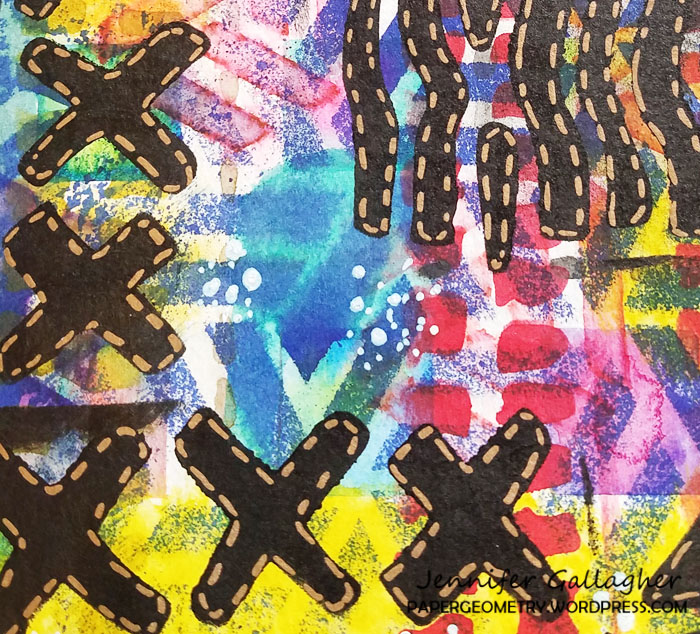
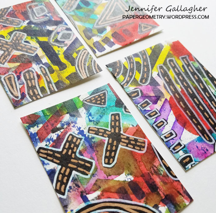
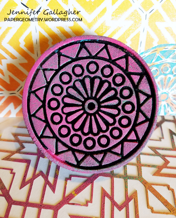
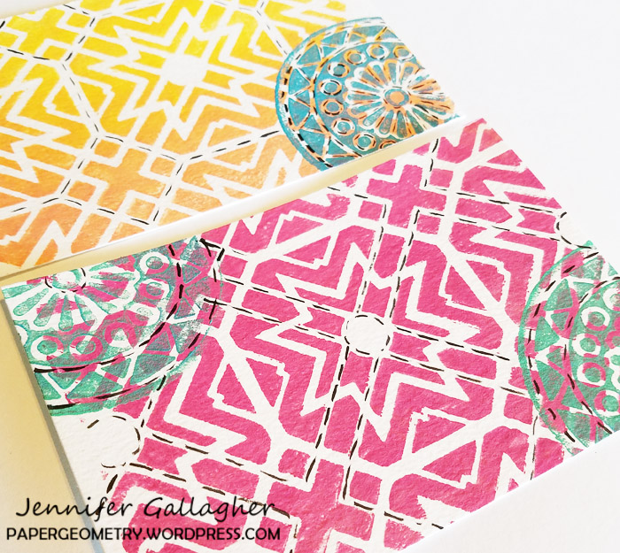
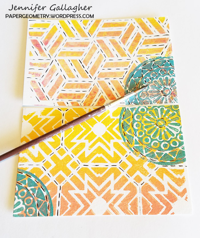
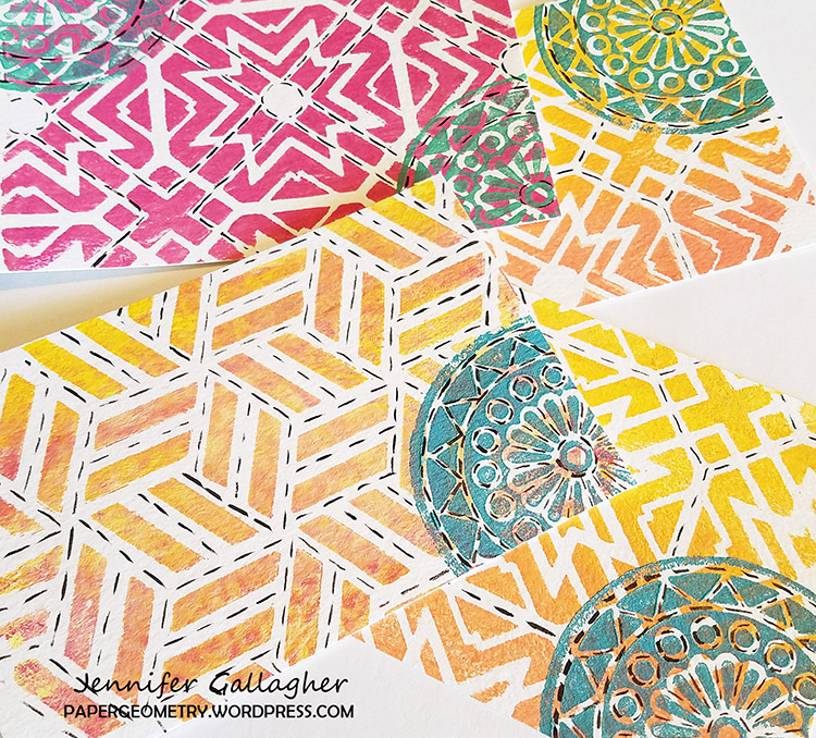
Welcome to a post from the Creative Squad! Today we have a set of Artist Trading Cards from Jennifer Gallagher – little masterpieces of layered fun for sure! Jennifer uses my Batik and Kassel stencils along with this month’s theme: Layers of Love – We love layers and all the juicy yummy goodness they bring to mixed media. This month we’re layering it up and letting viewers discover all the different strata of our artistic mark making.


One of the great joys of working in mixed media is creating delicious layers of color and pattern. This month, I thought I would share with you a fun way to create the perfect layered background you can use for many different projects.

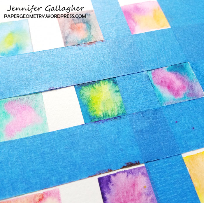
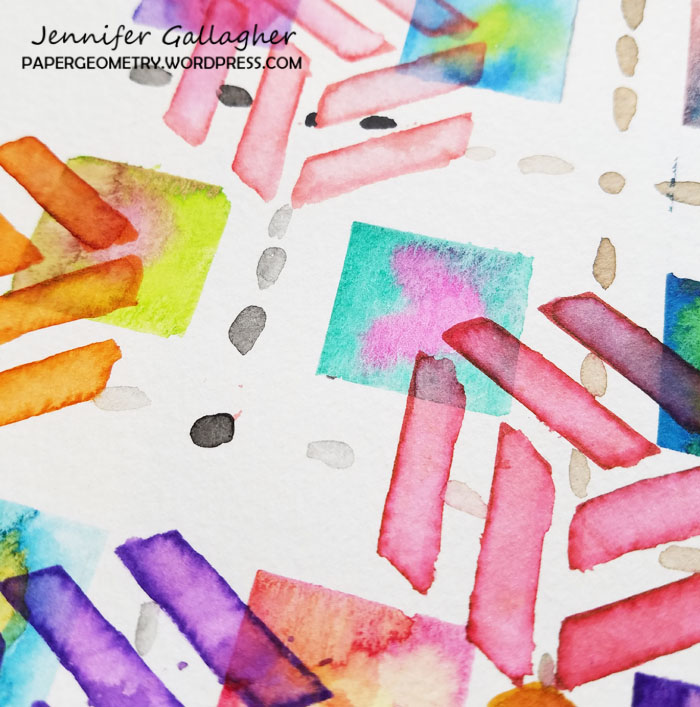
I am starting with a sheet of watercolor paper, 140 lb. I used painters tape to create a square grid on my paper and painted some watercolor squares. You can do circles or any type of watercolor wash. Remember to leave a little bit of white space here and there. It leaves places for your eyes to rest.

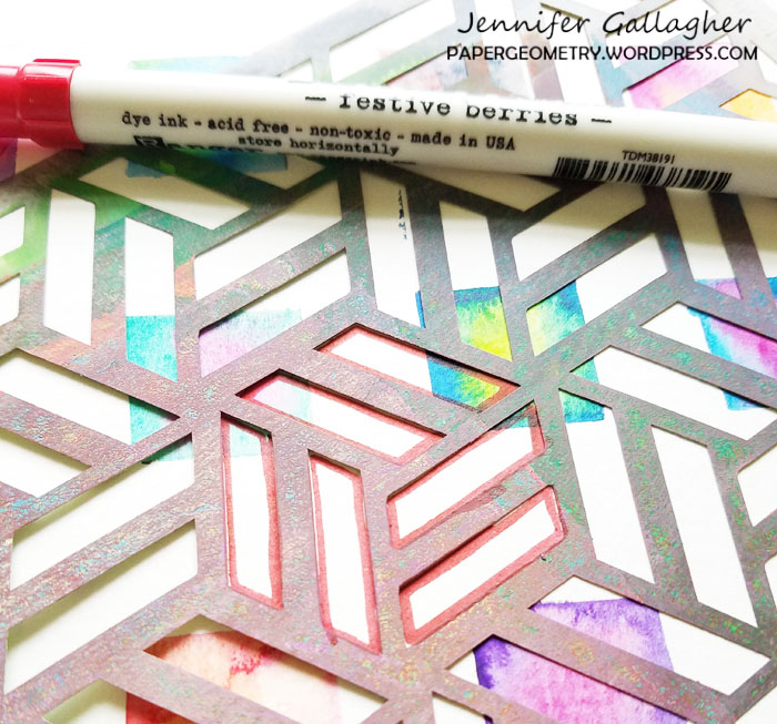
Next, I laid Nat’s Kassel stencil over my watercolor paper and chose places to put the cube designs. Using my distress markers I drew in the design. The Tim Holtz water brush is the perfect tool for filling in the designs for a watercolor look.  I also did a little mark making with my watercolors. You will notice little black dots here and there.

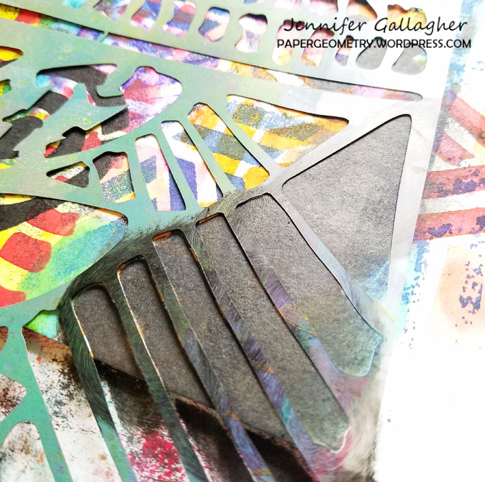
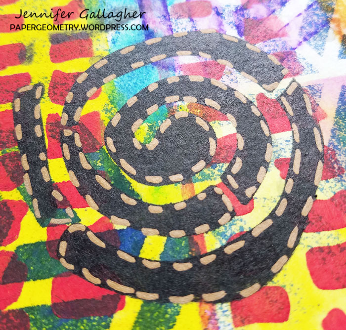
At this point I used my distress stains to add a few circular areas of color. Then I sprayed Dylusions ink spray through the Kassel stencil in a few select areas. Don’t forget to keep some white space! At this point I chose a special stencil as a focal point. Nat’s Batik stencil is the perfect one for this. I chose parts of the stencil I wanted to use and painted through with Dina Wakley Media paint in ruby and Dylusions black marble paint using a Tim Holtz mini blending tool.

Once the black paint dried I went back over the designs with a Ranger Letter It Metallic Marker and a Uni Posca Pen. I also added some more art marks on the background with the white Posca Pen.

Now that we have this yummy layered paper, what can we do with it? I turned mine into Artist Trading Cards. You can use your background for a paper flag, bookmarks, or an art journal page. You are only limited by your imagination. Won’t you join the creative squad this month and try our techniques?


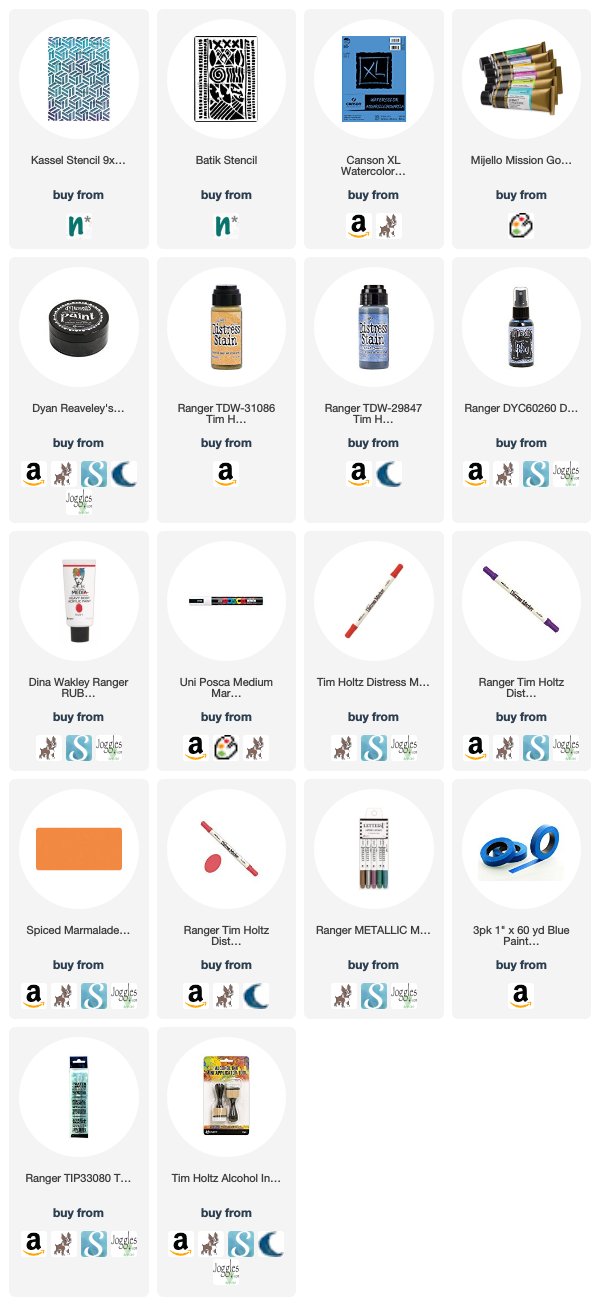
Thank you Jennifer! I love how you used my stencils to create so many interesting layers of shape and color in these! They are really fun ATCs! Here are some of the supplies that Jennifer used:


Feel inspired to get in on the layered action? Working on something yourself that you’d like to share?  I love to see how you interpret our monthly themes. Email me how you used my stencils and stamps with the theme and email me an image – I would love to share your projects in my next  “n*Spiration From Around the Globe“.
SaveSave

SaveSave

SaveSave

Comments (1)

  • maura

    |

    Love how you created your layers on these awesome ATC’s, Jennifer!

    Reply

Leave a comment

The Future is Now – Art Journal

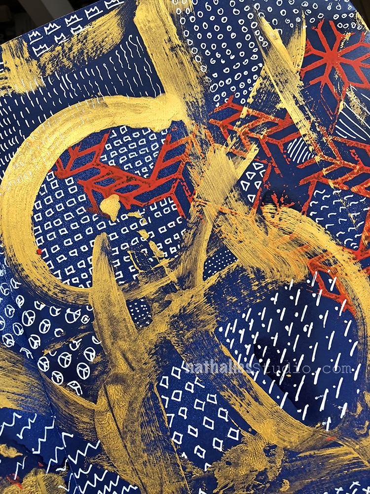
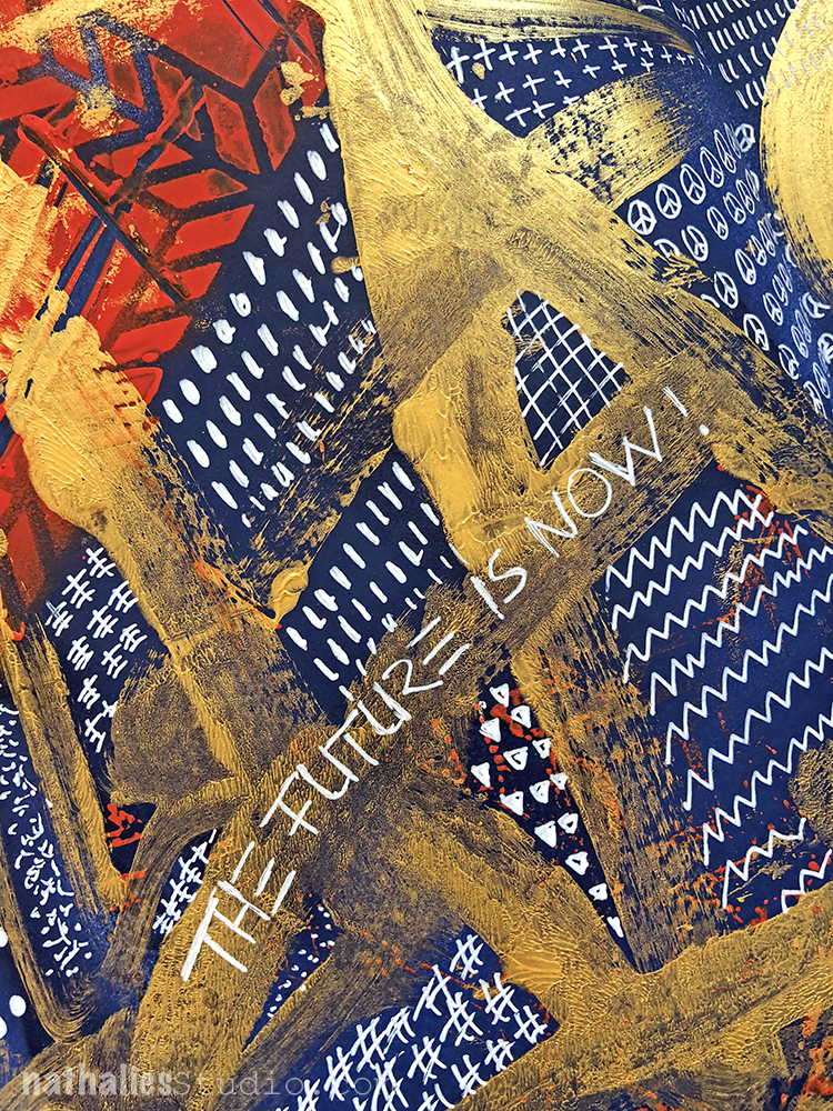
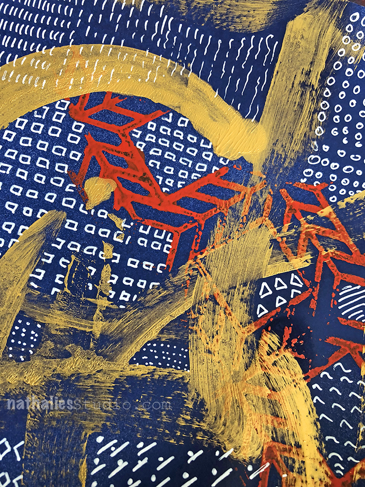
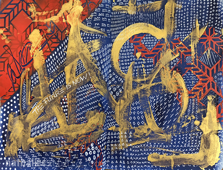
An art journal page that I created after the marches last month happened. I love that Art Journaling can be a way of taking note of current events in a visual way – and as you know I am not much of a writer in my art journal because a lot of my thoughts and feelings are conveyed by the colors, paints and techniques I am using.

I spray painted the background in blue and then sprayed in red through my Santiago Stencil – I flipped it over while the paint on top was still wet to get a reverse pattern.

Some obstructed notes with a gold gesso and a thick brush and then I filled in all the areas with patterns using a white signo pen.

It was a nice and meditative time to fill in the page with white little patterns, marks and doodles :)

Here is what I used for this spread:


Comments (2)

  • Deb

    |

    Striking composition. Love the colors and the addition of the gold gesso. Different look for you to using block printing instead of cursive. Overall great art journal pages! Agree how meditative mark making can be. Inspired to go do some! Thanks.
    Deb

    Reply

    • nathalie-kalbach

      |

      Thank you Deb! Yeah I rarely do use block printing but I actually like it …good reminder to use it more often :)

      Reply

Leave a comment

Layers of Love – Josefine Fouarge


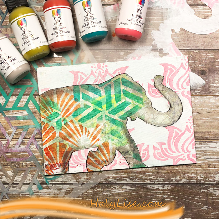
Welcome to a post from the Creative Squad. Today we have a sweet little mixed media canvas from Josefine Fouarge. She’s playing with lots of layers with my Kassel, Toledo, Lily Wallpaper, Art Deco Wallpaper and Elephant Parade stencils based on this month’s theme: Layers of Love – We love layers and all the juicy yummy goodness they bring to mixed media. This month we’re layering it up and letting viewers discover all the different strata of our artistic mark making.


Layers, yummy layers. I enjoy working in layers and being able to see through every one of them and get a peek of what’s lying underneath the surface.

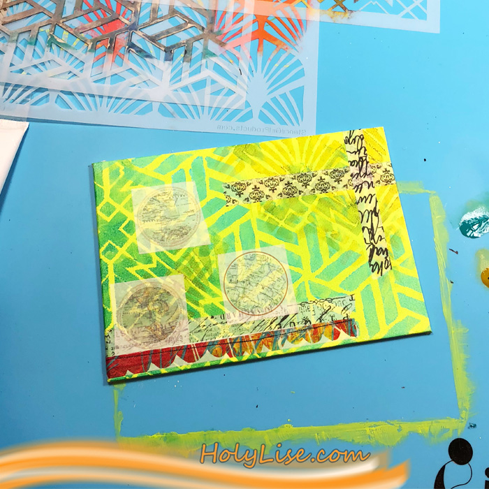
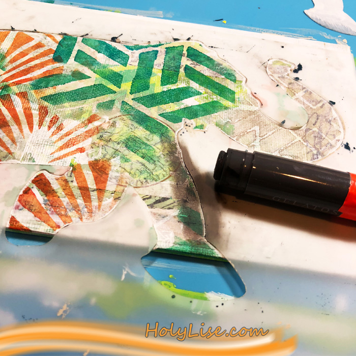
For today’s project, I picked the Elephant Parade stencil as my focal point and I had an idea in my head of several patterns shining through the silhouette. So, I grabbed a 5×7” canvas and added a wash of Dina Wakley Lime color. Then I added the first layer using the Kassel, Toledo and Art Deco stencil and three different shades of green.

For the next layer, I picked a few different washi tapes and randomly adhered them to the background.

I wanted to add more stenciled layers. To avoid a chaos on my canvas, I painted a light layer of Gesso on top of the first one. Then I used the same three stencils, this time with different colors, one of them in a more contrasting orange shade.

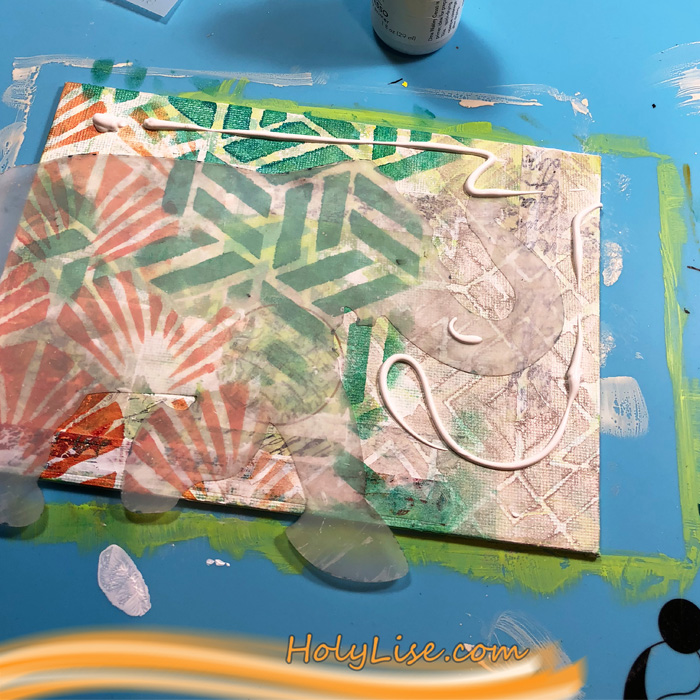
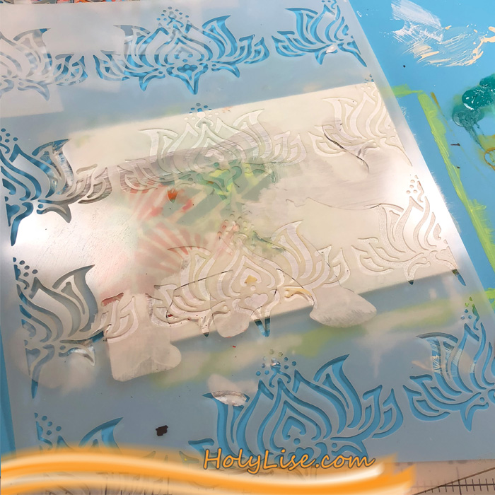
It was time to create the Elephant silhouette. I started by placing down the mask and adding two layers of Gesso around it.

Next, I switched to the Elephant Parade stencil and added a shadow to the inside of the elephant using a Faber Castell Gelato in grey.

The white washed area was a little too white for me, so I covered the elephant again with the mask and then added a blush color through the Lily Wallpaper stencil.

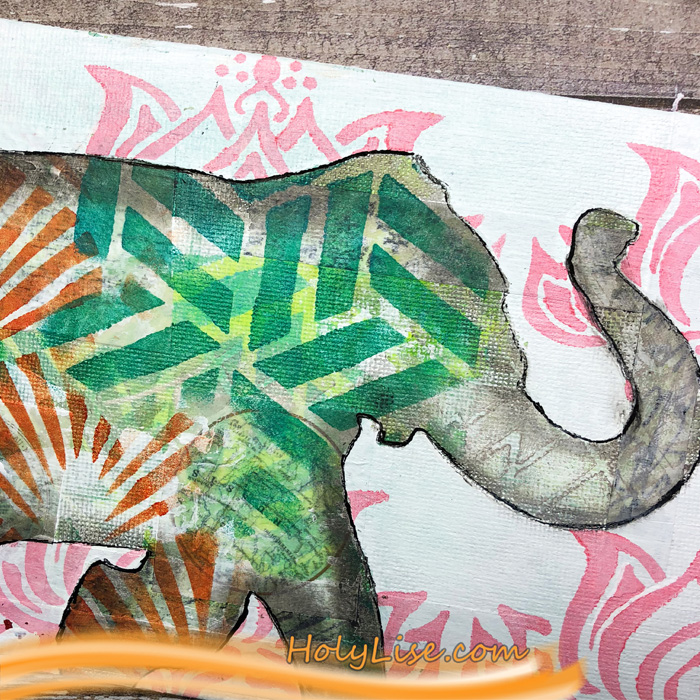
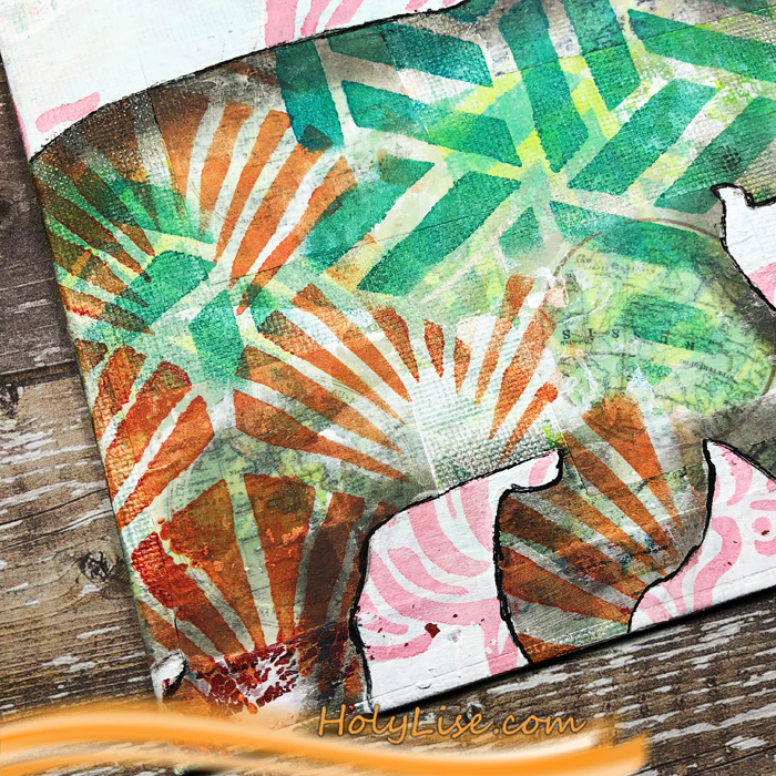
Here you can see all the yummy layers shining through and building the body of the elephant.

You can also see parts of the washi tape, for example the globe. Enough to be interesting, but not enough to draw the eye to it.

Thanks so much for stopping by. I hope you enjoyed my layered canvas and feel inspired to create your own textured images.


Thank you Josefine! Love seeing all those stencil layers through the Elephant! Here are some of the supplies that Josefine used:


Feel inspired? Working on something yourself that you’d like to share?  I love to see how you interpret our monthly themes. Email me how you used my stencils and stamps with the theme and email me an image – I would love to share your projects in my next  “n*Spiration From Around the Globe“.
Comments (1)

  • maura

    |

    Josefine, I love how you layered the elephant with the stencils! Cool!

    Reply

Leave a comment

Layers of Love – Tania Ahmed


Today is a special Creative Squad day because we are welcoming the very talented Tania Ahmed to the team! Tania’s fresh style will be a great addition to our lovely little group :) You can read more about Tania in this Nice to Meet You post from last week. Today she brings us a beautiful little book that totally rocks my Santiago and What’s the Point stencils. She’s working from our new theme: Layers of Love – We love layers and all the juicy yummy goodness they bring to mixed media. This month we’re layering it up and letting viewers discover all the different strata of our artistic mark making.


Hi Everyone, this is my first post as part of the Creative Squad! Thank you to dear Nathalie and Kim for inviting me to join the team, I am so pleased, thrilled and honoured! I am so excited to be kicking off this month’s challenge: the theme is Layers of Love and there’s nothing better to demonstrate this than Stencils!

I adore stencils and love to incorporate them into my work. There are so many ways to use them, you can sponge paint or medium through them, stamp with them, use mists with, the list is endless. At the moment I am really obsessed with gel plate printing and I thought what better way to demonstrate layering than with monoprinting!

I created a variety of prints and I started by centring my Gelli Arts plate on a piece of A4 sized paper. This will help you create a register for your print so that you can line up the pattern stencils each time you pull a print.

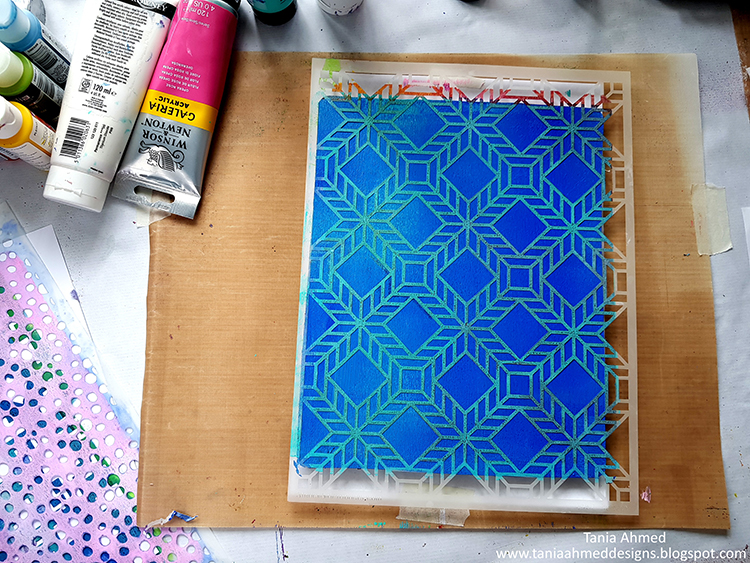
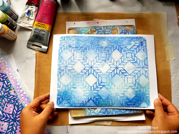
I started by spreading Permanent Light Blue and Cobalt Blue acrylic paint with a brayer on my gel printing plate. I lined the 9 x 12 Santiago Stencil with the paper under my gel plate along the bottom left corner. This will be my register every time I place either my stencil or my paper:

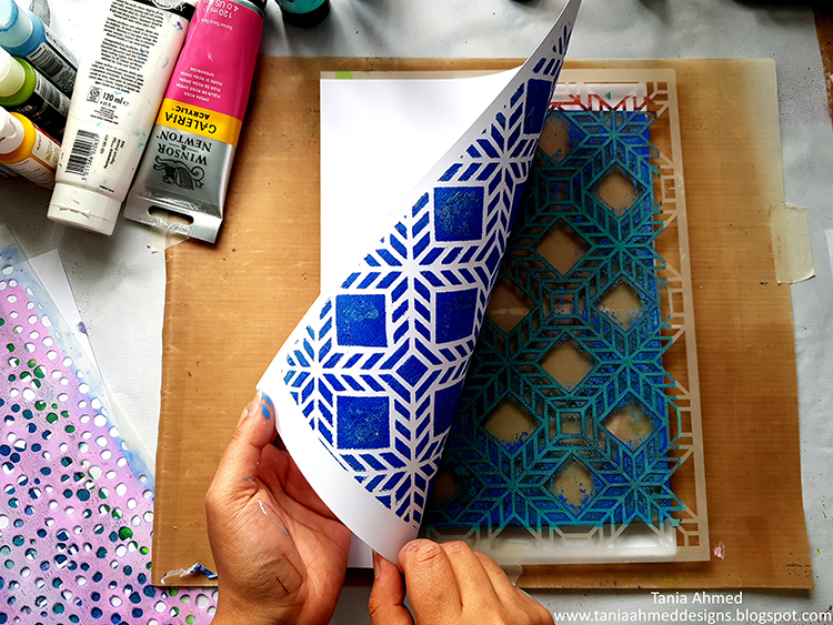
I then pulled a print:

I removed my stencil let the paint dry on my gel plate. I then brayered white acrylic paint all over the plate and pulled another print with new paper. This will be my ghost print:

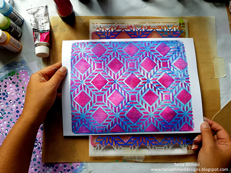
I cleaned my gel plate off and then applied Process Magena and Opera Rose acrylic paint with my brayer and lined up the stencil again and pulled a print on the ghost printed paper. I made sure to line up my print with the paper under the gel plate!

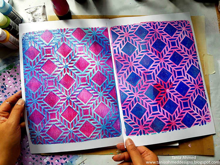
I removed the stencil and quickly pulled another print using the first gel printed paper, making sure to line it up with the paper under the plate:

I repeat this using the same colours with other stencils until I had a few prints to choose from.

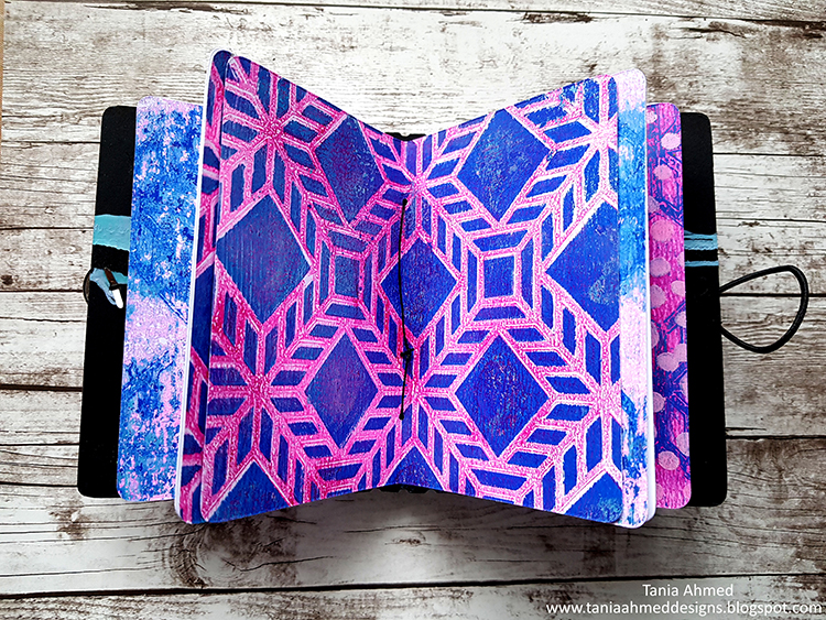
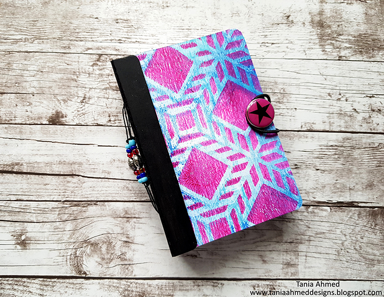
I then die cut some mount board (or you can use light chipboard sheets) using the Eileen Hull’s Passport Sizzix Die, and added my printed papers to the cover. I painted the spine with black chalk acrylic paint. I also die cut some pages for the journal using the same die. I assembled the journal, added some beads to the spine, elastic and a brad for the closure. I am really looking forward to filling this little mini album with photos and journaling!

Thank you so much for stopping by, I had a blast making this project :)


Thank YOU Tania! So glad to have you and absolutely loving this first project from you! Here are some of the supplies that Tania used:


Feel inspired? Working on something yourself that you’d like to share?  I love to see how you interpret our monthly themes. Email me how you used my stencils and stamps with the theme and email me an image – I would love to share your projects in my next  “n*Spiration From Around the Globe“.
Leave a comment

Vacation Mode – Jennifer Gallagher


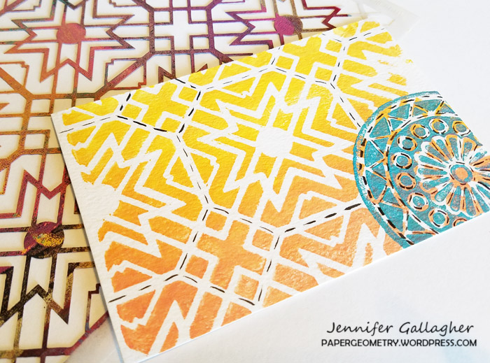
Hello from the Creative Squad! Today we have Jennifer Gallagher and her set of absolutely lovely postcards to send from your vacation destination. She is using my Toledo and Kassel stencils and my Valley Road foam stamp, along with our theme: Vacation Mode – Here in the Northern Hemisphere, we are slogging through winter with only one thing on our minds – vacation! Whether it’s Spring Break, a weekend getaway, or an hour with a good book, everyone needs an escape to Vacation Mode now and again.


This month we are in Vacation Mode here at the Nstudio Creative Squad. What better time to beat my current winter blues than looking ahead to Summer and family vacations. I love the warm Summer sun, sand between my toes, and the salty ocean breeze. So, today I will walk you through making some adorable beach-inspired postcards to send to family and friends from any destination.

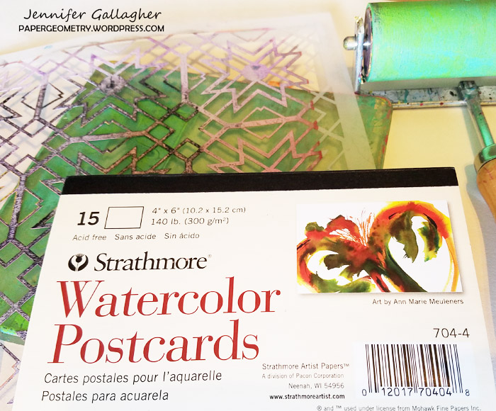
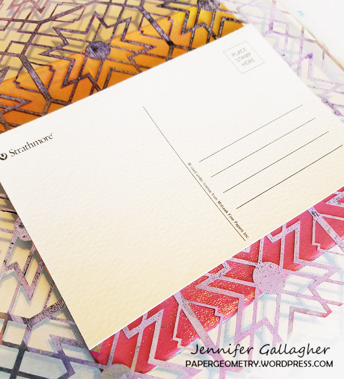
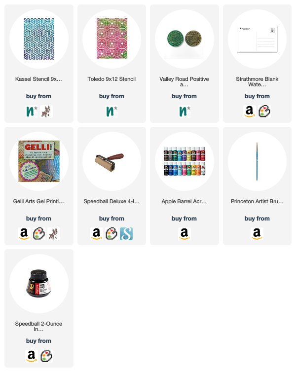
These fun postcards are quick and easy to make and you can use your favorite Nstudio stencils, stamps, and artfoamies to make them uniquely you. I used my six by six inch gelli plate, brayer, watercolor postcards, and inexpensive acrylic craft paints. To make some really standout postcards I used Nat’s Toledo stencil, Kassel stencil, and Valley Road Artfoamies.

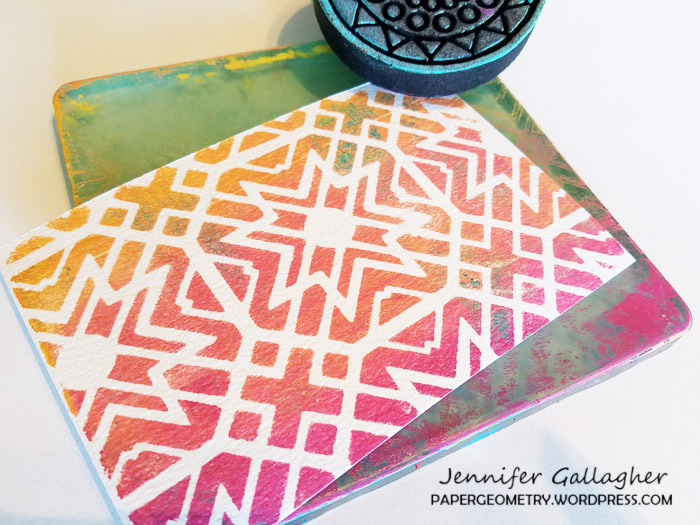
I layered my paint onto my gelli plate from light to dark in coordinating colors with my brayer. I put down my stencil and pressed my watercolor postcard down. Press firmly!

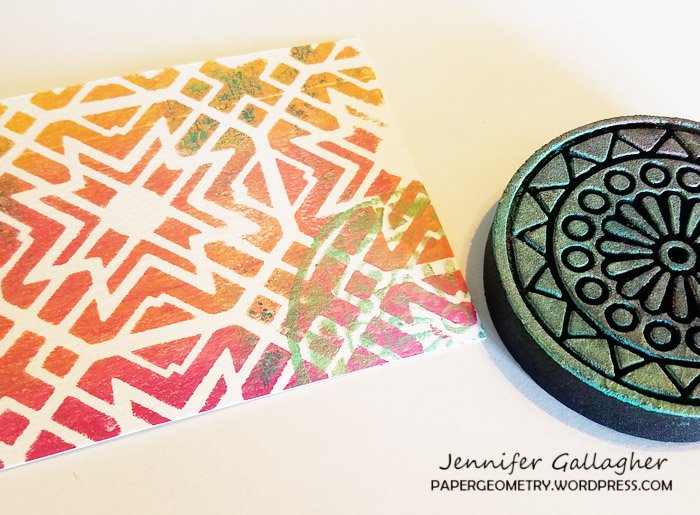
I chose complimentary colors, in this case turquoise and teal, and applied the paint to my artfoamies. I applied the design in interesting places on my postcards.

After the paint dried, I decided to add some interest with black India ink. Following the spaces between the stencil gives an interesting line for the eye to follow.

Now all that is left is to send them out. Thanks for stopping by and be sure to visit every Tuesday for the latest Creative Squad post. Enjoy!


Thank you Jennifer! Those colors are sure to brighten any gloomy winter day :)  Here are some of the supplies that Jennifer used:


Feel inspired? Working on something yourself that you’d like to share?  I love to see how you interpret our monthly themes. Email me how you used my stencils and stamps with the theme and email me an image – I would love to share your projects in my next  “n*Spiration From Around the Globe“.


Join us on Thursday March 22nd at 4pm EST for my latest Kaffeeklatsch on Facebook! I’ll be chatting about all the latest and greatest here at Nathalie’s Studio. Special this time is a GIVEAWAY you will not want to miss, tales from my trip to Japan, and lots of news about exciting upcoming in-person workshops! Join us and say hi!
SaveSave

SaveSaveSaveSave

Comments (1)

  • maura

    |

    Love how you made your own postcards with the stencils and stamps, Jennifer! Cool idea and colors! Maura

    Reply

Leave a comment

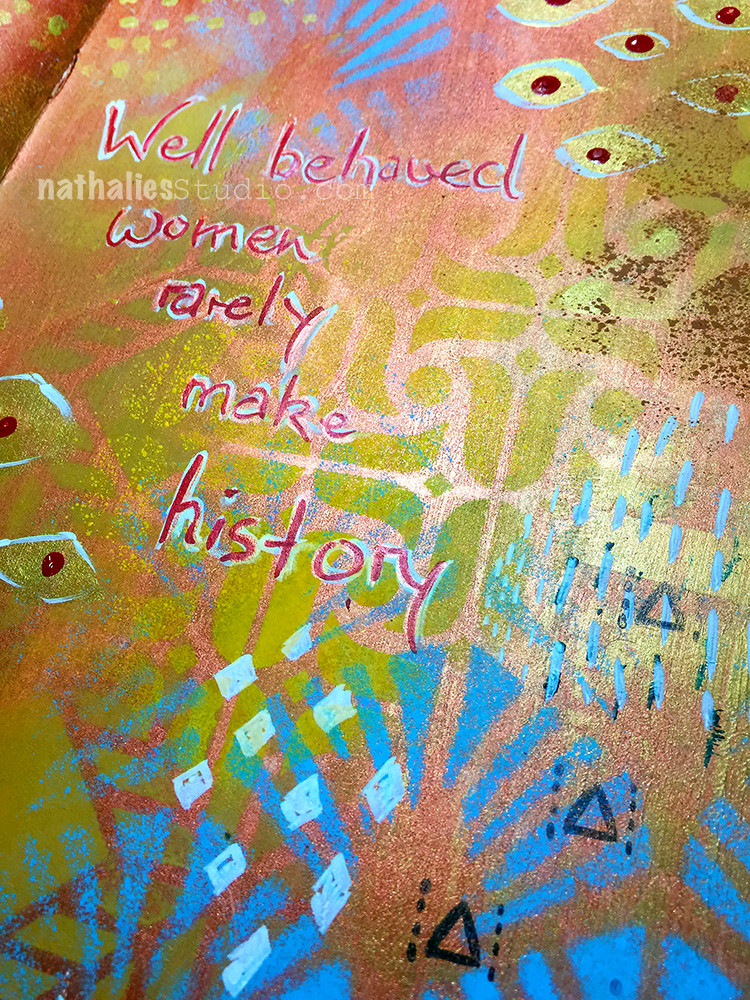
Well Behaved Women – Art Journal

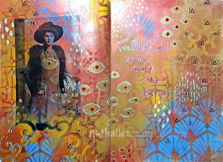
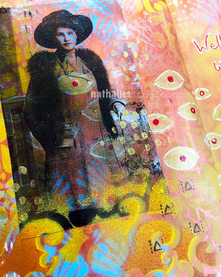
This is another Art Journal spread using my great grandmother’s photo as an indirect image transfer. I love how the transparency of the image let’s the background come through.

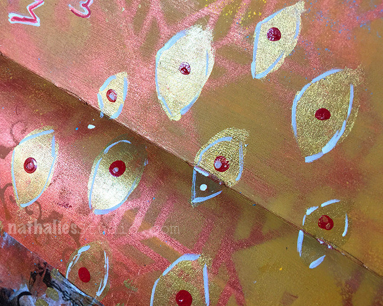
Inspired by Klimt I added hand painted and also stenciled patterns with acrylic paint and acrylic spray paint. I also inked up just part of my Numerals stamp as I thought the triangle would make a great pattern stamp

I love how this came out and I wonder if my great grandmother actually liked Klimt – she for sure liked fashion – I have a nice stash of photos of her and she always liked to dress up.

I will post soon how I do indirect image transfers – they are fun and especially work with photos that have bigger areas of white so you have a clear area that works well with the background.

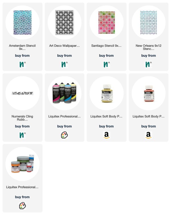
Here are some of the supplies I used for this spread


Comments (2)

  • Sue Clarke

    |

    Love LOVE Love this…colors, photos and quote!

    Reply

Leave a comment