Inspiration From Around the Globe! January 2017

This Tuesday we’re taking a short break from our Creative Squad (they will be back next week with a new February theme to play with!) to bring you some amazing projects from around the globe. My stamps and stencil designs are available for purchase online and maybe even in your local craft store, so crafters and mixed media artists and art journalers from around the world are using them. I am always excited to see how YOU use my products in your own projects. I am even more excited to share some of the beautiful and creative examples of these projects with you today. Enjoy this inspiration from around the globe!


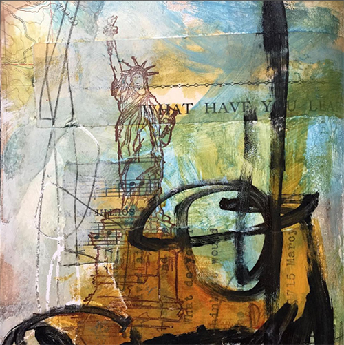
Mary Beth Shaw had some fun with my NEW Lady Liberty Cling Rubber stamp in her art journal in Missouri, USA.

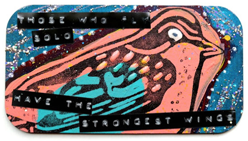
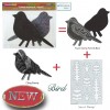
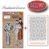
From Virginia, USA, Dana Tatar created this fun mixed media board using my Bird Foam Stamp set and she cleverly used the trouser stamp from my Fashion Dame Stamp set to create the purple stripes in the background.

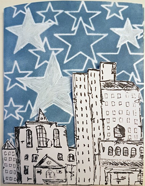
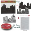
Gunvor Andersson Storck in Sweden brings us a really cool Happy New Year card using my Urban Scribble Foam Stamp set.

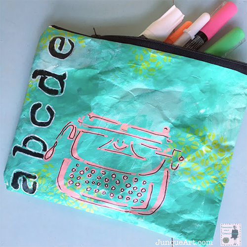
From the USA, Cindy Gilstrap has created a cute pencil case using my Typewriter stencil.

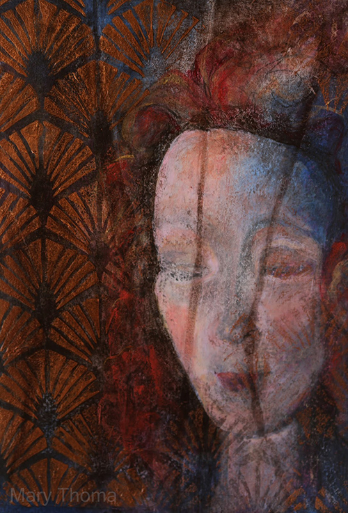
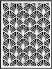
Mary Thoma from Oklahoma, USA has used my Art Deco Wallpaper stencil to create a background in this beautiful mixed media piece.

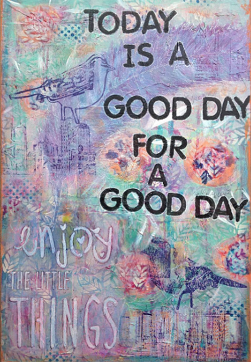
From the Netherlands, Jacqueline van Zuiden created this uplifting mixed media piece using my Bird Foam Stamp set and my Urban Scribble Foam Stamp set.


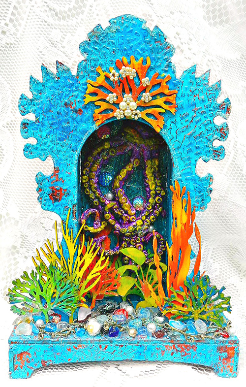
Finally, Kristie Taylor shares this amazing underwater shrine with us and in the video above she shows how she used my Crackle stencil to create such gorgeous texture.


Join us again next Tuesday for another great project from one of our Creative Squad members! They will be working with a new theme for February. And in the meantime, share with me what you’ve been working on with my stamps and stencils. I would love to feature your project in an upcoming post!

Try some of the above techniques for yourself with these n*Studio supplies:


Leave a comment

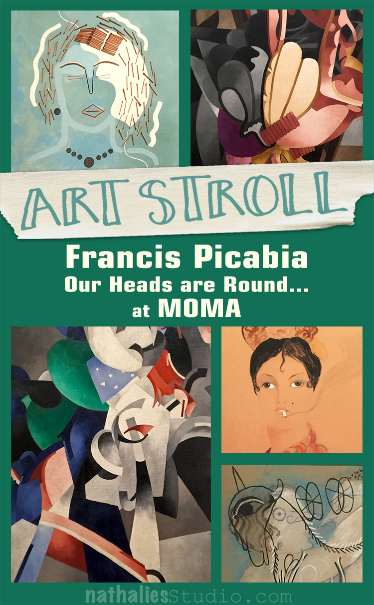
Art Stroll: Francis Picabia at MoMA

Last month I went with some of my friends to the opening of Francis Picabia “Our Heads Are Round so Our Thoughts Can Change Direction” at MoMA
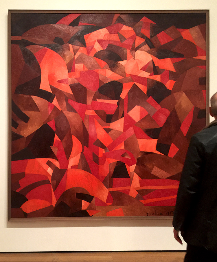
Dances at the Spring II

I had seen a couple of Picabia’s paintings before and love them a lot but to be honest, I didn’t know much of him. My friend Adam, was totally excited because he is a huge Picabia fan and told us, he was waiting for this exhibition for a long time.
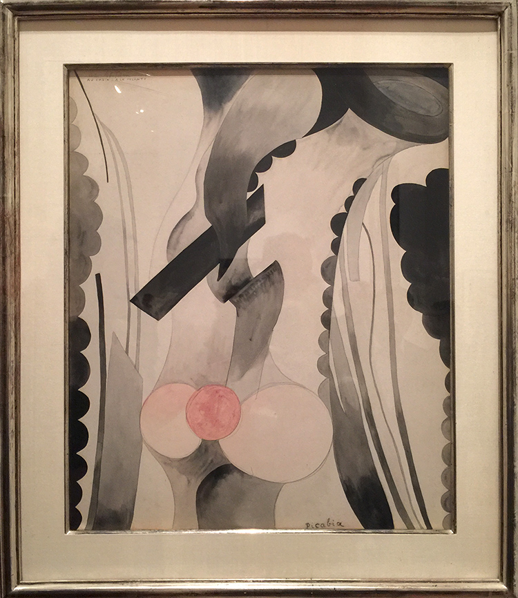
I was pleasantly surprised and loved loved loved the exhibition. Every single one of the rooms in the exhibition offered something different in style and was often challenging.
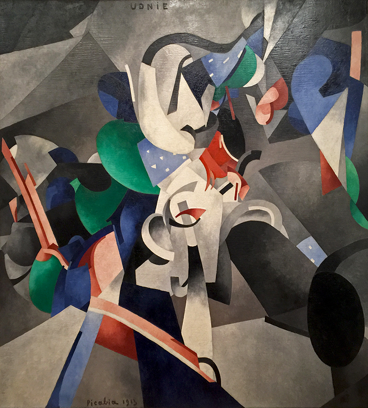
Francis Picabia, 1913, Udnie (Young American Girl, The Dance), oil on canvas

The exhibition covered Picabia’s entire career. He was born to wealth in 1879 and apparently all he did was painting…and partying. He had a lot of humor and was by many, including himself called a Prankster.
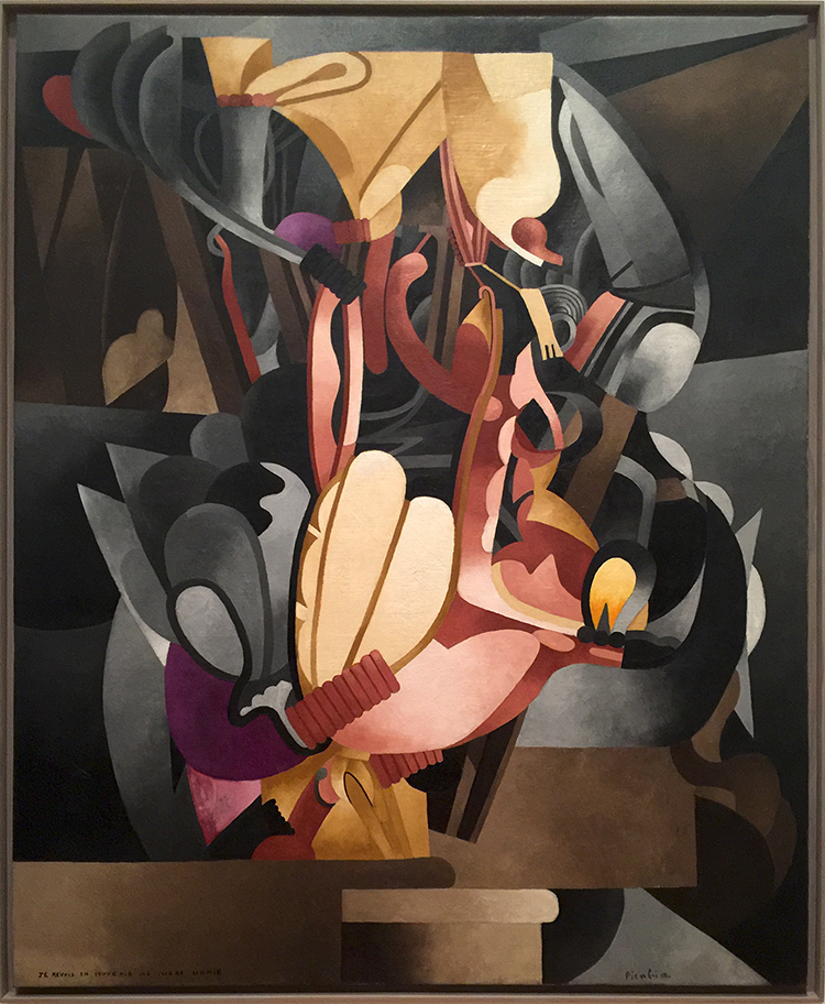
Arriving in the next room all the artwork became very industrial, mechanical and added different materials to the flat canvas. He was also a big part of the Dada-Movement.
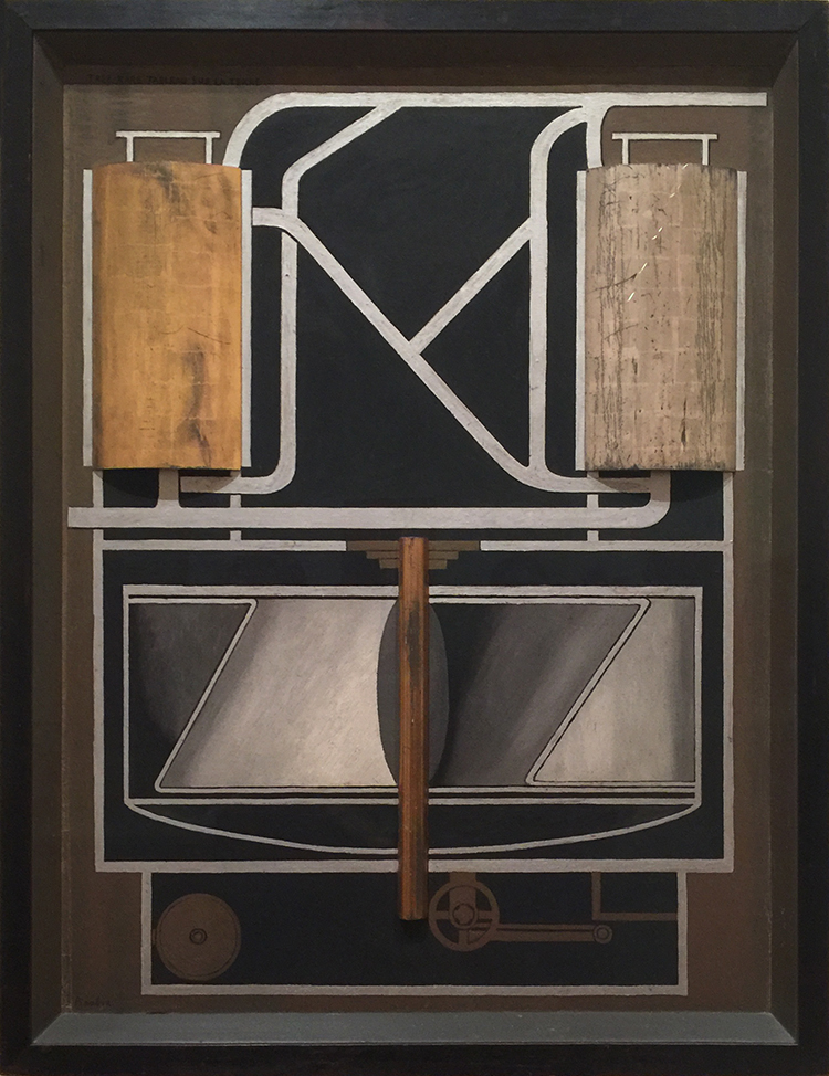
Très rare tableau sur la terre (Very Rare Picture on the Earth) (1915) Oil and metallic paint on board, and silver and gold leaf on wood, including artist’s painted frame
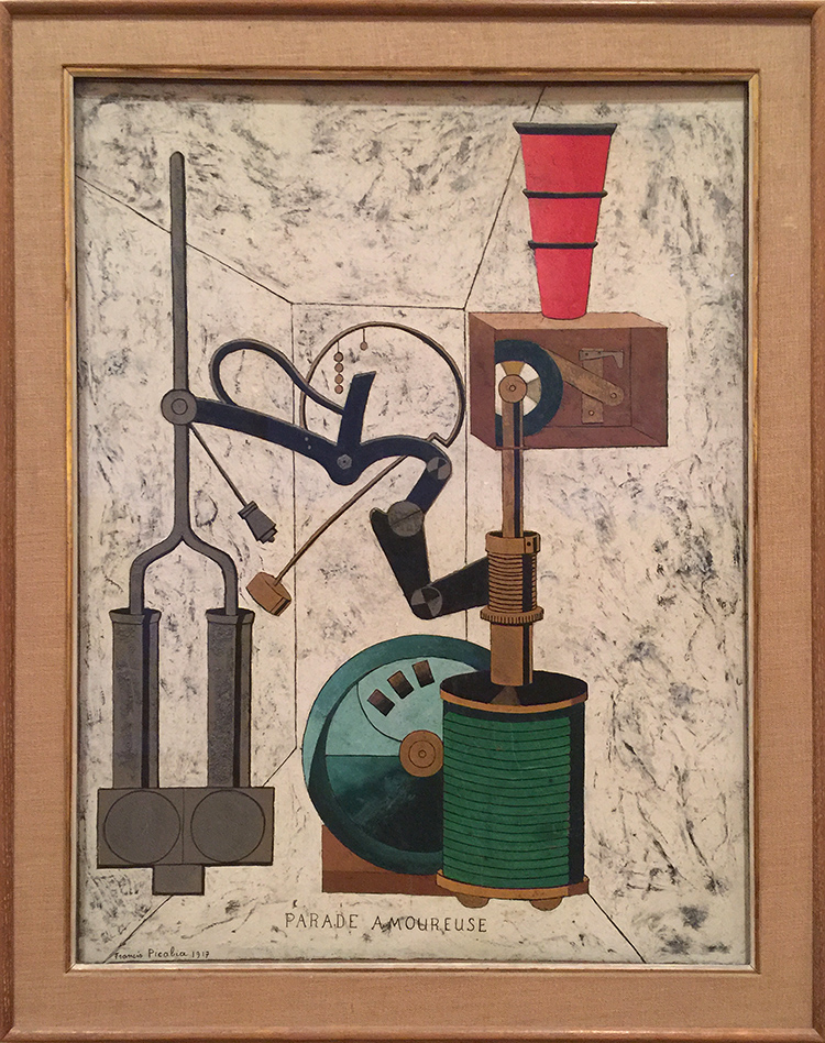
Amorous Parade, Francis Picabia, 1917- Oil, gesso, metallic pigment, ink, gold leaf, pencil and crayon on board.

And then just as you got used to it …everything changes once again
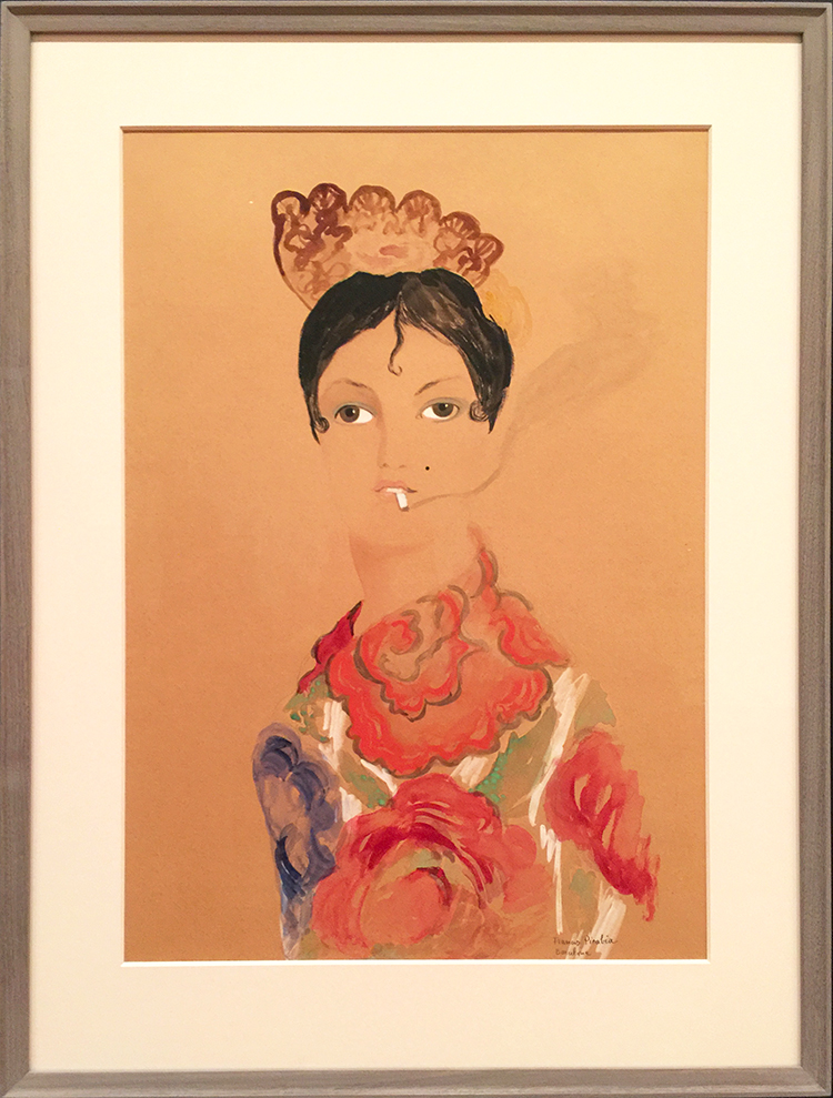
and again
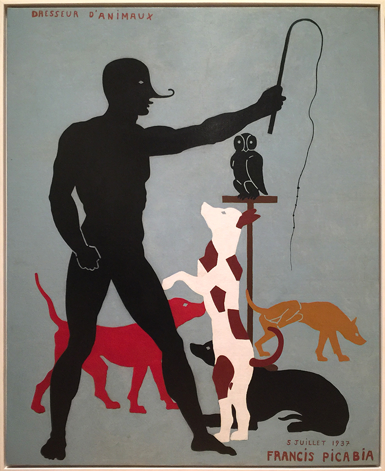
Animal Trainer, Francis Picabia

The above painting is seen as one of Picabia’s typical jokes and mocking fine craftsman ship. The hand of the figure shows prominently bridges – a typical sign of using stencils – and the dogs as well are created with the use of stencils. This was frowned upon on when he painted this – which was in 1923 and not as he also placed as a joke onto the canvas in 1937. Also check out what the yellow dog is doing in the background.
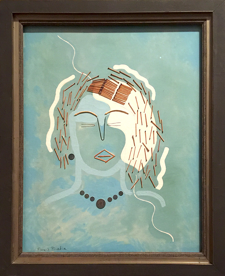
I loved his playful use of unusual materials in the next gallery -like matches and canvas wedges, brushes, coins. It’s been all done before – it is fun – it is humorous and amazing.
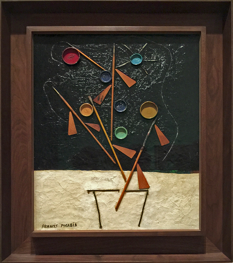
Flowerpot , Francis Picabia, 1924-25. Enamel paint, Ripolin paint-can lids, brushes, wooden stretcher wedges, string and quill toothpicks on canvas.

One gallery was dedicated to his Transparencies 1927 – 1930. I also loved all the different frames- a topic I have talked about in many other posts . They are probably still original because museums weren’t that interested in his artwork up and until the 50s – and so fortunately they did not get destroyed to go with the “museum style frames”
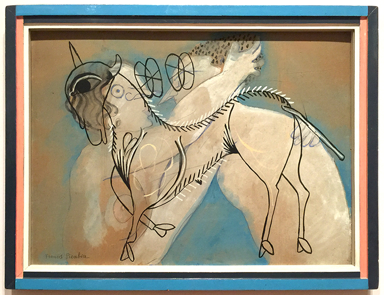
Working in his large new studio in Mougins, Picabia painted his Transparencies by alternating layers of paint with layers of resinous varnish. This process allowed him to lay linear motifs atop one another while keeping them distinct. These richly layered, multi referential compositions interweave an often dizzying array of con tour images drawn from such diverse sources s Renaissance painting, Catalan frescoes, and the popular culture of the day.
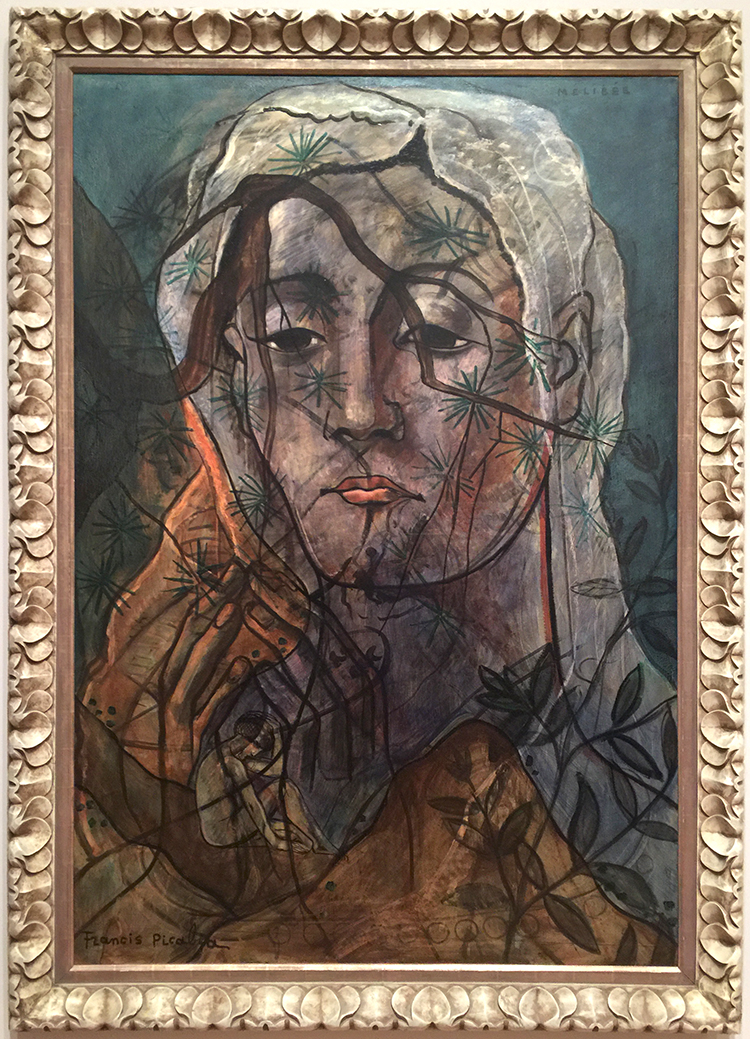
 

Mélibée

Picabia’s unorthodox application of unusual materials sometimes resulted in surfaces that could be interpreted as damaged or in need for restoration. In fact, these effects were often deliberately induced by him. In Portrait of a Woman- shown below, Picabia enhanced some of the bumps with dark paint, purposefully amplifying the paints’s already pronounced topography.
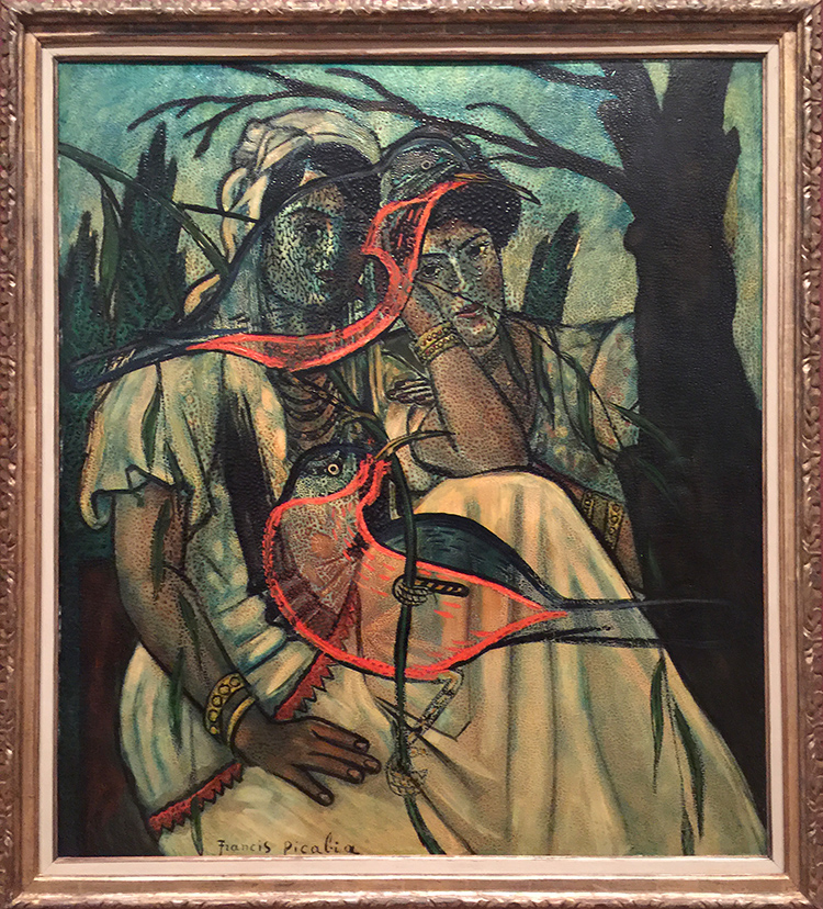
Portrait of a Woman, Francis Picabia, 1935-37 -Oil on Canvas
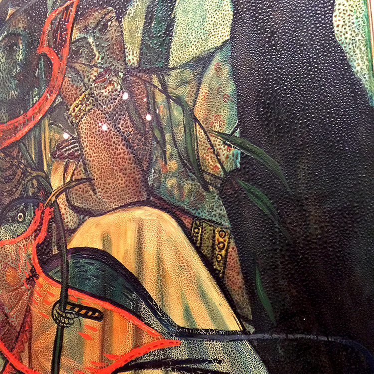
Isn’t that amazing? And then…it changes again
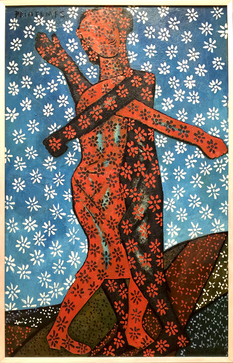
Spring, Francis Picabia, 1937-38/c.1943 . Oil on wood

And again

The Adoration of the Calf, Francis Picabia, 1941-42, oil on board.

Although Picabia was a resolutely apolitical artist, it is difficult not to read this painting and its cynical vision of the worship of false idols as an engagement with contemporary politics.
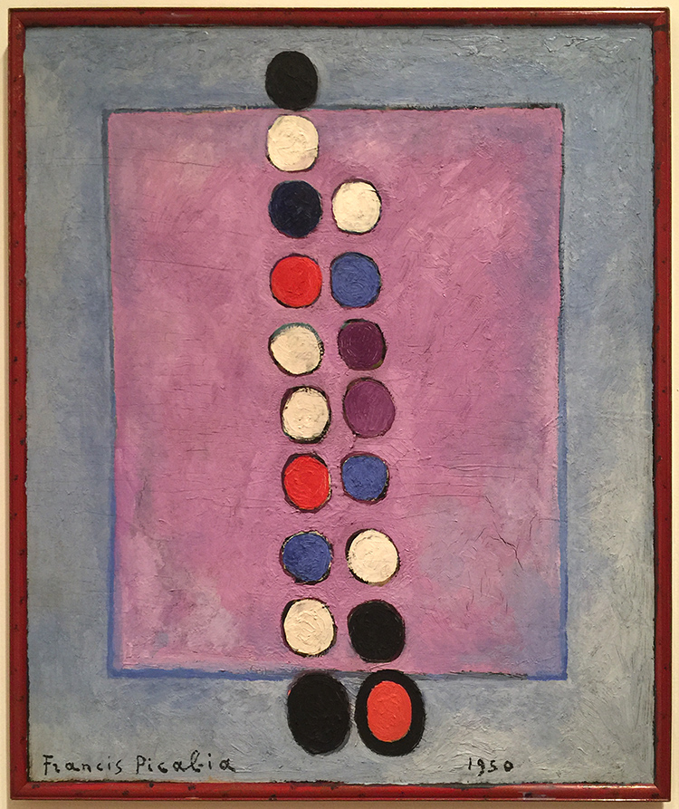
Symbol, Francis Picabia, 1950, Oil on canvas

“If you want to have clean ideas, change them as often as you change your shirts.” (Francis Picabia). Our life changes, in that I guess we are consistent and so was Francis Picabia in his art.

If you are in the area make sure to visit this exhibition before it closes in March. I will definitely be back to see it once more :) I hope you enjoyed this little Art Stroll.

 

Comments (2)

  • Linda Faber

    |

    Thanks, again, Nathalie, for a great tour of an intriguing exhibit. I love his abstract pieces! This artist is new to me and I wish I could get up to NYC (oh but it’s too cold for me now) to see it. And….last year you introduced me to Anselm Kiefer….whose name has been popping up in so many places, and is now on exhibit in Miami! As a retired teacher myself, I love getting these inspirations and knowledge from you….and I know it must be a kick for you as well.
    Linda

    Reply

    • nathalie-kalbach

      |

      thank you Linda, for joining me :) Ha- it is cold here right now …not my favorite thing about NYC ;) Ohhh I have to come to Miami for the Kiefer Show- he is one of my very very favorites!!! Have a gorgeous week, Nat

      Reply

Leave a comment

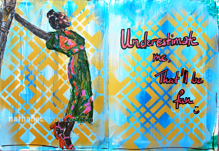
Go ahead, underestimate me! – sassy Art Journal Spread ;)

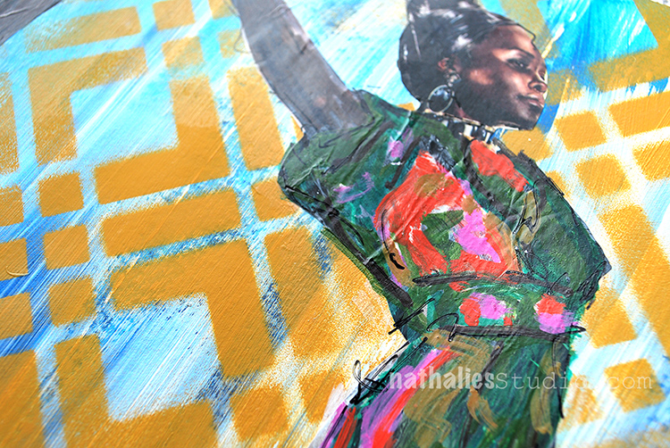
I thought it was funny :) And I love Lupita Nyong’o and I wanted to use her image from a magazine.

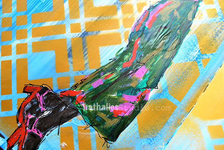
I used my new Chicago Stencil and sprayed over it with acrylic spray paint.

I used different markers to paint over the magazine image. When I applied the magazine image, it crinkled up a bit, which I add to “oops, oh – good now it has some wrinkles and texture- good”

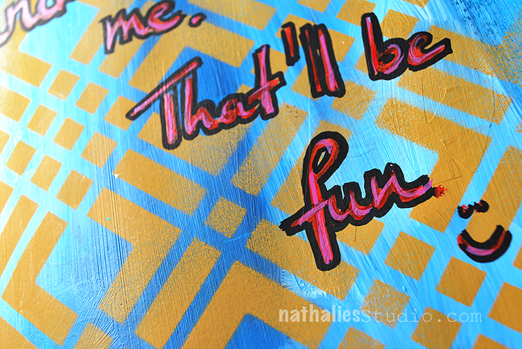
I added the journaling with a red and pink marker and traced the outside of the letters in black. I like the page- even though it is a pretty simple one in terms of layering

Here are the supplies I used – some links are affiliate links:


Wishing you a gorgeous day!!!!

Comments (6)

  • Julie B

    |

    Love this (and even better in person)……can’t wait for the stencil; love how clean the image from this stencil is with spray paint and the quote cracks me up. Thank you!

    Reply

    • nathalie-kalbach

      |

      Thank you Julie! HA and now that you played with spray paint in my class…maybe you are on it yourself ;)

      Reply

  • LauraB

    |

    yaaaassss, Queen, yaaaaasssss!

    Reply

  • Barb Charlotte, NC

    |

    Very creative. Thanks for sharing.

    Reply

Leave a comment

Be Happy – ArtFoamies for Clay and Pottery!

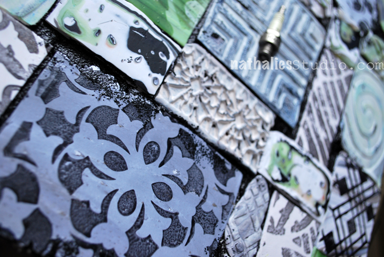
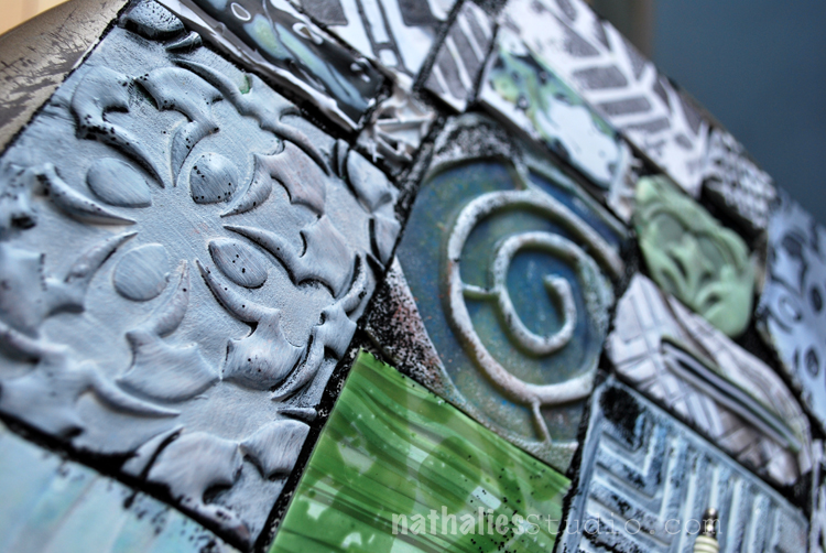
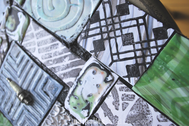
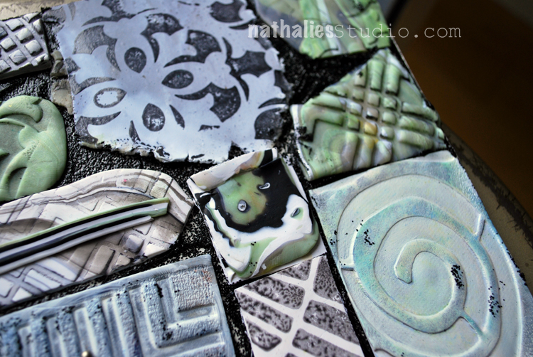
I made this piece for the ArtFoamies booth at Creativation (a Craft and Hobby Convention). Additional to my Foam Stamp Designs as you know them, ArtFoamies just released my designs also in a more sturdy and harder foam form so that they can also be used for pottery and clay. What a great excuse to try those and have a play date with  my friend and neighbor Donna Greenberg who is an amazing Polymer Clay Artist. What a lucky ducky I am with such a great teacher! Check her amazing work out!!!

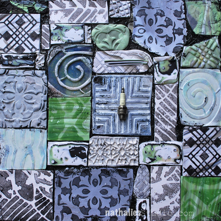
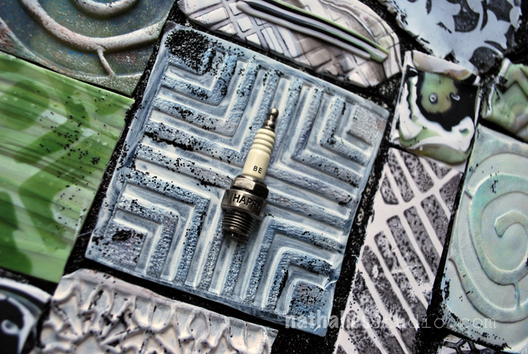
While those stamps work very well with paper clay, Donna showed me that for Polymer Clay I would have to use some softer versions to get a nice impression. I played around with all kinds of fun and new to me stuff. I made impressions directly into the polymer clay, for example here with the Manhattan Foam Stamp for Clay.

I stamped with some liquid polymer clay on top of polymer clay- ohhhh I love this! See the Versailles Stamp on the bottom.

Here are some more varieties of impressions with Versailles and the Batik Stamp.

On the top right you can see the Chicago stamp stamped with liquid Polymer Clay.

I cut the pieces and mounted them with Black Lava onto a board. I totally love all the texture and the outcome. One of my favorite pieces and a big stretch for me working with a material I have never worked with before. You can buy the Clay versions of my stamps directly at ArtFoamies – I carry all the normal Foam Stamps as well :) I cannot wait to play a bit more with those – next up is paper clay.

Are you working with Clay, Polymer Clay or Pottery and would you use those?

Comments (4)

  • Marna

    |

    Excellent! I love working with textures and clay and have used embossed wallpaper with patterns in my pieces. Can you describe how you used the liquid clay?

    Reply

    • nathalie-kalbach

      |

      thank you Marna. I used it like paint on top of the foam stamp and stamped with onto the still non baked polymer clay. Then I baked it. Love the visual and actual texture this created and the liquid polymer clay is just slightly sitting on top of the polymer clay piece.

      Reply

  • joi

    |

    Just mind boggling Nat – how INCREDIBLE. These are WONDERFUL. Never even imaged such wonders as these! Xj.

    Reply

    • nathalie-kalbach

      |

      awe- thank you so much Joi – glad you like it :) Have a gorgeous weekend!

      Reply

Leave a comment

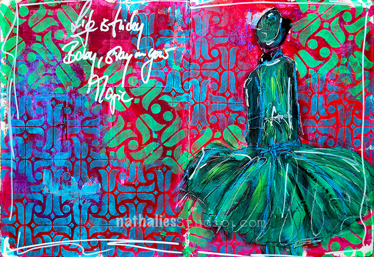
Life is tricky

Life is tricky, Baby, stay in your magic.

I had a good time creating this page when I wasn’t really cheery but playing with those colors and with my new Amsterdam Stencils – 9×12 and 6×6 – made me happy again :)

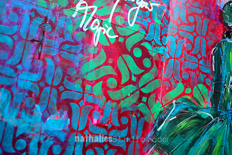
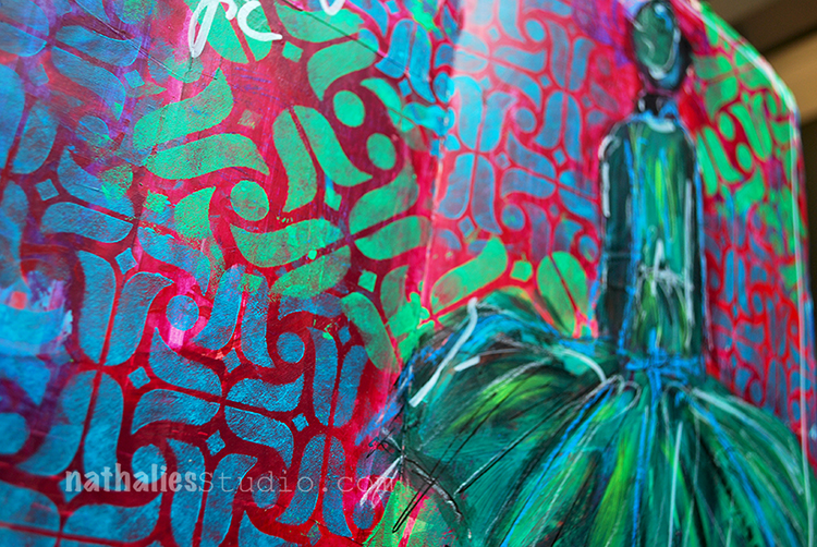
I used red and green as complimentary colors on purpose to make everything pop a bit more. I applied acrylic paint with a foam stamp through the stencils.

I love that the pattern is slightly different in the 6×6 stencil and the tulips are also bigger- different size, different pattern but same elements – an easy way to tie the design together and apply some layering.

I used a small brush to paint over the magazine image and added some highlights with pastels – I love how the blue pastel pops off the dress.

Here is the supply list- some links are affiliate links:


I hope your day is super magic today!

Comments (12)

  • jbonomo

    |

    Stunning page! This stencil is one of my favorites (there are too many favorites like Chicago) and thank you for your color theory tutorial at AWOH. I love how everything pops off the page. Me thinks that your next venture will be high couture.

    Reply

    • nathalie-kalbach

      |

      Awe- thank you Julie! It was wonderful to have you at AWOH!!!!

      Reply

  • sunmoongal

    |

    Hi, love this spread. Have to get some stamps!

    Reply

  • Linda Faber

    |

    Wow! I so love this page! So dynamic in color and style. Great stamps too.

    Reply

  • joi

    |

    What SUPER pages Nat. Love your sentiment and the neat dress PLUS your amazing patterns and colors! Xj.

    Reply

    • nathalie-kalbach

      |

      Awe- thank you Joi – I want to own that dress :) Have a wonderful day !!!

      Reply

  • Sandra

    |

    Nathalie, I’ve signed up for one of your classes at Artiscape this year. Excited to meet you. Will your stencils and foam stamps be available for sale there?

    Reply

    • nathalie-kalbach

      |

      Sandra, so happy you will be there and I will meet you! I think stencil and foam stamps as well as my rubber stamps will be there – I am in the midst of organizing that ;)

      Reply

Leave a comment

A Visual Interview with Rachel Greig

Meet my friend and artist Rachel Greig. See how she feels in January, what she can never be without and how she starts her day with a yummie treat :)

A Visual Interview with Rachel Greig from Nathalie Kalbach on Vimeo.

Rachel is one of the teachers of Creative JumpStart 2017 along with 26 other artists – read more about this Mixed Media Online Class and sign up here. It is not too late to join us!

Leave a comment

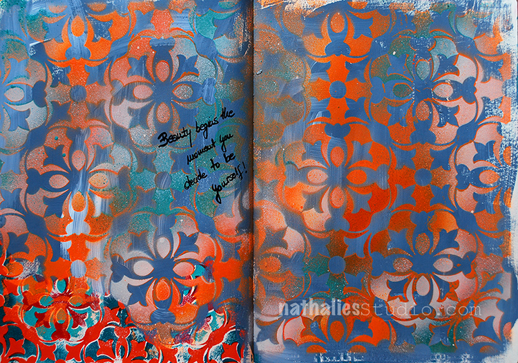
When Beauty Begins – Art Journal Spread

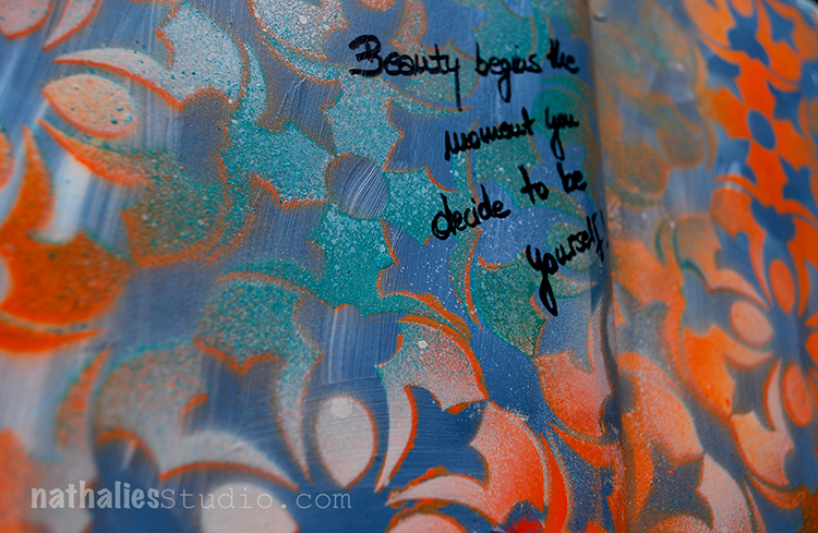
Beauty begins the moment you decide to be yourself!

I painted the background with different blue and teal acrylic colors – also mixing some white gesso in there in between.

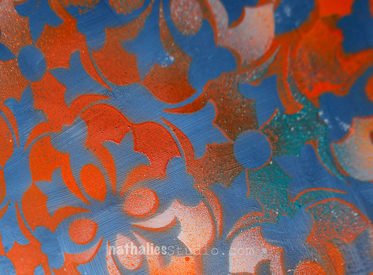
I layered the Versailles 9×12 Stencil on top and sprayed some orange and parchment colored acrylic spray paint over the stencil.
I love the dimension spray paint layered up can give and this is definitely one of my favorite stencils.
Here are the supplies I used for this art journal spread – some links are affiliate links:


have a beautiful day!!!

Comments (1)

  • joi

    |

    Absolutely FABULOUS – wow… wow… love this. And…. YOU dear Nat are always just YOURSELF and BEAUTIFUL! Xj.

    Reply

Leave a comment

Dream a New Dream – Michelle Rydell


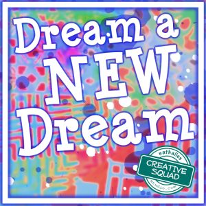
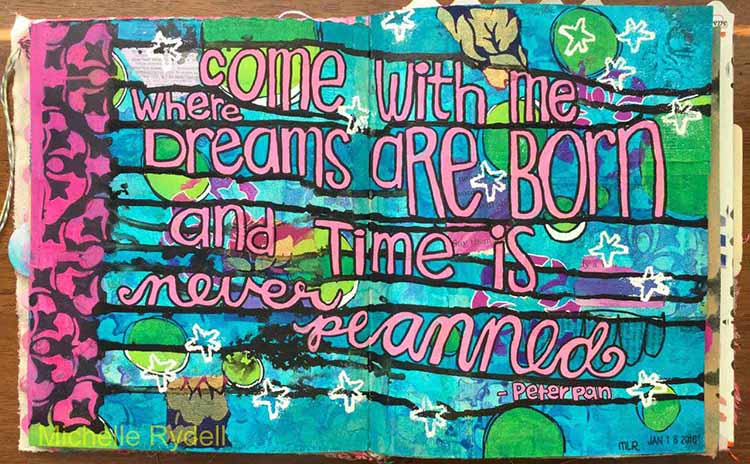
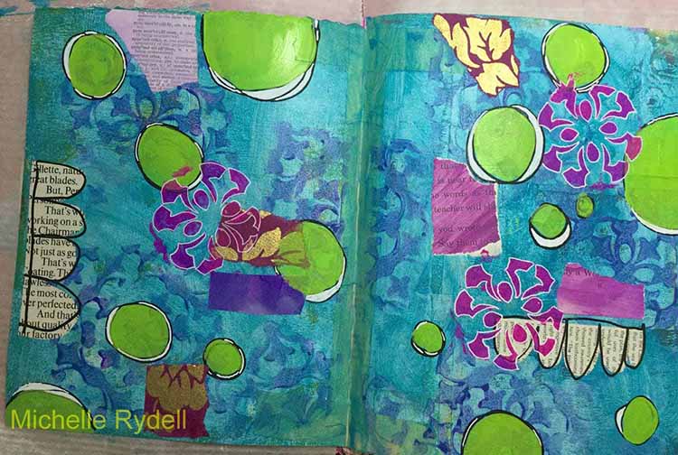
Hello! Today Michelle Rydell from my Creative Squad is sharing a super happy art journal spread using my Versailles Positive and Negative Foam Stamp set, my new Star Tag Cling Rubber Stamp, and her take on this month’s theme: Dream a New Dream. This January, let’s focus on all the possibilities of a fresh start.  What are your dreams for this year?  Whether it’s art-making, family, travel, or work related, January is a great time to dream about what the future could hold.


This month’s theme is sooo perfect for me, because New Year’s Eve/Day is my favorite holiday!  I adore the fresh start and the time to “Dream a New Dream!”

I had a quote that I wanted to document in my journal, and this was the perfect opportunity…

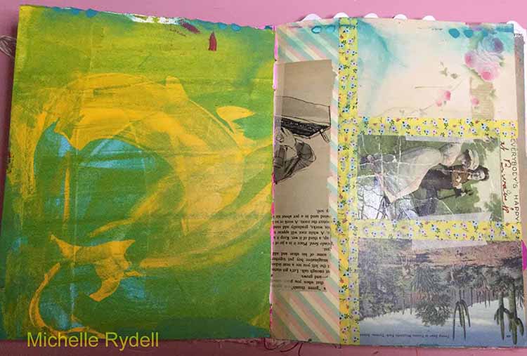
I’m creating this spread in my 8” x 10” junque journal. For reference, here’s what the pages looked like before I started…

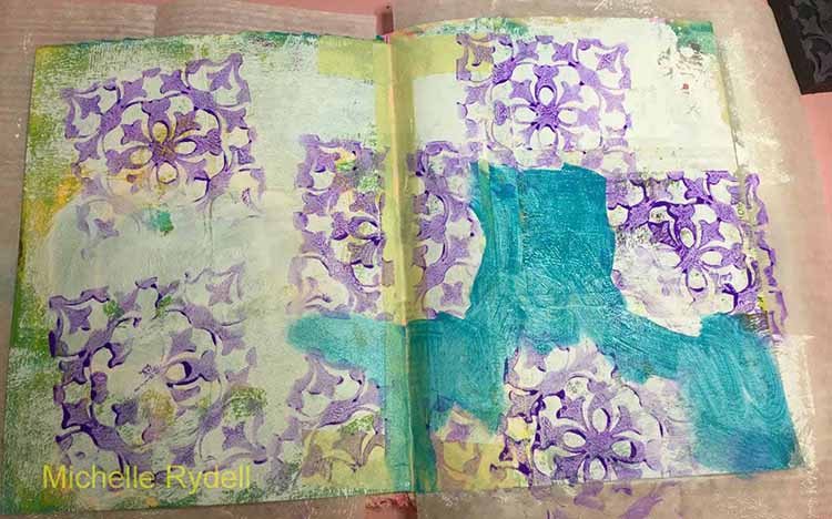
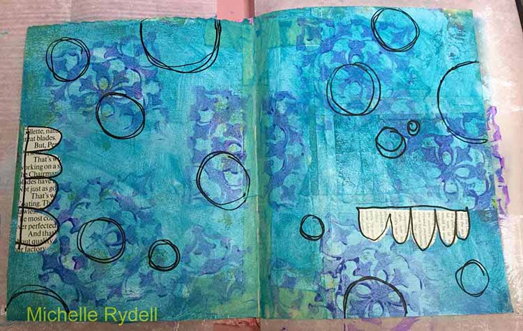
I started building the background with a coat of gesso, some random stamping of one of the Versailles stamps (the negative), and a thin coat of turquoise paint.

The second layer was done with paint pen doodles and a couple of paper bits.

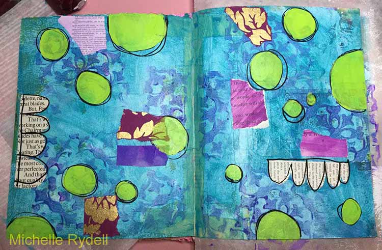
Third layer includes more scraps of paper – purple to bring out the underlying stamped images, and lime green for contrast…

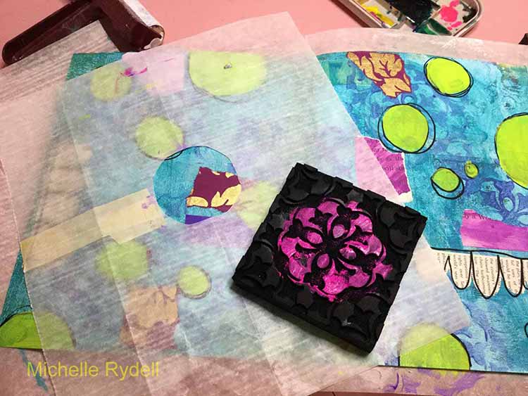
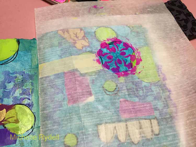
One of the cool things about the Versailles stamps, is that, when I look at them I see designs within designs! Here, I wanted to bring out the circular part of the stamp, so I cut a circle in some deli paper – just the size of the part of the stamp I wanted to capture; then painted up the positive stamp and stamped thru the hole in the deli paper.  (You could actually do this without the deli paper, if you were a little more careful than I was with the paint application)…

I outlined the circle patterns with a white paint pen…

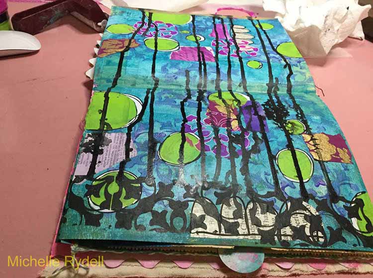
Then I turned the spread sideways, stamped the negative stamp with black paint along the left edge, and added some flow paint along the bottom. Lifted the page so it dripped randomly down the page.  These drips would work as journaling lines for my quote…

To finish the page, I filled in the spaces on the border and added the quote with a paint pen, used a Faber Castell Pitt Brush Pen to darken the background in places, and added some embossed white stars, using Nat’s new Star Tag stamp.


Thank you Michelle! I love Michelle’s uplifting quote and how she used the drips as journaling lines! In addition to some collage paper, Michelle used these supplies – some links are affiliate links:


Play along with us! I love to see how you interpret our monthly themes. Email me how you used my stencils and stamps with the theme and email me an image – I would love to share your projects in my “n*Spiration From Around the Globe“.

Comments (3)

  • Sharon Fritchman

    |

    Michelle, your style is absolutely amazing. I love everything about your art journal spread and your take on the theme.

    Reply

  • Jessica Sporn

    |

    What a gorgeous page and a great tutorial. I love that quote, the stamps, and Michelle’s exuberant style!

    Reply

Leave a comment