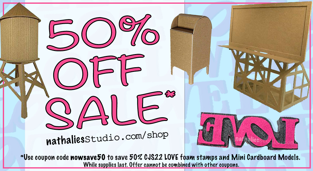
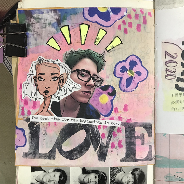
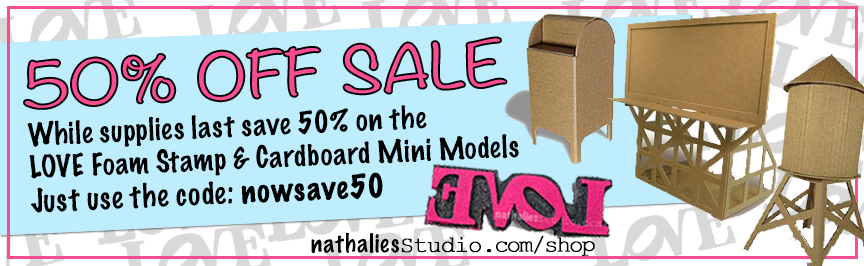
I’m running a big blowout sale on some of my products and you can save 50% off! Starting today, just use the coupon code nowsave50 at checkout to save on my CJS22 Limited Edition LOVE Foam Stamp and all of my Mini Cardboard Model kits. This offer will be good as long as supplies last :)
Here is what’s on sale:
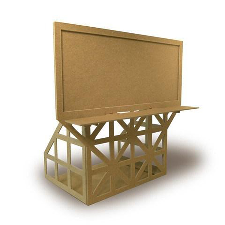
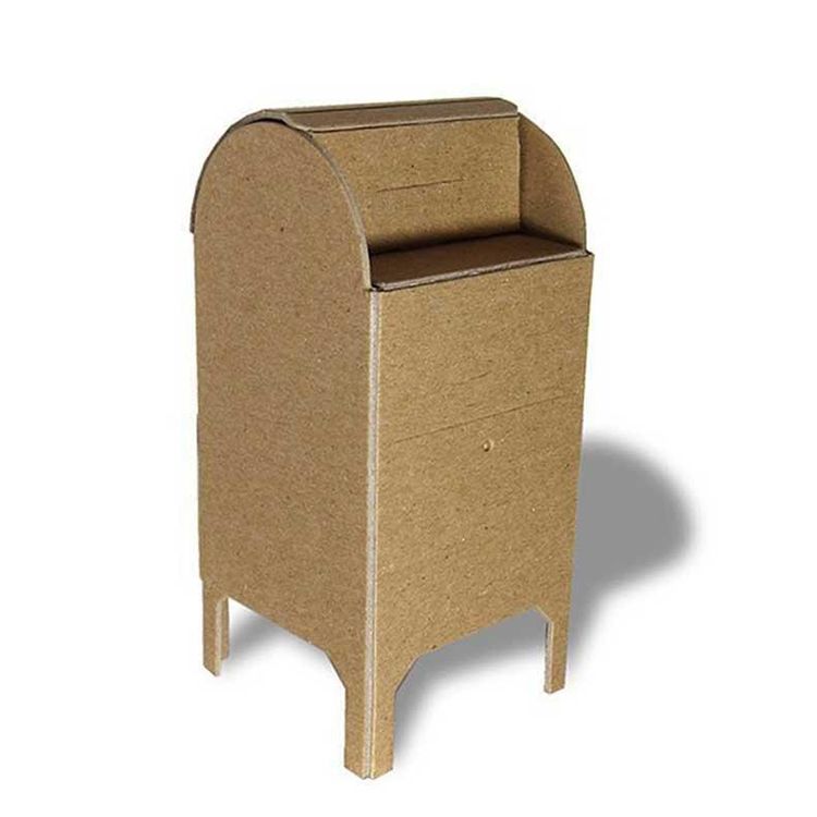
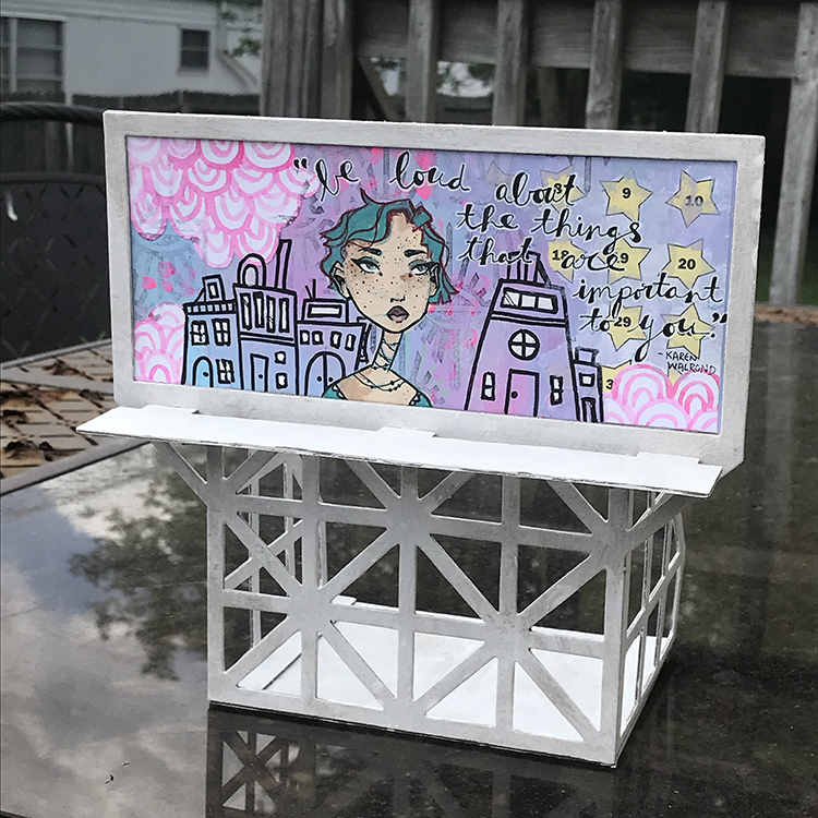
The cardboard kits are a blast to make and paint on a rainy day. We did have the Creative Squad play with those one month and look at some of the results:
They would also be a great gift idea for a young or young at heart creative in your life ;)
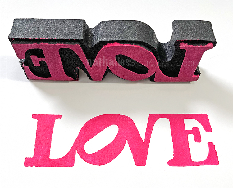
And then the iconic LOVE stamp. Don’t we all need some more of this in the world?
Strolls through my hood get me out of my studio, they help me get unstuck and often I get inspired by what I see and get new ideas to create something. It is part of my philosophy about Artful Adventures in Mixed Media – which is the subject of my book. Here are some photos that I gathered in the last couple weeks.
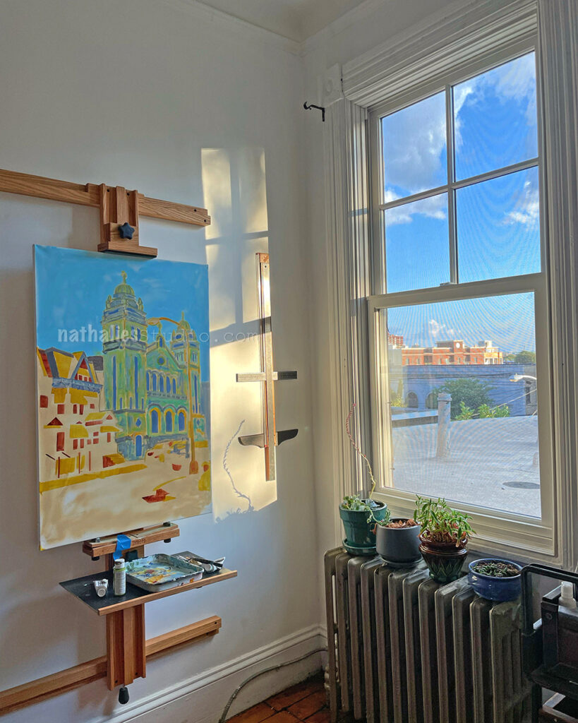
I really love the light in my new studio and I am looking almost forward to colder months that make us stay home more and me spend more time in the studio.
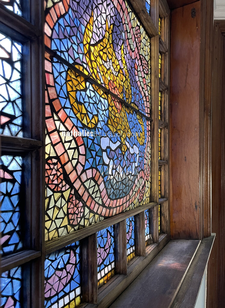
Our stained glass window in the kitchen needs a lot of love as it is starting to sag and bulge and I had to take some photos to get things in motion for the restoration – isn’t this just amazing? I love love love all the little bits and pieces and color variations.
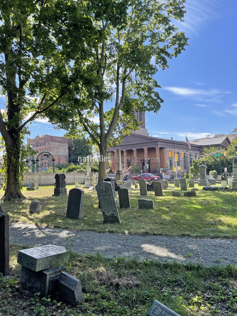
This old cemetery – which has it’s first recorded burial in 1680 is the last resting place for a lot of the older families from the Netherlands that settled here around the 1630s. It is never open – so it was a treat to be able to go in finally.
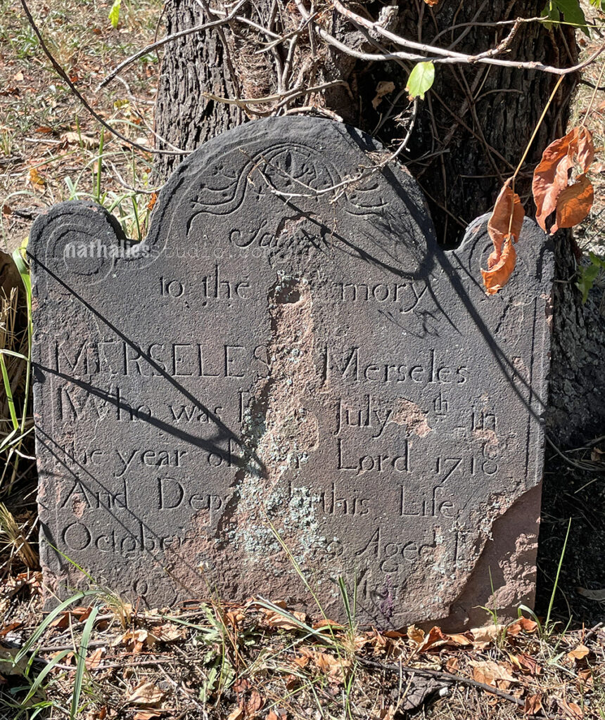
A lot of the gravestones cannot be read anymore- but every name is a street in Jersey City.
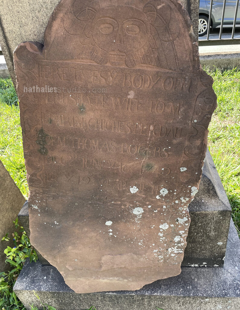
This one has this interesting skull engraving on the top.
And then we stumbled across this stone …and I gasped – not only because it was half eaten by the tree but because I recognized the name and the dates right away. Albert J. Vreeland’s widow and his children lived after his death in our house for a couple years – and I had found his son’s WWI enlistment etc. It was somehow touching to see the gravestone …I know weird, but then I thought- hey, there hasn’t been anyone in decades probably who stopped at this stone and thought of this person…so it is meant to be.
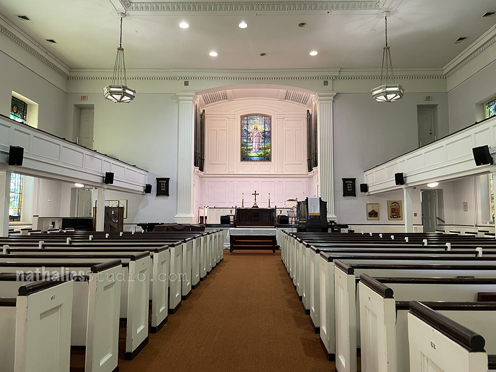
Across the cemetery is the Old Bergen Church which has been re-built several times and has each of the old headstones in walls. It was the first time that the church was actually open as well and I could see it since we moved here
It is a pretty church and quite similar to some of the Northern German churches I have seen.
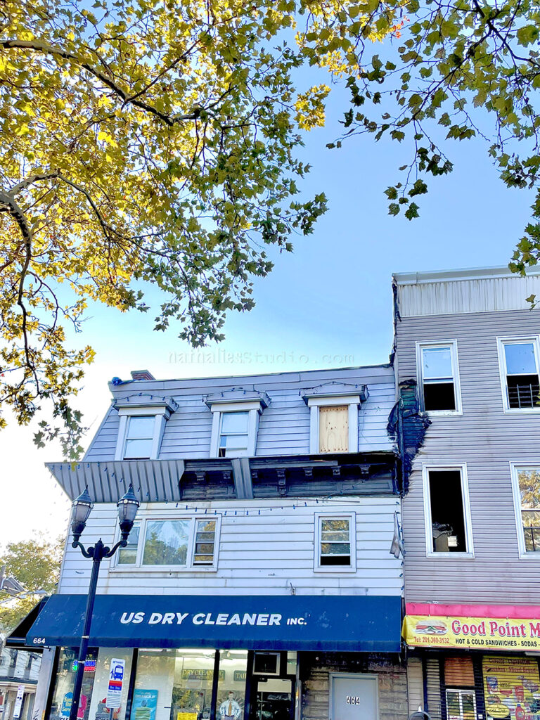
This one is a bit sad as the two buildings had a huge fire – everyone is ok. The reason I am posting it, is because of the cornice. For years I walked by this building and said “I bet there is a really cool cornice underneath that ugly vinyl siding” and there it is. I am glad the people in the houses and business owners are ok. So scary.
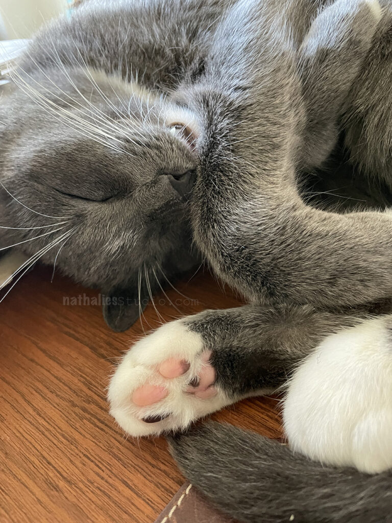
Meanwhile this guy just sleeps on my desk – being a Pretzel
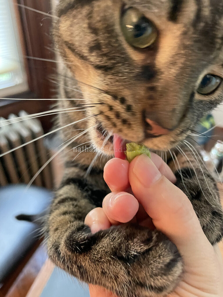
And this guy loves lettuce …don’t ask …
Hope you enjoyed the stroll this month – see you soon :)
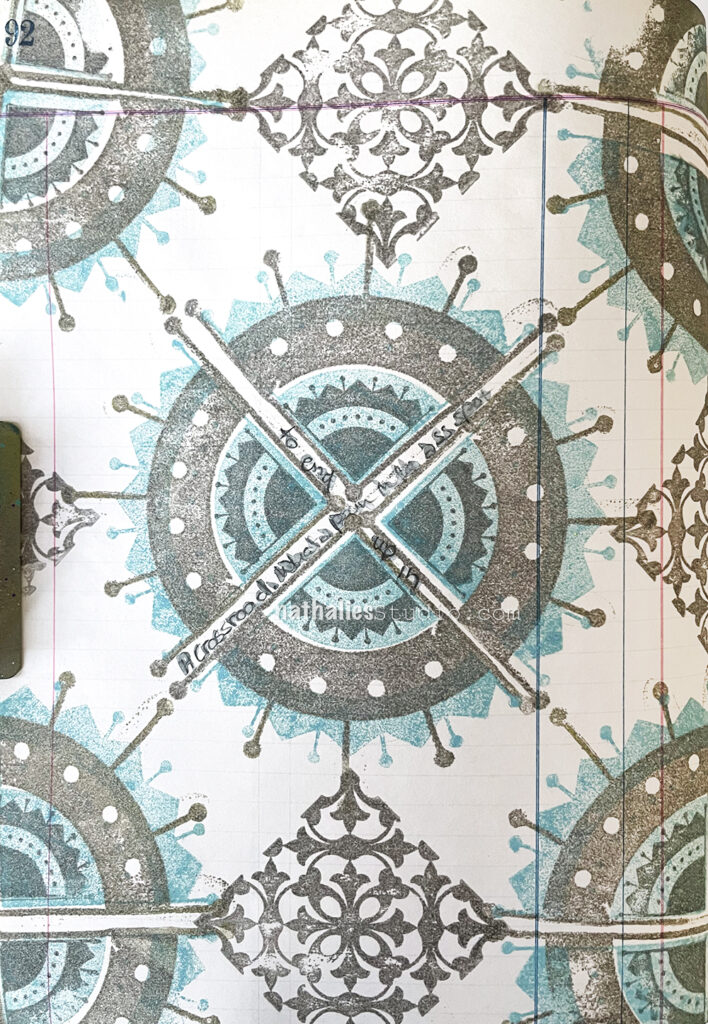
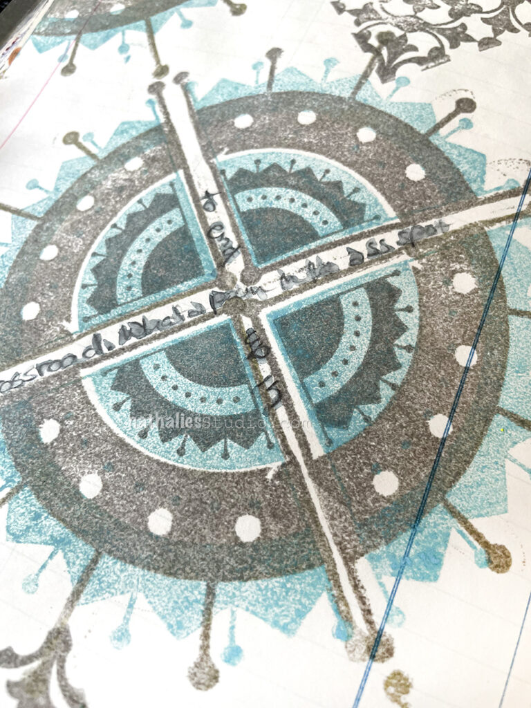
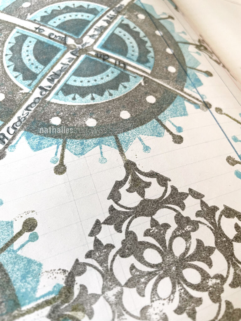
“A Crossroad. What a pain in the ass spot to end up in.”
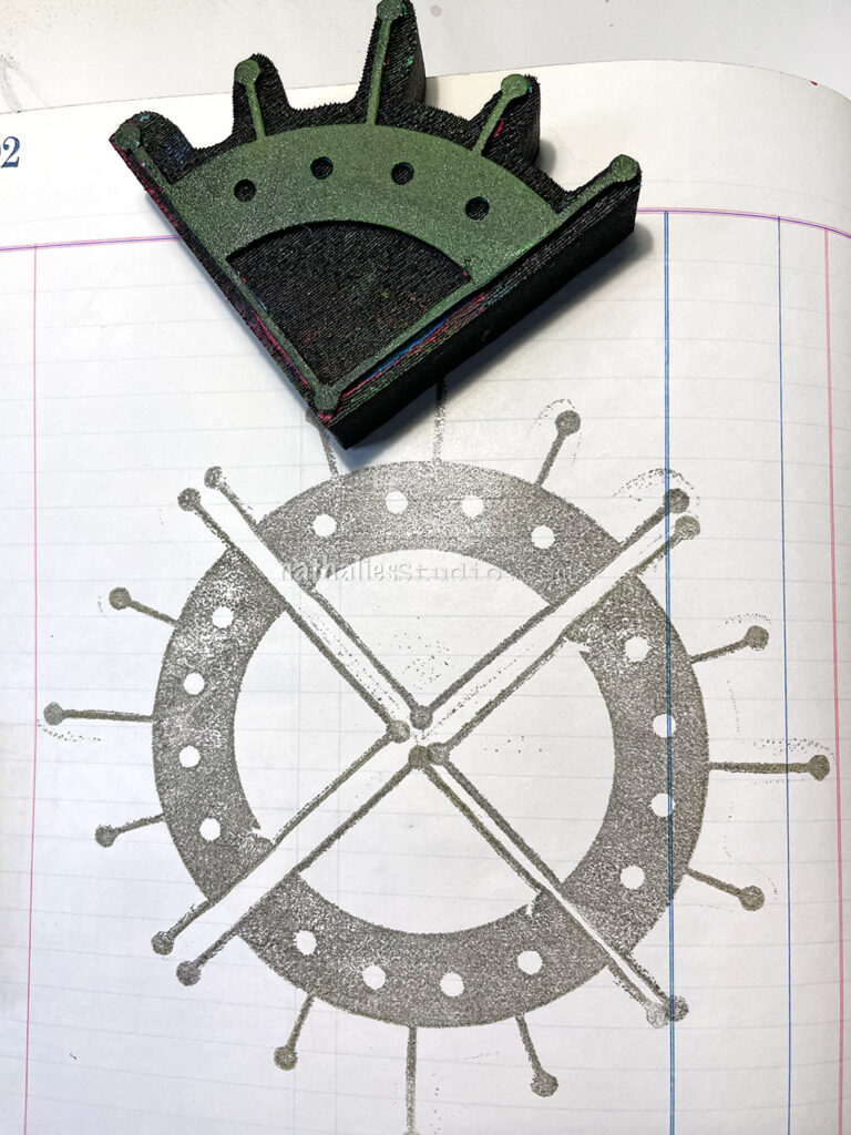
I started by stamping one of my Mini Motif foam stamps in a circle with grey ink…
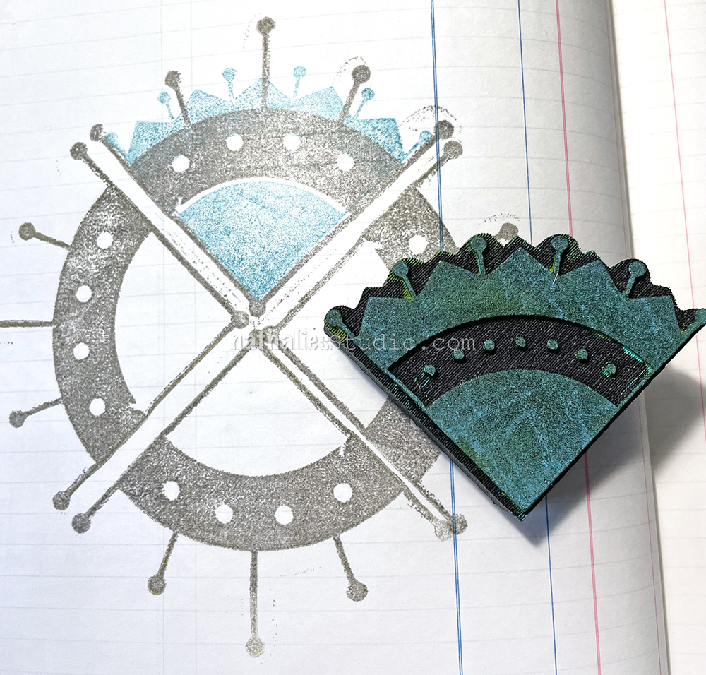
then layered a second Mini Motif stamp on that in teal…
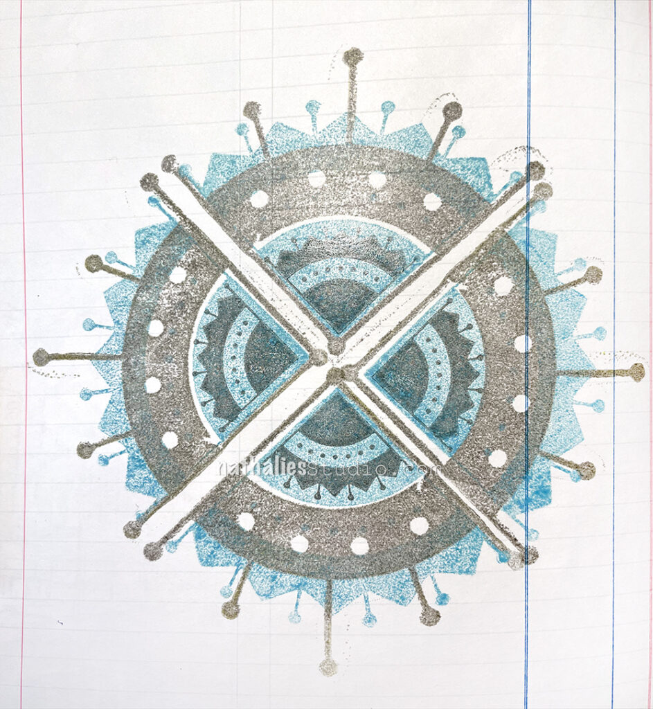
and then finally added the rubber stamp Mini Motif stamp on top, using the Versafine in grey again.
Next I added the Versailles rubber stamp from the Floral Tile Large set for a pattern – it reminds me a bit of all those Minton tile patterns I have been seeing lately while looking at house accounts on instagram.
I did my journaling with a water soluble sketch pencil.
Hello from my Creative Squad! Today we have a post and video from Riikka Kovasin who is sharing an art journal page that is an abstract and thoughtful take on our theme this month: I am a Collage – We are all complex beings with many different facets. Create a “self portrait” piece using collage to represent parts of yourself, either literally or in an abstract way.
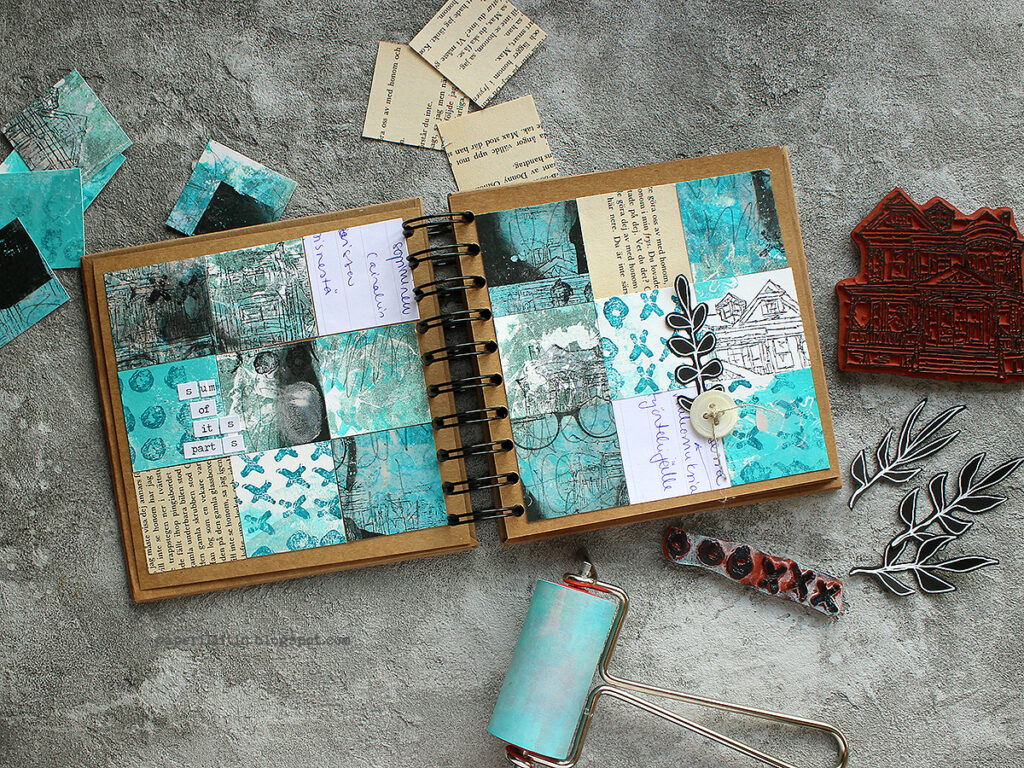
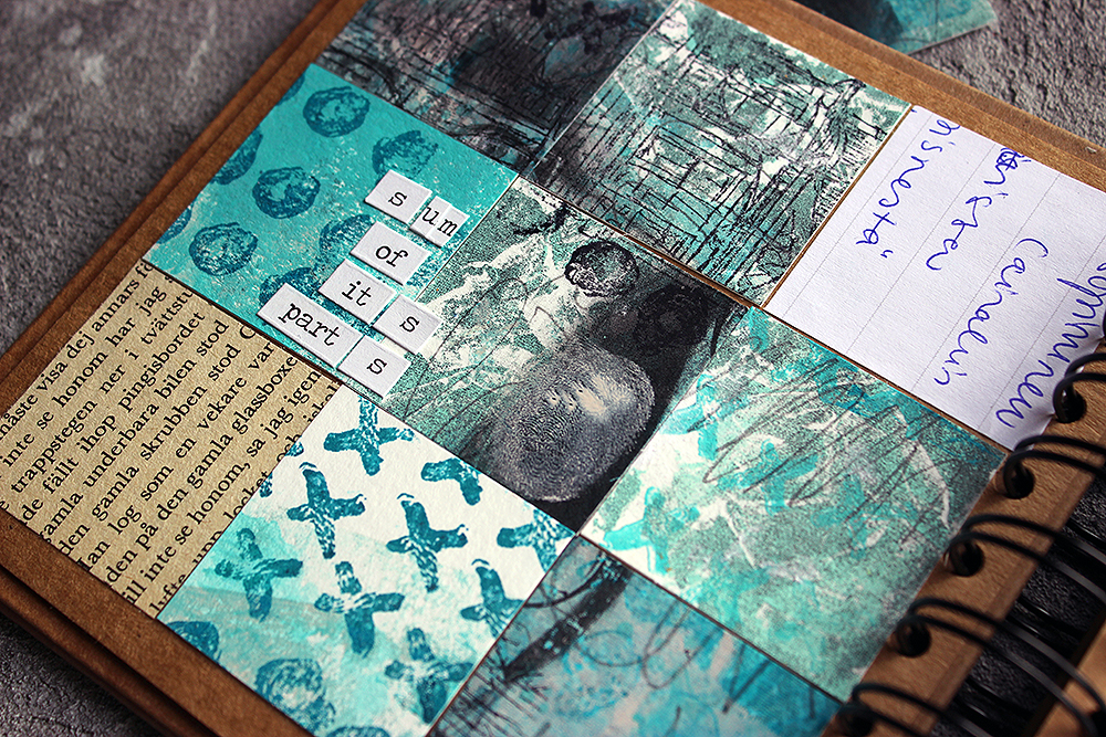
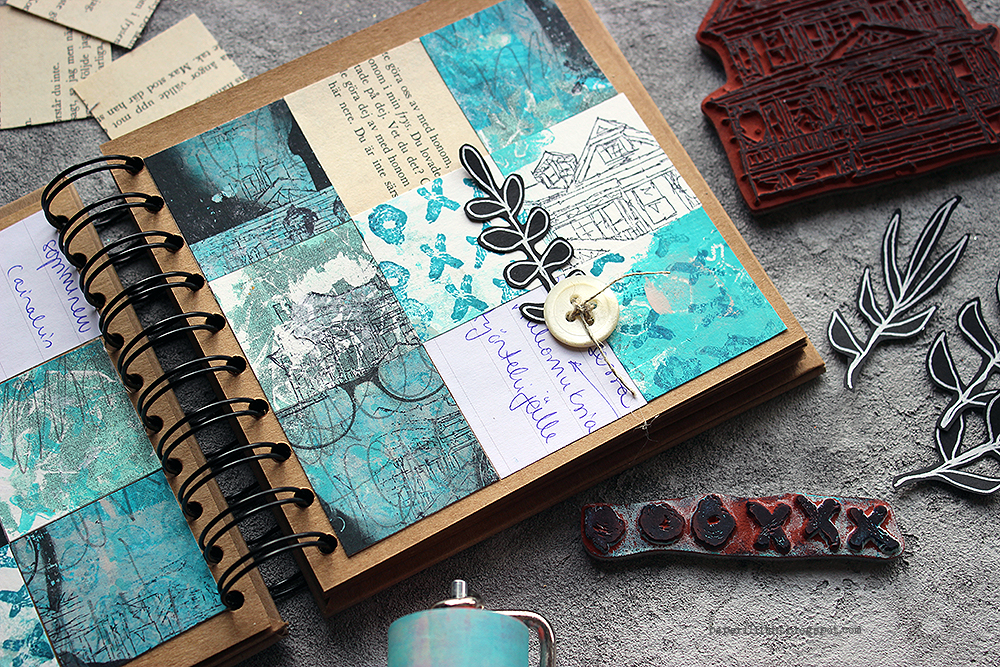
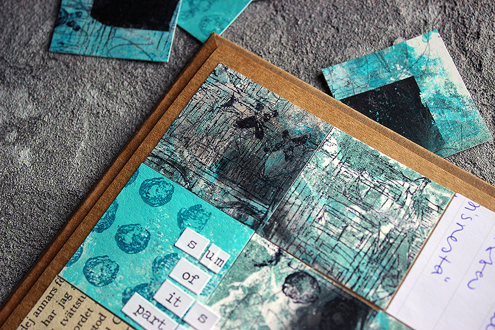
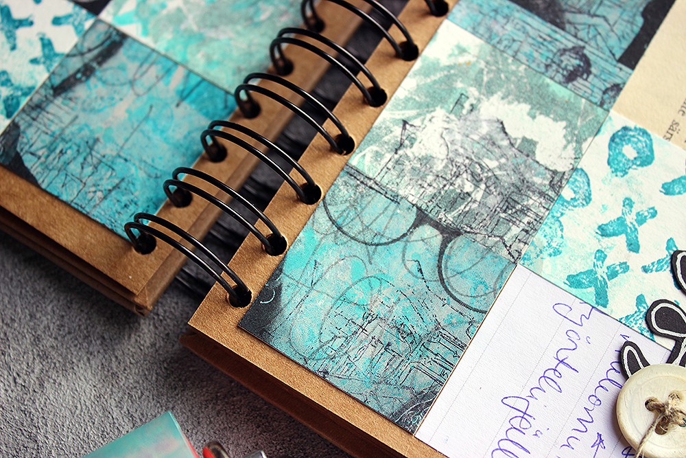
Moikka! It’s Riikka Kovasin here today with a project for the monthly theme “I am a collage”. If you look at the photo of the project, I’m fairly sure you don’t immediately recognize me from it. But I’m in there! It’s a kind of jigsaw “Where’s Wally”.
Usually, when reading the month’s theme, my head starts spinning with all the possible ideas. But this time, funnily enough, I had a clear picture in my head from the start. I wanted to do a photo transfer and then hide it by cutting the surface apart. In a way going cubistic, but not quite.
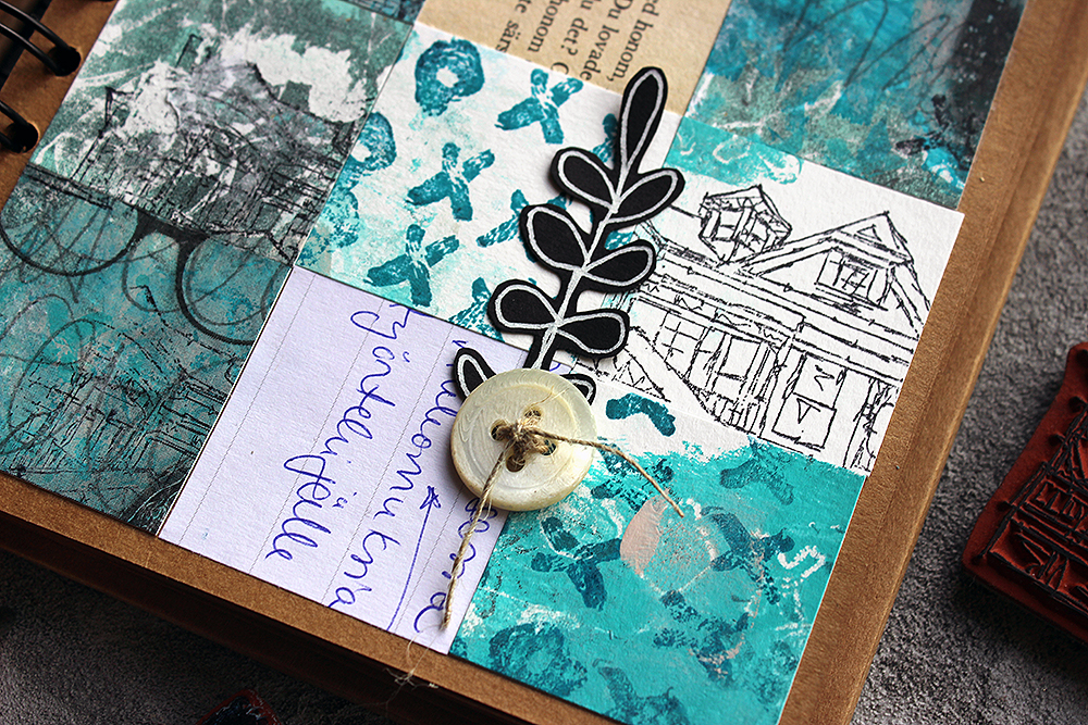
Besides the photo transfer, I wanted to use other papers, too. As in my mind collage is a sum of various parts, acquired differently. Like some old book paper, a bit of painted paper and then maybe a cut out photo. Various sources, different textures. As this collage was about me, I wanted to add different aspects of me in a way. For example, like I say in the video, I stamped the “Queen Anne” house to the piece several times as home is important to me. Maybe I should have said “family” instead of “home” as it’s not that much about the building itself but more who are in it and what that building represents.
If you want to see how this quilt came into being, please see the video below!
When making the surface for the photo transfer, I added some of my handwriting in it. My mind drew a complete blank at that point, and I didn’t want to scribble a shopping list this time, so instead I used the first quote that popped in my head. Those were the opening words of Kalevala, Finnish national epic. The opening words in a way were appropriate in several ways – the theme of the phrase is about getting started, the speaker declares that he has an urge to begin the story, much like I was eager to get started or continue with the project. The other thing is that the words are in Finnish, my mother tongue, which bring my nationality to the piece. After all, that’s the culture I’ve grown up with and it’s rooted in me in ways I might not even come to realize.
Even though I had the idea of cutting the photo apart from the start, I needed some pondering when it came to the size and amount of the cuts. Cutting it into same sized squares seemed the easiest solution, although I first played with the idea of different sized rectangular bits. When I had the decision about the squares, it then came down to thinking about the size. Not to have the squares too tiny, I pondered between four and three centimeters, which meant three or four squares in a row. As you could see, I chose the bigger squares and three in a row as I thought that might be more pleasing to the eye.
Throughout the project I also used a lot of the “Love Knots” stamp. I love the graphical design of it, but also what it stands for – the combining, integrative force of love.
Thank you for stopping by today! Wishing you a lovely, love filled day!
Xoxo Riikka
Thank you Riikka! Love all the different levels of you in this piece and reading your post too. Sometimes abstract work can be tricky to understand at first glance, but by spending time with it we are gratified with new ideas and ways to create art. This piece is certainly inspiring!!!
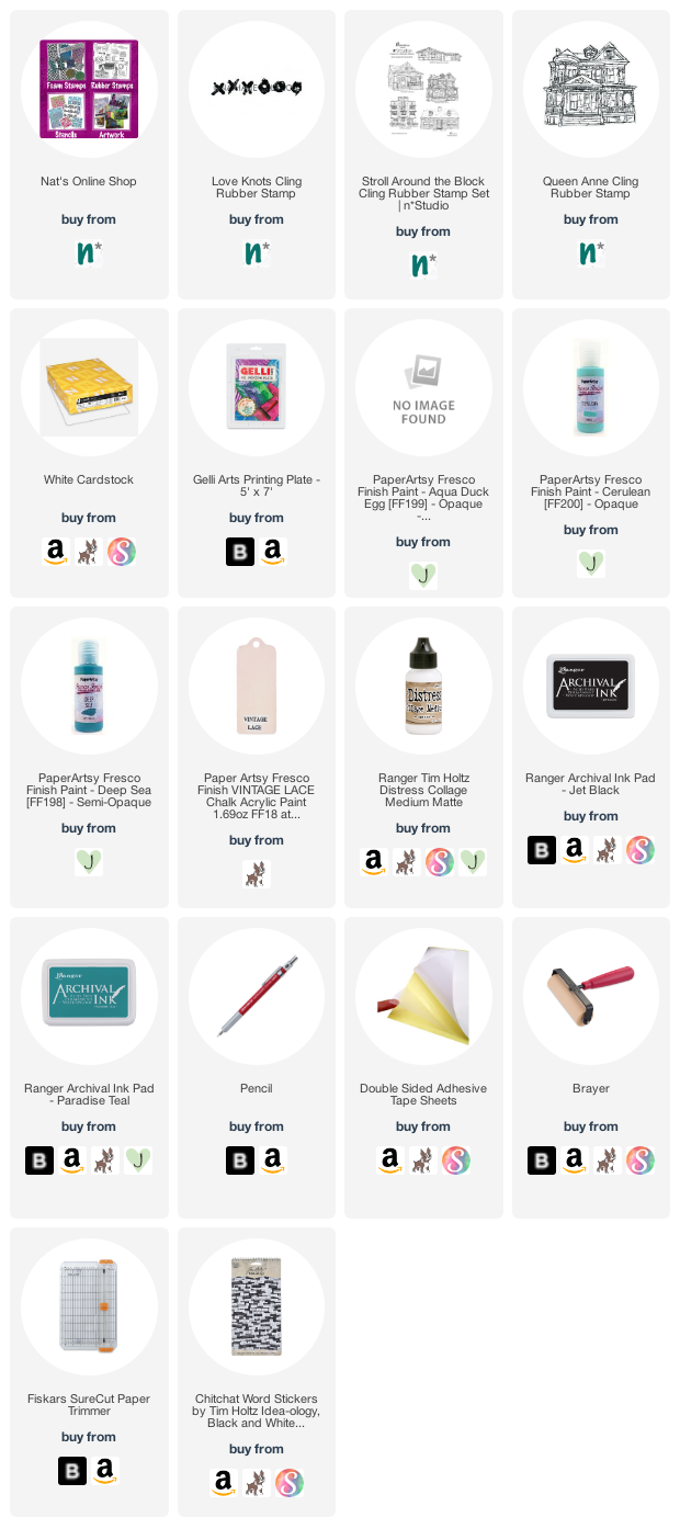
Give it a try: you can find all my Rubber Stamps in my Online Shop and in addition to a laser printed image and some ephemera, here are some of the supplies Riikka used:
Looking for more projects? Follow the Creative Squad on Instagram here.
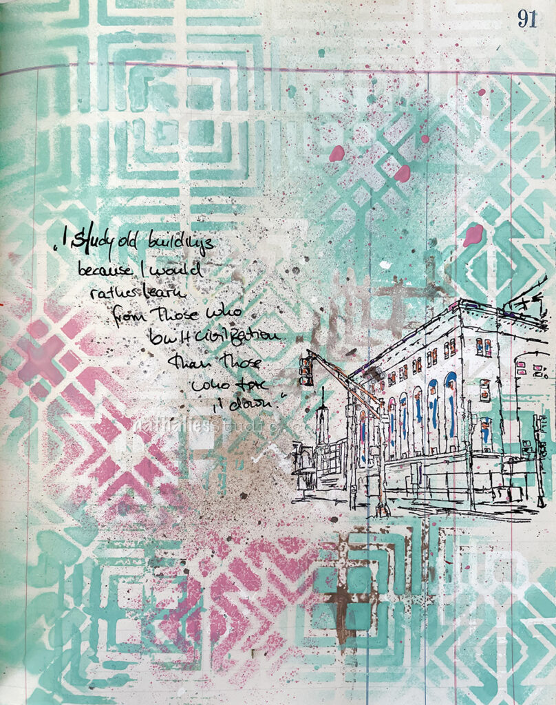
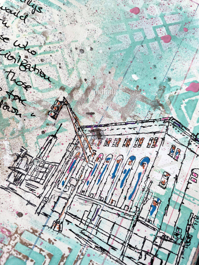
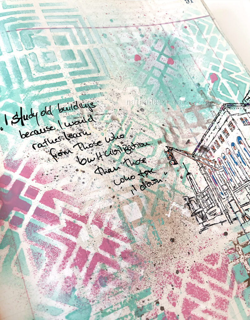
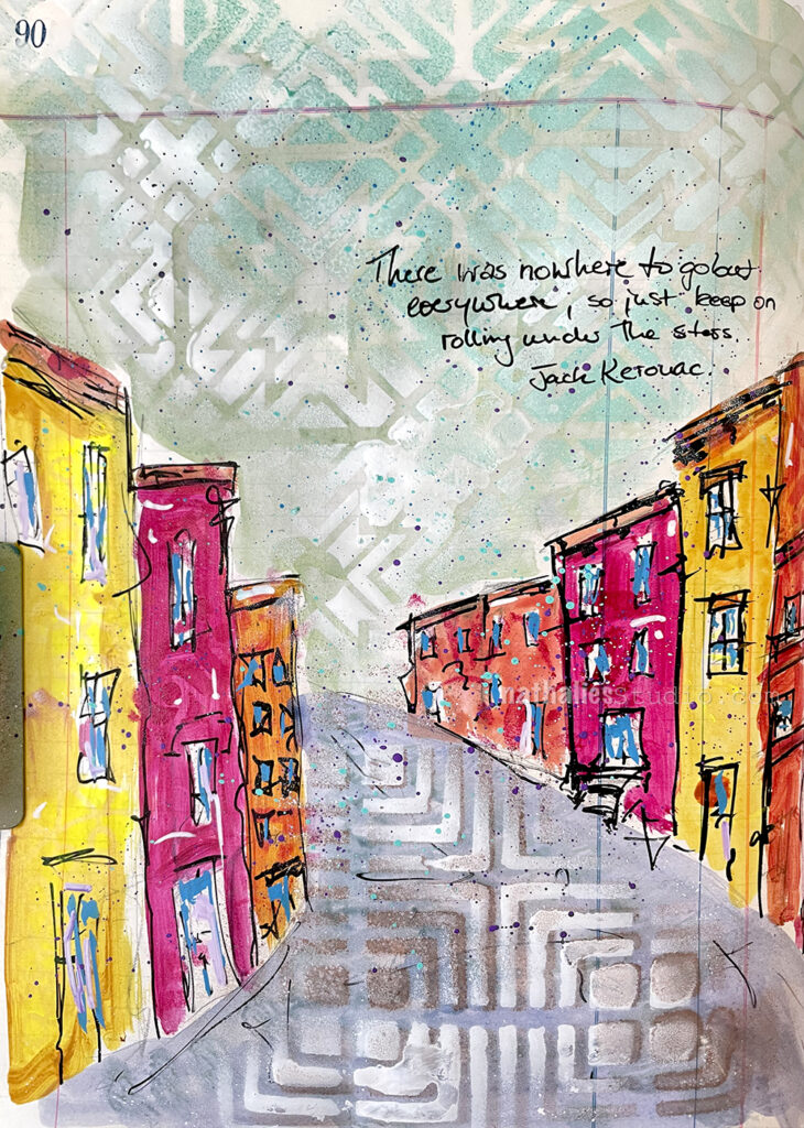
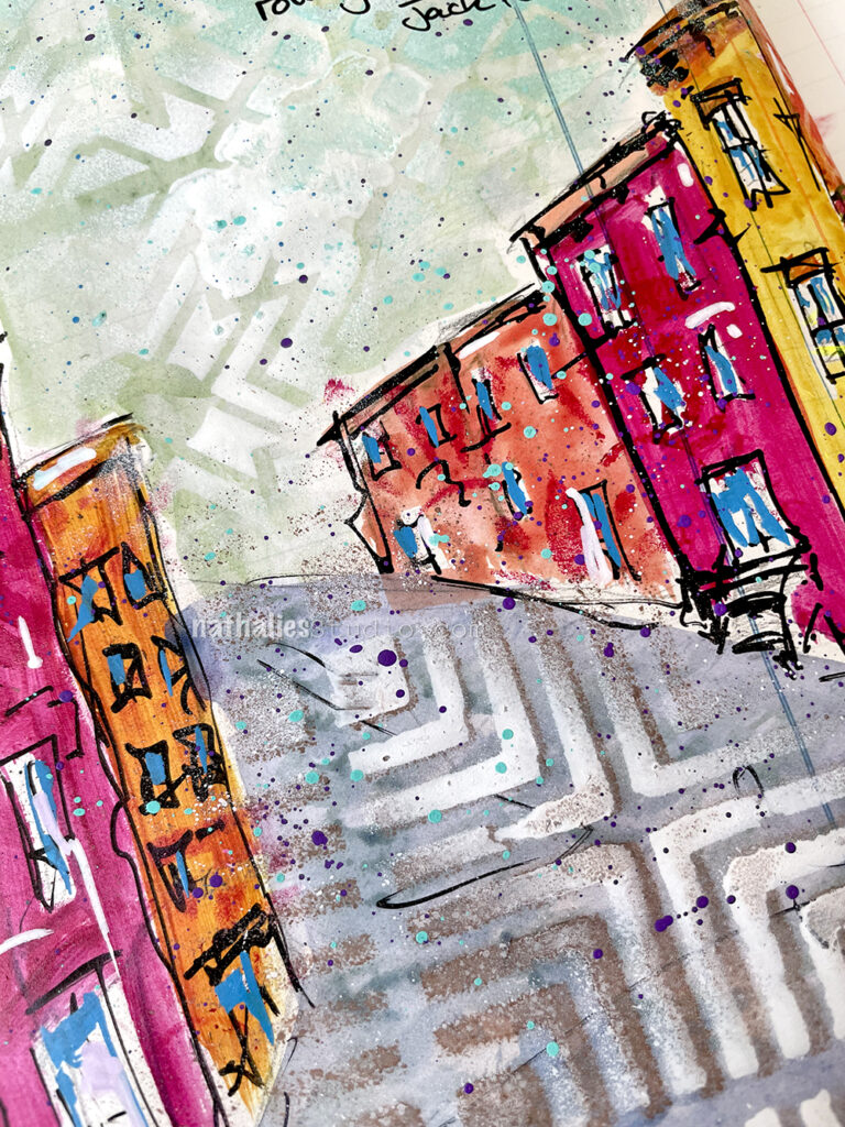
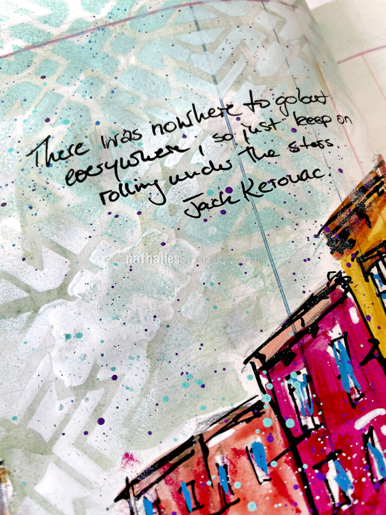
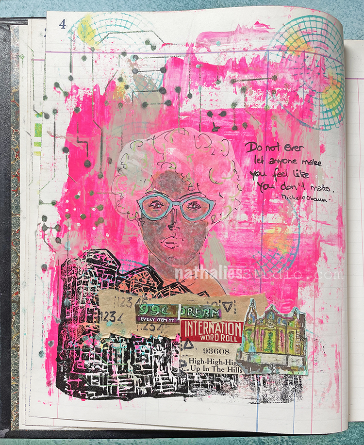
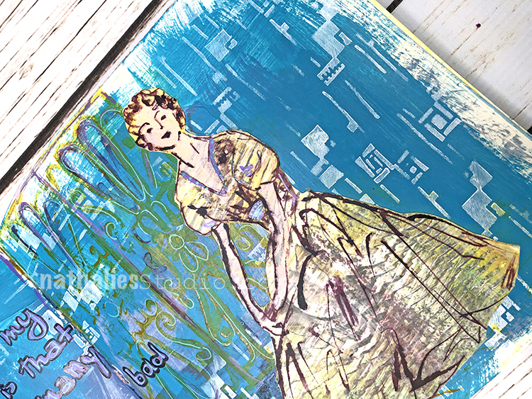
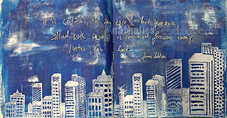
I painted a loose street scene with acrylic paints in this art journal spread. I added some details and definition with markers and used stencils and spray paint over the “sky” (my Toledo stencil) and the “street” (my Manhattan stencil).
To add a little bit of pattern into the house I reached for my ATC Mixup stencil. It’s very subtle – basically in the same color as the house where it was painted, just to give some texture and oomph to the colors.
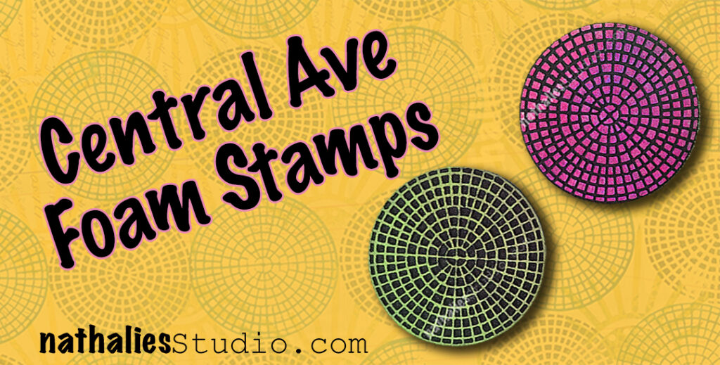
My neighborhood is a constant source of inspiration for me (have you seen my Stroll Through the Hood posts?) and that was just the case when I designed the Central Ave foam stamps. I was out and about looking at all kinds of drainage grates, manhole covers, and iron fences. I was getting inspo from all the municipal patterns out there that often we just overlook. Lots of them, especially the old intricate ones, are very ornamental and beautiful. Central Ave isn’t beautiful per say, but I love the intricate geometry of it and its urban and gritty vibe.
Central Ave is a two piece foam stamp set – a positive and negative of the same design. If you’re really fussy, you can line them up and play off that. I personally love using them together in an art journal page – doubling up on the design in my compositions – but not necessarily lining them up.
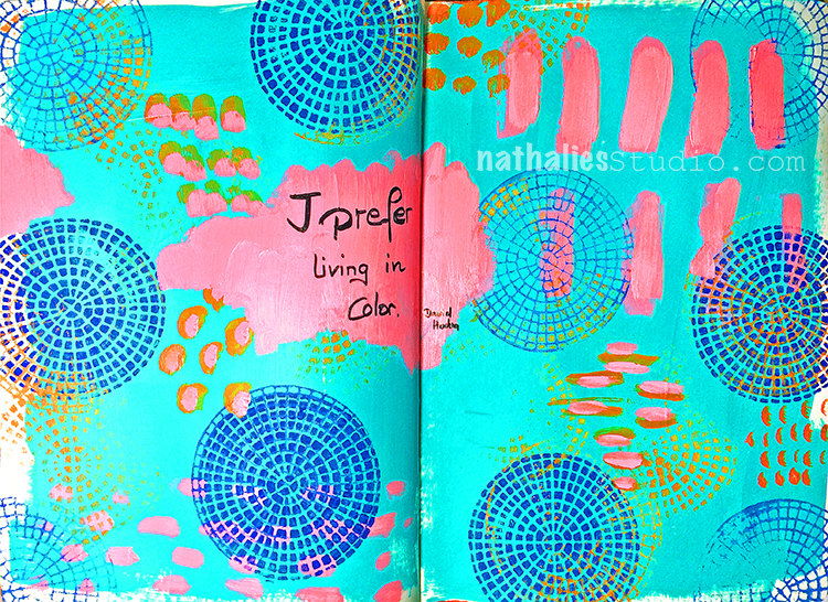
In the above art journal spread I stamped them onto the patterned inside of a junk mail envelope, as well as stamping them directly in the background. The junk mail pieces were nice to cut up into different sizes, repeating the circle shape but adding variety to the composition too.
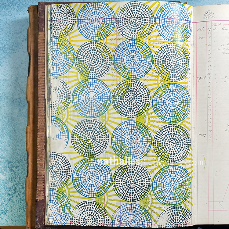
Patterns are another way to go with the Central Ave foam stamp set. You can watch me make this pattern HERE for the April ArtFoamies Challenge back in 2021. This would be an excellent background for an art journal page or maybe an idea for a fabric project…
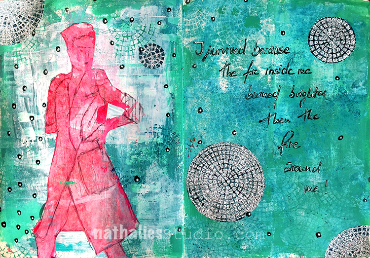
Even as a delicate addition to a page, the Central Ave pattern works nicely. It was just the fine linear detail that I needed to finish off this art journal page.
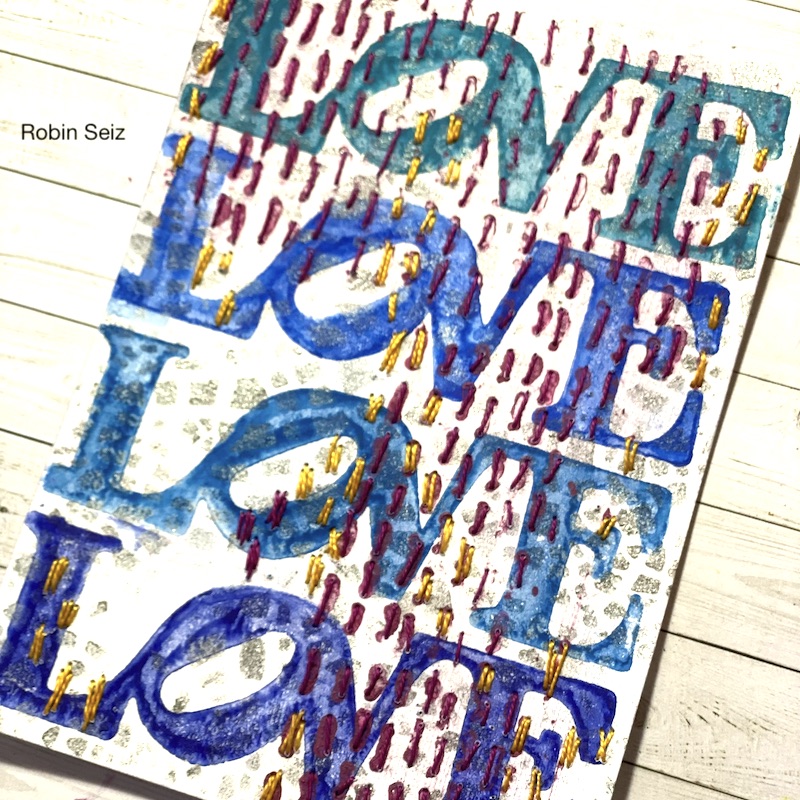
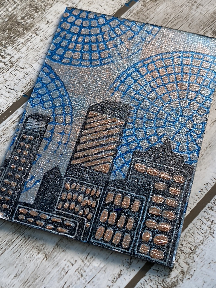
My Creative Squad is no stranger to the magic of Central Ave either. Here Robin finishes off a sweet nocturnal cityscape with the stamp in a deep shimmery blue. It reminds me of how lights flare and radiate through the darkness.
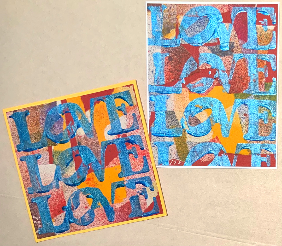
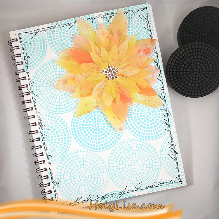
And Creative Squad alum Josefine keeps it clean and simple in this art journal page, highlighting the Central Ave foam stamps. I love the complimentary colors in this page and how the center of the flower also uses the center of the stamp.
Here are some of the supplies used in these projects:
A Look Back – I’ve got the blues. The art journal blues. No, no, I’m not sad or anything :) I’m talking color today! I’m keeping it simple and taking a look back at some art journal pages that are blue. All shades of blue, but definitely LOTS of blue. Let’s have a look:
Let’s kick things off with this spread from 2019 where I created a background with blue acrylic paint and gesso, mixing them on the page to create some tints. On top I stamped my Jazzed and Gnarly foam stamps but blue is the dominant color for sure. Take a look at the whole page here.
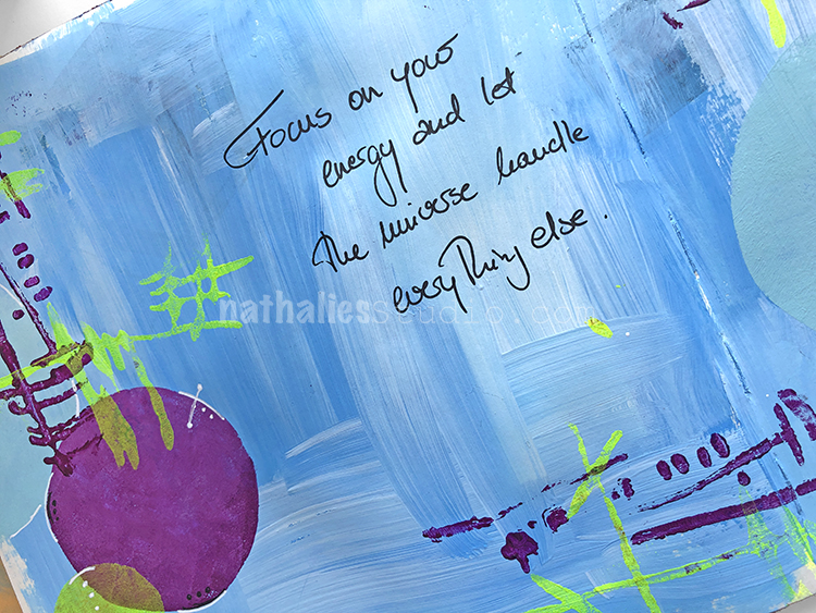
This is another spread from 2019 that began with blue acrylic paint right onto the page. Then I used my Space Age Modern stencil with white acrylic paint and collaged on top of all of that. I called this spread Fantastic Bad Ideas hahaha and you can see the whole thing here :)
Cyanotype or sun printing creates one of my favorite shades of blue and in this page I combined sun printed fabric with some stamping in blue too. Both patterns are created with my Triple Play foam stamp set. You can check out more of the story behind this spread here.
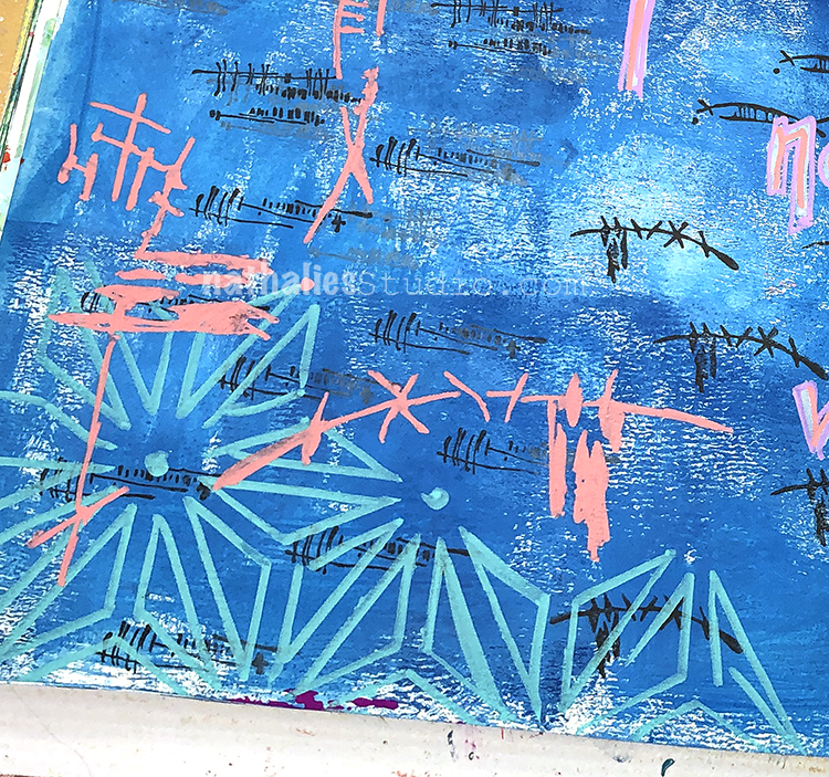
Blue plays so nicely with lots of other colors and I love to experiment with colors that harmonize and colors that pop. Here I started my background with blue acrylic paint, then used my Wabi Sabi rubber stamps in black, an aqua posca marker with my Star Struck stencil, and finally finished things up with peach colored acrylic paint and my Kyoto stencil. I love how that last one really stands out too! You can see the whole spread here.
I wanted to end with this spread because I think sometimes simple can be very powerful. Here I was just working with blues and white. I painted my background with those colors and then stamped my Midtown and Midtown Minis foam stamp sets on top in white. You can read more about this page from June 2020 here.
I hope you enjoyed this Look Back post all about the blues :) Maybe you’ll be inspired to pull those blue paints and inks out of your stash and concentrate on letting them shine in your next art journal page or mixed media piece.
A Look Back is a blog series to show you some projects and posts that you may have missed – sometimes going WAY back in the archive. I think it will be fun to revisit a few ideas that we haven’t seen for a while. I’m excited to see how a little look back might inspire something new in the future :)
Here are some of the supplies used in these projects:
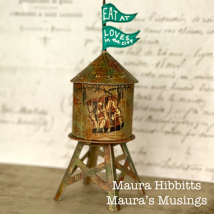
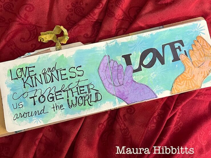
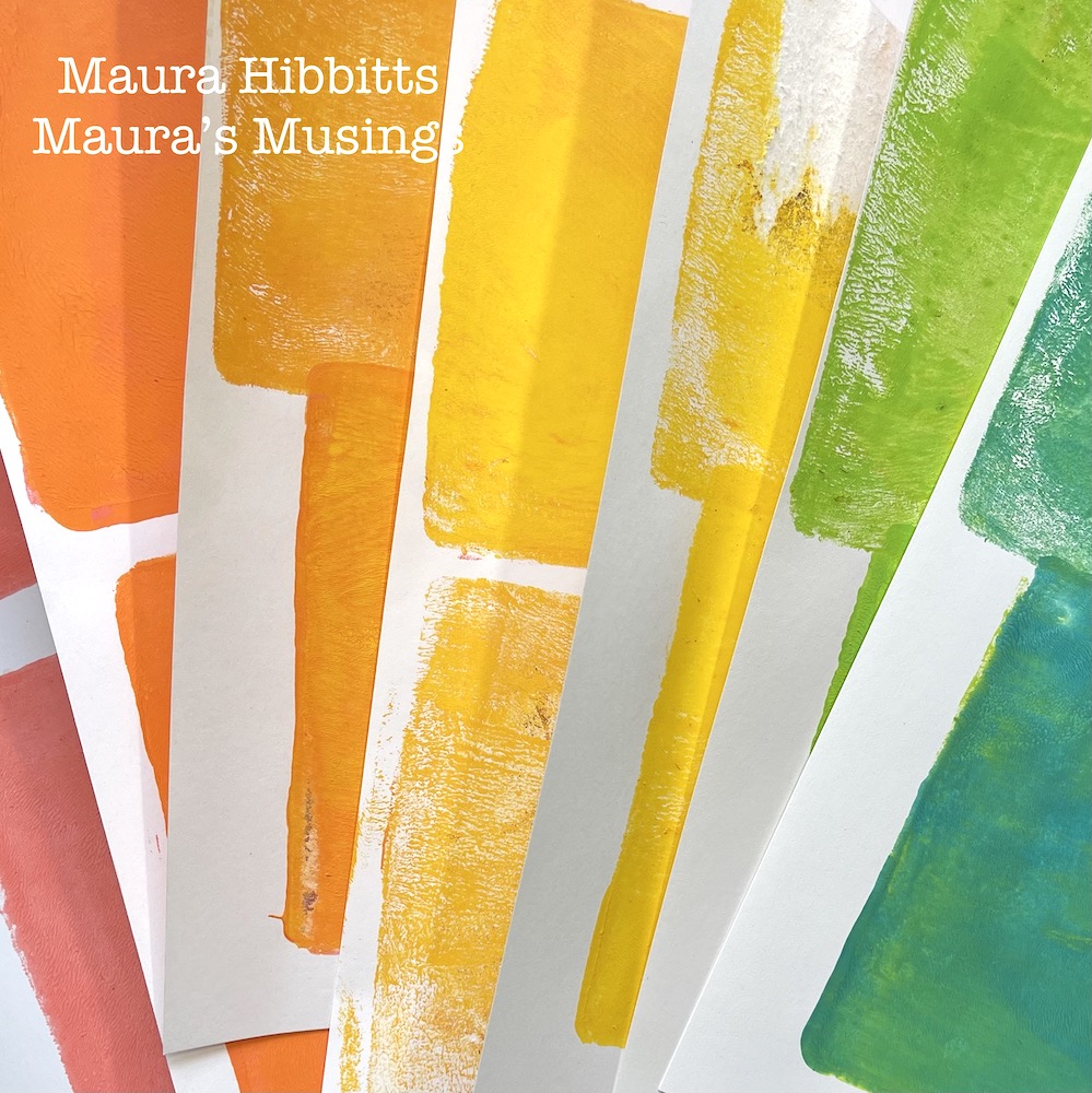
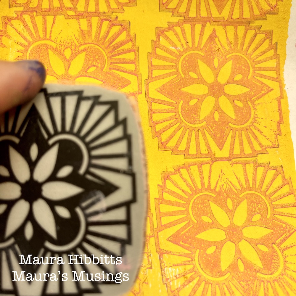
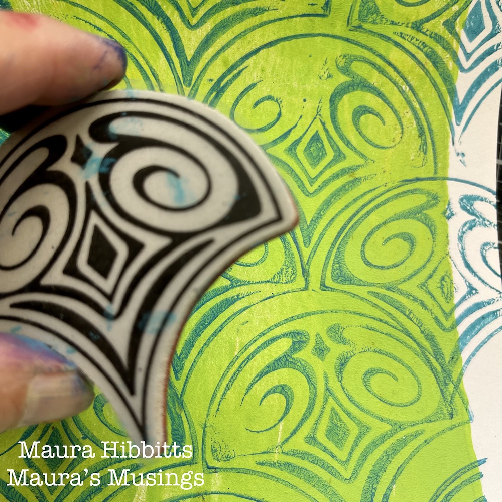
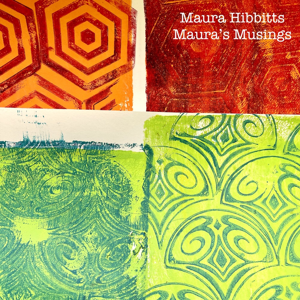
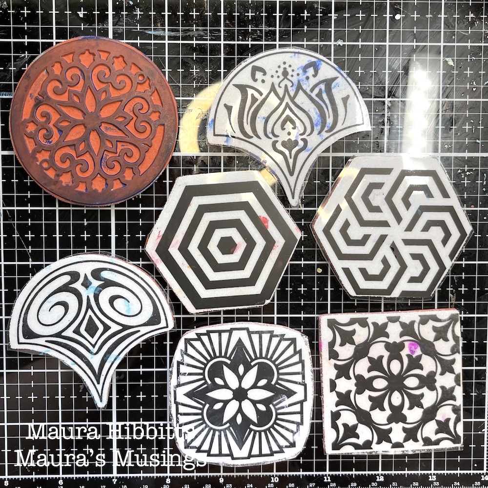
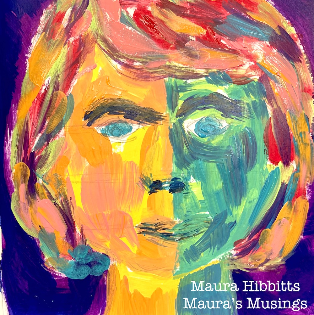
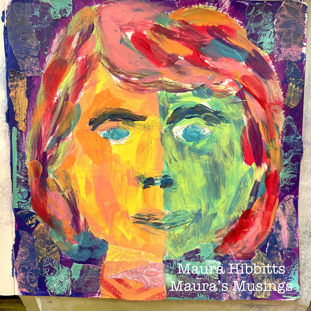
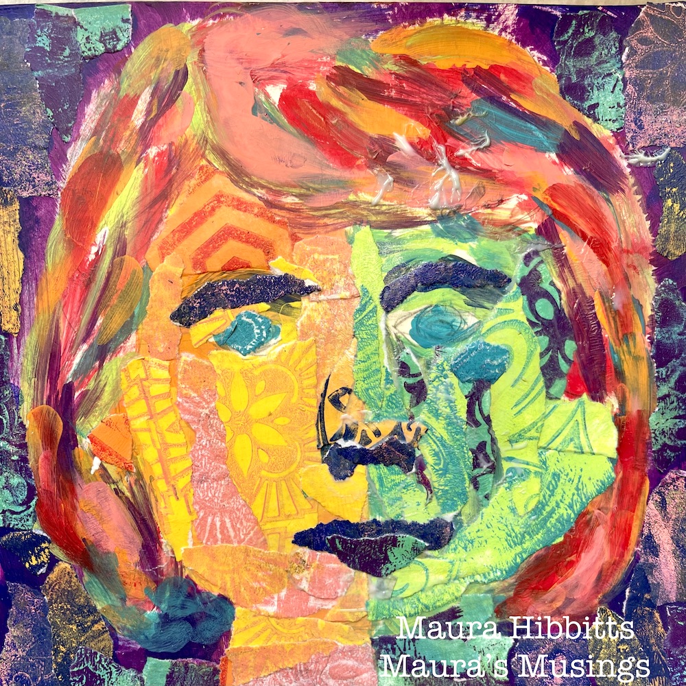
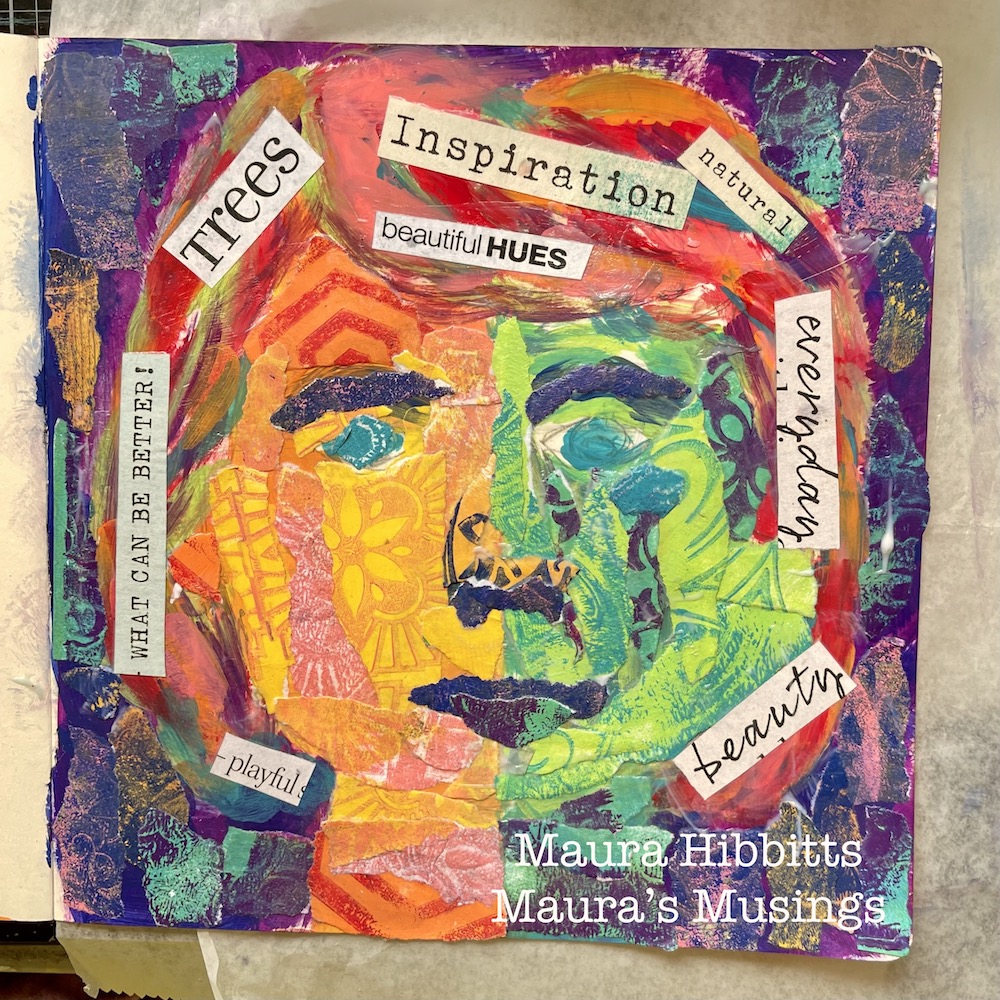
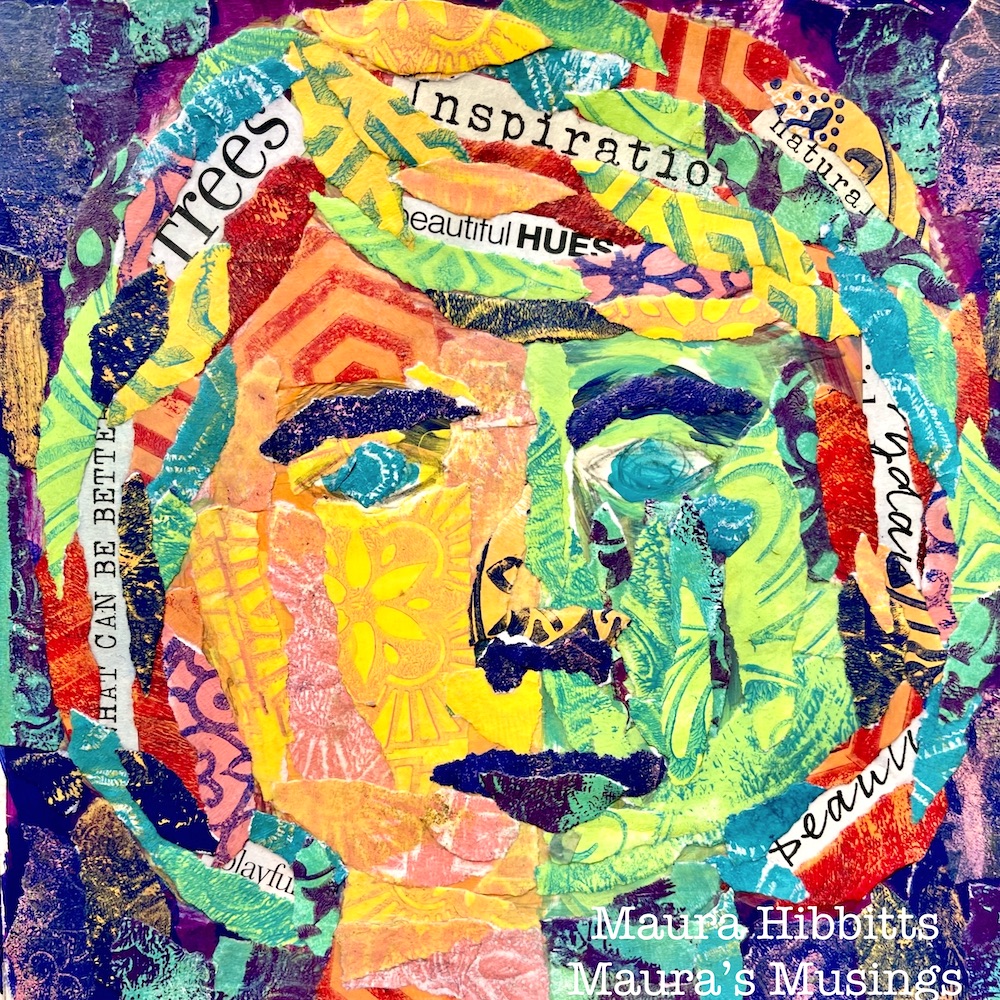
Hello from my Creative Squad! Today we have a post from Maura Hibbitts using my Circle Jumble Large, Hex Set Large, Floral Tile Large, and Fan-Tastic Large rubber stamp sets and our newest theme: I am a Collage – We are all complex beings with many different facets. Create a “self portrait” piece using collage to represent parts of yourself, either literally or in an abstract way.
I am a collage of thoughts, ideas, feelings and colors. The patchwork of my life has shaped who I am today. The experiences I’ve had, the highs and lows, the people I’ve met and shared my life with, adventures, work, laughing, crying, stopping in my tracks to take in a gorgeous sunset…all of these make up the layers of me that are expressed in my collage. Some are hidden, some in plain sight…these are the things that color my world.
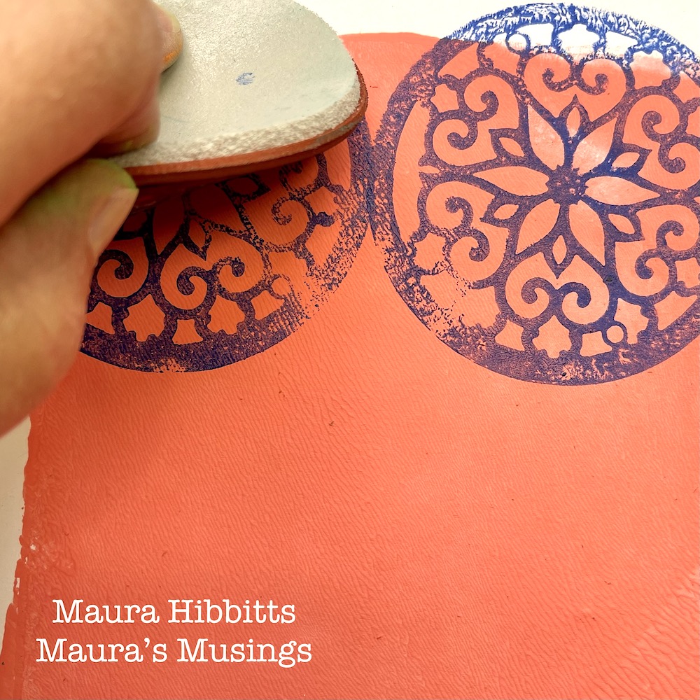
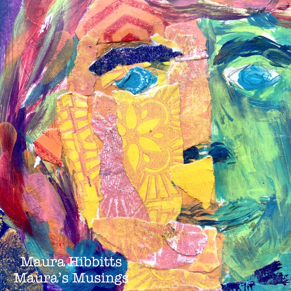
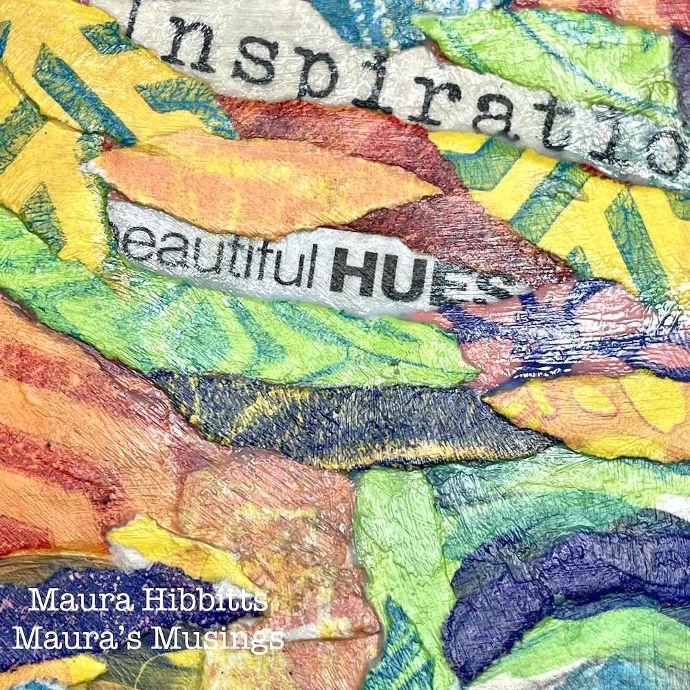
The collage technique I used, I learned from artist Elizabeth St. Hilaire. I began with the gel plate, lighter hued paints and a brayer to create the background papers. Add a small amount of paint to the gel plate, brayer it smooth, then press the white cardstock onto it and lightly rub then lift off. Using a 5×7” gel plate, you can get two impressions onto one sheet. Make a batch of background papers in different colors. Set aside to dry or use a heat tool.
Next, brayer a dark or contrasting color onto the gel plate, and stamp into it with Nathalie’s Park Blvd stamp. Now, stamp the image repeatedly onto your background sheet in one section. Brayer the paint on the gel plate again and stamp repeating images on the plate, then place the other background section over it and lightly rub and lift. Basically, you are creating a positive and a negative print. Let dry or use heat tool.
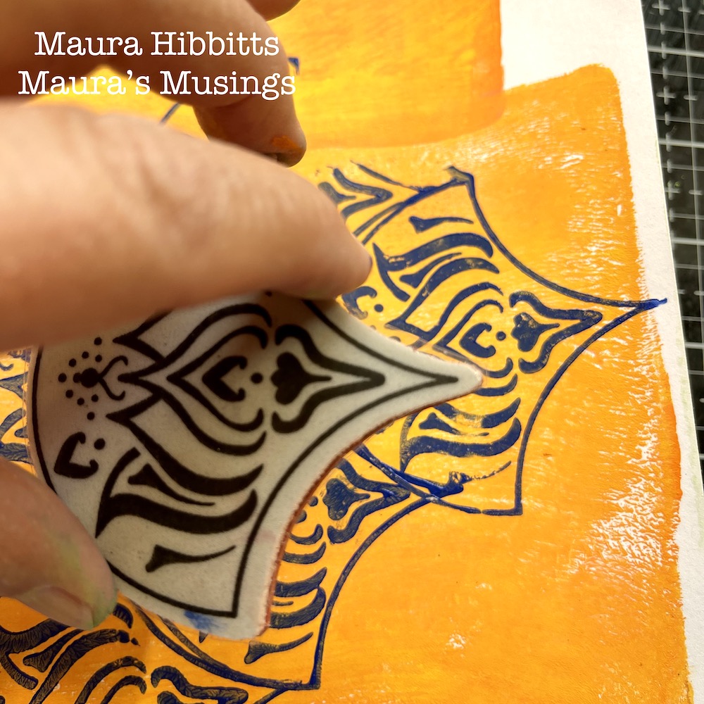
Repeat using the Lily Fan stamp and a different paint color.
Now for the final repeat of this step – use the Fairview Fan stamp and a different paint color. Let all papers dry thoroughly.
At this point, you will have a selection of papers in several colors and designs to use for the project.
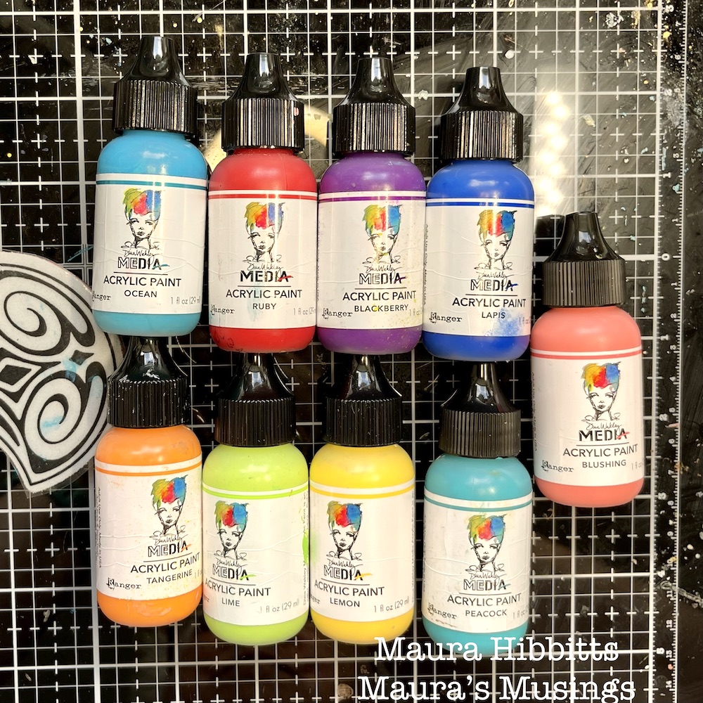
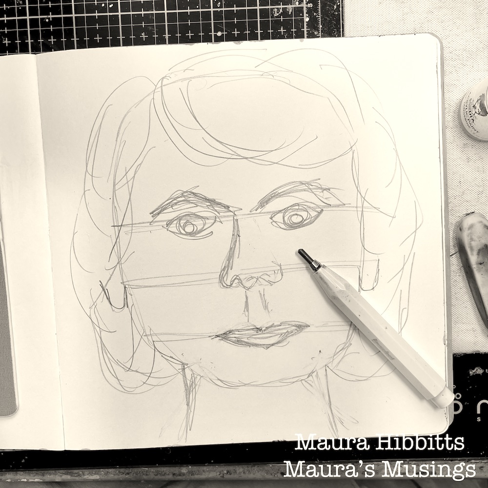
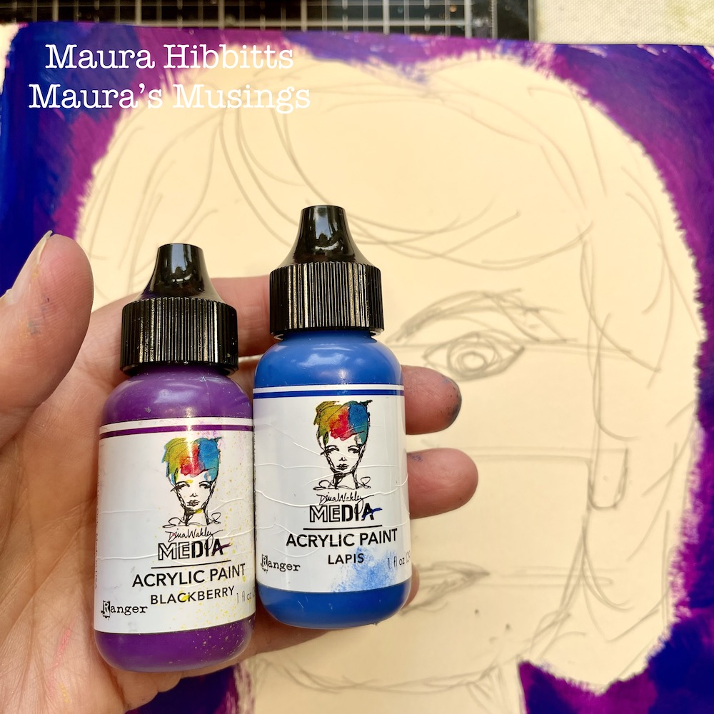
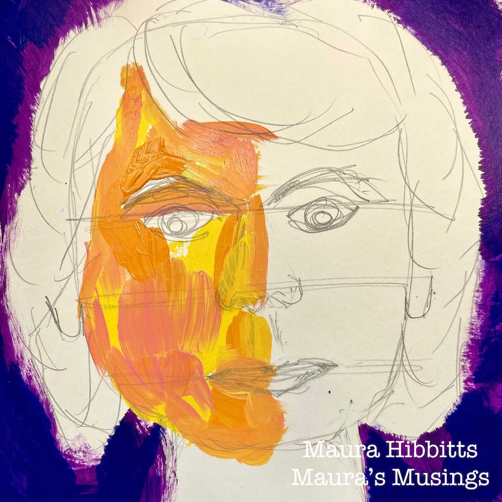
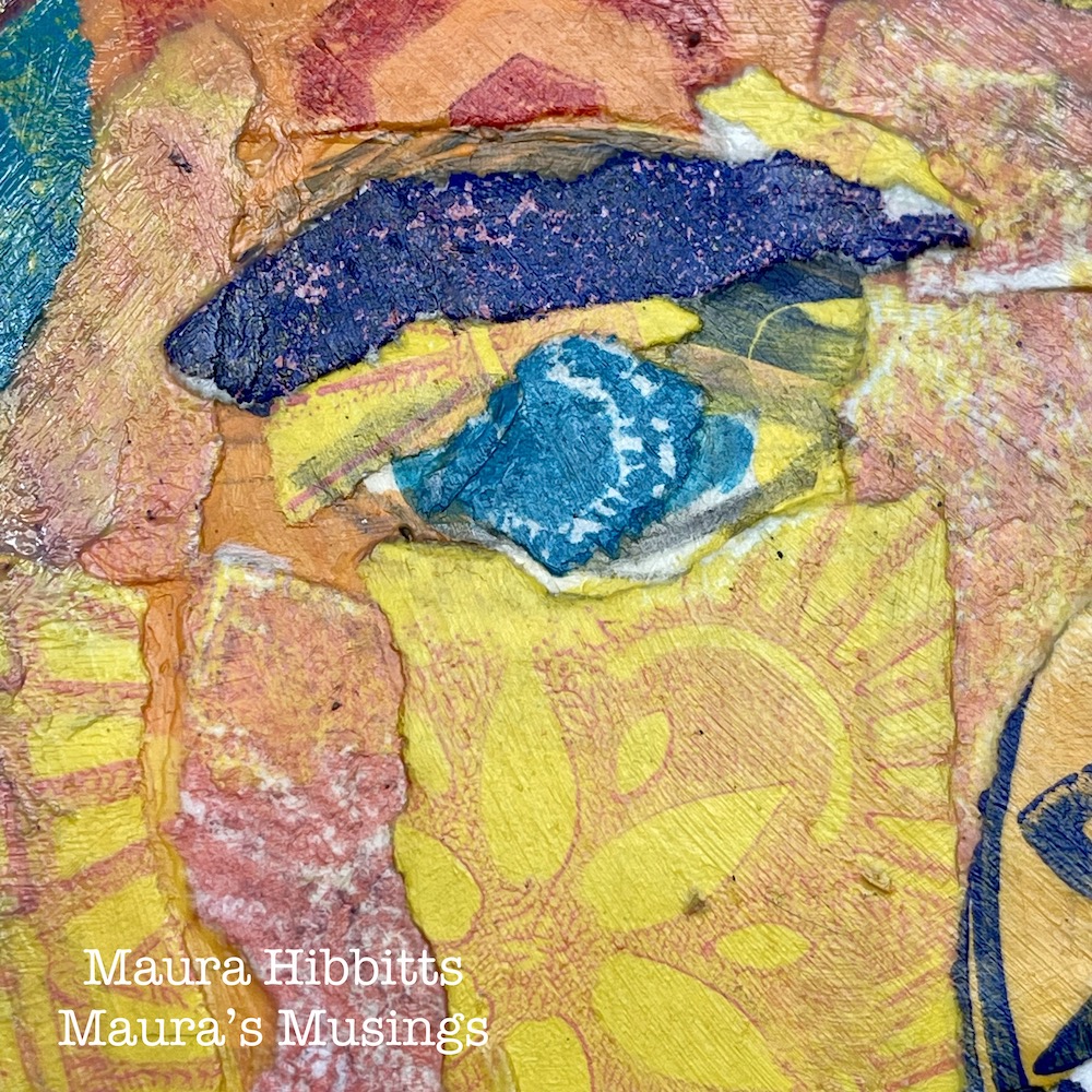
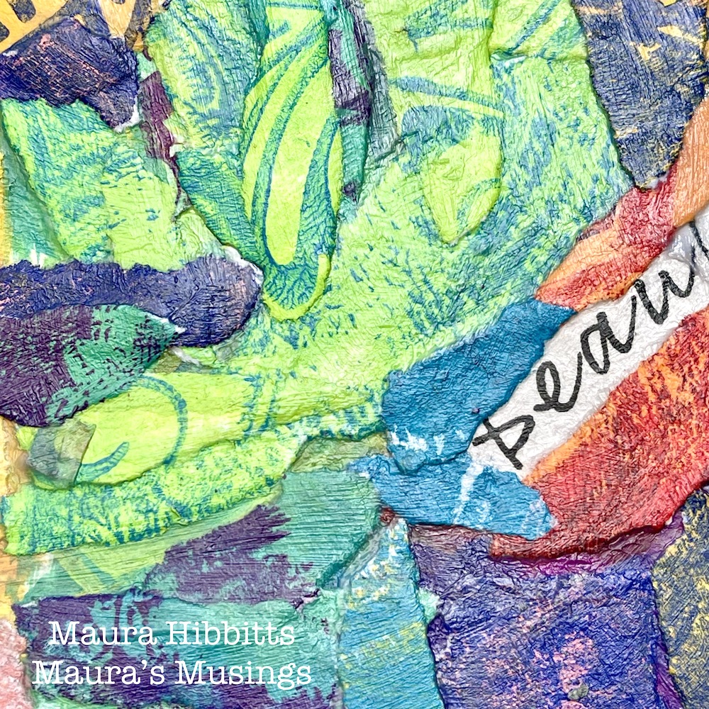
Now, the fun begins! Sketch a face on your page. Use the same paint colors here as you used to make the papers. Paint a mix of dark colors around the face to make a background. (I used Lapis and Blackberry) I wanted to use non traditional colors for my face and lots of variety… it might look a bit psychedelic to you, but I love the freedom of play here.
I used warm colors on one side of the face, and cool colors on the other. (When I look at the one side, I’m getting “She Hulk” vibes, lol!) And just go into a color frenzy with the hair! I tried to paint with big, loose strokes.
Rip out small pieces of paper from your background papers, matching the paint colors. Note – if you rip the paper towards you, it will eliminate a white edge. Adhere to the background with collage medium. I like to add the medium to the back of the piece, press it down with the brush, then go over it with more medium, pressing down.
Next, move to the face, and continue collaging paper pieces over your painted image. Match the paper bits to the paint color.
Cut words out of a magazine, or write them and collage onto the hair. Then, collage paper bits onto the hair and around the words, leaving them mostly visible.
When you look at the details in your project, you will see the layers of paper, color and stamped images. When you step back and look at it, you see the face, albeit a very colorful one.
How fun is it to think of yourself as a collage, and create a wild and colorful image? I found the collaging to be a very meditative process, giving me lots of time to think about what makes me unique. I hope you have as much fun with creating your own collage as I did. Happy creating! – Maura
Thank you Maura! Watching this process come together was very cool and I absolutely love the result – it’s complex, emotional, and such a wonderful way to approach self portraiture!
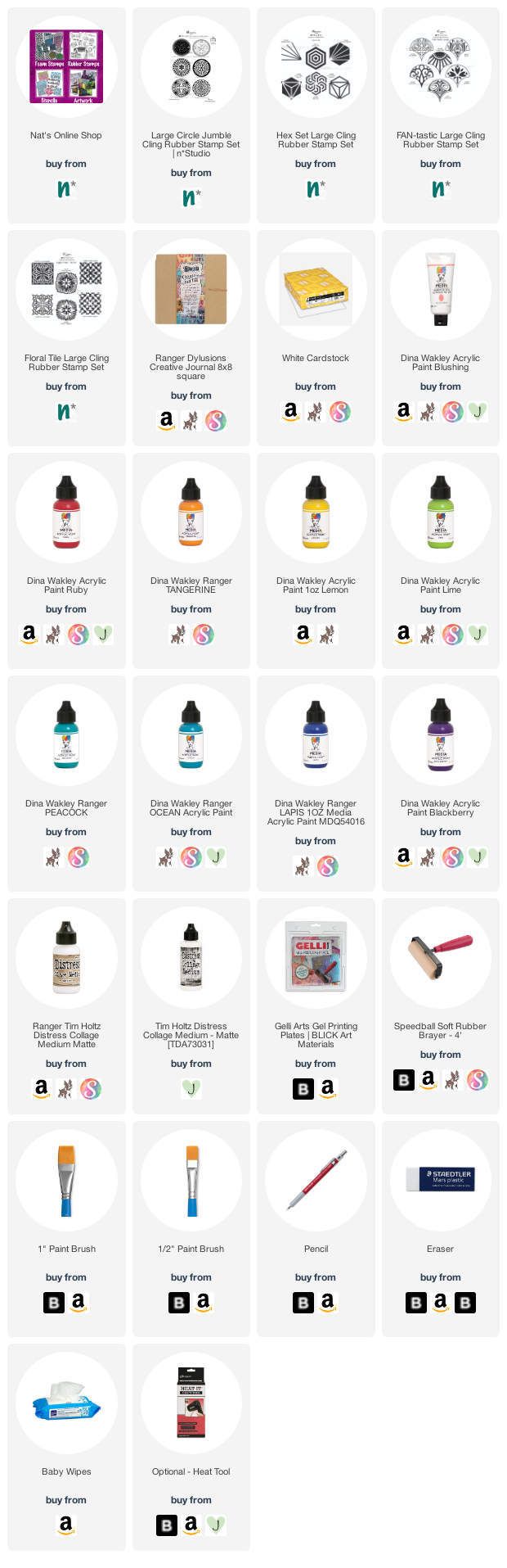
Give it a try: you can find all my Rubber Stamps in my Online Shop and in addition to her word clippings, here are some of the supplies Maura used:
Looking for more projects? Follow the Creative Squad on Instagram here.

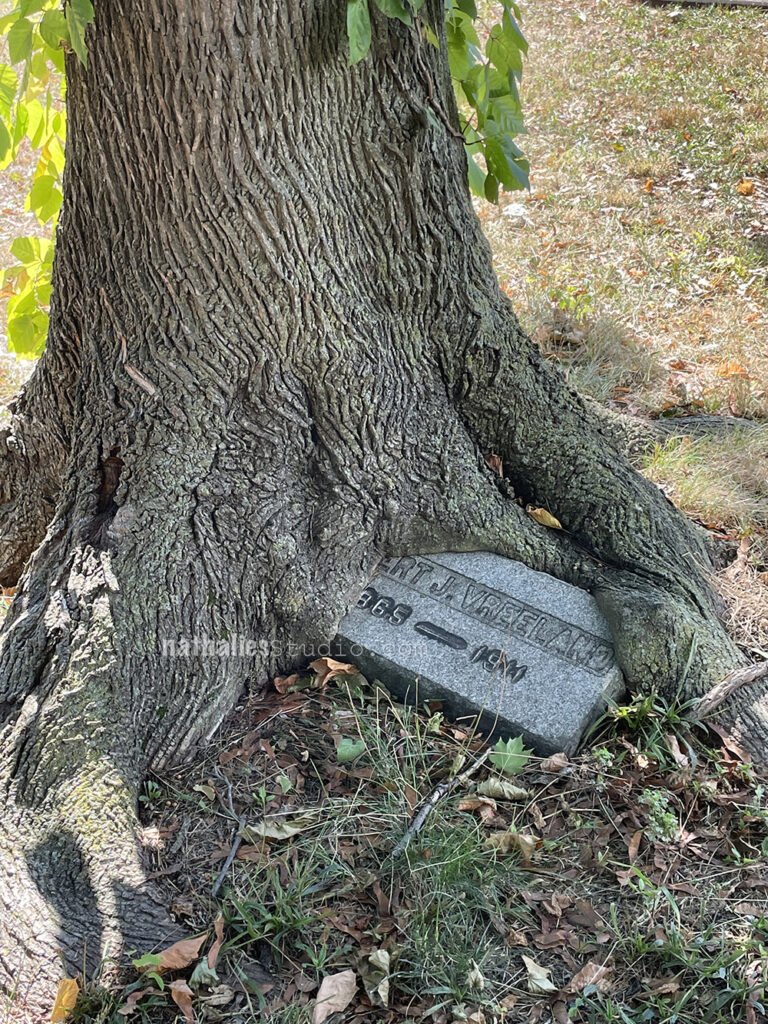


That stone marker under the tree is so cool and how special that you knew the name from your house!
Reply