A Look Back – As artists we are obviously very aware of the visual world and that means it’s easy to get caught up in getting things to look right… maybe even perfect… but what is perfection and who sets the rules anyway? I thought it might be a good time to give perfection a hard look and maybe we’ll see that it isn’t such a great idea after all.
For A Look Back today let’s take a stroll through my art journals from the past and tease out some gems that reveal my Thoughts on Perfection.
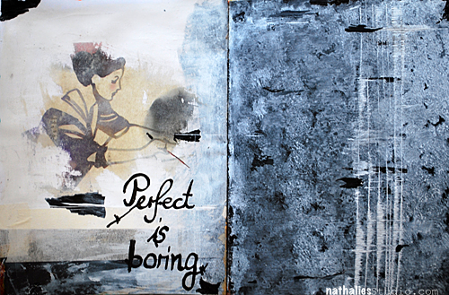
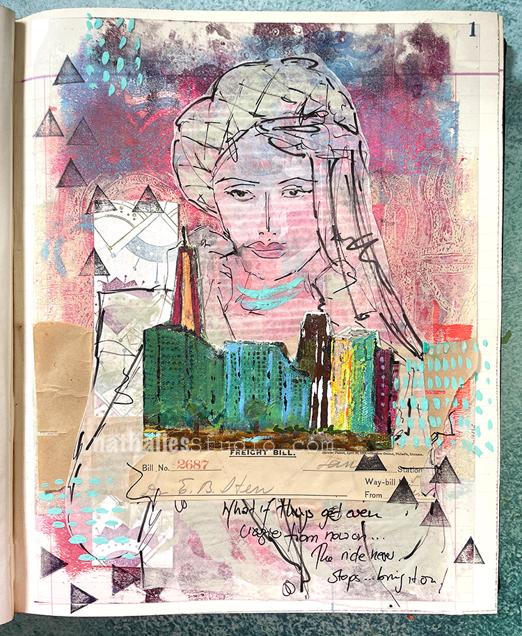
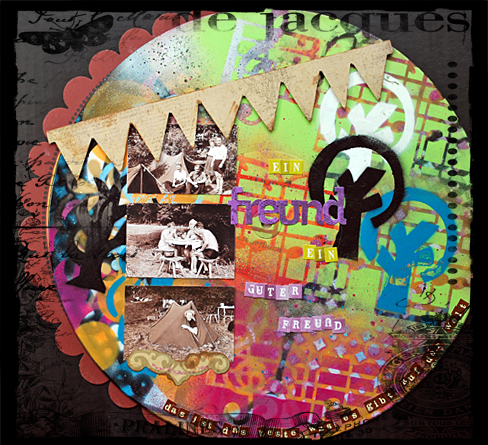
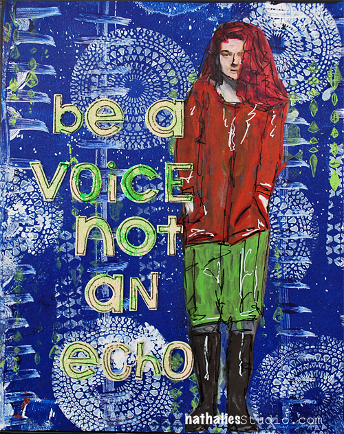
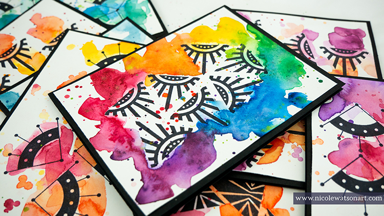
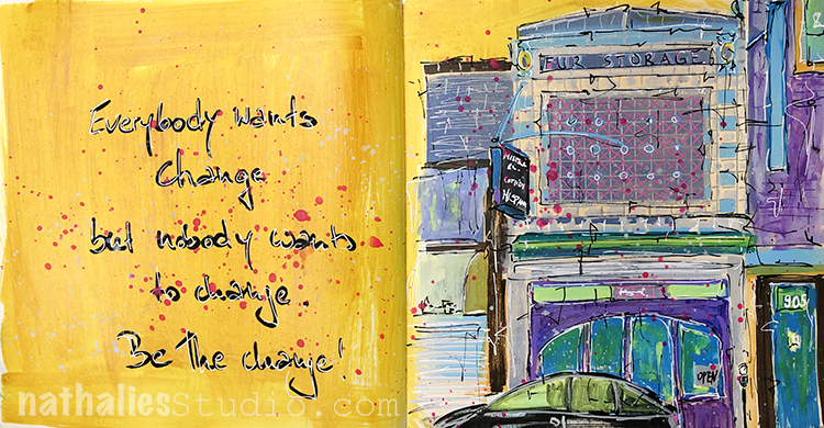
Let me just come right out and say it, “Perfect is boring.” When you’re perfect you’re not pushing boundaries, exploring the uncharted, or challenging yourself and that’s the spice of life! I think when you stop trying to be so perfect in your art, all those messy adventures that turn out a little different than anticipated are pretty interesting. You can see this art journal post from 2014 here.
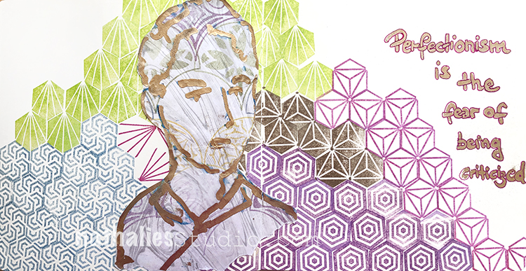
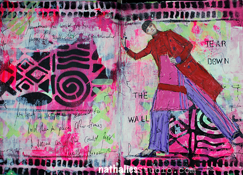
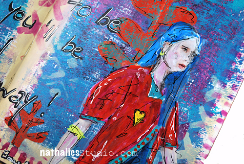
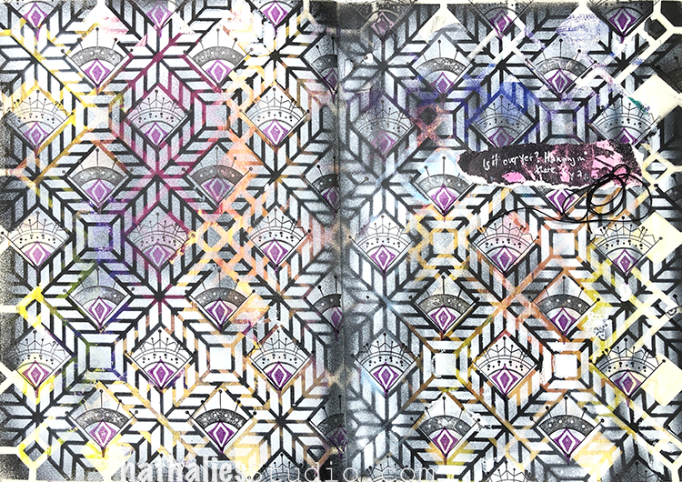
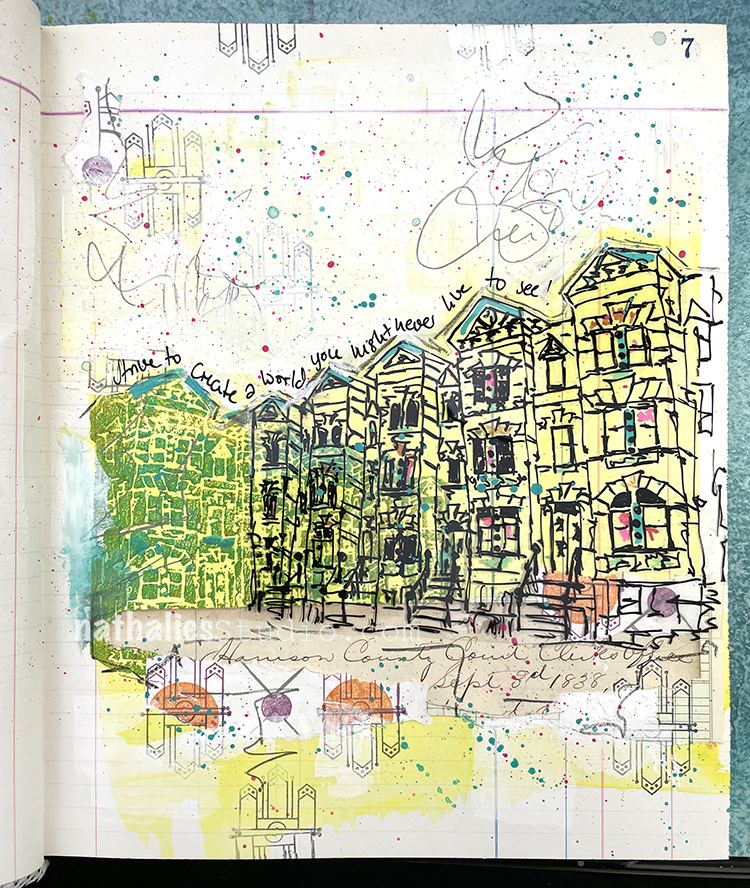
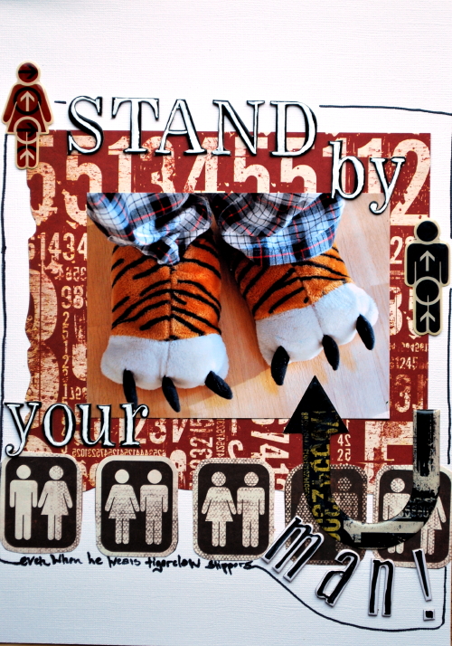
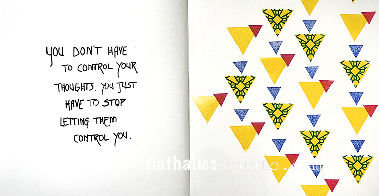
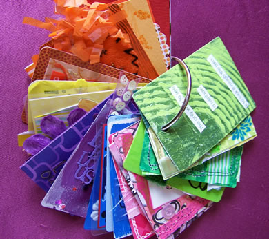
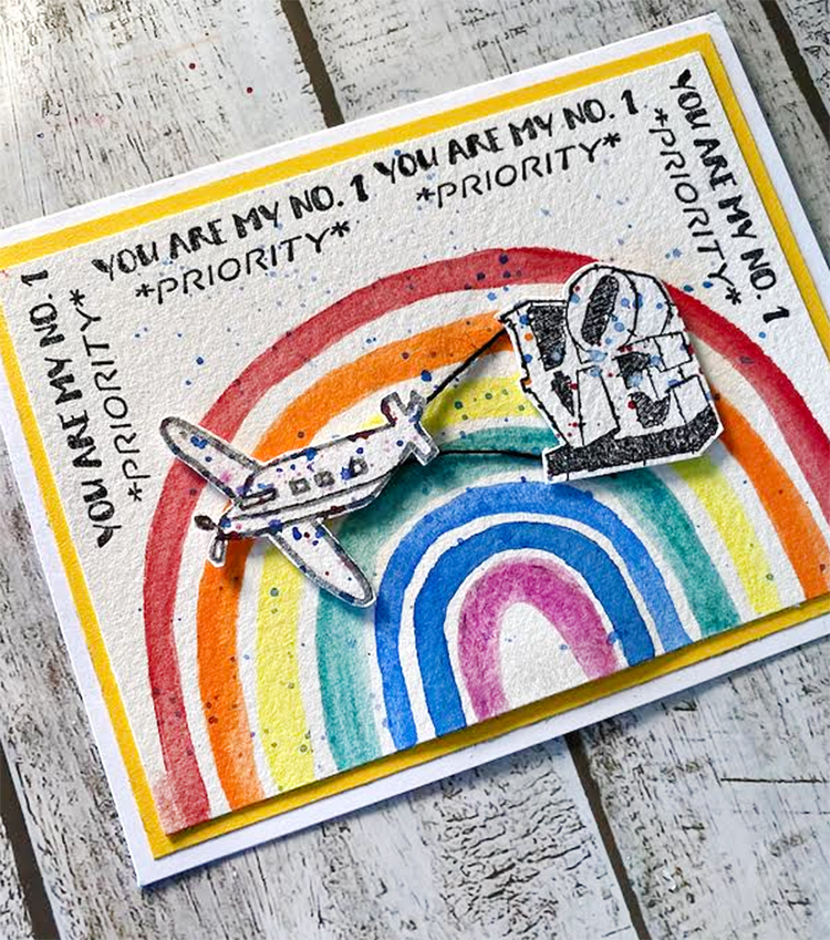
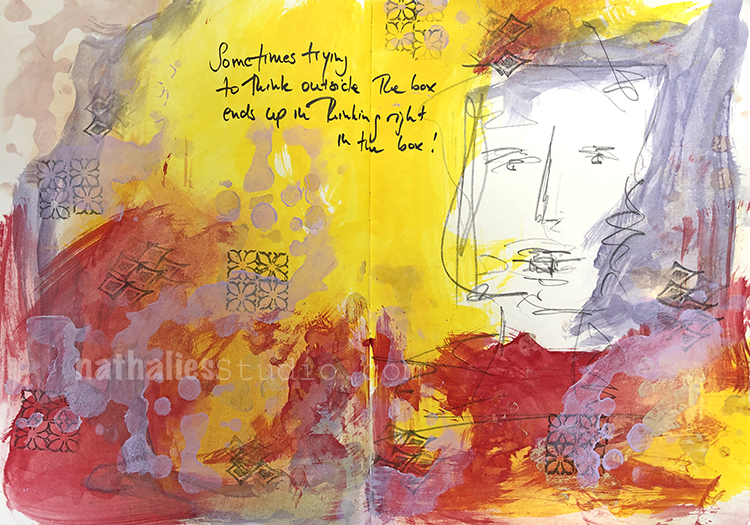
Perfection and fear seem to be very close friends… so I’m thinking if you say bye bye to trying to be perfect you may not be so afraid of what happens next. So what if your art journal page is a bit wonky, or someone thinks it looks less than lovely? The goal was never to be perfect, the goal was to create, and no one can tell you that you didn’t accomplish that. Here is that original post from 2019.
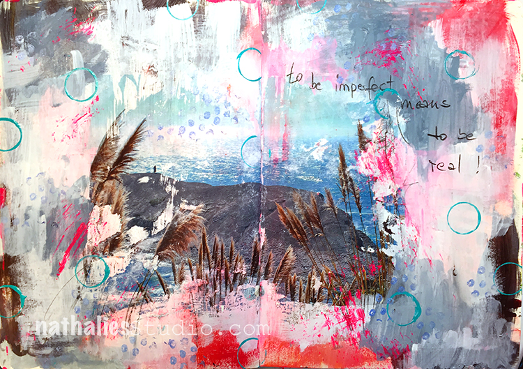
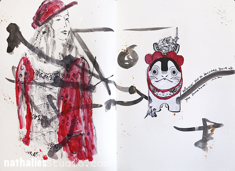
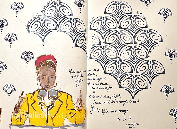
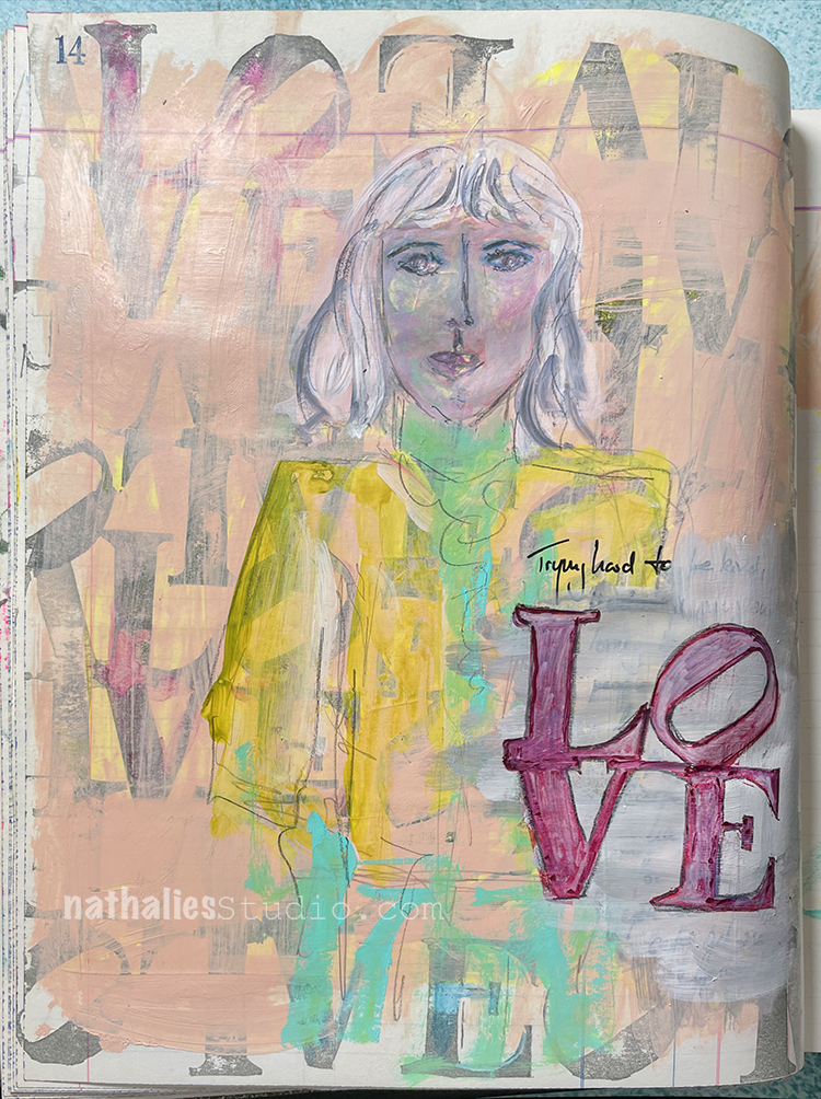
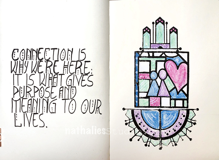
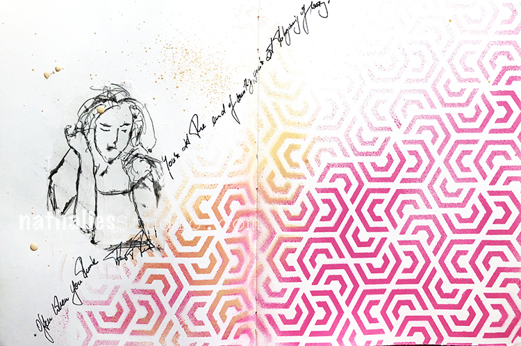
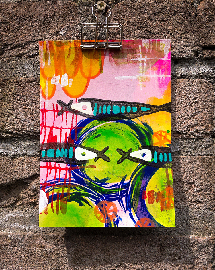
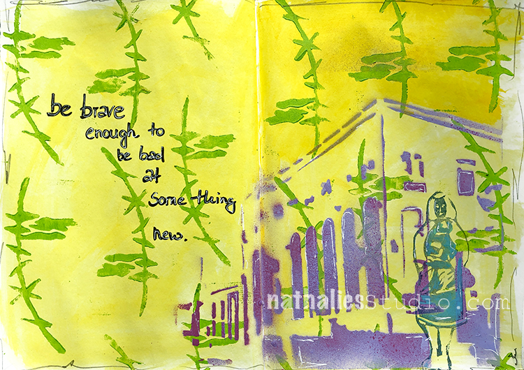
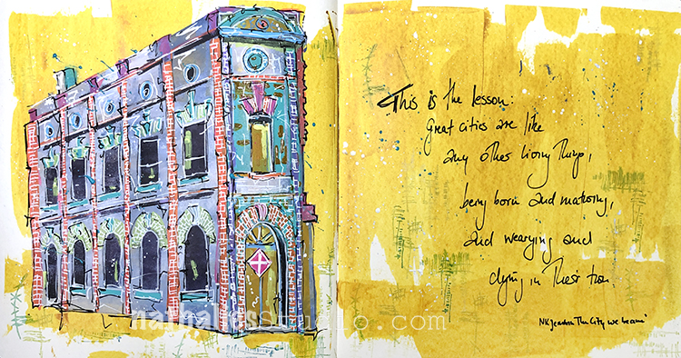
“To be imperfect means to be real!” It’s hard to argue with that – after all, no one is perfect. And don’t we all feel our best when we can just be ourselves, “warts and all”? I think the same goes for creating artwork too – its power comes from authentic expression more than some achievement of perfection. Here is the post for this art journal page from 2018.
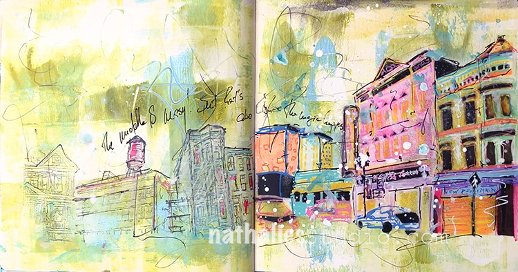
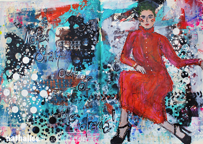
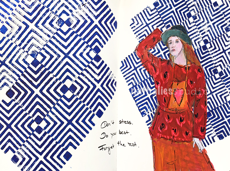
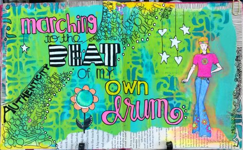
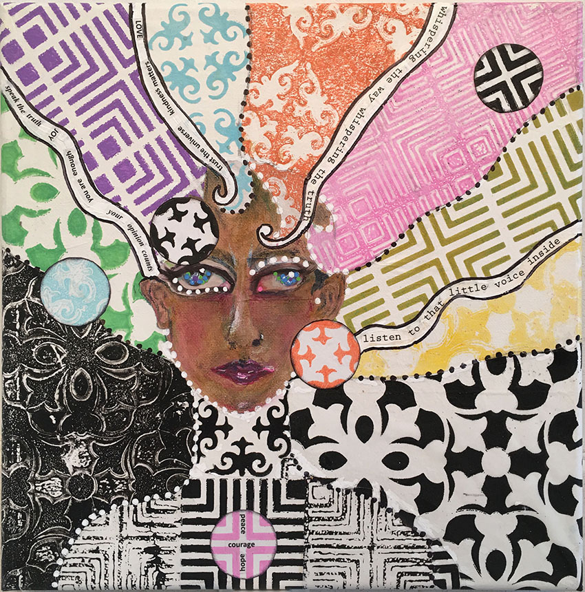
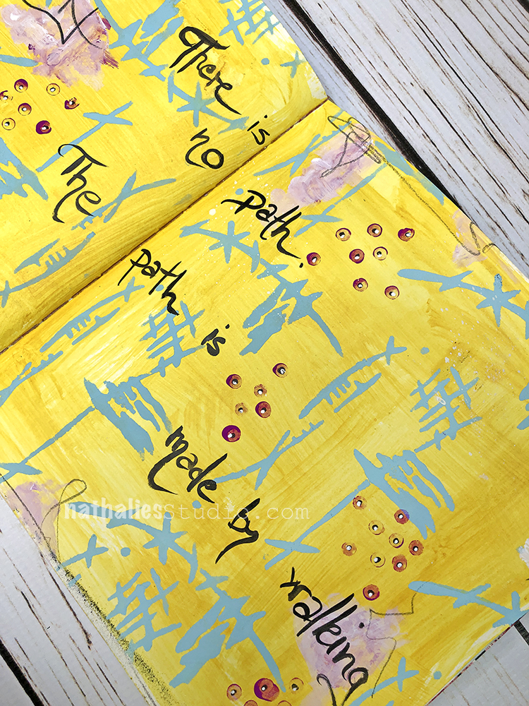
Bottom line? “The middle is messy but that is where the magic happens.” There are probably going to be some major messes, some mistakes, maybe even a few dramatic failures BUT taking those artistic risks is how you move forward, grow, and keep things interesting. I think that as long as the goal is to Make Art and not To Be Perfect, the journey and the destination will be much more fun, exciting, and satisfying. You can find this art journal page post from 2020 here.
I hope you enjoyed this and are ready to say “So long” to the limitations of perfection.
A Look Back is a blog series to show you some projects and posts that you may have missed – sometimes going WAY back in the archive. I think it’s fun to revisit a few ideas that we haven’t seen for a while. I’m excited to see how a little look back might inspire something new in the future :)
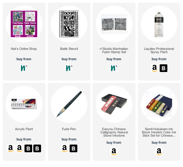
Here are some of the supplies I used in these projects: